This is the multi-page printable view of this section. Click here to print.
Element Setup
- 1: Intelligent Fixture Wizard
- 1.1: Select Profile
- 1.2: Edit Functions
- 1.3: Edit Channels
- 1.4: Color Support
- 1.5: Automation
- 1.6: Dimming Curves
- 1.7: Grouping
- 1.8: Summary
- 2: Setup Display Elements
- 3: Renaming Elements
- 4: Renaming Elements by Find/Replace
- 5: Duplicating Elements
- 6: Color Handling
- 7: Element Tags
- 8: Face Property
- 9: State Property
1 - Intelligent Fixture Wizard
Required Materials
Vixen’s support for intelligent fixtures (DMX moving heads) is based on giving Vixen detailed knowledge about your hardware. To perform this data entry you are going to need the User manual for your fixture that lists the functions your fixture supports and what channel(s) are associated with those functions.
Time Commitment
Expect to spend ~20 minutes defining your fixture profile.
Background
The Intelligent Fixture Wizard has two purposes:
- It creates fixture profiles. The fixture profile contains what functions the fixture supports and what channels are used for those functions.
- It creates Intelligent Fixture display elements and adds them to the display.
How to Start
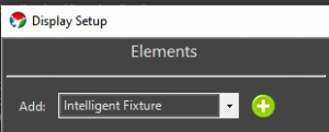
The Intelligent Fixture Wizard can be activated from the Display Setup. Select Intelligent Fixture from the Elements drop down and then select the Plus button.
Video Tutorials
1.1 - Select Profile
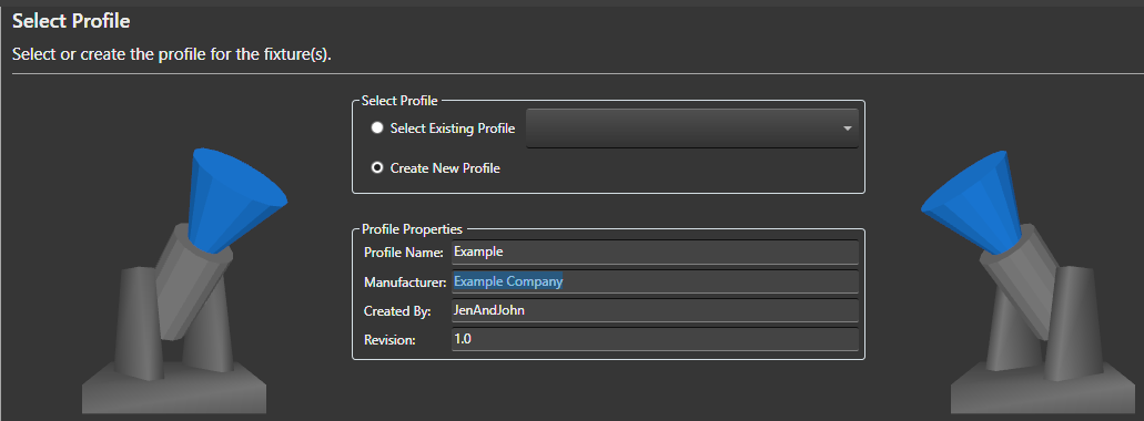
Select Profile Options
-
Select Existing Profile - If you have already created a Profile for your fixture you could select it here. The drop down shows all fixtures installed into the active Vixen profile. The fixture profiles are stored within the Vixen profile. Note in the future users may be able to download fixture profiles from the Vixen website that other users have submitted.
-
Create New Profile - The default is to create a new fixture profile. The fixture profiles are stored within your overall Vixen profile.
Profile Properties
-
Profile Name - Name of the intelligent fixture profile. For new fixture enter a unique name. This name is used as the fixture profile filename.
-
Manufacturer - Optional name of the manufacturer of the fixture hardware.
-
Created By - This read-only field is determined by the Windows login name.
-
Revision - Field for keeping track of updates to the profile definition. Refer to Persistence Note below for implications of updating a profile. If the profile is being updated consider incrementing the Revision number.
Persistence Note
If the Profile Name is changed it is effectively a ‘Save As’ like operation as the existing profile is not modified. If anything is changed in a profile, only newly created fixtures will receive the changes. Existing fixtures are NOT impacted by the changes and if desired will need to be updated via their Intelligent Fixture property.
Select the Next button to continue to configure your intelligent fixture.
Video Tutorials
1.2 - Edit Functions
Background
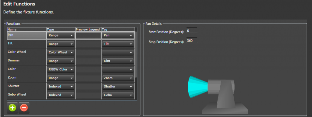
This wizard page (Edit Functions) and the Edit Channels wizard page define the majority of the fixture. Vixen comes with a number of built in functions to make this data entry task easier. This page defines the functions that will be assigned to channels on the next wizard page (Edit Channels). The name of each function needs to be unique. Note the names of the predefined functions can be changed to better match your fixture’s user manual.
What is a Tag?
The Vixen Intelligent Fixture support was designed to allow users to input their fixture channel map information in verbatim. There are areas of the Vixen Intelligent Fixture support where Vixen needs to know what certain fixture function do. These areas include the Preview, Effects and automating the handling of certain functions like shutter. The Fixture Profile uses a tag to give the software the necessary knowledge about the functions. There is tagging at the function level but there is also tagging for index values. Many of the built in functions are already assigned a tag.
What Do I Do On This Wizard Page?
Look over your fixture user manual and make sure all your fixture functions are defined on this page.
Note it is possible to navigate back and forth between the Edit Functions and Edit Channels wizard pages if you find you need to add an additional function.
Select the Plus  button to add additional fixture functions.
Some of the functions require additional details which appear in the details pane to the right.
Create New Function
- Select the Plus button to add a new function.
- Give the function a unique name.
- Assign the function a type (Range, Indexed, Color Wheel, RGB Color, RGBW Color, None).
- (Optionally) assign a Preview Legend. The preview legend is displayed below the fixture with corresponding DMX value assigned to the channel. This feature can be useful for debugging problems.
- Optionally assign a Tag to the function. See ‘What is a Tag’ section above for more information.
Assigning Function Details
There are nine built in functions. The following sections describe each built in function and what configuration is still required. The functions in the fixture profile are NOT ordered. If your fixture does not support one of these built in functions there is no harm in leaving them in the profile. If there is any doubt if a function might be applicable to your fixture leave it in the list to save data entry. These built-in functions are properly tagged to maximize support with the Vixen Intelligent Fixture sequencing effects.
- Pan Function - Input the range of motion the fixture supports when panning. This value helps ensure the Preview matches the movement of the actual hardware. The Start position defines the resting position of the fixture. The stop position defines the maximum range of movement.
- Tilt Function - Input the range of motion the fixture supports when tilting. This value helps ensure the Preview matches the movement of the actual hardware. The Start position defines the resting position of the fixture. The stop position defines the maximum range of movement.
-
Color Wheel - Defines the colors that the fixture supports. This function may not be applicable to color mixing fixtures.
- Select the Plus button to add a new color wheel entry.
- Enter a unique name for the color wheel entry.
- Enter the DMX start value for the color.
- Enter the DMX stop value for the color.
- (Optionally) select if the entry should be controlled via a curve. Example: select Use Curve when the manual shows a range of DMX values that spin the color wheel.
- (Optionally) select the Half Stop option if the entry is half way between two colors on the color wheel. Note the colors will automatically be populated for this entry.
- Select the … button to assign the color.
- Select the Exclude Color Property option to exclude the color entry from the color property associated with the element. This option should be selected for colors like CTB and UV.
- Select the Plus
- Zoom Function - Indicate whether the fixture zooms from a narrow beam to a wide beam or vice-versa.
-
Shutter Function - Defines a function for controlling the fixture’s shutter position.
- Select the Plus button to add a new index entry.
- Enter a unique name for the index entry.
- Optionally select Use Curve for entries that define a strobing rate.
- Enter the DMX start value for the index entry.
- Enter the DMX stop value for the index entry.
- Tag the entry if the entry open or closes the shutter. This tagging allows Vixen to automatically control the shutter when color is applied to the fixture.
- Select the Plus
-
Gobo Function - Defines a function for selecting gobos.
- Select the Plus button to add a new gobo entry.
- Enter a unique name for the gobo entry.
- Optionally select the Use Curve for entries that spin the gobo wheel or define a range where the user should select a specific value.
- Enter the DMX start value for the gobo entry.
- Enter the DMX stop value for the gobo entry.
- Optionally select an Image for the gobo entry. The image is displayed on the timeline for Gobo effect. Gobo images are stored in the Vixen profile at \Fixtures\Images. Select the Import Gobo Images button to copy images to this folder.
- Select the Plus
-
Open Close Prism Function - This fixture function may not be mainstream but is similar to a shutter function in that it applies a prism or removes the prism. For fixtures that support this function it is typical to have one index entry that applies the prism and another entry to remove the prism. If the entries are tagged Vixen will automatically apply the prism if a prism is selected via another function.
- The entry that applies the prism should be tagged Prism Open.
- The entry that removes the prism should be tagged Prism Close.
Associated Prism Function - This drop down allows the user to select the associated Prism function that is being opened and closed. This field is critical when the fixture contains more than one prism function that can be opened and closed.
-
Prism Function - Defines a function for placing a prism into the beam of light.
- Select the Plus button to add a new prism entry.
- Optionally select the Use Curve for entries that define a range where the user should select a specific value within that range. This entry will be edited using a curve in effects.
- Enter the DMX start value for the prism entry.
- Enter the DMX stop value for the prism entry.
- Set the Tag to Prism for prism entries that should be available in the Prism effect. Entries like a Stop can be omitted.
- Select the Plus
- Frost Function - Defines a function that places a frost lens in the beam of light. This function is a range function and does not require any further configuration.
Select the Next button to continue to configure your intelligent fixture.
Video Tutorials
1.3 - Edit Channels

Background
The Edit Channels wizard page defines the channels on the fixture.
The channels in this grid are order dependent.
When complete the channels in this grid should match your fixture’s user manual.
The number of channels in this grid should match your fixture’s user manual.
Often intelligent fixtures define channels for the convenience of controlling the fixture from a lighting controller with sliders.
If there are channels that are not needed when controlling the fixture from Vixen they can be skipped by placing an Ignore row and a function of None.
A channel with a function of None will be ignored by Vixen. Including these ignore rows are important to keep patching to a controller easy and straightforward.
What Do I Do On This Wizard Page?
This wizard page defines the channels that make up the fixture. This table should match your user manual precisely. Channels should not be skipped or omitted. Order is important and should match your fixture’s manual.
- Select the Plus button to add a new channel.
- Give the channel a unique name.
- Select the fixture Function for the channel.
You can use the Wizard Back button to add or edit the functions.
Select the Next button to continue to configure your intelligent fixture.
Video Tutorials
1.4 - Color Support
Background
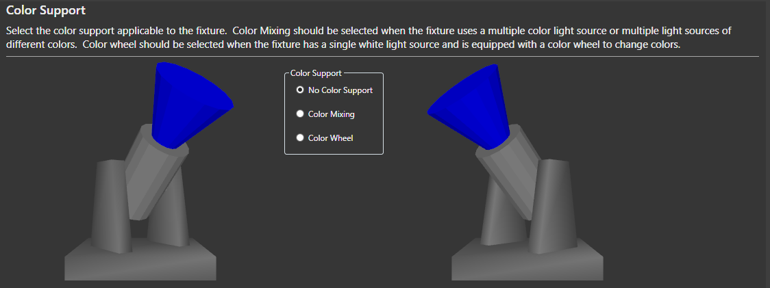
Vixen will examine fixture channels and functions and default the color support. This selection is hardware dependent. The Color Wheel option requires that the fixture has a Color Wheel function. Vixen will extract all the colors from the color wheel and create a color property for the fixture element with a discrete color for each color on the color wheel.
-
No Color Support - This option can be selected if you want to manually control the color through separate display elements. This option is not recommended.
-
Color Mixing - This option should be selected when the fixture uses multiple color sources or multiple light sources of different colors. Examples are RGB and RGBW.
-
Color Wheel - This option should be selected when the fixture has a single white light source and is equipped with a color wheel to change colors.
Select the Next button to continue to configure your intelligent fixture.
Video Tutorials
1.5 - Automation
Background
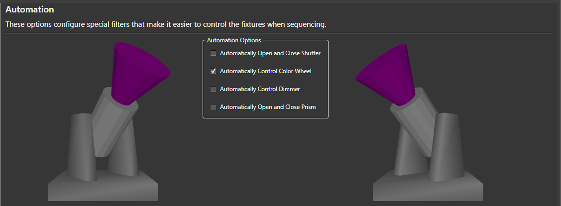
This wizard page configures Vixen Intelligent Fixture automation. The goal of the automation is to make it as easy as possible to sequence the intelligent fixture. Vixen will examine the fixture’s channels and functions and default these options accordingly.
-
Automatically Open and Close Shutter - This option will automatically control the shutter channel based on the color channels. Whenever an effect is generating color, the shutter will open. Whenever there is no effect, or the effect is dark, the shutter will be closed.
-
Automatically Control Color Wheel -This option will automatically control the color wheel by matching colors generated in the effects to colors supported on the color wheel.
-
Automatically Control Dimmer - This option is usually selected for fixtures with a color wheel and fixed white light source. It will automatically control the fixture’s dimmer channel based on the intensity of the colors in the effects.
-
Automatically Open and Close Prism - This option is usually selected for fixtures that have both a channel for enabling the prism and another channel for selecting the position or movement of the prism.
Select the Next button to continue to configure your intelligent fixture.
Video Tutorials
1.6 - Dimming Curves
Background
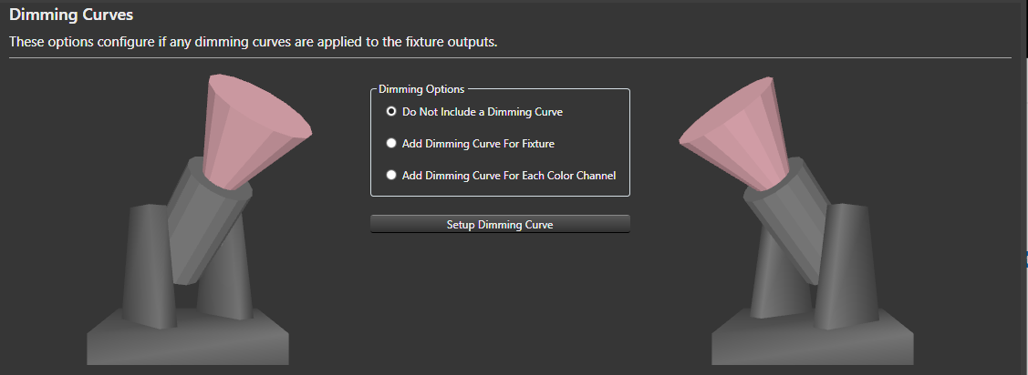
This wizard page configures optional dimming curves for the fixture outputs. From this wizard one dimming curve can be configured via the Setup Dimming Curve button. A dimming curve can be useful if you want to ensure you drive the fixture at less than maximum intensity. Typically used on fixtures with a LED light source.
-
Do Not Include a Dimming Curve - The default option is to not include any dimming curves.
-
Add Dimming Curve For Fixture - This option adds a single dimming curve for all color channels.
-
Add Dimming Curve for Each Color Channel - This option configures a separate dimming curve for each color channel. With this option all the dimming curves are initially identical. The curves can be further adjusted via the Patching Graphical View.
Select the Next button to continue to configure your intelligent fixture.
Video Tutorials
1.7 - Grouping
Background
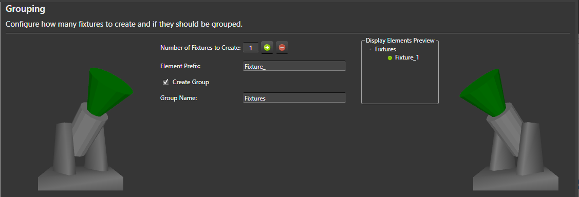
This wizard page determines how many fixture display elements to create and if to group them. This wizard page also determines the naming convention for the fixtures. The Display Elements Preview to the right gives an indication of how the fixtures will be displayed in the Elements tree. Note Vixen will modify the element names as necessary to avoid duplicates as all display elements must have unique names.
-
Number of Fixtures to Create - Number of fixture display elements to create. Select the Plus
button to have the wizard create additional fixtures. -
Element Prefix - Name prefix for the fixture display elements.
-
Create Group - Determines if the fixtures are nested under a group in the display element tree.
-
Group Name - Name of the fixture group.
Select the Next button to continue to configure your intelligent fixture.
Video Tutorials
1.8 - Summary
Background
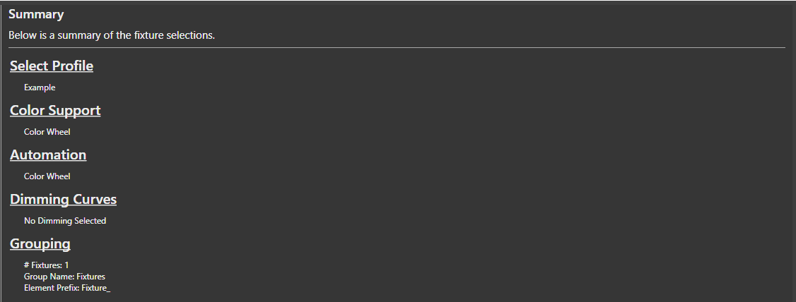
The Summary wizard page summarizes the selections made on the previous pages for review. Select the Finish button for the wizard to actually create the fixture display elements and save the fixture profile to the file system.
2 - Setup Display Elements
Concepts
Elements are the main building blocks of your display. Every display item you want to use in your show will need either an element, or an element group defined for it.
Adding Single-Element Items
An item such as a single string of lights is defined as a single item in the Element Tree. So, if you have a string of lights that is a single color, or even a single multi-colored standard string, it is defined as a single element. Think of if this way. If you plug it in and can only control the entire string at once, it is a single display item. Conversely, if you can set each light to any number of colors or there is more than one controllable item in the string, it is not defined this way.
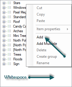
Right-click somewhere in the white-space of the Element Tree and select Add.
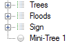
Give your element a name. We’ll call ours Mini-Tree 1. The new element will be added to the list as a single node.
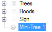
Click on the newly created element to select it.
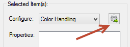
Make sure Color Handling is selected in the Selected Item(s)/Configure section and press the Configure button

When the Color Configuration dialog box appears, click on the first radio button (They are a single color…).
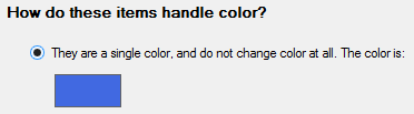
Click the color box (blue in the above graphic) to define the color of this element.
Click OK when you’re done and you’ll get a dialog box telling you what you just did – hit OK on this dialog to close it.
That’s it. You’ve successfully defined a single element for your display.
There is no need yet to link anything in the Element Tree to output controllers. With these elements defined, you can sequence your display and setup a preview. Only when you are ready to physically connect your output controllers do you need to come back and mess with the controllers.
Single-Element Shortcuts
Let’s say you have 16 mini-trees that are a single color (mine are white). These are standard 120V light strings and each is separately controlled by a channel on a Renard controller (so, 16 strings, 16 outputs on a controller)
Select Generic Numbered Group from the Add combo-box under Element Setup.
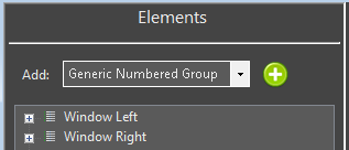
Click on the  to the right of Generic Numbered Group drop down box.
A dialog box will appear that lets you name your new element group and each item within the group. We’re going to fill ours out with a group name of Mini-Trees, an item prefix of Mini-Tree and an item count of 16.
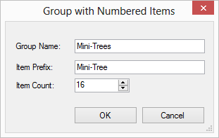
When you press OK a new group will be created at the bottom of the Element Tree named Mini-Trees with 16 individual trees named Mini-Tree-X where X is the number of the item.
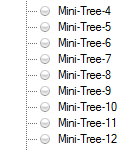
Now, we need to define the color-handling for these items. For versions 3.6 and above the following steps will be invoked automatically for you when you create an item with the prop shortcuts. In addition, you will be prompted to ask if you need a dimming curve to control the brightness of your prop. Click on the Mini-Trees group so it is selected.
Make sure Color Handling is selected in the Selected Item(s)/Configure section and press the .
When the Color Configuration dialog box appears, click on the first radio button (They are a single color).
Click the color box (blue in the above graphic) to define the color of this element.
Click OK when you’re done and you’ll get a dialog box telling you what you just did — hit OK on this dialog to close it.
That’s it. You’ve successfully defined a group of single 16 elements for your display.
Multiple-Element Shortcuts
3 - Renaming Elements
Introduction
There are multiple ways to rename elements. The simplest form is a single item rename. There are also features that enable multiple items to be renamed at the same time. One of them will be discussed here. The other one has its own section under Find/Replace.
Simple Renaming
To rename a single element, you can select the element and then right click and select rename. You will be prompted with a dialog to enter the new name. Clicking the ok button will apply the change. If the new name for the element matches an existing name, it may append a unique qualifier because all element names must be unique.
Multiple Element Rename
When you select multiple items to rename, a dialog box will appear to allow you to shape the renaming by forming templates. These templates are the same as the one used in the Add Multiple helpers that generate elements based on sequential naming patterns.
4 - Renaming Elements by Find/Replace
Introduction
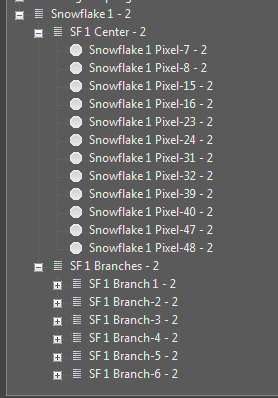
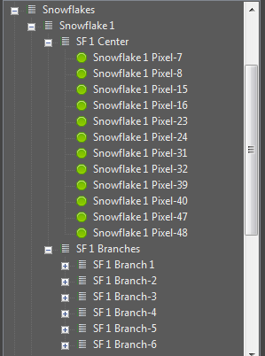
You may have element structures that were created with names that did not have the exact structure you wanted or have evolved over time and need some restructuring. The standard rename function has abilities to rename multiple items via a sequential template format. At times, this may be too rigid for your needs and a simple find replace mechanism can better serve the purpose. An example is shown below where the paste as new function was used to duplicate an element group structure. The groupings themselves have elements that have been restructured out of a sequential naming structure. The intent here is to remove the - 2 on the end and change it from Snowflake 1 to Snowflake 5. This way the newly cloned element group will match the pattern of the original ones it was cloned from. See element duplication for additional details. Starting in 3.6 and above this can be done from the Display Setup or the Preview Setup forms.
Steps
-
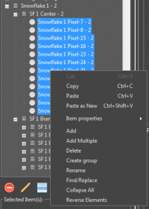
Select a group of elements to Find/Replace naming patterns. They can be all together, or selected from multiple different levels. Select only the items you wish to act on.
-
Right click on the selected items and choose Find/Replace.
-
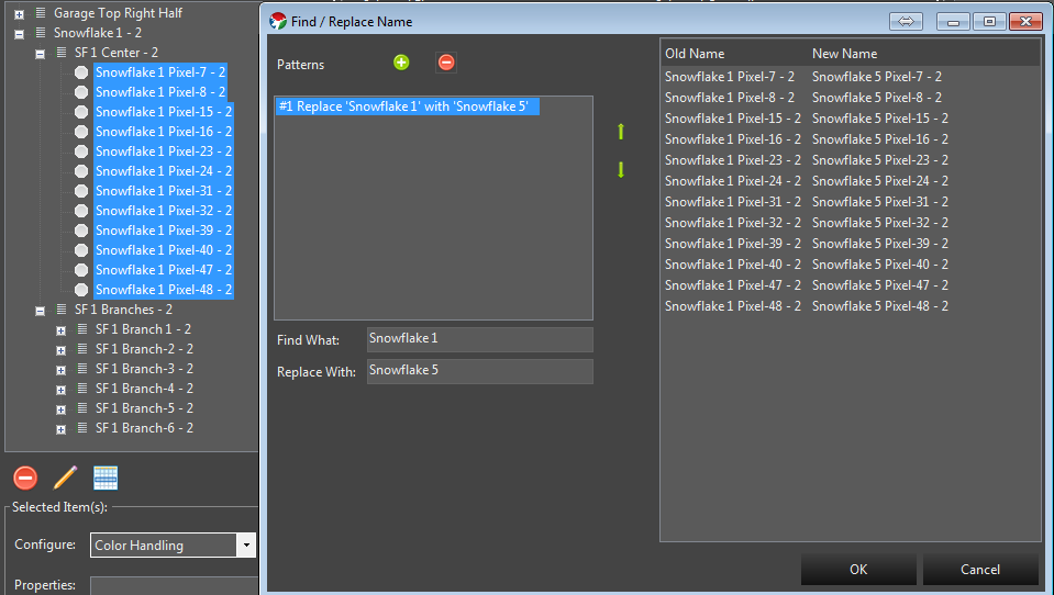
On the dialog box that appears you can create patterns of find and replace. Patterns can be chained to allow for multiple find replace operations in one pass without having to do the Find/Replace operation multiple times.
-
First we will create the pattern to rename Snowflake 1 to Snowflake 5. In the Find what text field we put Snowflake 1. In the Replace with text field we put Snowflake 5. You will notice the list at the left showing on the fly what will happen as you type the values in.
- Next we also want to remove the - 2 on the end. So we click the green + button to add a new pattern. This new Find/Replace will occur on the result of the previous pattern. We enter the - 2 in the find what. Notice we enter a blank space in front because we also want to remove the blank that is there. - 2. Because we want to replace that with nothing, we leave the replace with text field empty. The list on the right updates to reflect the result of all our changes.
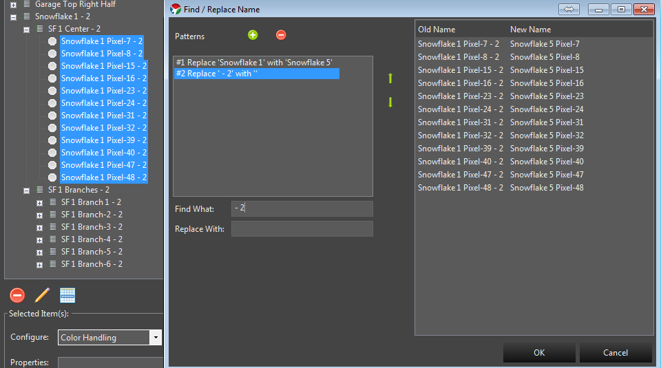
- Now that the list on the right reflects what we want the elements to look like, we can click the ok button and the changes will be applied.
5 - Duplicating Elements
Introduction
In some cases you may have created an element structure that does not conform to one of the built in template generators and you need to create more of them. Instead of manually recreating each one, Vixen has a feature to allow you to copy and paste a new version of it. Normally copy and paste just makes additional copies that are linked to the original. But in this case you truly want a new version of it.
Steps
-
Select the top level of the item group you want to make a new version of. In the example above I would select the Snowflake 1 Element group.
-
Right click out in the white space area of the element list and the context menu will appear.
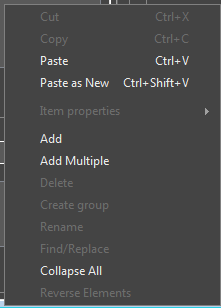
- Choose Paste as New. After this a cloned copy will be created as shown below.
Because Vixen does not allow different elements to have the same name, the feature will append some numeric qualifier on the end of the new elements to make them different. You can leave these as is, or use some of the renaming features described elsewhere to rename them.
6 - Color Handling
Color Handling
Color handling provides information on how the elements use color. There are 3 common types of lights.
- Traditional analog incandescent, or LED string lights. These have been around for a long time and are typically a string of single color lights.
- Dumb Pixels. These are LED pixels, but the whole string color can be controlled and will all be the same color at the same time. These lights are not individually addressable.
- Pixels. These are modern addressable string of lights that can be made any color and each light can be any color.
The color configuration can occur from multiple places. If you add elements in display setup using the templates, the color setup will typically be presented as part of the setup workflow for each type of prop. If you create individual elements outside of one of the wizards, then it will be presented when you use the Add Properties -> Color Handling.
Color Configuration
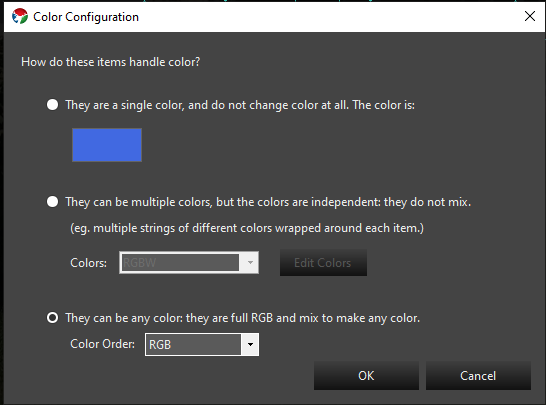
The Color Configuration dialog will be presented from multiple places. It is key to getting the color setup correct on your elements so the sequencer can properly manage them. There are 3 options on this dialog and they relate to the information above on what type of lights you are using.
- Single color. This is for traditional lights where the element is a single color only.
- Multiple colors that do not mix. This is for what is known as super strings of traditional lights. A single prop may have multiple strings of different color lights covering the same area. You would configure this to have the set of colors that match what your strings are.
- Mixing color types. This is typical of a pixel that can be any color. Typically they are RGB.
7 - Element Tags
Overview
Element Tags let you attach simple organizational or workflow labels to an element without renaming it, moving it in the Element Tree, or relying on notes kept outside of Vixen. This is useful for things like marking an element you’re phasing out, tucking an element out of the way while you work, or flagging elements you plan to migrate to a physical prop later.
Vixen ships with three built-in tags:
- Deprecated (red dot by default) — marks an element you no longer want to actively sequence against. In the Sequencer, rows tagged Deprecated reject new effects, and opening a sequence that already has effects on a Deprecated element shows a warning listing the affected elements. See Element Tags in the Sequencer section for details.
- Hidden (black dot by default) — marks an element you want to keep in your configuration but don’t need to see or work with right now. In the Sequencer, Hidden elements can be toggled out of the row list for the current editing session.
- Prop (blue dot by default) — reserved for identifying elements intended for a future Prop migration workflow. It has no special behavior yet beyond being assignable and shown.
A tag applies only to the element it’s assigned to — it is not automatically inherited by an element’s children in a group.
Display Setup and Preview Setup share the same Element Tree control, so tagging works identically in both.
Assigning and Removing Tags
Right-click one or more elements or groups in the Element Tree and choose Tags from the context menu. The submenu lists every tag currently in the catalog — today, the three built-in tags — with a checkmark next to any tag already assigned to your selection.
- Click an unchecked tag to assign it to every selected element.
- Click a checked tag to remove it from every selected element.
- If your selection is mixed — some elements have the tag, some don’t — the checkmark appears as a muted, partial checkmark instead of a plain checkmark or no checkmark at all. Clicking a partial checkmark assigns the tag to the entire selection; only a fully-checked tag removes it from the entire selection when clicked.
Hold Ctrl while clicking a tag to apply the change to all children of the selected element(s) as well, not just the selected element(s) themselves. This most useful when deprecating elements to ensure all children are known to be deprecated as well.
Tag Color Dots
Display Setup and Preview Setup never hide elements based on their tags — every element always stays visible in the tree, whether or not it’s tagged. Instead, a tagged element shows a small colored dot after its name, one dot for each assigned tag that has a color, ordered left to right by the tag’s sort order. For example, an element tagged both Deprecated and Hidden shows two dots side by side.
Managing Tag Colors
Choose Tags > Manage Tag Colors… from the context menu to open the Element Tag Manager. It lists the built-in tags with a color swatch for each — click a swatch to choose a new color, then save. Color changes apply everywhere tags are shown: Display Setup, Preview Setup, and the Sequencer.
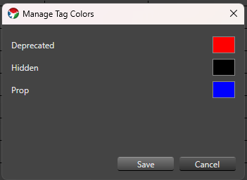
Tag assignments and any tag color changes made from Display Setup or Preview Setup are saved along with the rest of your changes when you save and close that editor, the same as any other edit made there.
8 - Face Property
Overview
The Face property lets you map individual elements to mouth phonemes and to the other parts of a singing face — eyes open, eyes closed, and outline — plus a color for each. It’s the authoring side of a pair of features: once elements are mapped here, the LipSync effect renders them in the Sequencer when its Mapping Type is set to Face Mapping. This is the same relationship the newer State Property has with the State effect, except Face is purpose-built for singing faces and their phoneme codes.
If you’re using LipSync’s Image Mapping type instead — drawing a mouth-shape image onto a pixel matrix rather than mapping individual elements — you don’t need a Face property at all; see Image Mapping below.
Adding the Face Property
- In Display Setup, select all of the individual elements that make up your face prop’s mouth, eyes, and outline — every element that needs its own phoneme or component mapping. This is usually many leaf elements (individual pixels or segments), not a single parent group.
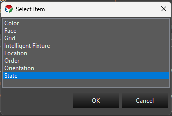
- In the Selected Item(s)/Configure section, press Add Properties. In the Select Item dialog, choose Face and press OK. Every element in your selection gets its own Face property.
- With Face selected in the Configure list, press Configure. Face provides its own setup wizard instead of a plain settings dialog, so this opens the Face Setup window directly, with one row for every element you selected.
Face Setup Wizard
Face Setup has two tabs, each a grid with one row per element you selected, ending in a shared Color column — setting a color on one tab also updates it on the other, since it’s really one color per element.
Mouth
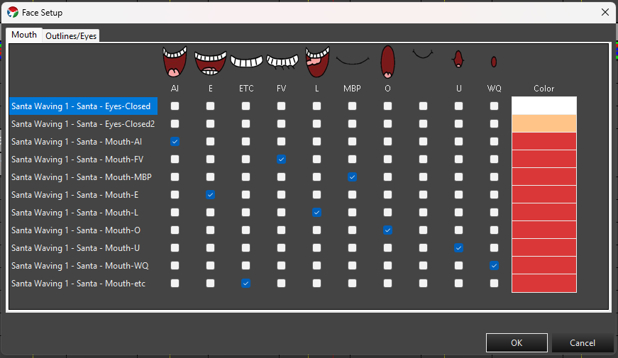
One checkbox column per phoneme — AI, E, ETC, FV, L, MBP, O, U, WQ, and REST (the standard Preston Blair/Papagayo set). Check the phoneme(s) that row’s element should light up for.
Outlines/Eyes
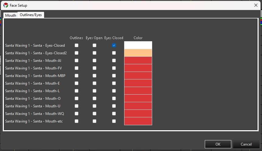
Checkbox columns for Outlines, Eyes Open, and Eyes Closed. Check the appropriate box(es) for that row’s element.
- Click a checkbox cell to toggle it. You can select multiple cells first (click, Ctrl-click, Shift-click, or drag across a range) — clicking any one of the selected cells then toggles the whole selection together: if fewer than half of the selected cells are currently checked, the click checks all of them; otherwise it unchecks all of them.
- Double-click a Color cell to open a color picker for that row’s element. If the target elements only support a fixed set of discrete colors, you get a picker limited to those choices; otherwise you get the full color picker. Multi-select several rows’ Color cells first and double-click one to apply the same color to all of them at once.
- OK writes the checked phonemes/components and chosen color to each element’s Face property. Cancel discards any changes made in the wizard.
Editing from the Sequence Editor
You don’t have to return to Display Setup to adjust face mapping. In the Sequence Editor, Tools -> LipSync -> Edit Element Face Mapping opens the LipSync Mapping Node Select dialog:
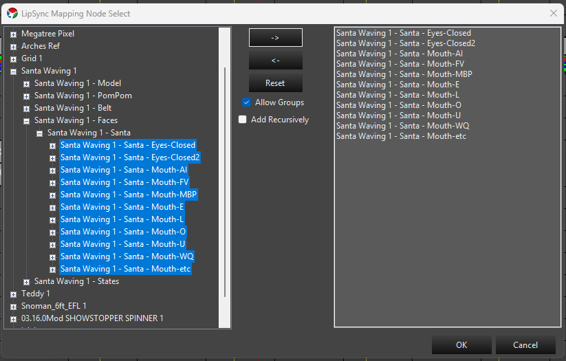
- Browse and select elements in the tree on the left, then press -> to move them into the list on the right — multi-select first to move several at once. <- moves selected items back out of the list, and Reset clears it entirely.
- Allow Groups (checked by default) lets you move a group node itself into the list as a single entry, instead of restricting the list to individual leaf elements.
- Add Recursively expands a moved group into its individual descendant elements in the list, instead of keeping it as one group entry.
- Once the elements you want to map are in the list on the right, press OK to open the same Face Setup wizard described above, for that selection.
This is a faster way to fix or build out face mapping without leaving your sequence.
Image Mapping
LipSync’s other Mapping Type, Image Mapping, doesn’t use the Face property or individual element mapping at all — it draws a phoneme image onto the target as if it were a pixel matrix, using shared image maps instead. See LipSync Image Maps for how to manage those.
Next Steps
Once your elements have Face properties configured, add a LipSync effect targeting a group that contains them, with Mapping Type set to Face Mapping.
9 - State Property
Overview
Since Build 1449.
The State property lets you define one or more named State definitions for an element or group, each made up of State Items that map a color to a set of elements. It’s the authoring side of a pair of features: once States are defined here, the State effect renders them in the Sequencer. This is the same relationship the existing Face Property has with the LipSync effect, except State isn’t limited to faces or phonemes — it works for any prop with parts that need to switch between named looks, like a waving arm, a lit sign, or a costume.
- A State definition is one named State, such as
Eyes OpenorArm Up. It has a description and one or more State Items. - A State Item is one row inside a State definition — a name, a color, and the set of elements it applies to. Giving two State Items the same name groups them so the effect can activate both together (for example,
Full Outfitmight be built from a red-coat State Item and a white-cuffs State Item, both named the same or targeted together as needed).
Adding the State Property
- In Display Setup, select the element or group you want to add States to. This should primarily always be the top level model group defining your Prop. Each Prop that needs State should generally only have one State Property.
- In the Selected Item(s)/Configure section, press Add Properties. In the Select Item dialog, choose State and press OK.
- With State selected in the Configure list, press Configure to open the State Property Setup dialog.
State Definitions
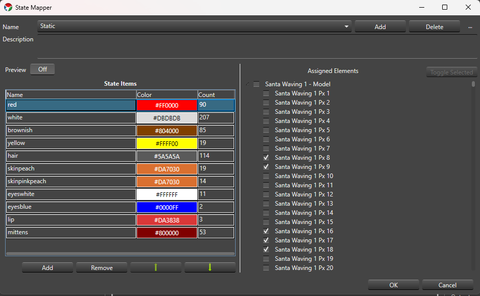
At the top of the setup dialog:
- Name A drop-down of the State definitions on this property. The first one is selected automatically when the dialog opens.
- Add Prompts for a name (suggesting
State - 1,State - 2, and so on) and creates a new State definition at the end of the list with one starter State Item namedState Item - 1. - Delete Confirms, then removes the selected State definition. You can’t delete the last remaining State definition.
- … menu:
- Rename Prompts for a new name without touching the definition’s State Items or IDs.
- Copy Prompts for a name (suggesting
<name> Copy) and duplicates the selected definition, including its State Items, as an independent copy — later edits to either one don’t affect the other.
- Description A free-text field below the name controls for describing what the State definition is for.
State definition names must be non-blank and unique. Names that differ only by case (Open vs. open) are allowed but show a non-blocking warning in case it was a typo. OK is disabled while any blocking validation error exists; Cancel and closing the window are always available and discard unsaved edits.
State Items
The grid on the left side of the dialog lists the selected State definition’s State Items:
- Name Click to edit inline. Required and trimmed of leading/trailing whitespace; duplicate names across rows are allowed (that’s how you build a State Item Group).
- Color Double-click the cell to open the standard Vixen color chooser (or discrete-color chooser, if the assigned elements only support fixed colors). The cell shows the chosen color as its background with the hex value as text.
- Count Read-only — the number of leaf elements currently assigned to that row.
Below the grid:
- Add Adds a new row named
State Item - N. If the property’s elements are discrete-color and share at least one common color, the new row defaults to that color; otherwise it defaults to white. - Remove Deletes the selected row(s), after confirming (the confirmation message says how many rows will be removed).
- Move Up / Move Down (the arrow icon buttons) Manually reorder the selected row one position at a time. These are only enabled when a single row is selected and it isn’t already at that end of the list.
The grid also supports column-header sorting — click Name, Color, or Count to sort by that column. A sorted or manually reordered layout is remembered the next time you open this State definition. You can multi-select rows (standard click, Ctrl-click, Shift-click) to remove several at once or preview several at once — see Preview below.
Assigned Elements
The tree on the right side shows the selected element and its children so you can choose which elements a State Item applies to. It’s only shown and editable when exactly one State Item row is selected in the grid — select more than one row and the tree is empty, since assignments can only be edited one row at a time.
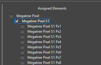
- Click a node to select it — this only highlights it, it doesn’t change its assignment.
- Ctrl-click adds or removes individual nodes from the selection; Shift-click selects every visible node between the last-clicked node and the new one.
- Press Space, or click Toggle Selected, to toggle the checked (assigned) state of every currently selected node.
- Checking a group node clears and grays out its descendants — they’re assumed included through the group. Unchecking the group re-enables the descendants without restoring whatever was individually checked before.
The Count column on the State Items grid updates as you check and uncheck elements.
Preview
- Preview A simple Off/On toggle. It’s off by default and, while off, nothing you do in the dialog affects your live output or preview.
- When Preview is On, whichever State Item row(s) are currently selected in the grid light up on the real output/preview using their configured colors. Selecting a different row (or set of rows) updates the preview immediately, and clearing the selection stops previewing anything.
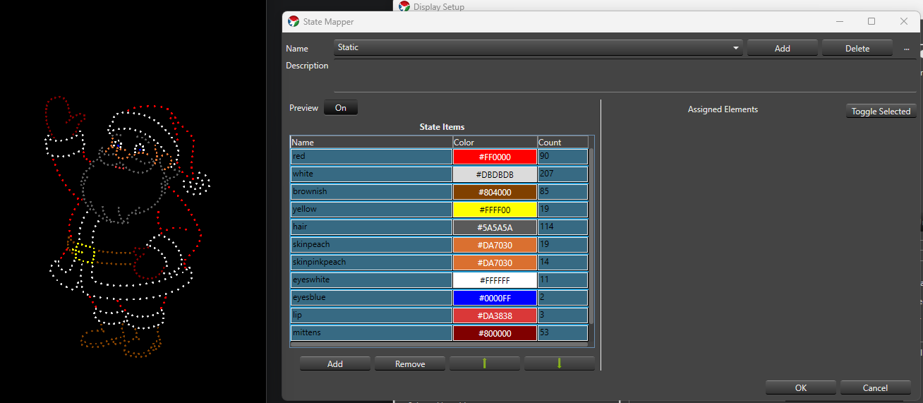
- Editing a previewed row’s assignments or color updates the preview live. Turning Preview off, or closing the dialog through OK, Cancel, or the window close button, always clears any active preview.
Saving
OK saves your State definitions and closes the dialog; it stays disabled while a blocking validation error exists anywhere in the property. Cancel, or closing the window, discards any changes made in this session.
Next Steps
Once an element has one or more State definitions, add a State effect to that element (or a parent group) in the Sequencer to render them.