State
Overview
Since Build 1449.
The State effect renders the named States defined by a State property on a prop. It is similar in purpose to the LipSync effect, but it isn’t limited to faces or phonemes. Any prop with a State property can use it — a waving Santa can define Arm Up and Arm Down States, a decorated Santa can define a Full Outfit State made up of a red coat, white cuffs, and a gold belt buckle State Item, and a face can define Eyes Open and Eyes Closed.
Before adding a State effect, the target element (or one of its children) needs a State property configured. See State Property for how to create State definitions and State Items.
The effect looks for a State property anywhere on the target element or its descendants, so it can be placed on a group without needing every leaf element to carry its own State property.
Configuration
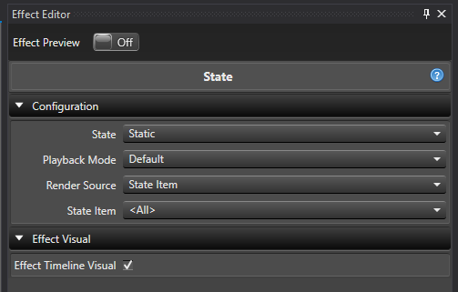
-
State Selects which discovered State definition to render. This lists every State definition found on the target element and its descendants, in element-tree order. If more than one discovered definition shares a name, each is disambiguated by adding its owning element’s name in parentheses, for example
Eyes Open (Santa - Model); if that’s still not unique, a short id is appended as well. A newly added State effect auto-selects the first discovered State definition. If the target has no State property at all, this shows<No States Available>and the effect renders nothing. If a previously selected State definition is later deleted, this shows the missing selection and the effect renders nothing until you pick a valid one. -
Playback Mode Controls how multiple active State Items are scheduled.
- Default All active State Items render together for the full effect duration.
- Cycle Active State Items render one after another, splitting the effect duration between them.
-
Cycles Only shown when Playback Mode is Cycle. Sets how many times the full sequence of active State Items repeats across the effect duration. Ranges from 1 to 20 and defaults to 1.
-
Cycle Offset Only shown when Playback Mode is Cycle. Shifts which slot in the cycle renders first, without changing slot durations, grouping, colors, marks, assignments, or how many times the sequence repeats. Ranges from 0 to 100 and defaults to 0. For example, a cycle of
Red,Green,Bluewith a Cycle Offset of 1 starts onGreenand continuesGreen,Blue,Red. The offset is taken modulo the current number of slots in the cycle, so a value equal to (or a multiple of) the slot count has no visible effect, and any value up to 100 wraps around sensibly regardless of how many slots the cycle currently has. The shift is applied once, before Cycles repeats the sequence — so an offset of 1 onRed,Green,Bluewith 2 Cycles rendersGreen,Blue,Red,Green,Blue,Red, not a rotation of the already-repeated six-item sequence. This behaves consistently across all three Render Source options; see the notes under each below. -
Render Source Selects how the effect decides which State Items are active.
- State Item Uses one selected State Item, or all of them.
- Mark Collection Uses Marks to activate State Items by name over time.
- Custom Uses an ordered list of State Item rows that you build directly on the effect.
Switching Render Source doesn’t clear the other sources’ settings — your State Item selection, Mark Collection, and Custom State Items rows are all remembered, so you can switch back and forth without losing anything (switching the top-level State selection is the exception; see below).
State Item
Shown only when Render Source is State Item.
- State Item Selects which State Item name to render, or
<All>to render every State Item in the definition. The list contains<All>followed by each unique State Item name in the order it first appears in the State definition — if multiple State Items share a name (a State Item Group), selecting that name activates all of them together. If the State definition has no State Items, this shows<No State Items Available>.- In Default mode,
<All>renders every State Item simultaneously for the full effect duration. - In Cycle mode,
<All>renders each unique State Item name in turn, splitting the duration between them (and repeating Cycles times); selecting one specific name still renders every State Item with that name for the full duration in either Playback Mode.
- In Default mode,
If the selected State Item name is later renamed, the effect keeps following it and displays the new name. If it’s deleted, the effect keeps the missing selection and renders nothing until you choose <All> or another valid name.
When Playback Mode is Cycle and State Item is <All>, Cycle Offset shifts which unique State Item name starts the sequence — the remaining names still follow in their original order and wrap back to the beginning. A specific single-name selection isn’t a cycling sequence, so Cycle Offset has no effect on it.
Mark Collection
Shown only when Render Source is Mark Collection.
- Mark Collection Selects the Mark Collection whose mark labels drive which State Items are active over time. This uses the standard Mark Collection selector, the same one used by effects like LipSync and Alternating.
Each mark’s label can contain one or more comma-separated State Item names, for example Open, Closed. Matching is case-sensitive, and leading/trailing whitespace around each name is trimmed. Unknown or blank names are ignored (they don’t render anything, but in Cycle mode they still consume their share of time as blank slots). Gaps between marks render nothing — close the gaps in the Marks editor if you don’t want blank sections. Overlapping marks all render, and marks that only partially overlap the effect are clipped to the effect’s boundaries.
- In Default mode, all recognized names on a mark render together for that mark’s duration; duplicate names in the same mark only render once.
- In Cycle mode, each comma-separated segment gets an equal share of the mark’s duration, repeated Cycles times, and renders in the order listed — so
Open, Closed, Openproduces three intervals, not two.
If the Mark Collection is deleted, the selection clears and the effect renders nothing until you choose another one.
In Cycle mode, Cycle Offset shifts which comma-separated segment starts each mark’s cycle independently — every mark rotates its own segment list rather than being offset against other marks. Blank and unrecognized segments still count as slots, so they shift along with the rest and keep consuming their share of time; the offset never removes or reorders which segments are blank.
Custom State Items
Shown only when Render Source is Custom.
Builds an ordered list of State Item rows directly on the effect, instead of relying on <All> or a Mark Collection. This is useful when you want a specific sequence of a subset of State Items, or want to override a State Item’s color for just one row.
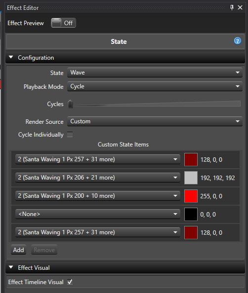
- Custom State Items An expandable list of rows. Each row has:
- State Item Picks one specific State Item from the selected State definition. In Cycle mode,
<None>is also offered as the first choice — a blank row that consumes a timing slot but renders nothing.<None>is not available in Default mode, since Default renders every row at once and a blank row would have no effect. If the same State Item name appears more than once in the definition, the row picker disambiguates the duplicates using their assigned element names, or a row number, or a short id if needed. - Color The color used when this row renders, defaulting to the State Item’s configured color when the row is added or its State Item is changed. Change it to override the color for just that row, without affecting the State Item’s own configured color. The color editor respects the color capabilities of that State Item’s assigned elements (full color or discrete color).
- State Item Picks one specific State Item from the selected State definition. In Cycle mode,
Rules that apply to the row list:
- In Default mode, each State Item can only be used by one row, and every row renders together for the full effect duration — equivalent to
<All>in State Item mode, but limited to the rows you’ve added. - In Cycle mode, the same State Item can be added to multiple rows, and every row (including
<None>and any row whose State Item was since deleted) consumes an equal share of the duration, repeated Cycles times. - Switching Playback Mode from Cycle to Default automatically removes
<None>rows and any duplicate rows for the same State Item, keeping the first occurrence of each. - Switching Render Source to Custom adds one starter row automatically if the list is empty and the State definition has at least one State Item. At least one row is required while Custom is active.
- Changing the top-level State selection clears the Custom State Items list and, if Custom is still selected, reseeds it with one row for the newly selected definition’s first State Item.
In Cycle mode, Cycle Offset shifts which row (or, with Cycle Individually unchecked, which group of consecutive same-item rows) starts the sequence. Rows and groups keep their existing order, color overrides, and <None>/missing-selection blank slots — the offset only changes the starting point, and grouped rows continue to move and render together after the shift.
Cycle Individually
Shown only when Render Source is Custom and Playback Mode is Cycle.
By default (Cycle Individually checked), every row in Custom State Items gets its own timing slot, even if consecutive rows share the same State Item name.
Unchecking Cycle Individually groups consecutive rows that resolve to the same State Item name into a single timing slot — each row in the group still renders with its own row color, but the group only consumes one slot’s worth of time. Rows aren’t grouped just because they share a name; they must be next to each other in the list. For example, with rows Item 2, Item 2, Item 2, <None>, Item 4, Item 4, Item 4:
- Cycle Individually checked: 7 timing slots, one per row.
- Cycle Individually unchecked: 3 timing slots — the three
Item 2rows together, the<None>row, and the threeItem 4rows together.
Non-consecutive rows with the same name are never merged, even with grouping off.
Effect Timeline Visual
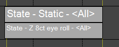
- Effect Timeline Visual Enabled by default. When on, the Sequencer timeline shows a dark gray bar labeled with the effect name, the selected State definition, and the active render source (for example
State - Eyes Open - Marks, orState - Eyes Open - Custom Groupwhen Custom is grouped by unchecking Cycle Individually) instead of a rendered color preview. Turn this off if you’d rather see the effect’s rendered colors in the timeline.
Rendering
- An active State Item renders its color (or the row color override, in Custom mode) on every element it’s assigned to. If an assignment is a group, the group’s current leaf elements are used, so adding or removing elements from that group changes the render on the next pass without editing the effect.
- Multiple active State Items (or Custom rows) that overlap the same elements all render; the rendering pipeline mixes the results.
- On a discrete-color element, if the configured color isn’t one of that element’s supported colors, the effect falls back to the element’s first supported color. If the element has no supported colors at all, it’s skipped.
- The effect only affects the elements assigned to the selected State definition’s State Items — other descendants of the effect’s target are left alone.
- There’s no intensity curve on this effect. Use an intensity layer above it if you want to fade the State colors.
Feedback
Was this page helpful?
Glad to hear it!
Sorry to hear that. Please tell us how we can improve.