This is the multi-page printable view of this section. Click here to print.
Basic Lighting
- 1: Alternating
- 2: Candle Flicker
- 3: Chase
- 4: Dissolve
- 5: LipSync
- 6: Pulse
- 7: Set Level
- 8: Spin
- 9: State
- 10: Twinkle
- 11: Wipe
1 - Alternating
Overview
The Alternating effect does what its name implies. It automates the process of alternating elements between colors. A simple example is a row of mini trees alternating back and forth from red to green.
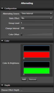

Configuration
- Timing Source This sets the source of how the alternating timing occurs.
- Time Interval This sets the timing of the alternates to be based on a fixed interval of time. Selecting this reveals the Static Effect, Change Interval, and Color Offset options below.
- Mark Collection Since Version 3.5. This sets the reference for the alternates to be based on the Marks in a Mark Collection. Selecting this reveals a Mark Collection picker in place of Static Effect and Change Interval; Color Offset still applies.
-
Mark Collection This allows you to choose the Mark Collection for the Marks to be used in aligning the alternates. The following is an example of being aligned to the Marks.
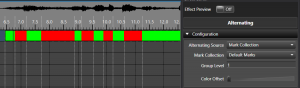
-
- Static Effect Only shown when the Timing Source is Time Interval. This option allows you to specify if the effect actually changes back and forth between colors over the duration of the effect or just sets up an alternating color pattern that is the same over the duration of the effect. This can be easily used to set alternating color patterns without having to use a pulse on all the individual elements. An example of this is the American flag that has red and white bars alternating, but are the same color for the length of the flag. Enabling this hides the Change Interval and Color Offset options, since there’s no longer a change to time.
- Group Level Specifies how many elements are of the same color before switching to the next color in the list. In the case of pixels with color of red and white set, if you set it to 5, there will be 5 lights that are red and then 5 that are green and then 5 more red and back to green and so on. This works for non pixel elements as well. Range is 1-5000. The default is 1.
- Change Interval Only shown when Static Effect is disabled. Defines how often the colors switch back and forth, in milliseconds. So if you want the colors to switch back and forth every 500 ms, set it to 500. Range is 0-10000 ms. The default is 500.
- Color Offset Only shown when Static Effect is disabled. Specifies how many colors the starting color shifts by each time the colors switch (on every Change Interval, or every Mark when using a Mark Collection), rather than only once. With the default of 1, each switch advances every element’s color by one position in the list, which is what produces the classic back-and-forth alternation. Larger values skip further ahead each switch, which can create a marquee-style effect where the pattern appears to march across the elements over time. Range is 1-10. The default is 1.
Color
- Gradients This allows you to choose the color sets to be used. The alternating supports what we can a Color Gradient Level Pair. In this case the color and the brightness level work together. With this you can specify fading colors or any other combination. This works just like a pulse, only within that color portion of the alternating. Each Color Gradient has a Curve to control it. You can add or remove these pairs of colors. Both the Color Gradient and the Curve support drag and drop. See Inline Curve Editor and Inline Gradient Editor.
Depth
- Levels Deep When enabled it controls at what level the Alternating is applied inside a group of elements. So you can have 8 items and then have 4 of them grouped to the left and 4 grouped to the right. All of these are grouped under on group. By placing the Alternating at the top level group, you can Alternating all 8 of the items or the left and the right group as a pair.
Tutorials
2 - Candle Flicker
Overview
The Candle Flicker effect was designed to simulate the effect of a candle flickering. It has many settings to adjust how the flicker behaves.
Configuration
- Group Level Controls how many elements in the group have the same flicker applied to them. Elements are grouped in blocks of this size, and every element in a block shares the same randomly generated flicker pattern. Range is 1-5000. Defaults to 1, meaning each element gets its own unique flicker.
Color
- Color Sets the single solid color used for the flicker. Unlike some other effects, Candle Flicker does not support a Color Gradient — only brightness is varied over time.
Brightness
- Max Controls the maximum brightness a flicker can reach. This is a 0-100 percent range of the overall color brightness. Default is 100%.
- Min Controls the minimum brightness a flicker can drop to. This is a 0-100 percent range of the overall color brightness. Default is 10%.
Flicker
The flicker is generated as a series of random brightness steps between the Min and Max brightness. Each step has a duration and a size, and both are randomized around the values below so that no two flickers look exactly alike.
- Frequency Sets the baseline flicker rate, in changes per second. For example, a value of 20 targets a new brightness step roughly every 1000/20 = 50 ms on average. The actual duration of each step is then randomized using Flicker below. Default is 20.
- Change Percent Sets the average size of each brightness step, as a percentage of the overall brightness range. The actual size of each step is then randomized using Deviation below, and each step is randomly chosen to move brightness up, down, or not at all. Default is 20%.
- Flicker Sets how much the timing of each step can randomly deviate from the Frequency setting, as a percentage. Higher values make the flicker’s timing less regular. Default is 25%.
- Deviation Sets how much the size of each brightness step can randomly deviate from the Change Percent setting, as a percentage. Higher values make the flicker’s intensity less consistent. Default is 50%.
3 - Chase
Overview
The Chase Effect allows you to have a series of Pulse effects spaced out across the duration of the effect. Instead of having to place and distribute individual pulses over time, this effect will do the math to distribute them evenly for you.
Behavior
Since Version 3.6u1
The Behavior control only appears when there’s a meaningful choice to make — either you’ve targeted more than one element/group, or the target has more than two levels of grouping beneath it (the same condition that reveals the Levels Deep option in the Depth section below).
-
Across Elements/Groups is the default behavior and is equivalent to how the effect acted prior.
-
Each Element/Group This is a new behavior that changes how the effect looks at the elements and targets them. Previously you could use the levels and chase across a group of Arches or similar props, but if you wanted to apply the same chase to each Arch in the group, you would need to put a Chase on each Arch specifically. Now you can choose the Each Element/Group behavior and the proper level to get an identical Chase on each arch. This also allows the possibility to Chase up/down a Pixel tree instead of just around it. Many combinations are possible using variations of the Behavior and Level options.
Color
-
Color Handling This controls how the colors are applied on the effect. The simplest is a single color which will create a simple chase with only that color on it. The other three options allow for a Color Gradient to be applied in different ways on the effect. See Inline Gradient Editor
- Single Color This sets the color to be a simple color.
- Gradient Thru Effect This will transition the colors on the chase over time to match the colors in the gradient. This allows you to have a chase that goes from say red to blue over the duration.

- Gradient Per Pulse Each individual pulse within the chase will have the gradient applied to it. Each pulse will have the same color. So the pulse can go from red to blue.

- Gradient Across Items The gradient will be applied proportionately over group of items that the chase covers with each item receiving the color within the gradient that corresponds to its percentage of the entire group.

-
Color Gradient / Color Depending on the Color Handling setting this will allow the simple color, or the Color Gradient to be set. See Inline Gradient Editor.
Brightness
-
Pulse Intensity This setting controls the shape of the pulse Curve. Much like the same setting in the pulse effect, you can control is each pulse ramps up or down or any shape you can design with the Curve. See Inline Curve Editor.
The default setting represents a ramping on motion where each portion of the chase ramps up to full brightness

The shows a pulse ramping up and then down just by altering the shape of the Curve into a ^ shape.

-
Minimum Brightness Enables a constant background level behind the chase, rendered for the full duration of the effect using the same Color Handling settings as the moving pulses. This lets the un-chased elements sit at a low glow instead of being fully off between pulses.
-
Minimum Level Only shown when Minimum Brightness is enabled. Sets the brightness of that background level. A value of 0 is sometimes useful on its own to force certain behaviors when layering this effect with others underneath it.
Direction
-
Direction This Curve controls the direction the chase moves across items. In its simple form it is right to left, or left or right. But you can design custom movements to have it move right and then back left in the same effect. See Inline Curve Editor
Normal Direction

Reversing Direction

Pulse
-
Extend Pulse To End Extends the pulses to the end of the effect to enable a chase to on type effect. Each pule will foloow the curve and then maintain the last intensity to the end of the effect. Pulse Intensity must be above zero on the curve at the end.

-
Extend Pulse To Start. This is the opposite of etendign to end. This allows the effect to be all on at the start, and then chase the elements off. Pulse Intensity must be > 0 at the beginning of the curve.

-
Pulse Overlap Controls how many milliseconds the individual pulses of the chase overlap with each other. This can be used to create a more smooth flowing effect by adding more overlap. Negative values do the opposite, shortening each pulse and leaving a gap between them instead.
Zero overlap
200 ms overlap

Depth
- Levels Deep Controls at what level the Chase is applied inside a group of elements. So you can have 8 items and then have 4 of them grouped to the left and 4 grouped to the right. All of these are grouped under on group. By placing the Chase at the top level group, you can Chase all 8 of the items or the left and the right group as a pair.
4 - Dissolve
Overview
The Dissolve effect simulates colors dissolving from, or filling into a space. The effect name of Dissolve may seem to suggest that it can only dissolve, but it also supports the opposite with filling color into an element. It has many settings to adjust how the effect behaves.
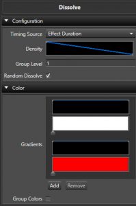
Configuration
- Timing Source Controls if the effect is driven by the effect’s time duration, or by Marks in a Mark Collection.
- Effect Duration This is the default. The dissolve/fill progresses continuously across the whole length of the effect, following the Density curve.
- Mark Collection Ties the dissolve/fill to Marks in a Mark Collection instead of the raw time duration. Selecting this reveals the Mark Collection picker and Mark Type option below.
- Mark Collection Chooses which Mark Collection to align the dissolve/fill to.
- Mark Type Controls how each Mark is used to drive the effect.
- Per Mark The default. Each Mark-to-Mark interval behaves like its own small Effect Duration dissolve, following the Density curve within that interval.
- Per Mark Fill Ignores Density. An even fraction of the elements is added at every Mark instead, so the prop fills up steadily, one Mark at a time.
- Per Mark Dissolve The reverse of Per Mark Fill — an even fraction of the elements is removed at every Mark, so the prop empties out steadily, one Mark at a time.
- Mark Label Value - % Reads each Mark’s label text as a percentage (0-100) and sets the coverage of elements to match that percentage at that Mark, letting you drive the amount dissolved/filled directly from your Mark labels.
- Mark Label Value - Elements The same idea as above, but the Mark’s label text is read as an absolute count of elements/pixels to cover at that Mark, rather than a percentage.
- Density A Curve that governs how dense the coverage of the elements is over time, and how the dissolve itself acts. See the Inline Curve Editor. Only available when Timing Source is Effect Duration, or when it’s Mark Collection with Mark Type set to Per Mark — the other Mark Type options control coverage directly and don’t use this curve.
- Group Level Controls how many elements in the group have the same Dissolve applied to them. Range is 1-50000. Defaults to 1, meaning each element gets its own unique Dissolve. This (and the whole Depth section below) is hidden automatically when using Mark Collection timing with Mark Type set to Per Mark Fill or Per Mark Dissolve while Color Per Step is enabled — in that combination grouping is calculated automatically from the Marks instead.
- Random Dissolve Controls if the Dissolve pattern is random (checked) as to the order elements dissolve, or if the user can take more control. Enabled by default.
- Starting Element Only shown when Random Dissolve is off. Starting location where the Dissolve or Fill will commence from. Range is 1-50000.
- Dissolve Flip Only shown when Random Dissolve is off. Flips the direction of the sequential Dissolve.
- Both Directions Only shown when Random Dissolve is off. Dissolves or Fills in both directions, one after the other.
- Directions Together Only shown when Both Directions is also enabled. Dissolves or fills in both directions at the same time instead of one after the other.
Color
- Gradients Sets the Color Gradient and intensity Curve for the effect. You can have more than one Gradient and each Gradient will have its own intensity Curve. See the Inline Gradient Editor and Inline Curve Editor.
- Color Per Step When enabled, color will change for each step variation. When disabled, each step variation will have all colors.
- Random Color Order When enabled the colors will be chosen at random instead of in order.
- Group Colors When enabled, each element will have all colors generated in parallel, rather than a single color from the list.
Depth
- Effect Depth Disabled by default. Enables grouping the target’s elements by hierarchy depth instead of always treating every individual leaf element on its own. Enabling this reveals the Levels Deep option below.
- Levels Deep Only shown when Effect Depth is enabled. Controls at what level of the target’s hierarchy the Dissolve is applied — so instead of clustering consecutive leaf elements together with Group Level, you can group along an existing prop hierarchy, letting each sub-group (e.g. each Arch in a group of Arches) dissolve or fill as one unit.
5 - LipSync
Overview
The Lip-sync effect helps to facilitate sequencing singing faces. It is a multi purpose effect that has evolved over the years into a powerful tool for syncronizing lyrics to your face mapped props.
The phoneme codes used throughout this effect (and in your Mark labels) are the standard Preston Blair/Papagayo set: AI, E, O, U, FV, L, MBP, WQ, ETC, and REST (mouth closed/idle).
When Mapping Type is set to Face Mapping (the default and most common setup), this effect relies on the target elements having a Face property configured, mapping individual elements or lights to mouth phonemes, eyes, and an outline.
Configuration
- Phoneme/Marks This setting determines how the LipSync effect gets its phoneme information.
- Mark Collections Since Version 3.5. This is the default and the most common way to use the effect. It sets the effect to get its phoneme information from the Marks in a Mark Collection.
- Mark Collection This sets the Mark Collection that contains the Marks with the Phonemes in it.
- Since Build 1465, the dropdown is filtered to only show Mark Collections that are tagged as Phoneme collections, so Phrase, Word, and other unrelated collections no longer clutter the list. If the effect already has a non-Phoneme collection selected (for example from an older sequence), that collection remains selected and is shown in the list like before so you can still see and continue using it. Once you pick a real Phoneme collection, that legacy entry drops out of the list.
- Allow Mark Gaps When enabled, the effect does not fill gaps between the Marks with a REST.
- Mark Collection This sets the Mark Collection that contains the Marks with the Phonemes in it.
- Phoneme This allows the effect to be used in manual mode where you configure a single phoneme for the whole effect, rather than pulling one from Marks.
- Phoneme Selects the single phoneme mouth shape to hold for the entire length of the effect.
- Lyric A free-text label for the lyric this phoneme is associated with. It’s purely informational — it’s shown on the effect block for your own reference and doesn’t affect rendering.
- Mark Collections Since Version 3.5. This is the default and the most common way to use the effect. It sets the effect to get its phoneme information from the Marks in a Mark Collection.
- Mapping Type This allows you to choose the mapping type. This controls how phonemes are mapped to the individual elements in your Prop.
- Face Mapping This option is used when you have a Prop that is usually a defined shape and you have mapped specific elements to the mouth phonemes via the Face property. Selecting this reveals the Eye Mode and Show Outline options below.
- Image Mapping This option is used for matrix type props that use an image for a mouth shape rather than mapping individual lights or elements — it treats the target like a pixel matrix and draws a phoneme image onto it, similar to the Picture effect. It doesn’t require a Face property. Selecting this reveals the Image Mapping options below instead of Eye Mode and Show Outline.
- Eye Mode Only available when Mapping Type is Face Mapping. This sets how the eyes should be handled when the effect is active.
- Open This sets the eyes to open using the open eyes mapping.
- Closed This sets the eyes to be closed using the eyes closed mapping.
- Off This sets the effect to ignore turning on the eyes.
- Show Outline Only available when Mapping Type is Face Mapping. This sets the effect to turn on the outline using the outline mapping.
Image Mapping
These settings only appear when Mapping Type above is set to Image Mapping.
- Image Map Chooses which phoneme-to-image library to use for mapping phonemes to mouth images. See LipSync Image Maps for how to create and edit these.
- Orientation Defines the direction of the strings and controls how the effect is oriented on the element — Horizontal or Vertical.
- Scale To Grid When enabled (the default), automatically scales the phoneme images to match the element’s pixel grid size.
- Scale Only shown when Scale To Grid is off. Controls the percentage to scale images down by, to fit large images onto the grid. Range is 1-100%.
- X Offset and Y Offset Two Curves that let you shift the phoneme image’s horizontal and vertical position over the course of the effect, instead of leaving it centered the whole time. See the Inline Curve Editor.
Brightness
- Intensity Only available when Mapping Type is Image Mapping. Controls the overall brightness the phoneme images are rendered at. Range is 1-100%.
Lip-Sync Enhancements
Since Vixen 3.5
Lyric Tracks
A good way to get lyric tracks that are very close to begin with is to use a track generator. One that works pretty well is the Autolyrics site. One of our users made a video that gives an overview of the process. When selecting the mark track to use in the effect, be sure to use the Phoneme one. If you need to make adjustments, you can adjust the phoneme marks to better align with the lipmovements you want. If the track is slightly off, you can select and move the blocks of phrases, words, phonemes to meet your needs. In most cases this gets you very close.
6 - Pulse
Overview
The Pulse effect is one step above a Set Level. In fact this effect can do everything the Set Level can plus more. The main differences here are the ability to use a color gradient over a single color and the ability to shape the brightness as a curve value to vary over the length of the effect. See the sections on Curves and Color Gradients for more details on how they work.
With the ability to control the brightness over the duration of the effect, the Pulse enables things like a fade on or fade off by adjusting the curve from a ramp up or ramp down. But the curve can take any shape and thus you can form your pulse to do about anything.
The pulse is also highly useful as a modifying effect when using layers. It can be used to fade other effects on or off, or control their brightness. See the sections on Layers for more details.
Color
- Gradients Sets the Color Gradient for the effect. See the Inline Gradient Editor.
Brightness
- Intensity Sets the intensity Curve for the effect. See the Inline Curve Editor.
7 - Set Level
Overview
The Set Level is the most basic of all effects. It allows you to turn on an element at a level for the specific duration. The level slider determines the brightness of the effect. It supports a single RGB color.
Color
- Color This allows you to set the color of the element. Double click the color box to bring up a color picker, or drag and drop colors from the library onto it.
Brightness
- Intensity This slider allows you to choose the intensity of the color. It is a 0 - 100 percent slider.
8 - Spin
The Spin is similar to the Chase effect. It can be thought of as repeating chases back to back which creates a spinning effect.
Behavior
Since Version 3.6u1
The Behavior control only appears when there’s a meaningful choice to make — either you’ve targeted more than one element/group, or the target has more than two levels of grouping beneath it (the same condition that reveals the Levels Deep option in the Depth section below).
-
Across Elements/Groups is the default behavior and is equivalent to how the effect acted prior.
-
Each Element/Group This is a new behavior that changes how the effect looks at the elements and targets them. Previously you could use the levels and spin across a group of Arches or similar props, but if you wanted to apply the same Spin to each Arch in the group, you would need to put a Spin on each Arch specifically. Now you can choose the Each Element/Group behavior and the proper level to get an identical Spin on each arch. This also allows the possibility to Spin up/down a Pixel tree instead of just around it. Many combinations are possible using variations of the Behavior and Level options.
Color
-
Color Handling This controls how the colors are applied on the effect. The simplest is a single color which will create a simple Spin with only that color on it. The other three options allow for a Color Gradient to be applied in different ways on the effect. See Inline Gradient Editor
- Single Color This sets the color to be a simple color.
- Gradient Thru Effect This will transition the colors on the Spin over time to match the colors in the gradient. This allows you to have a Spin that goes from say red to blue over the duration.
- Gradient Per Pulse Each individual pulse within the Spin will have the gradient applied to it. Each pulse will have the same color. So the pulse can go from red to blue.
- Gradient Across Items The gradient will be applied proportionately over group of items that the Spin covers with each item receiving the color within the gradient that corresponds to its percentage of the entire group.
-
Color Gradient / Color Depending on the Color Handling setting this will allow the simple color, or the Color Gradient to be set. See Inline Gradient Editor.
Brightness
-
Pulse Intensity This setting controls the shape of the pulse Curve. Much like the same setting in the pulse effect, you can control is each pulse ramps up or down or any shape you can design with the Curve. See Inline Curve Editor.
The default setting represents a ramping on motion where each portion of the chase ramps up to full brightness
The shows a pulse ramping up and then down just by altering the shape of the Curve into a ^ shape.
-
Minimum Brightness This allows you to set a minimum level of the color across areas that are not spinning. So you could have a green spin over a dim green background. The background will have the same color attributes chosen above.
- Minimum Level Enabled when you choose minimum brightness and allows you to set the 0 - 100 percent intensity via a slider.
Direction
- Direction The direction the spin rotates can be chosen from this drop down. The possible values are Forward and Reverse.
Speed
- Speed Format This controls the way the speed of the spin is controlled.
- Revolution Count This sets the speed to be a number of revolutions over the span of the effect.
- Count The number of revolutions.
- Revolution Frequency This controls the speed as a factor of frequency over the span of the effect.
- Revolution The frequency of the revolutions.
- Fixed Time This controls the speed of the spin as a function of time.
- Revolution Time Time in milliseconds for a revolution to take.
Pulse
- Pulse Type This controls the type of the pulse behavior.
- Distribute Evenly This distributes the pulses evenly over the timespan of the revolution. This is the default.
- Fixed Time This sets the duration of each pulse in milliseconds. Selecting this reveals the Duration and Pulse Overlap options below.
- Duration Duration of the pulse in milliseconds. This is only used while Pulse Overlap is 0.
- Pulse Overlap Controls how many milliseconds the individual pulses overlap. As soon as this is set to a non-zero value, it takes over from Duration — the pulse length is instead calculated automatically (spread evenly across the target elements) and then lengthened by this many milliseconds, so the pulses overlap in time. Negative values do the opposite, shortening each pulse and leaving a gap between them instead.
- Percent Revolution This sets the duration of the pulse to be a percent of the revolution time.
- Pulse Length A 0 - 100 percent value determining the percent of the revolution.
Depth
- Levels Deep Controls at what level the Spin is applied inside a group of elements. So you can have 8 items and then have 4 of them grouped to the left and 4 grouped to the right. All of these are grouped under on group. By placing the Spin at the top level group, you can Spin all 8 of the items or the left and the right group as a pair.
9 - State
Overview
Since Build 1449.
The State effect renders the named States defined by a State property on a prop. It is similar in purpose to the LipSync effect, but it isn’t limited to faces or phonemes. Any prop with a State property can use it — a waving Santa can define Arm Up and Arm Down States, a decorated Santa can define a Full Outfit State made up of a red coat, white cuffs, and a gold belt buckle State Item, and a face can define Eyes Open and Eyes Closed.
Before adding a State effect, the target element (or one of its children) needs a State property configured. See State Property for how to create State definitions and State Items.
The effect looks for a State property anywhere on the target element or its descendants, so it can be placed on a group without needing every leaf element to carry its own State property.
Configuration
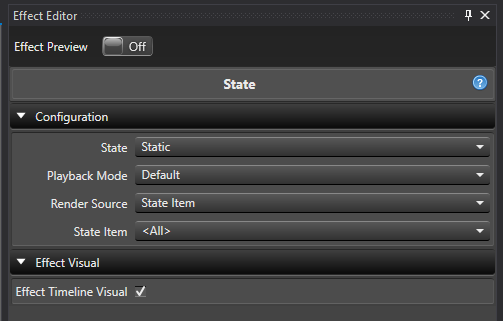
-
State Selects which discovered State definition to render. This lists every State definition found on the target element and its descendants, in element-tree order. If more than one discovered definition shares a name, each is disambiguated by adding its owning element’s name in parentheses, for example
Eyes Open (Santa - Model); if that’s still not unique, a short id is appended as well. A newly added State effect auto-selects the first discovered State definition. If the target has no State property at all, this shows<No States Available>and the effect renders nothing. If a previously selected State definition is later deleted, this shows the missing selection and the effect renders nothing until you pick a valid one. -
Playback Mode Controls how multiple active State Items are scheduled.
- Default All active State Items render together for the full effect duration.
- Cycle Active State Items render one after another, splitting the effect duration between them.
-
Cycles Only shown when Playback Mode is Cycle. Sets how many times the full sequence of active State Items repeats across the effect duration. Ranges from 1 to 20 and defaults to 1.
-
Cycle Offset Only shown when Playback Mode is Cycle. Shifts which slot in the cycle renders first, without changing slot durations, grouping, colors, marks, assignments, or how many times the sequence repeats. Ranges from 0 to 100 and defaults to 0. For example, a cycle of
Red,Green,Bluewith a Cycle Offset of 1 starts onGreenand continuesGreen,Blue,Red. The offset is taken modulo the current number of slots in the cycle, so a value equal to (or a multiple of) the slot count has no visible effect, and any value up to 100 wraps around sensibly regardless of how many slots the cycle currently has. The shift is applied once, before Cycles repeats the sequence — so an offset of 1 onRed,Green,Bluewith 2 Cycles rendersGreen,Blue,Red,Green,Blue,Red, not a rotation of the already-repeated six-item sequence. This behaves consistently across all three Render Source options; see the notes under each below. -
Render Source Selects how the effect decides which State Items are active.
- State Item Uses one selected State Item, or all of them.
- Mark Collection Uses Marks to activate State Items by name over time.
- Custom Uses an ordered list of State Item rows that you build directly on the effect.
Switching Render Source doesn’t clear the other sources’ settings — your State Item selection, Mark Collection, and Custom State Items rows are all remembered, so you can switch back and forth without losing anything (switching the top-level State selection is the exception; see below).
State Item
Shown only when Render Source is State Item.
- State Item Selects which State Item name to render, or
<All>to render every State Item in the definition. The list contains<All>followed by each unique State Item name in the order it first appears in the State definition — if multiple State Items share a name (a State Item Group), selecting that name activates all of them together. If the State definition has no State Items, this shows<No State Items Available>.- In Default mode,
<All>renders every State Item simultaneously for the full effect duration. - In Cycle mode,
<All>renders each unique State Item name in turn, splitting the duration between them (and repeating Cycles times); selecting one specific name still renders every State Item with that name for the full duration in either Playback Mode.
- In Default mode,
If the selected State Item name is later renamed, the effect keeps following it and displays the new name. If it’s deleted, the effect keeps the missing selection and renders nothing until you choose <All> or another valid name.
When Playback Mode is Cycle and State Item is <All>, Cycle Offset shifts which unique State Item name starts the sequence — the remaining names still follow in their original order and wrap back to the beginning. A specific single-name selection isn’t a cycling sequence, so Cycle Offset has no effect on it.
Mark Collection
Shown only when Render Source is Mark Collection.
- Mark Collection Selects the Mark Collection whose mark labels drive which State Items are active over time. This uses the standard Mark Collection selector, the same one used by effects like LipSync and Alternating.
Each mark’s label can contain one or more comma-separated State Item names, for example Open, Closed. Matching is case-sensitive, and leading/trailing whitespace around each name is trimmed. Unknown or blank names are ignored (they don’t render anything, but in Cycle mode they still consume their share of time as blank slots). Gaps between marks render nothing — close the gaps in the Marks editor if you don’t want blank sections. Overlapping marks all render, and marks that only partially overlap the effect are clipped to the effect’s boundaries.
- In Default mode, all recognized names on a mark render together for that mark’s duration; duplicate names in the same mark only render once.
- In Cycle mode, each comma-separated segment gets an equal share of the mark’s duration, repeated Cycles times, and renders in the order listed — so
Open, Closed, Openproduces three intervals, not two.
If the Mark Collection is deleted, the selection clears and the effect renders nothing until you choose another one.
In Cycle mode, Cycle Offset shifts which comma-separated segment starts each mark’s cycle independently — every mark rotates its own segment list rather than being offset against other marks. Blank and unrecognized segments still count as slots, so they shift along with the rest and keep consuming their share of time; the offset never removes or reorders which segments are blank.
Custom State Items
Shown only when Render Source is Custom.
Builds an ordered list of State Item rows directly on the effect, instead of relying on <All> or a Mark Collection. This is useful when you want a specific sequence of a subset of State Items, or want to override a State Item’s color for just one row.
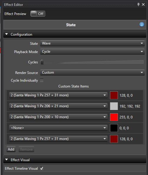
- Custom State Items An expandable list of rows. Each row has:
- State Item Picks one specific State Item from the selected State definition. In Cycle mode,
<None>is also offered as the first choice — a blank row that consumes a timing slot but renders nothing.<None>is not available in Default mode, since Default renders every row at once and a blank row would have no effect. If the same State Item name appears more than once in the definition, the row picker disambiguates the duplicates using their assigned element names, or a row number, or a short id if needed. - Color The color used when this row renders, defaulting to the State Item’s configured color when the row is added or its State Item is changed. Change it to override the color for just that row, without affecting the State Item’s own configured color. The color editor respects the color capabilities of that State Item’s assigned elements (full color or discrete color).
- State Item Picks one specific State Item from the selected State definition. In Cycle mode,
Rules that apply to the row list:
- In Default mode, each State Item can only be used by one row, and every row renders together for the full effect duration — equivalent to
<All>in State Item mode, but limited to the rows you’ve added. - In Cycle mode, the same State Item can be added to multiple rows, and every row (including
<None>and any row whose State Item was since deleted) consumes an equal share of the duration, repeated Cycles times. - Switching Playback Mode from Cycle to Default automatically removes
<None>rows and any duplicate rows for the same State Item, keeping the first occurrence of each. - Switching Render Source to Custom adds one starter row automatically if the list is empty and the State definition has at least one State Item. At least one row is required while Custom is active.
- Changing the top-level State selection clears the Custom State Items list and, if Custom is still selected, reseeds it with one row for the newly selected definition’s first State Item.
In Cycle mode, Cycle Offset shifts which row (or, with Cycle Individually unchecked, which group of consecutive same-item rows) starts the sequence. Rows and groups keep their existing order, color overrides, and <None>/missing-selection blank slots — the offset only changes the starting point, and grouped rows continue to move and render together after the shift.
Cycle Individually
Shown only when Render Source is Custom and Playback Mode is Cycle.
By default (Cycle Individually checked), every row in Custom State Items gets its own timing slot, even if consecutive rows share the same State Item name.
Unchecking Cycle Individually groups consecutive rows that resolve to the same State Item name into a single timing slot — each row in the group still renders with its own row color, but the group only consumes one slot’s worth of time. Rows aren’t grouped just because they share a name; they must be next to each other in the list. For example, with rows Item 2, Item 2, Item 2, <None>, Item 4, Item 4, Item 4:
- Cycle Individually checked: 7 timing slots, one per row.
- Cycle Individually unchecked: 3 timing slots — the three
Item 2rows together, the<None>row, and the threeItem 4rows together.
Non-consecutive rows with the same name are never merged, even with grouping off.
Effect Timeline Visual
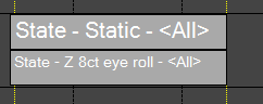
- Effect Timeline Visual Enabled by default. When on, the Sequencer timeline shows a dark gray bar labeled with the effect name, the selected State definition, and the active render source (for example
State - Eyes Open - Marks, orState - Eyes Open - Custom Groupwhen Custom is grouped by unchecking Cycle Individually) instead of a rendered color preview. Turn this off if you’d rather see the effect’s rendered colors in the timeline.
Rendering
- An active State Item renders its color (or the row color override, in Custom mode) on every element it’s assigned to. If an assignment is a group, the group’s current leaf elements are used, so adding or removing elements from that group changes the render on the next pass without editing the effect.
- Multiple active State Items (or Custom rows) that overlap the same elements all render; the rendering pipeline mixes the results.
- On a discrete-color element, if the configured color isn’t one of that element’s supported colors, the effect falls back to the element’s first supported color. If the element has no supported colors at all, it’s skipped.
- The effect only affects the elements assigned to the selected State definition’s State Items — other descendants of the effect’s target are left alone.
- There’s no intensity curve on this effect. Use an intensity layer above it if you want to fade the State colors.
10 - Twinkle
Overview
The Twinkle effect was designed to simulate the effect of twinkling lights on a Prop.
Color
- Color Handling This controls how the colors are applied on the effect. The simplest is a single color which will create a simple Twinkle with only that color on it. The other three options allow for a Color Gradient to be applied in different ways on the effect. See Inline Gradient Editor.
- Single Color This sets the color to be a simple color.
- Gradient Thru Effect This will transition the colors on the Twinkle over time to match the colors in the gradient. This allows you to have a Twinkle that goes from say red to blue over the duration.
- Gradient Per Pulse Each individual pulse within the Twinkle will have the gradient applied to it. Each pulse will have the same color. So the pulse can go from red to blue.
- Gradient Across Items The gradient will be applied proportionately over group of items that the Twinkle covers with each item receiving the color within the gradient that corresponds to its percentage of the entire group.
- Color Gradient / Color Depending on the Color Handling setting this will allow the simple color, or the Color Gradient to be set. See Inline Gradient Editor.
Brightness
- Max Controls the peak brightness a twinkle pulse can reach.
- Min Controls the baseline brightness maintained across the whole effect. Each twinkle pulse ramps up from this level and back down to it, rather than starting from fully off.
- Variation Controls how much the peak brightness of each individual twinkle randomly varies below Max, as a percentage of the Min-Max range. Higher values mean some twinkles will noticeably dimmer than others instead of all peaking at the same brightness.
Configuration
- Avg Pulse Time Controls how long the average pulse time of each twinkle is in milliseconds. The default is 400 ms.
- Coverage Controls how densely packed the twinkles are in time — essentially how much of the time an element spends twinkling versus sitting idle at the minimum brightness between twinkles. Higher values produce more frequent, overlapping twinkles; lower values produce sparser, more occasional ones. This is a percentage, and the default is 50%.
- Variation Controls the percent variation in the time (duration) of each twinkle, relative to Avg Pulse Time.
Depth
- Effect Depth Controls whether each targeted element twinkles independently, or whether elements are grouped together and twinkle in sync. Enabled by default.
- When enabled, this reveals the Levels Deep option below, and every element or group at that depth is given its own independently randomized twinkle pattern — this is the classic, organic-looking twinkle.
- When disabled, grouping is turned off entirely (the effect always targets individual leaf elements, regardless of Levels Deep), and every element is given the exact same randomly generated twinkle pattern, so they all twinkle in perfect sync rather than independently. This can be useful for a uniform pulsing look across a whole prop.
- Levels Deep Only shown when Effect Depth is enabled. Controls at what level the Twinkle is applied inside a group of elements. So you can have 8 items and then have 4 of them grouped to the left and 4 grouped to the right. All of these are grouped under one group. By placing the Twinkle at the top level group, you can Twinkle all 8 of the items or the left and the right group as a pair — with each group’s twinkle pattern still independently randomized from the other group’s. The default is 0, which targets individual leaf elements.
11 - Wipe
Overview
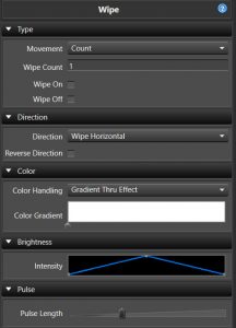
The Wipe was one of the first location aware effects in Vixen. The goal of this effect is somewhat similar to the Chase, however it is aware of the position of the elements as defined in the Preview. It uses this location awareness to simulate a chase across all of its elements in a Wiping fashion.
Behavior
Since Build 1448.
-
Across Elements/Groups is the default behavior and is equivalent to how the effect has always acted. The Wipe collects every element under the target and calculates a single bounding area, so the wipe crosses the whole combined target as one pass.
-
Each Element/Group applies an independent Wipe to each child element or group instead of combining them into a single pass. Each child gets its own local bounding area, so the Wipe restarts for every group. This is useful for applying the same Wipe to, say, each Arch in a group rather than wiping across all the Arches together.
The Behavior section, and the Depth section below, only appear when the target has enough levels in its hierarchy for this choice to matter, or when more than one element/group is targeted. If only a single target with a shallow hierarchy is selected, Wipe always behaves as Across Elements/Groups.
Type
- Movement This sets the source of timing for the wipe.
- Count This sets the number of wipe passes in the timespan of the effect.
- Wipe Count The number of wipes.
- Wipe On When enabled, the wipe will maintain the elements in the on state as the wipe moves across.
- Wipe Off When enabled, the wipe will start out on and wipe off across the prop.
- Pulse Length This controls the wipe by a measure of the pulse length.
- Duration Sets the length of each pulse in milliseconds.
- Movement This controls the wipe by the Movement curve instead of a fixed count or duration.
- Count This sets the number of wipe passes in the timespan of the effect.
The Wipe on/off options are similar to the Chase extend to start/end options. These are most useful for wiping the stage on or off. The pulses have the same rules as the Chase and need to have a > zero end value for wiping on and a > zero start value for wiping off. The default pulse curve has a zero start and end value, so to use this you would need to adjust to a ramp on for the wipe on case or ramp off for wipe off as an example. Wipe Count, Wipe On, and Wipe Off are only available when Movement is set to Count.
Direction
- Direction It can move in a number of directions: horizontal, vertical, diagonal up, diagonal down, burst, circle burst and diamond burst.
- Reverse Direction When enabled, the direction will be reversed. Only available when the Type Movement is set to Count or Pulse Length.
- Movement When the Type Movement is set to Movement, this Curve controls how the wipe progresses across the elements over time, allowing non-linear motion instead of a constant pace. See Inline Curve Editor.
Movement
- X Offset Shifts the center point of the effect along the X axis. Only available for the Burst, Circle Burst, and Diamond Burst directions, and may not work in all cases.
- Y Offset Shifts the center point of the effect along the Y axis. Only available for the Burst, Circle Burst, and Diamond Burst directions, and may not work in all cases.
Color
- Color Handling This controls how the Color Gradient is applied across the wipe. Unlike some other effects, Wipe has no single/static color mode — it always applies a gradient, just in one of the two ways below. See Inline Gradient Editor. Only available when the Type Movement is set to Count or Pulse Length — in Movement mode the gradient is always applied across the whole effect, and the Reverse setting below is used instead.
- Gradient Thru Effect This will transition the colors on the Wipe over time to match the colors in the gradient. This allows you to have a Wipe that goes from say red to blue over the duration.
- Gradient Across Items The gradient will be applied proportionately over the group of items that the Wipe covers, with each item receiving the color within the gradient that corresponds to its percentage of the entire group.
- Color Per Count When enabled with Gradient Across Items, spreads the color gradient across each individual pass (count) instead of across the full length of the effect.
- Color Gradient Sets the Color Gradient to be used. See Inline Gradient Editor.
- Reverse When the Type Movement is set to Movement, this reverses the color and Curve depending on the direction the movement curve is heading, instead of following the Reverse Direction setting.
Brightness
- Intensity This sets the Curve that controls the intensity of the color over the effect. See Inline Curve Editor.
Pulse
- Pulse Length The pulse length is also similar to the pulse overlap feature of the Chase and allows for the pulses to be adjusted to smooth out the Wipe or lengthen the amount of visible time any part of the lights are lit. Available when the Type Movement is set to Count or Movement.
Depth
Since Build 1448.
- Levels Deep Only available when Behavior is set to Each Element/Group and a single target is selected. Controls at what level of the target’s hierarchy each independent Wipe is applied. Depth choices that would simply resolve to individual leaf elements are excluded from the list since they aren’t useful for this effect. When more than one element/group is targeted, each selected target is treated as its own independent group and this setting doesn’t apply.