This is the multi-page printable view of this section. Click here to print.
Smart Shapes
- 1: Arch
- 2: Candy Cane
- 3: Icicles
- 4: Intelligent Fixture
- 5: Mega Tree
- 6: Net
- 7: Star
1 - Arch
Overview
An arch can be either Pixel based or Standard string based. A pixel arch has individually addressable pixels across the entire arch and a standard arch has a number of segments that span the arch.
Adding an Arch in Vixen 3.6+
Start in the Preview instead of in Display Setup as you may have done in the past.
You can add an Arch using the wizard buy clicking the Rainbow icon in the Smart Objects toolbar and then with the mouse, click a point in your preview to start the Arch and drag from upper left to lower right. This will create a basic ARch shape and launch the wizard. Next a dialog will appear to setup the basic attributes of the Arch.
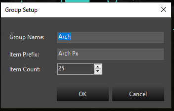
In this dialog, you will provide the group name for your Arch. It defaults to Arch, but if you are adding multiples, you will want to name them Arch-1, Arch-2, etc. The next entry is the name the segments will be called. This defaults to Arch Px. If you are adding multiple Arches, you would name this Arch-1 Px or Arch-2 Px. The Px is just a shortcut for pixel, you can use anything you like for the segments. Each segment will have a number appended to this name. Example Arch-1 Px-1, Arch-1 Px-2.
Last is the number of segments. If this is a Pixel Arch it would be the number of pixels. If it is a Standard* Arch wrapped with segments of light strings, it will be the number of light segments. It defaults to 25.
Once you select Ok, the next step will be whether to add a Dimming Curve or not. See the section on Dimming Curves
After the Dimming Curve, is a dialog to set up the color type of the prop. Depending on the type of lights you are using, the choice here will vary depending on the type of lights used in your Arch. See the section on Color Handling.
After setting the Color Handling, the Arch will be completed and the elements will show up in the tree. All the linking will be done and you are ready to use it. You can resize or move it around using the preview tools.
Linking a Standard Arch to existing Elements
An arch is configured differently than all the other items in the display preview. To define a standard arch, you will be setting the string type to Pixel. Doesn’t make much sense, but stick with me and I’ll explain.
You can assign the same element to multiple lights on a string. That’s what we’re going to do in the case of an arch with multiple segments. We’re going to assign the same element to groups of pixels so that a group of lights turn on when a single element is lit.
Steps:
- Do NOT click on the elements or groups you want to add.
- Click on the Arch smart object.
- Draw the arch on the screen.
- Change the string type to Pixel
- Change the Light Count to a multiple of the number of segments you have. So, if you have 9 segments, I’d suggest 36 (9 X 4) lights.
- Click on the … next to Linked Elements
- Assign your first arch element to the first item multiple (in our example, the first 4 pixels).
- Assign each successive multiple (in our example above, 4 pixels) to the same element.
- That’s it, your done.
Linking a Pixel Arch to existing Elements
This is much easier than adding a standard arch. Just click on your arch group in the element tree, click the arch icon in the toolbar and draw your arch. Your done. Your arch is drawn and is linked to your elements.
Linking Elements
Properties
Position
See Position in Common Settings
Light Count
For an Arch, this is commonly the number of segments in the arch. If your Arch has 25 pixel segments, it will be 25. If you have 9 segments of analog lights, the number will be 9. See Light Count in Common Settings
Light Size
See Light Size in Common Settings
Linked Elements
See Linking Elements
String Type
The string type of an arch will probably be Pixel for nearly everyone. Please see the Adding a Standard Arch above for more information on properly setting the string type.
2 - Candy Cane
Overview
A Candy Cane can be either Pixel based or Standard string based. A pixel Candy Cane has individually addressable pixels across the entire cane and a standard cane has a single strand of lights that span the cane.
Adding a Candy Cane in Vixen 3.6+
Start in the Preview instead of in Display Setup as you may have done in the past.
You can add a Candy Cane using the wizard buy clicking the Candy Cane icon in the Smart Objects toolbar and then with the mouse, click a point in your preview to start the Candy Cane and drag from upper left to lower right. This will create a basic Candy Cane shape and launch the wizard. Next a dialog will appear to setup the basic attributes of the Candy Cane.
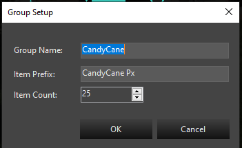
In this dialog, you will provide the group name for your Candy Cane. It defaults to CandyCane, but if you are adding multiples, you will want to name them CandyCane-1, CandyCane-2, etc. The next entry is the name the segments will be called. This defaults to CandyCane Px. If you are adding multiple Candy Canees, you would name this CandyCane-1 Px or CandyCane-2 Px. The Px is just a shortcut for pixel, you can use anything you like for the segments. Each segment will have a number appended to this name. Example CandyCane-1 Px-1, CandyCane-1 Px-2.
Last is the number of segments. If this is a Pixel Candy Cane it would be the number of pixels. If it is a Standard* Candy Cane wrapped with segments of light strings, it will be the number of light segments. It defaults to 25.
Once you select Ok, the next step will be whether to add a Dimming Curve or not. See the section on Dimming Curves
After the Dimming Curve, is a dialog to set up the color type of the prop. Depending on the type of lights you are using, the choice here will vary depending on the type of lights used in your Candy Cane. See the section on Color Handling.
After setting the Color Handling, the Candy Cane will be completed and the elements will show up in the tree. All the linking will be done and you are ready to use it. You can resize or move it around using the preview tools.
Linking Elements
Properties
Position
See Position in Common Settings
Light Count
For an Candy Cane, this is commonly the number of segments in the Candy Cane. If your Candy Cane has 25 pixel segments, it will be 25. If you have 9 segments of analog lights, the number will be 9. See Light Count in Common Settings
Light Size
See Light Size in Common Settings
Linked Elements
See Linking Elements
String Type
The string type of a Candy Cane will probably be Pixel for nearly everyone.
3 - Icicles
Overview
Icicles can be either Pixel based or Standard string based. Pixel Icicles have individually addressable pixels across the entire Icicles and standard Icicles typically have one color strand.
Adding Icicles in Vixen 3.6+
Create Icicles in the Preview instead of in Display Setup as you may have done in the past.
You can add Icicles using the wizard buy clicking the Snowflake icon in the Smart Objects toolbar and then with the mouse, click a point in your preview to Iciclest the Icicles and drag from upper left to lower right. This will create a basic Icicles shape and launch the wizard. Next a dialog will appear to setup the basic attributes of the Icicles.
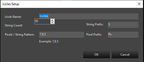
In this dialog, you will provide the name for your Icicles. It defaults to Icicles, but if you are adding multiples, you will want to name them Icicles-1, Icicles-2, etc. Fill in the string count and the pattern for the individual Icicle drops.
Once you select Ok, the next step will be whether to add a Dimming Curve or not. See the section on Dimming Curves
After the Dimming Curve, is a dialog to set up the color type of the prop. Depending on the type of lights you are using, the choice here will vary depending on the type of lights used in your Icicles. See the section on Color Handling.
After setting the Color Handling, the Icicles will be completed and the elements will show up in the tree. All the linking will be done and you are ready to use it. You can resize or move it around using the preview tools.
Settings
See Common Settings
Linking Elements
See Linking Elements
4 - Intelligent Fixture
Overview
Intelligent Fixtures are only supported in the OpenGL Preview due to performance and the need for 3D rendering capability.
There are two ways of adding an intelligent fixture to the preview. If the intelligent fixtures have already been created in the Display Setup then perform the following steps:
- Select the fixture in the Elements tree.
- Select the Intelligent Fixture button on the toolbar.
- Click on the preview and drag to add the intelligent fixture.
If the intelligent fixtures do not exist in the Display Setup perform the following steps:
-
Click on the preview and drag to add the intelligent fixture.
-
Follow the steps on the Intelligent Fixture Wizard to create the intelligent fixture(s).
Once the Intelligent Fixture graphics have been created the following Intelligent Fixture Properties may be adjusted. Select the fixture by clicking on it in the Preview area.
Beam Properties
-
Beam Length - Percentage of the background height. If a background image is not being used then the beam length is the percentage of the height of the preview window. Note percentages greater than 100 are allowed.
-
Beam Transparency - Transparency of the light beam. 0% is completely opaque. 100% is completely transparent. Note at 100% transparency the beam is not visible.
-
Beam Width Multiplier - Determines the beam width at the top of the beam. The multiplier is multiplied times the base width to determine the top width.
Color Wheel Properties
-
Color Wheel Rotation Speed Maximum (s) - The time in seconds it takes the color wheel to make a complete rotation when configured to the fastest setting.
-
Color Wheel Rotation Speed Minimum (s) - The time in seconds it takes the color wheel to make a complete rotation when configured to the slowest setting.
Pan Properties
-
Invert Pan Direction - Changes the start point of the pan by 180 degrees and inverts the direction of movement. This setting is often used with Top (upside down) mounting position.
-
Maximum Pan Travel Time (s) - The time in seconds it takes the fixture to travel from the start position to the stop position.
-
Pan Start Position (Degrees) - Defines the resting position of the fixture. This value helps ensure the Preview matches the movement of the actual hardware.
-
Pan Stop Position (Degrees) - The stop position defines the maximum range of movement. This value helps ensure the Preview matches the movement of the actual hardware.
Position Properties
The following cooordinate properties define a rectangle determing the preview drawing area for the Intelligent Fixture.
-
Bottom Left - Bottom left coordinate of the drawing area.
-
Bottom Right - Bottom right coordinate of the drawing area.
-
Top Left -Top left coordinate of the drawing area.
-
Top Right - Top right coordinate of the drawing area.
Settings
-
Linked Element - Determines the Intelligent Fixture element the graphic is linked to. Selecting the … button allows you to pick an Intelligent Fixture element.
-
Mounting Position - Selects the mounting position of the fixture. This property allows for simulating the fixture being mounted upside down.
-
Name - Name of the intelligent fixture.
-
Show Legend - When true enables a legend that will show a function label and the corresponding channel value. The legend can be used to debug problems and to provide feedback for functions that are not directly supported by the preview. The legend is only applicable to index and range functions that were populated with a Preview Legend character.
-
Zoom Narrow To Wide - Indicates whether the fixture zooms from a narrow beam to a wide beam or vice-versa.
Strobe Properties
-
Maximum Strobe Duration - Determines the maximum amount of time an intelligent fixture’s beam will be active in the preview when it’s shutter is in strobe mode. This time may be reduced depending on the strobe interval time such that the beam is ON (active) for 25% of the interval. This property should be configured to allow the preview to simulate the actual strobe duration of the physical hardware.
-
Strobe Rate Maximum (Hz) - Defines the maximum rate in Hz at which the intelligent fixture should strobe in the preview. This property should be configured to allow the preview to simulate the actual strobe rate of the physical hardware.
-
Strobe Rate Minimum (Hz) - Defines the minimum rate in Hz at which the intelligent fixture should strobe in the preview. This property should be configured to allow the preview to simulate the actual strobe rate of the physical hardware.
Tilt Properties
-
Invert Tilt Direction - Swaps the start position with the stop position and inverts the direction of movement. This setting is often used with Top (upside down) mounting position.
-
Maximum Tilt Travel Time (s) - The time in seconds it takes the fixture to travel from the start position to the stop position.
-
Tilt Start Position (Degrees) - Defines the resting position of the fixture. This value helps ensure the Preview matches the movement of the actual hardware.
-
Tilt Stop Position (Degrees) - Defines the maximum range of tilt movement. This value helps ensure the Preview matches the movement of the actual hardware.
Video Tutorial
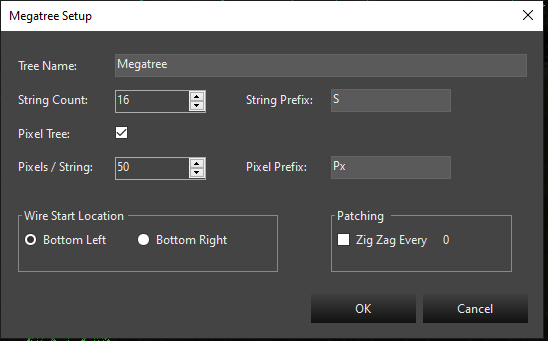
5 - Mega Tree
Overview
A Mega Tree can be either Pixel based or Standard string based. A pixel Mega Tree has individually addressable pixels across the entire cane and a standard cane has a single strand of lights that span the cane.
Adding a Mega Tree in Vixen 3.6+
Start in the Preview instead of in Display Setup as you may have done in the past.
You can add a Mega Tree using the wizard buy clicking the Mega Tree icon in the Smart Objects toolbar and then with the mouse, click a point in your preview to start the Mega Tree and drag from upper left to lower right. This will create a basic Mega Tree shape and launch the wizard. Next a dialog will appear to setup the basic attributes of the Mega Tree.
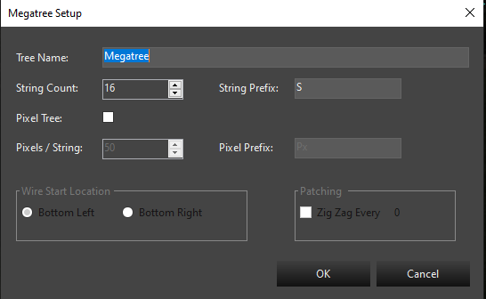
In this dialog, you will provide the name for your Mega Tree. It defaults to Megatree, but if you are adding multiples, you will want to name them Megatree-1, Megatree-2, etc. The next entry is the string count and the prefix name for each string. This defaults to 16 and a prefix of S. Adjust the string count to the number of strings you have.
The next choice is to determine if you have a pixel tree or an analog tree of traditional light strings. If yours is a Pixel tree, then check the Pixel Tree box. You will then choose the number of pixels on each string and the pixel name prefix. The default is 50 nodes. Adjust the count to match your setup. If you have a Standard light tree, then skip over the pixel count.
The next section concerns the startign location for the wiring on your tree. Typical is the bottom left. If yo uare using zig zag strings, then set the option for Zig Zag and enter the number of pixels in each Zig Zag. This is only if you are not setting up the Zig Zag in hardware. This will affect the patching to compensate for hardware that cannot do Zig Zag or if you choose to do it in software istead. It will setup a patching order, so you can just patch it straight through on the Display Setup screen. This does not generally apply to Standard light trees.
Setup for a Pixel Tree
Once you select Ok, the next step will be whether to add a Dimming Curve or not. See the section on Dimming Curves
After the Dimming Curve, is a dialog to set up the color type of the prop. Depending on the type of lights you are using, the choice here will vary depending on the type of lights used in your Mega Tree. See the section on Color Handling.
After setting the Color Handling, the Mega Tree will be completed and the elements will show up in the tree. All the linking will be done and you are ready to use it. You can resize or move it around using the preview tools.
Adding a Mega Tree Manually
There are two different ways to add a mega-tree to the preview display. You can either auto-assign elements to the mega tree when it is drawn, or you can draw the object and define the linked elements later. Both methods have their benefits.
If you have already taken the time to define your element groupings, then you can save a lot of time vs linking the tree manually to elements.
Sometimes, it is nice to just start drawing& on the screen to test your ideas and plan the props you may want to add to your display. In this case, you might just want to play around with placement of objects that you may or may not have created in your element tree. Vixen allows you do place items on the preview without pre-linking them to elements.
Method 1: Auto-Linking Elements
- Click on the main element group for your mega-tree.
- Click on the Mega Tree icon on the toolbar.
- Left-click and hold the mouse button at the top left corner where you want to position the mega tree and, while holding the mouse button, drag to the bottom right to size the tree.
Notes on Auto Linking
- A mega tree without pixels must have 4 or more strings. Each of the child strings in your mega tree must not be a group.
- A pixel mega tree must have a main group with more than 4 sub-groups. Each string in the mega tree (sub-groups) must define more than 4 pixels each and all strings must have the same number of pixels.
Method 2: Manually Linked Elements
- Click on the main element group for your mega-tree.
- Click on the Mega Tree icon on the toolbar.
- Left-click and hold the mouse button at the top left corner where you want to position the mega tree and, while holding the mouse button, drag to the bottom right to size the tree.
Settings
After the tree is drawn, there are many options that can be set to adjust the look of the tree on the preview.
Element Links
Click on the Setup button to link elements to the strings in the Mega Tree. Elements are linked to the mega tree in the Element Links Screen.
String Type
See the common settings section for more information.
Light Size
See the common settings section for more information.
String Count
The string count is the total number of visible strings you have in your mega tree. If you’ve got a 180 degree mega tree and you want 10 strings, set the string count to 10.
Lights per String
Enter the number of lights in each string. This is the same for all strings in the tree.
Top Height
A mega tree is made up of a top ellipse and a bottom ellipse connected by light strings. This is the height of the top ellipse.
Top Width
A mega tree is made up of a top ellipse and a bottom ellipse connected by light strings. This is the width of the top ellipse. It can be as small as 1 or as large as you want. It can even be larger than the base if that’s the way you want it.
Base Height
A mega tree is made up of a top ellipse and a bottom ellipse connected by light strings. This is the height of the bottom ellipse. The width of the ellipse is defined by re-sizing the tree on the preview screen.
6 - Net
Overview
The net can be used to quickly cover an area with lights similar to the Net lights. Areas such as a tree-trunk or a bush can be covered without having to draw every strand of lights. It also makes a fairly accurate representation of icicle light strings.
Settings
Position
See Position in Common Settings
Light Size
See Light Size in Common Settings
Light Spacing
The light spacing is the number of pixels between each light in the net. You can just play with this number to get the look you like.
Linked Elements
See Linked Elements
7 - Star
Overview
A Star can be either Pixel based or Standard string based. A pixel Star has individually addressable pixels across the entire Star and a standard Star has a number of segments that span the Star.
Adding an Star in Vixen 3.6+
Start in the Preview instead of in Display Setup as you may have done in the past.
You can add an Star using the wizard buy clicking the Star icon in the Smart Objects toolbar and then with the mouse, click a point in your preview to start the Star and drag from upper left to lower right. This will create a basic Star shape and launch the wizard. Next a dialog will appear to setup the basic attributes of the Star.
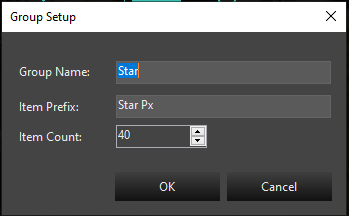
In this dialog, you will provide the group name for your Star. It defaults to Star, but if you are adding multiples, you will want to name them Star-1, Star-2, etc. The next entry is the name the segments will be called. This defaults to Star Px. If you are adding multiple Stars, you would name this Star-1 Px or Star-2 Px. The Px is just a shortcut for pixel, you can use anything you like for the segments. Each segment will have a number appended to this name. Example Star-1 Px-1, Star-1 Px-2.
Last is the number of segments. If this is a Pixel Star it would be the number of pixels. If it is a Standard* Star wrapped with segments of light strings, it will be the number of light segments. It defaults to 25.
Once you select Ok, the next step will be whether to add a Dimming Curve or not. See the section on Dimming Curves
After the Dimming Curve, is a dialog to set up the color type of the prop. Depending on the type of lights you are using, the choice here will vary depending on the type of lights used in your Star. See the section on Color Handling.
After setting the Color Handling, the Star will be completed and the elements will show up in the tree. All the linking will be done and you are ready to use it. You can resize or move it around using the preview tools.
Settings
See Common Settings
Position
A star is defined by two points. If you imagine a rectangle around the star, you have the ability to adjust the top left and bottom right corner of the rectangle to size the star to whatever you need.
Both have an X and Y position. X is horizontal and Y is vertical. You can precisely position the star using the Bottom Right and Top Left configuration options.
Inside Size
A star is defined by two ellipses. The outer ellipse is sizing the star on the screen. The inside size is a percentage of the outer size of the star. For example, if the star is 200 pixels tall and 100 pixels wide and the inside size is set to 40, the inside size will be 80 pixels tall and 40 pixels wide.
This may sound confusing. Just mess around with the setting to get what you want.
Light Count
The number of lights around the perimeter of the star. This will be automatically adjusted DOWN so that each point will have the same number of lights.
Light Size
From one pixel up, the size of the lights in the star.
Linked Elements
See the Linking Elements section for more information.
Star Points
The number of points in the star. It must be three or more… or else it isn’t a star.
String Type
See the String Type section for more information.
Notes
- Holding Ctrl when re-sizing using the bottom right corner will force the star to a fit a perfect square.
- Star pixels start at the right tip of the right-most point (the one pointing to the right) and move clockwise.
- You can nudge any object on the preview screen by selecting it and using the arrow keys. This will move it one pixel at at time.