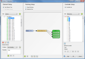
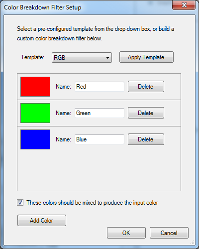
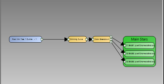
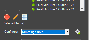
When setting up a light display with Vixen, there are certain configuration steps that must be taken to tell the software what elements and output controllers you will be using. Vixen separates the elements you have in your physical display from the outputs and controllers you use to run your display. You can work all year designing and sequencing a display and setup your outputs as you setup your physical display.
Elements
You can think of an element as an individually controlled item in your display. Examples of a single element is an incandescent or LED string of lights, multiple strings of lights you want to ALWAYS control as a single unit, a single node in an RGB pixel, or even a servo driven prop.
You’ll notice that we call a single pixel an element. In Vixen, all three colors are GROUPED into a single element based on filters (next section) so you can think of this RGB node as a single item. When you sequence this pixel later, you tell it you want it to be blue and it just is.
Standard light strings (single color incandescent or LED strings, multi-color strings, etc.) are what Vixen calls “single color”. There are two ways to configure the color handling of these strings.
Single Color: This is generically what Vixen calls a “standard” string of lights. A single string with all red lights or a single string with multi-colored lights are a both defined as a “single color” item.
Multiple Colors: This selection is used when you have multiple light strings on a single prop in your display that are controlled separately. For example, a popular way to light mini-trees is to wrap them with red, green, blue and white strands of standard light strings but control each of the strings separately. This allows you to set the trees to any one of these colors (or some or all of the colors) at any time in your sequencing. In vixen, you define ONE ELEMENT and tell the software, by selecting this option, that this element is a set of multiple strings of lights. When sequencing, you select an effect and color (red fade for example) and just the red trees light automatically.
RGB strings are defined by choosing this filter. If you have a string of 50 RGB nodes, for example, you would select the string in the element tree and define the color handing as “Full RGB”. This tells each of the 50 nodes that there are 3 colors in EACH of the nodes (150 outputs total).
Controllers
Controllers define single outputs to your physical display. So, for example, if you have an element that is a single color string of lights, this string would be linked to an individual controller. As another example, if you had defined a string with 50 RGB pixel nodes and defined their color handling as RGB, you would link each of these elements to 3 output channels. Your 50 pixel RGB string would be linked to 150 output channels.
Information about setting up DMX intelligent fixture display elements.
Required Materials
Vixen’s support for intelligent fixtures (DMX moving heads) is based on giving Vixen detailed knowledge about your hardware.
To perform this data entry you are going to need the User manual for your fixture that lists the functions your fixture supports and what channel(s) are associated with those functions.
Time Commitment
Expect to spend ~20 minutes defining your fixture profile.
Background
The Intelligent Fixture Wizard has two purposes:
It creates fixture profiles. The fixture profile contains what functions the fixture supports and what channels are used for those functions.
It creates Intelligent Fixture display elements and adds them to the display.
How to Start
The Intelligent Fixture Wizard can be activated from the Display Setup. Select Intelligent Fixture from the Elements drop down and then select the Plus button.
Video Tutorials
1.1.1 - Select Profile
Information about selecting or creating a DMX intelligent fixture profile.
Select Profile Options
Select Existing Profile - If you have already created a Profile for your fixture you could select it here. The drop down shows all fixtures installed into the active Vixen profile. The fixture profiles are stored within the Vixen profile.
Note in the future users may be able to download fixture profiles from the Vixen website that other users have submitted.
Create New Profile - The default is to create a new fixture profile. The fixture profiles are stored within your overall Vixen profile.
Profile Properties
Profile Name - Name of the intelligent fixture profile. For new fixture enter a unique name. This name is used as the fixture profile filename.
Manufacturer - Optional name of the manufacturer of the fixture hardware.
Created By - This read-only field is determined by the Windows login name.
Revision - Field for keeping track of updates to the profile definition. Refer to Persistence Note below for implications of updating a profile.
If the profile is being updated consider incrementing the Revision number.
Persistence Note
If the Profile Name is changed it is effectively a ‘Save As’ like operation as the existing profile is not modified.
If anything is changed in a profile, only newly created fixtures will receive the changes.
Existing fixtures are NOT impacted by the changes and if desired will need to be updated via their Intelligent Fixture property.
Select the Next button to continue to configure your intelligent fixture.
Video Tutorials
1.1.2 - Edit Functions
Information about editing intelligent fixture functions.
Background
This wizard page (Edit Functions) and the Edit Channels wizard page define the majority of the fixture.
Vixen comes with a number of built in functions to make this data entry task easier.
This page defines the functions that will be assigned to channels on the next wizard page (Edit Channels).
The name of each function needs to be unique.
Note the names of the predefined functions can be changed to better match your fixture’s user manual.
What is a Tag?
The Vixen Intelligent Fixture support was designed to allow users to input their fixture channel map information in verbatim.
There are areas of the Vixen Intelligent Fixture support where Vixen needs to know what certain fixture function do.
These areas include the Preview, Effects and automating the handling of certain functions like shutter.
The Fixture Profile uses a tag to give the software the necessary knowledge about the functions.
There is tagging at the function level but there is also tagging for index values.
Many of the built in functions are already assigned a tag.
What Do I Do On This Wizard Page?
Look over your fixture user manual and make sure all your fixture functions are defined on this page.
Note it is possible to navigate back and forth between the Edit Functions and Edit Channels wizard pages if you find you need to add an additional function.
Select the Plus button to add additional fixture functions.
Some of the functions require additional details which appear in the details pane to the right.
Create New Function
Select the Plus button to add a new function.
Give the function a unique name.
Assign the function a type (Range, Indexed, Color Wheel, RGB Color, RGBW Color, None).
(Optionally) assign a Preview Legend.
The preview legend is displayed below the fixture with corresponding DMX value assigned to the channel.
This feature can be useful for debugging problems.
Optionally assign a Tag to the function.
See ‘What is a Tag’ section above for more information.
Assigning Function Details
There are nine built in functions.
The following sections describe each built in function and what configuration is still required.
The functions in the fixture profile are NOT ordered. If your fixture does not support one of these
built in functions there is no harm in leaving them in the profile. If there is any doubt if a function might
be applicable to your fixture leave it in the list to save data entry. These built-in functions are properly tagged
to maximize support with the Vixen Intelligent Fixture sequencing effects.
Pan Function - Input the range of motion the fixture supports when panning.
This value helps ensure the Preview matches the movement of the actual hardware.
The Start position defines the resting position of the fixture.
The stop position defines the maximum range of movement.
Tilt Function - Input the range of motion the fixture supports when tilting.
This value helps ensure the Preview matches the movement of the actual hardware.
The Start position defines the resting position of the fixture.
The stop position defines the maximum range of movement.
Color Wheel - Defines the colors that the fixture supports.
This function may not be applicable to color mixing fixtures.
Select the Plus button to add a new color wheel entry.
Enter a unique name for the color wheel entry.
Enter the DMX start value for the color.
Enter the DMX stop value for the color.
(Optionally) select if the entry should be controlled via a curve.
Example: select Use Curve when the manual shows a range of DMX values that spin the color wheel.
(Optionally) select the Half Stop option if the entry is half way between two colors on the color wheel.
Note the colors will automatically be populated for this entry.
Select the … button to assign the color.
Select the Exclude Color Property option to exclude the color entry from the color property associated with the element.
This option should be selected for colors like CTB and UV.
Zoom Function - Indicate whether the fixture zooms from a narrow beam to a wide beam or vice-versa.
Shutter Function - Defines a function for controlling the fixture’s shutter position.
Select the Plus button to add a new index entry.
Enter a unique name for the index entry.
Optionally select Use Curve for entries that define a strobing rate.
Enter the DMX start value for the index entry.
Enter the DMX stop value for the index entry.
Tag the entry if the entry open or closes the shutter.
This tagging allows Vixen to automatically control the shutter when color is applied to the fixture.
Gobo Function - Defines a function for selecting gobos.
Select the Plus button to add a new gobo entry.
Enter a unique name for the gobo entry.
Optionally select the Use Curve for entries that spin the gobo wheel or define a range where the user should select a specific value.
Enter the DMX start value for the gobo entry.
Enter the DMX stop value for the gobo entry.
Optionally select an Image for the gobo entry.
The image is displayed on the timeline for Gobo effect.
Gobo images are stored in the Vixen profile at \Fixtures\Images.
Select the Import Gobo Images button to copy images to this folder.
Open Close Prism Function - This fixture function may not be mainstream but is similar to a shutter function in that it applies a prism or removes the prism.
For fixtures that support this function it is typical to have one index entry that applies the prism and another entry to remove the prism.
If the entries are tagged Vixen will automatically apply the prism if a prism is selected via another function.
The entry that applies the prism should be tagged Prism Open.
The entry that removes the prism should be tagged Prism Close.
Associated Prism Function - This drop down allows the user to select the associated Prism function that is being opened and closed.
This field is critical when the fixture contains more than one prism function that can be opened and closed.
Prism Function - Defines a function for placing a prism into the beam of light.
Select the Plus button to add a new prism entry.
Optionally select the Use Curve for entries that define a range where the user should select a specific value within that range.
This entry will be edited using a curve in effects.
Enter the DMX start value for the prism entry.
Enter the DMX stop value for the prism entry.
Set the Tag to Prism for prism entries that should be available in the Prism effect.
Entries like a Stop can be omitted.
Frost Function - Defines a function that places a frost lens in the beam of light.
This function is a range function and does not require any further configuration.
Select the Next button to continue to configure your intelligent fixture.
Video Tutorials
1.1.3 - Edit Channels
Information about editing channels associated with the intelligent fixture.
Background
The Edit Channels wizard page defines the channels on the fixture.
The channels in this grid are order dependent.
When complete the channels in this grid should match your fixture’s user manual.
The number of channels in this grid should match your fixture’s user manual.
Often intelligent fixtures define channels for the convenience of controlling the fixture from a lighting controller with sliders.
If there are channels that are not needed when controlling the fixture from Vixen they can be skipped by placing an Ignore row and a function of None.
A channel with a function of None will be ignored by Vixen. Including these ignore rows are important to keep patching to a controller easy and straightforward.
What Do I Do On This Wizard Page?
This wizard page defines the channels that make up the fixture.
This table should match your user manual precisely.
Channels should not be skipped or omitted.
Order is important and should match your fixture’s manual.
Select the Plus button to add a new channel.
Give the channel a unique name.
Select the fixture Function for the channel.
You can use the Wizard Back button to add or edit the functions.
Select the Next button to continue to configure your intelligent fixture.
Video Tutorials
1.1.4 - Color Support
Information about selecting color support for the intelligent fixture.
Background
Vixen will examine fixture channels and functions and default the color support.
This selection is hardware dependent.
The Color Wheel option requires that the fixture has a Color Wheel function.
Vixen will extract all the colors from the color wheel and create a color property for the fixture element with a discrete color for each color on the color wheel.
No Color Support - This option can be selected if you want to manually control the color through separate display elements.
This option is not recommended.
Color Mixing - This option should be selected when the fixture uses multiple color sources or multiple light sources of different colors.
Examples are RGB and RGBW.
Color Wheel - This option should be selected when the fixture has a single white light source and is equipped with a color wheel to change colors.
Select the Next button to continue to configure your intelligent fixture.
Video Tutorials
1.1.5 - Automation
Information about configuring intelligent fixture automation options.
Background
This wizard page configures Vixen Intelligent Fixture automation. The goal of the automation is to make it as easy as possible to sequence the intelligent fixture.
Vixen will examine the fixture’s channels and functions and default these options accordingly.
Automatically Open and Close Shutter - This option will automatically control the shutter channel based on the color channels. Whenever an effect is generating color, the shutter will open. Whenever there is no effect, or the effect is dark, the shutter will be closed.
Automatically Control Color Wheel -This option will automatically control the color wheel by matching colors generated in the effects to colors supported on the color wheel.
Automatically Control Dimmer - This option is usually selected for fixtures with a color wheel and fixed white light source. It will automatically control the fixture’s dimmer channel based on the intensity of the colors in the effects.
Automatically Open and Close Prism - This option is usually selected for fixtures that have both a channel for enabling the prism and another channel for selecting the position or movement of the prism.
Select the Next button to continue to configure your intelligent fixture.
Video Tutorials
1.1.6 - Dimming Curves
Information about optionally configuring dimming curves for the intelligent fixture light outputs.
Background
This wizard page configures optional dimming curves for the fixture outputs.
From this wizard one dimming curve can be configured via the Setup Dimming Curve button.
A dimming curve can be useful if you want to ensure you drive the fixture at less than maximum intensity.
Typically used on fixtures with a LED light source.
Do Not Include a Dimming Curve - The default option is to not include any dimming curves.
Add Dimming Curve For Fixture - This option adds a single dimming curve for all color channels.
Add Dimming Curve for Each Color Channel - This option configures a separate dimming curve for each color channel.
With this option all the dimming curves are initially identical.
The curves can be further adjusted via the Patching Graphical View.
Select the Next button to continue to configure your intelligent fixture.
Video Tutorials
1.1.7 - Grouping
Information about controlling how many fixtures are created and if they are grouped.
Background
This wizard page determines how many fixture display elements to create and if to group them.
This wizard page also determines the naming convention for the fixtures.
The Display Elements Preview to the right gives an indication of how the fixtures will be displayed in the Elements tree.
Note Vixen will modify the element names as necessary to avoid duplicates as all display elements must have unique names.
Number of Fixtures to Create - Number of fixture display elements to create.
Select the Plus button to have the wizard create additional fixtures.
Element Prefix - Name prefix for the fixture display elements.
Create Group - Determines if the fixtures are nested under a group in the display element tree.
Group Name - Name of the fixture group.
Select the Next button to continue to configure your intelligent fixture.
Video Tutorials
1.1.8 - Summary
Summary information about the intelligent fixtures about to be created.
Background
The Summary wizard page summarizes the selections made on the previous pages for review.
Select the Finish button for the wizard to actually create the fixture display elements and save the fixture profile to the file system.
1.2 - Setup Display Elements
Concepts
Elements are the main building blocks of your display. Every display item you want to use in your show will need either an element, or an element group defined for it.
Adding Single-Element Items
An item such as a single string of lights is defined as a single item in the Element Tree. So, if you have a string of lights that is a single color, or even a single multi-colored standard string, it is defined as a single element. Think of if this way. If you plug it in and can only control the entire string at once, it is a single display item. Conversely, if you can set each light to any number of colors or there is more than one controllable item in the string, it is not defined this way.
Right-click somewhere in the white-space of the Element Tree and select Add.
Give your element a name. We’ll call ours Mini-Tree 1. The new element will be added to the list as a single node.
Click on the newly created element to select it.
Make sure Color Handling is selected in the Selected Item(s)/Configure section and press the Configure button
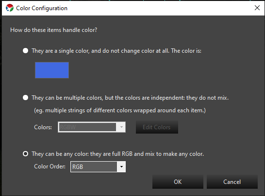
When the Color Configuration dialog box appears, click on the first radio button (They are a single color…).
Click the color box (blue in the above graphic) to define the color of this element.
Click OK when you’re done and you’ll get a dialog box telling you what you just did – hit OK on this dialog to close it.
That’s it. You’ve successfully defined a single element for your display.
There is no need yet to link anything in the Element Tree to output controllers. With these elements defined, you can sequence your display and setup a preview. Only when you are ready to physically connect your output controllers do you need to come back and mess with the controllers.
Single-Element Shortcuts
Let’s say you have 16 mini-trees that are a single color (mine are white). These are standard 120V light strings and each is separately controlled by a channel on a Renard controller (so, 16 strings, 16 outputs on a controller)
Select Generic Numbered Group from the Add combo-box under Element Setup.
Click on the to the right of Generic Numbered Group drop down box.
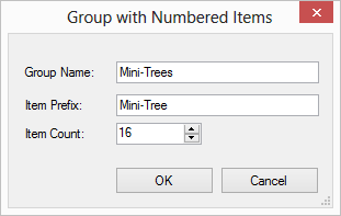
A dialog box will appear that lets you name your new element group and each item within the group. We’re going to fill ours out with a group name of Mini-Trees, an item prefix of Mini-Tree and an item count of 16.
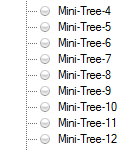
When you press OK a new group will be created at the bottom of the Element Tree named Mini-Trees with 16 individual trees named Mini-Tree-X where X is the number of the item.
Now, we need to define the color-handling for these items. For versions 3.6 and above the following steps will be invoked automatically for you when you create an item with the prop shortcuts. In addition, you will be prompted to ask if you need a dimming curve to control the brightness of your prop. Click on the Mini-Trees group so it is selected.
Make sure Color Handling is selected in the Selected Item(s)/Configure section and press the .
When the Color Configuration dialog box appears, click on the first radio button (They are a single color).
Click the color box (blue in the above graphic) to define the color of this element.
Click OK when you’re done and you’ll get a dialog box telling you what you just did — hit OK on this dialog to close it.
That’s it. You’ve successfully defined a group of single 16 elements for your display.
Multiple-Element Shortcuts
1.3 - Renaming Elements
Introduction
There are multiple ways to rename elements. The simplest form is a single item rename. There are also features that enable multiple items to be renamed at the same time. One of them will be discussed here. The other one has its own section under Find/Replace.
Simple Renaming
To rename a single element, you can select the element and then right click and select rename. You will be prompted with a dialog to enter the new name. Clicking the ok button will apply the change. If the new name for the element matches an existing name, it may append a unique qualifier because all element names must be unique.
Multiple Element Rename
When you select multiple items to rename, a dialog box will appear to allow you to shape the renaming by forming templates. These templates are the same as the one used in the Add Multiple helpers that generate elements based on sequential naming patterns.
1.4 - Renaming Elements by Find/Replace
Introduction
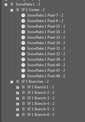
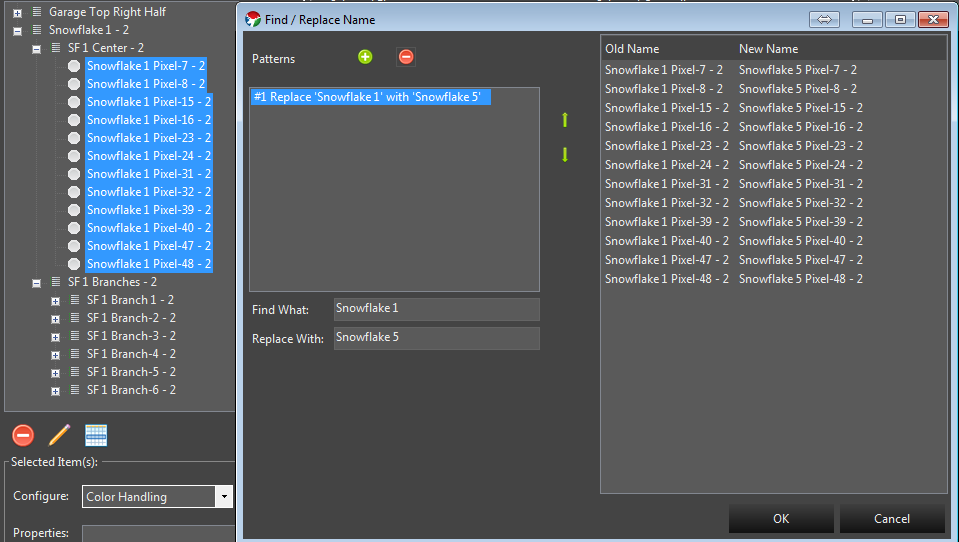
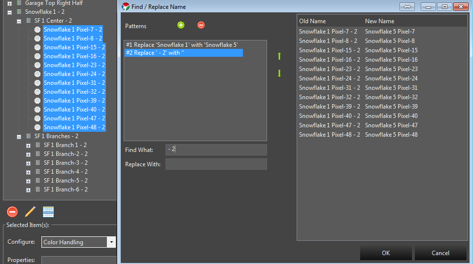
You may have element structures that were created with names that did not have the exact structure you wanted or have evolved over time and need some restructuring. The standard rename function has abilities to rename multiple items via a sequential template format. At times, this may be too rigid for your needs and a simple find replace mechanism can better serve the purpose. An example is shown below where the paste as new function was used to duplicate an element group structure. The groupings themselves have elements that have been restructured out of a sequential naming structure. The intent here is to remove the - 2 on the end and change it from Snowflake 1 to Snowflake 5. This way the newly cloned element group will match the pattern of the original ones it was cloned from. See element duplication for additional details. Starting in 3.6 and above this can be done from the Display Setup or the Preview Setup forms.
Steps
Select a group of elements to Find/Replace naming patterns. They can be all together, or selected from multiple different levels. Select only the items you wish to act on.
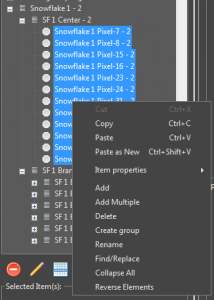
Right click on the selected items and choose Find/Replace.
On the dialog box that appears you can create patterns of find and replace. Patterns can be chained to allow for multiple find replace operations in one pass without having to do the Find/Replace operation multiple times.
First we will create the pattern to rename Snowflake 1 to Snowflake 5. In the Find what text field we put Snowflake 1. In the Replace with text field we put Snowflake 5. You will notice the list at the left showing on the fly what will happen as you type the values in.
Next we also want to remove the - 2 on the end. So we click the green + button to add a new pattern. This new Find/Replace will occur on the result of the previous pattern. We enter the - 2 in the find what. Notice we enter a blank space in front because we also want to remove the blank that is there. - 2. Because we want to replace that with nothing, we leave the replace with text field empty. The list on the right updates to reflect the result of all our changes.
Now that the list on the right reflects what we want the elements to look like, we can click the ok button and the changes will be applied.
1.5 - Duplicating Elements
Introduction
In some cases you may have created an element structure that does not conform to one of the built in template generators and you need to create more of them. Instead of manually recreating each one, Vixen has a feature to allow you to copy and paste a new version of it. Normally copy and paste just makes additional copies that are linked to the original. But in this case you truly want a new version of it.
Steps
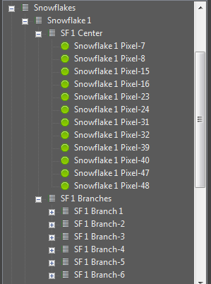
Select the top level of the item group you want to make a new version of. In the example above I would select the Snowflake 1 Element group.
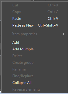
Right click out in the white space area of the element list and the context menu will appear.
Choose Paste as New. After this a cloned copy will be created as shown below.
Because Vixen does not allow different elements to have the same name, the feature will append some numeric qualifier on the end of the new elements to make them different. You can leave these as is, or use some of the renaming features described elsewhere to rename them.
1.6 - Color Handling
Color Handling
Color handling provides information on how the elements use color. There are 3 common types of lights.
Traditional analog incandescent, or LED string lights. These have been around for a long time and are typically a string of single color lights.
Dumb Pixels. These are LED pixels, but the whole string color can be controlled and will all be the same color at the same time. These lights are not individually addressable.
Pixels. These are modern addressable string of lights that can be made any color and each light can be any color.
The color configuration can occur from multiple places. If you add elements in display setup using the templates, the color setup will typically be presented as part of the setup workflow for each type of prop. If you create individual elements outside of one of the wizards, then it will be presented when you use the Add Properties -> Color Handling.
Color Configuration
The Color Configuration dialog will be presented from multiple places. It is key to getting the color setup correct on your elements so the sequencer can properly manage them. There are 3 options on this dialog and they relate to the information above on what type of lights you are using.
Single color. This is for traditional lights where the element is a single color only.
Multiple colors that do not mix. This is for what is known as super strings of traditional lights. A single prop may have multiple strings of different color lights covering the same area. You would configure this to have the set of colors that match what your strings are.
Mixing color types. This is typical of a pixel that can be any color. Typically they are RGB.
1.7 - Element Tags
This section covers using Element Tags to label and organize elements in Display Setup and Preview Setup.
Overview
Element Tags let you attach simple organizational or workflow labels to an element without renaming it, moving it in the Element Tree, or relying on notes kept outside of Vixen. This is useful for things like marking an element you’re phasing out, tucking an element out of the way while you work, or flagging elements you plan to migrate to a physical prop later.
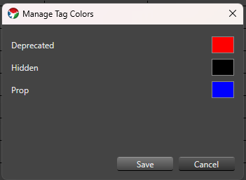
Vixen ships with three built-in tags:
Deprecated (red dot by default) — marks an element you no longer want to actively sequence against. In the Sequencer, rows tagged Deprecated reject new effects, and opening a sequence that already has effects on a Deprecated element shows a warning listing the affected elements. See Element Tags in the Sequencer section for details.
Hidden (black dot by default) — marks an element you want to keep in your configuration but don’t need to see or work with right now. In the Sequencer, Hidden elements can be toggled out of the row list for the current editing session.
Prop (blue dot by default) — reserved for identifying elements intended for a future Prop migration workflow. It has no special behavior yet beyond being assignable and shown.
A tag applies only to the element it’s assigned to — it is not automatically inherited by an element’s children in a group.
Display Setup and Preview Setup share the same Element Tree control, so tagging works identically in both.
Assigning and Removing Tags
Right-click one or more elements or groups in the Element Tree and choose Tags from the context menu. The submenu lists every tag currently in the catalog — today, the three built-in tags — with a checkmark next to any tag already assigned to your selection.
Click an unchecked tag to assign it to every selected element.
Click a checked tag to remove it from every selected element.
If your selection is mixed — some elements have the tag, some don’t — the checkmark appears as a muted, partial checkmark instead of a plain checkmark or no checkmark at all. Clicking a partial checkmark assigns the tag to the entire selection; only a fully-checked tag removes it from the entire selection when clicked.
Hold Ctrl while clicking a tag to apply the change to all children of the selected element(s) as well, not just the selected element(s) themselves. This most useful when deprecating elements to ensure all children are known to be deprecated as well.
Tag Color Dots
Display Setup and Preview Setup never hide elements based on their tags — every element always stays visible in the tree, whether or not it’s tagged. Instead, a tagged element shows a small colored dot after its name, one dot for each assigned tag that has a color, ordered left to right by the tag’s sort order. For example, an element tagged both Deprecated and Hidden shows two dots side by side.
Managing Tag Colors
Choose Tags > Manage Tag Colors… from the context menu to open the Element Tag Manager. It lists the built-in tags with a color swatch for each — click a swatch to choose a new color, then save. Color changes apply everywhere tags are shown: Display Setup, Preview Setup, and the Sequencer.
Tag assignments and any tag color changes made from Display Setup or Preview Setup are saved along with the rest of your changes when you save and close that editor, the same as any other edit made there.
1.8 - Face Property
Map elements to mouth phonemes, eyes, and outlines so the LipSync effect can render Face Mapping.
Overview
The Face property lets you map individual elements to mouth phonemes and to the other parts of a singing face — eyes open, eyes closed, and outline — plus a color for each. It’s the authoring side of a pair of features: once elements are mapped here, the LipSync effect renders them in the Sequencer when its Mapping Type is set to Face Mapping. This is the same relationship the newer State Property has with the State effect, except Face is purpose-built for singing faces and their phoneme codes.
If you’re using LipSync’s Image Mapping type instead — drawing a mouth-shape image onto a pixel matrix rather than mapping individual elements — you don’t need a Face property at all; see Image Mapping below.
Adding the Face Property
In Display Setup, select all of the individual elements that make up your face prop’s mouth, eyes, and outline — every element that needs its own phoneme or component mapping. This is usually many leaf elements (individual pixels or segments), not a single parent group.
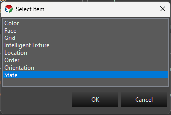
In the Selected Item(s)/Configure section, press Add Properties. In the Select Item dialog, choose Face and press OK. Every element in your selection gets its own Face property.
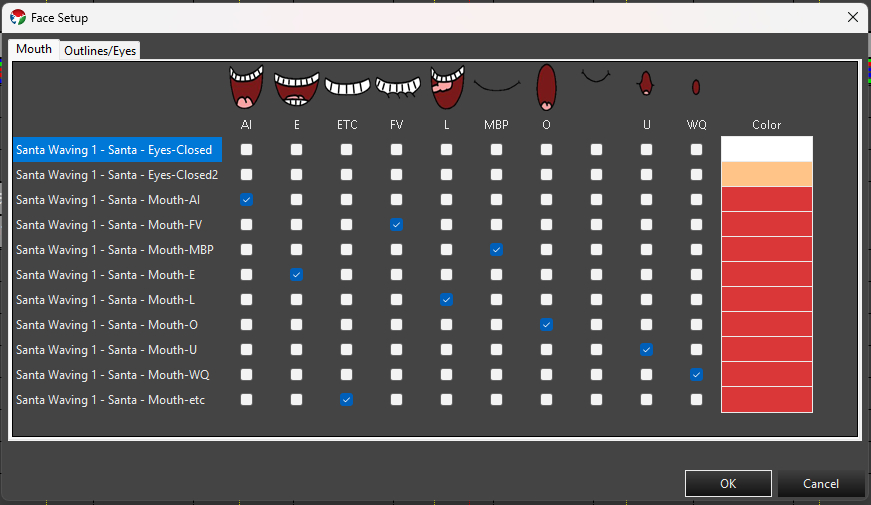
With Face selected in the Configure list, press Configure. Face provides its own setup wizard instead of a plain settings dialog, so this opens the Face Setup window directly, with one row for every element you selected.
Face Setup Wizard
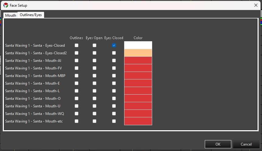
Face Setup has two tabs, each a grid with one row per element you selected, ending in a shared Color column — setting a color on one tab also updates it on the other, since it’s really one color per element.
Mouth
One checkbox column per phoneme — AI, E, ETC, FV, L, MBP, O, U, WQ, and REST (the standard Preston Blair/Papagayo set). Check the phoneme(s) that row’s element should light up for.
Outlines/Eyes
Checkbox columns for Outlines, Eyes Open, and Eyes Closed. Check the appropriate box(es) for that row’s element.
Click a checkbox cell to toggle it. You can select multiple cells first (click, Ctrl-click, Shift-click, or drag across a range) — clicking any one of the selected cells then toggles the whole selection together: if fewer than half of the selected cells are currently checked, the click checks all of them; otherwise it unchecks all of them.
Double-click a Color cell to open a color picker for that row’s element. If the target elements only support a fixed set of discrete colors, you get a picker limited to those choices; otherwise you get the full color picker. Multi-select several rows’ Color cells first and double-click one to apply the same color to all of them at once.
OK writes the checked phonemes/components and chosen color to each element’s Face property. Cancel discards any changes made in the wizard.
Editing from the Sequence Editor
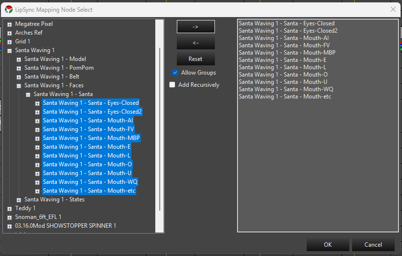
You don’t have to return to Display Setup to adjust face mapping. In the Sequence Editor, Tools -> LipSync -> Edit Element Face Mapping opens the LipSync Mapping Node Select dialog:
Browse and select elements in the tree on the left, then press -> to move them into the list on the right — multi-select first to move several at once. <- moves selected items back out of the list, and Reset clears it entirely.
Allow Groups (checked by default) lets you move a group node itself into the list as a single entry, instead of restricting the list to individual leaf elements.
Add Recursively expands a moved group into its individual descendant elements in the list, instead of keeping it as one group entry.
Once the elements you want to map are in the list on the right, press OK to open the same Face Setup wizard described above, for that selection.
This is a faster way to fix or build out face mapping without leaving your sequence.
Image Mapping
LipSync’s other Mapping Type, Image Mapping, doesn’t use the Face property or individual element mapping at all — it draws a phoneme image onto the target as if it were a pixel matrix, using shared image maps instead. See LipSync Image Maps for how to manage those.
Next Steps
Once your elements have Face properties configured, add a LipSync effect targeting a group that contains them, with Mapping Type set to Face Mapping.
1.9 - State Property
Define named States and State Items on an element so the State effect can render them.
Overview
Since Build 1449.
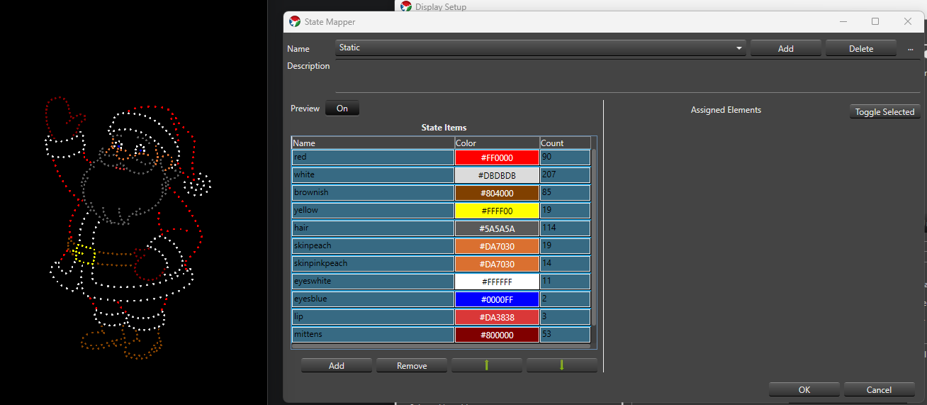
The State property lets you define one or more named State definitions for an element or group, each made up of State Items that map a color to a set of elements. It’s the authoring side of a pair of features: once States are defined here, the State effect renders them in the Sequencer. This is the same relationship the existing Face Property has with the LipSync effect, except State isn’t limited to faces or phonemes — it works for any prop with parts that need to switch between named looks, like a waving arm, a lit sign, or a costume.
A State definition is one named State, such as Eyes Open or Arm Up. It has a description and one or more State Items.
A State Item is one row inside a State definition — a name, a color, and the set of elements it applies to. Giving two State Items the same name groups them so the effect can activate both together (for example, Full Outfit might be built from a red-coat State Item and a white-cuffs State Item, both named the same or targeted together as needed).
Adding the State Property
In Display Setup, select the element or group you want to add States to. This should primarily always be the top level model group defining your Prop. Each Prop that needs State should generally only have one State Property.
In the Selected Item(s)/Configure section, press Add Properties. In the Select Item dialog, choose State and press OK.
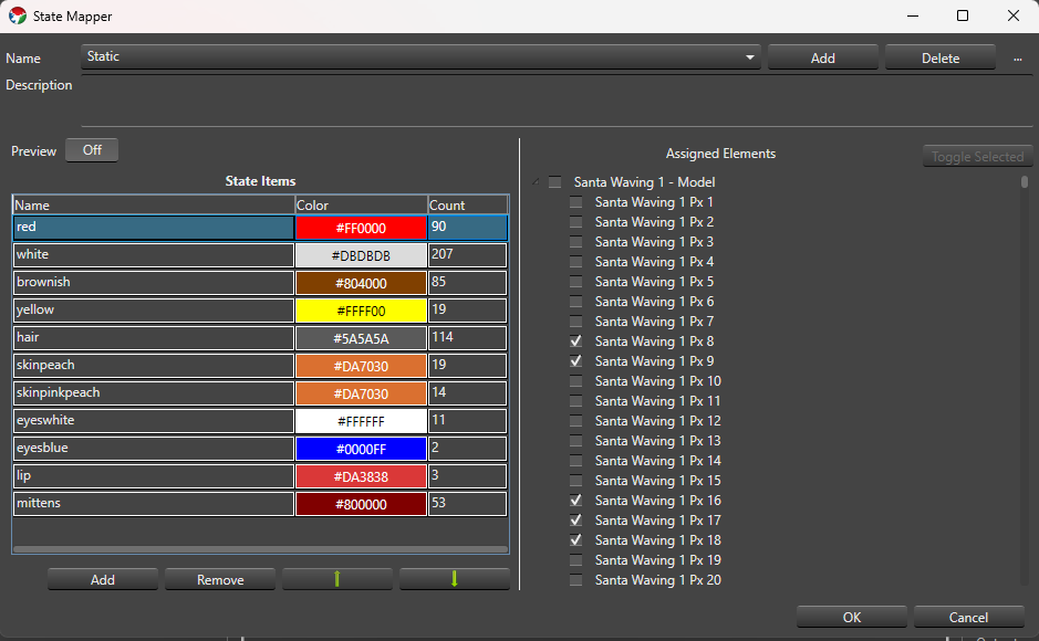
With State selected in the Configure list, press Configure to open the State Property Setup dialog.
State Definitions
At the top of the setup dialog:
Name A drop-down of the State definitions on this property. The first one is selected automatically when the dialog opens.
Add Prompts for a name (suggesting State - 1, State - 2, and so on) and creates a new State definition at the end of the list with one starter State Item named State Item - 1.
Delete Confirms, then removes the selected State definition. You can’t delete the last remaining State definition.
… menu:
Rename Prompts for a new name without touching the definition’s State Items or IDs.
Copy Prompts for a name (suggesting <name> Copy) and duplicates the selected definition, including its State Items, as an independent copy — later edits to either one don’t affect the other.
Description A free-text field below the name controls for describing what the State definition is for.
State definition names must be non-blank and unique. Names that differ only by case (Open vs. open) are allowed but show a non-blocking warning in case it was a typo. OK is disabled while any blocking validation error exists; Cancel and closing the window are always available and discard unsaved edits.
State Items
The grid on the left side of the dialog lists the selected State definition’s State Items:
Name Click to edit inline. Required and trimmed of leading/trailing whitespace; duplicate names across rows are allowed (that’s how you build a State Item Group).
Color Double-click the cell to open the standard Vixen color chooser (or discrete-color chooser, if the assigned elements only support fixed colors). The cell shows the chosen color as its background with the hex value as text.
Count Read-only — the number of leaf elements currently assigned to that row.
Below the grid:
Add Adds a new row named State Item - N. If the property’s elements are discrete-color and share at least one common color, the new row defaults to that color; otherwise it defaults to white.
Remove Deletes the selected row(s), after confirming (the confirmation message says how many rows will be removed).
Move Up / Move Down (the arrow icon buttons) Manually reorder the selected row one position at a time. These are only enabled when a single row is selected and it isn’t already at that end of the list.
The grid also supports column-header sorting — click Name, Color, or Count to sort by that column. A sorted or manually reordered layout is remembered the next time you open this State definition. You can multi-select rows (standard click, Ctrl-click, Shift-click) to remove several at once or preview several at once — see Preview below.
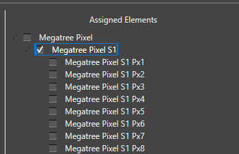
Assigned Elements
The tree on the right side shows the selected element and its children so you can choose which elements a State Item applies to. It’s only shown and editable when exactly one State Item row is selected in the grid — select more than one row and the tree is empty, since assignments can only be edited one row at a time.
Click a node to select it — this only highlights it, it doesn’t change its assignment.
Ctrl-click adds or removes individual nodes from the selection; Shift-click selects every visible node between the last-clicked node and the new one.
Press Space, or click Toggle Selected, to toggle the checked (assigned) state of every currently selected node.
Checking a group node clears and grays out its descendants — they’re assumed included through the group. Unchecking the group re-enables the descendants without restoring whatever was individually checked before.
The Count column on the State Items grid updates as you check and uncheck elements.
Preview
Preview A simple Off/On toggle. It’s off by default and, while off, nothing you do in the dialog affects your live output or preview.
When Preview is On, whichever State Item row(s) are currently selected in the grid light up on the real output/preview using their configured colors. Selecting a different row (or set of rows) updates the preview immediately, and clearing the selection stops previewing anything.
Editing a previewed row’s assignments or color updates the preview live. Turning Preview off, or closing the dialog through OK, Cancel, or the window close button, always clears any active preview.
Saving
OK saves your State definitions and closes the dialog; it stays disabled while a blocking validation error exists anywhere in the property. Cancel, or closing the window, discards any changes made in this session.
Next Steps
Once an element has one or more State definitions, add a State effect to that element (or a parent group) in the Sequencer to render them.
2 - Controller setup
Information about setting up display controllers.
2.1 - DDP
Description
The DDP Controller is used for sending DDP data packets to a controller that supports the DDP protocol. Later Falcon and FPP based controllers are known to support the DDP protocol. But there may be others. It’s an ethernet based protocol. It’s not nearly as universal as Streaming ACN. It’s slightly more efficient than sACN, but lacks many of the features. Because it’s so simple and has no features, there’s really nothing to configure beyond the unicast destination address.
There is minimal setup for this controller unlike the e1.31 controllers which have universes. You simply add the controller to your list of controllers and set the number of channels needed. In the setup screen accessed from the gear icon, you can set the destination ip address. Patching your Props to it is just like any other controller.
Patching
Elements / Props are patched to this controller just like any other controller. Select the controller and when you patch, the selected elements will be patched to the next available channels. You can also select a range of channels and patch elements to those directly.
2.2 - Launcher
Description
The Launcher Controller is used for triggering an external command from within Vixen. It is used in combination with the Launcher Effect that passes the command line executable and any arguments through to this controller at a specified time.
Setup
There is minimal setup for this controller. Just add it to your controller list and ensure it is enabled. You typically only need one output which is the default.
Patching
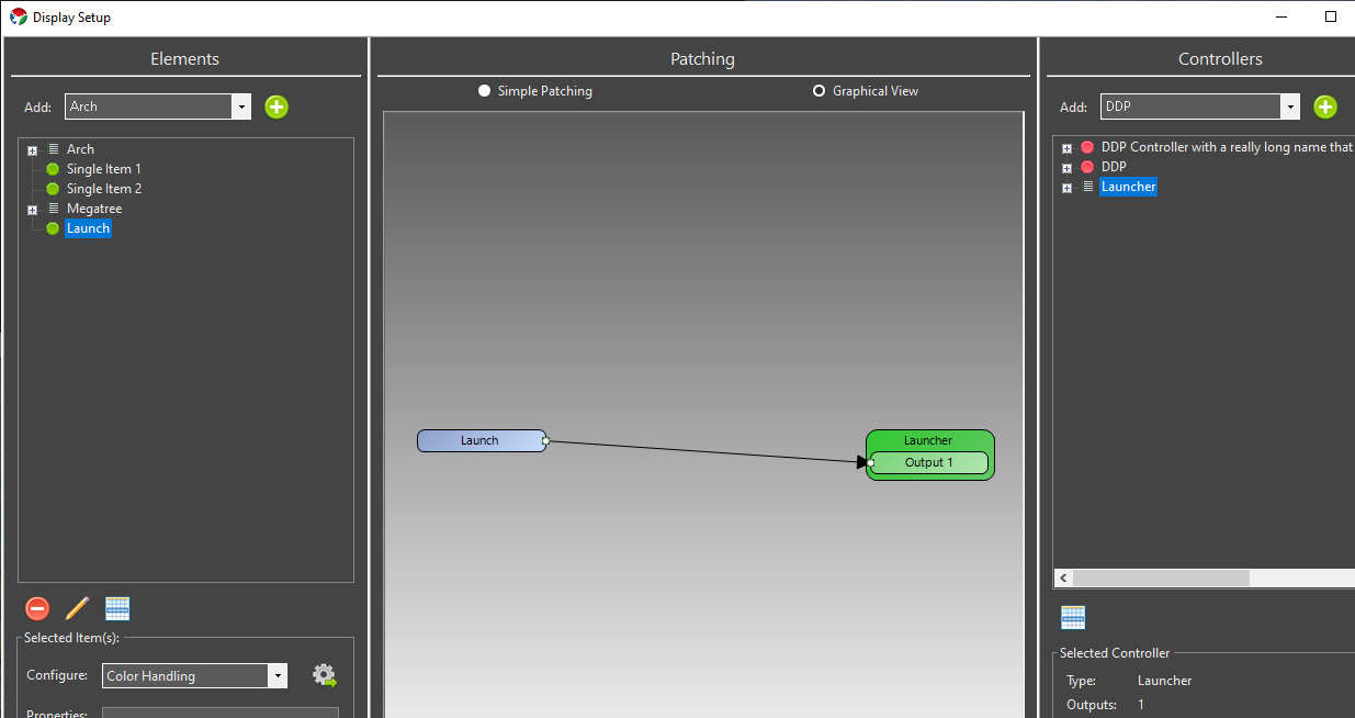
A single Element is normally directly patched to this controller. There should be no color breakdown or dimming handlers in the path. It should resemble the following.
2.3 - RDS
Description
The RDS Controller is used for triggering RDS (Radio Data System) data over a serial port to one of the supported chipsets. It also can be used to trigger some data to be posted to a url as a query parameter. That could be an RDS controller that supports web requests, or any other endpoint that may or may not be an RDS controller. It is used in combination with the RDS Effect that passes the text through to this controller at a specified time.
Setup
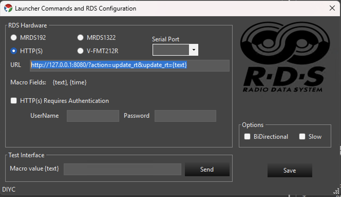
There is minimal setup for this controller if your RDS device has one of the supported chipsets. Just add it to your controller list with one output and ensure it is enabled. Using the gear icon, open the setup screen and select the proper chipset for your RDS controller. The supported chipsets are MRDS192, MRDS1322, or V-FMT212R. The latter being the once popular VAST transmitter. For the MRDS based controllers, select your COM port in the drop down box. There are options for bidirectional and slow which may help with certain serial port setups.
If you are using it for an HTTP controller, or some alternative device that accepts HTTP requests, select that option. You will enter the url in the URL text box. The text parameter from the effect will be used as a query string where you place the {text} macro. The following example calls an endpoint on localhost port 8080 with two query string parameters. The update_rt value will be set to the text from the RDS effect. That specific URL is typical of the VAST device, so if you are using something else, you will need to adjust how the url is configured to match your device.
The following shows an example of an HTTP setup without authentication.
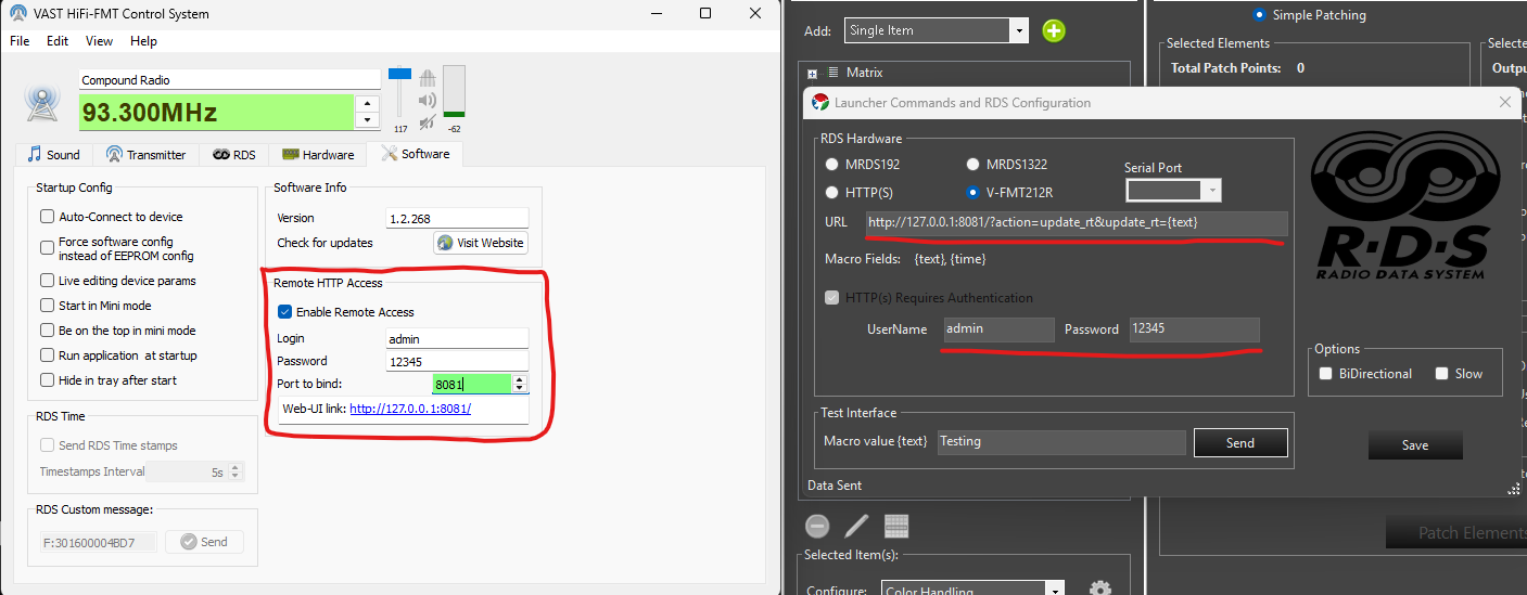
For the VAST V-FMT212R you need to ensure the VAST Control System software is running and has the Remote HTTP Access enabled. Full configuration is shown below. Note the areas highlighted with red. The Vixen web server defaults to using port 8080, so it is recommended to change the VAST port to 8081 as noted in the image.
Testing
You can enter text in the Test Interface section to simulate the macro value being set to some value. This should trigger the integration. On the controller setup page at the bottom is a text box. Entering some text there and hitting send will simulate what will occur if an effect passed the same text value. Your test text will be sent out as it is configured in order to validate your configuration works.
Patching
A single Element is normally directly patched to this controller. There should be no color breakdown or dimming handlers in the path. It should resemble the following. This example shows the Launcher controller, but the RDS controller will look the same.
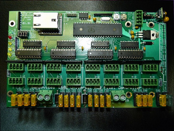
2.4 - SanDevices 682
Overview
NOTE some of the screenshots in this tutorial are slightly outdated. The underlying concepts however are sound and this article will remain available until we are able to update it.
If you only have a few strands that you would like to set up in Vixen, or want to get started quickly, setting up one strand per Universe will be the simplest way to achieve this.
In this example I will set up 3 strands of 54 RGB pixels each, running over WS2811.
Since we need 3 channels to drive each of the Red, Green and Blue channels, this means we need:
54 pixels x 3 colors = 162 channels per strand.
162 channels x 3 strands = 486 channels overall.
This example sets it up so that strand 1 is on Universe 1, strand 2 is on Universe 2 and strand 3 on Universe 3.
NOTE: One Universe-per-strand is not a good layout to deal with large displays like Megatrees, and in fact it’s not possible to set up a E682 with 1 Universe per strand and still use all 16 outputs. However, it’s a good way to learn initially, and fine for small displays.
Caveat: This assumes you have nothing else set up. If you do - you will have to change your numbering accordingly.
Configuration Steps
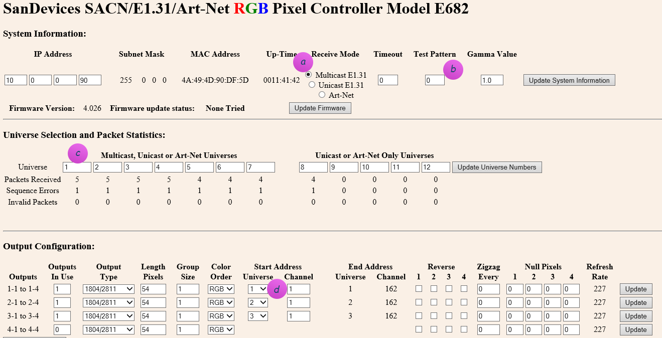
Start by opening your web browser and connect to the SanDevices IP address. It will display the SanDevices configuration page (in this case for a E682):
Set the page up as above.
a) Make sure you’ve specified Multicast, and no test pattern.
b) If you change either of those, click Update System Information before proceeding.
c) Make sure your Universe selection contains universe 1 to 12. These are the universes that will appear in the dropdown at (d)
TIP: After you change any one line on the page, you have to first click the button on the right of the line to apply. Don’t fill it all out and then click one of the buttons, you’ll lose all of your other changes!
Connecting to Vixen 3
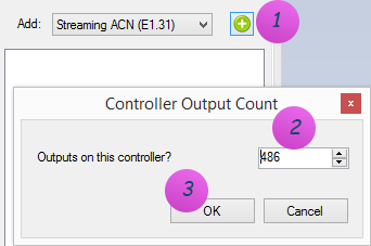
b) To connect the SanDevices controller, in Vixen 3, click on Setup Display and add a new Streaming ACN (E1.31) controller. Specify 486 outputs in order to match the 486 channels (54 pixels x 3 colors x 3 strands).
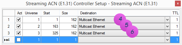
c) Right-click on the newly added controller, and click on Configure. Add 3 Universes and use Multicast Ethernet, since your SanDevices controller (above) is set up as Multicast E1.31:
NOTE 1: The name Multicast Ethernet may be called something else. This is the default name on Windows 8. On earlier operating systems it may be called: Multicast Local Area Connection.
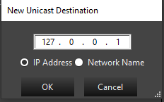
To instead enter a Unicast address, right-click the destination field to bring up the IP address form and enter the ip address, or the host name if you have DNS:
NOTE 3: The Start column above is the Vixen 3 start address of the channel inside its logical E1.31 controller view, and only comes into play if you need to individually map pixels to specific channels. It has nothing to do with the SanDevices controller, and likely will not map to any number you will see on the SanDevices configuration page.
Typically you would just set this up as a contiguous sequence throughout by setting line 1 to start at 1, and for all other lines use the formula of:
Start = Previous line Start + Previous line Size
d) Now create 3 elements to map to the 3 strings. These are the items that appear in the Sequence editor that you will use later to choreograph against.
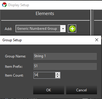
On the left hand side, add a Generic Numbered Group for String 1. See Setup Display Elements for more information.
Repeat the same steps for String 2 (item prefix: S2), and String 3 (item prefix: S3).
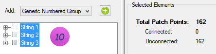
e) After this you should see 3 strings. Select them all.
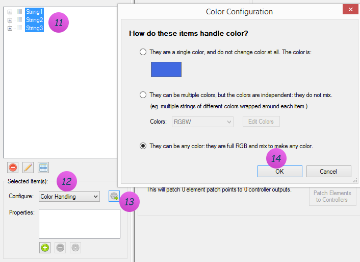
f) Notice above how it says: 162 patch points. At this point Vixen thinks you want 1 channel per item on the string. This is not quite right yet - you instead want 3 channels per item (RGB). So we need to tell that to Vixen. At the bottom on Configure, select Color Handling, and add the RGB filter.
g) If all went well, you should now see 486 patch points on the left, and 486 outputs on the right to path it to:
h) Click Patch Elements in the bottom center section, and you’re off to the races! See Patching Controllers for more information on patching.
2.5 - Streaming ACN (E1.31)
Description
The Streaming ACN controller, commonly known as E1.31 or sACN, is used to send DMX512 lighting data over an Ethernet network using the ANSI E1.31 protocol. It’s one of the most widely supported protocols in the lighting world; nearly every modern pixel controller (Falcon, SanDevices, J1Sys, ESPixelStick, WLED, FPP based controllers, and many others) can receive E1.31.
Unlike simpler protocols such as DDP, E1.31 is built around the concept of universes. A universe is a block of up to 512 DMX channels (slots) that is addressed and transmitted independently. A single E1.31 controller in Vixen can be configured with as many universes as you need, each mapped to a different range of the controller’s output channels. This makes E1.31 well suited to large displays where your channel count exceeds the 512 channel limit of a single DMX universe - you simply add more universes rather than more controllers.
All of the universes configured on one E1.31 controller instance in Vixen are sent to a single destination - either Multicast (sent out a chosen network adapter, with each universe automatically going to its own multicast group per the E1.31 spec) or Unicast (sent directly to one IP address or hostname). If you need to send data to more than one physical destination, add a separate E1.31 controller for each destination.
Setup
When you add a Streaming ACN (E1.31) controller in Vixen, you’ll be prompted for the number of output channels, just like other controllers. Set this to the total number of channels across all the universes you plan to configure.
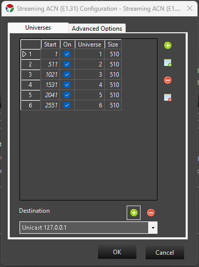
Right-click the controller and choose Configure to open the setup screen. It’s split into two tabs: Universes and Advanced Options.
Universes tab
The grid lists each universe configured on this controller:
Start - the first output channel (1-based) in this Vixen controller that this universe’s data is read from.
On - whether the universe is active. Inactive universes are kept in the list but not transmitted.
Universe - the E1.31 universe number, from 1 to 64000. Universe numbers must be unique within a controller.
Size - the number of channels (slots) in this universe, from 1 to 512.
By default, Vixen automatically manages the Start column for you, laying universes out contiguously one after another as you add or resize them. If you need to control the start channel of each universe yourself - for example to leave gaps, or to match a specific order used by your hardware - check Manually manage start values on the Advanced Options tab. While automatic management is on, you can also click a column header to sort the grid (left-click for ascending, right-click for descending).
Use the buttons to the right of the grid to:
Add Universe - add a single new universe, numbered one higher than the highest universe currently in the list.
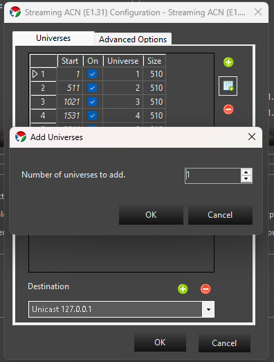
Add Multiple Universes - add a run of sequential universes in one step; you’ll be prompted for how many to add.
Delete Universe - remove the currently selected universe(s).
Delete All Universes - clear the list and start over with a single default universe.
At the bottom of the tab, the Destination drop-down selects where this controller’s E1.31 data is sent:
Multicast <adapter name> entries are populated automatically from your machine’s network adapters. Choosing one sends standard E1.31 multicast traffic out that adapter; every device on the network subscribed to a given universe’s multicast group will receive it. Multicast destinations can’t be removed since they come from your machine’s network configuration.
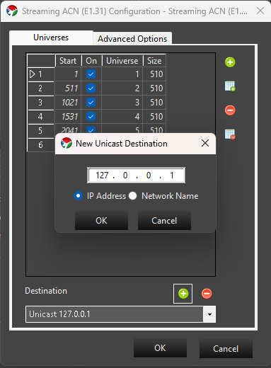
Unicast <address> entries send data directly to a single device. Click the + button next to the destination box to add one - you can enter either an IP address or a network/host name.
A unicast entry can be removed with the - button, as long as it isn’t currently selected as the destination for another E1.31 controller instance in your setup.
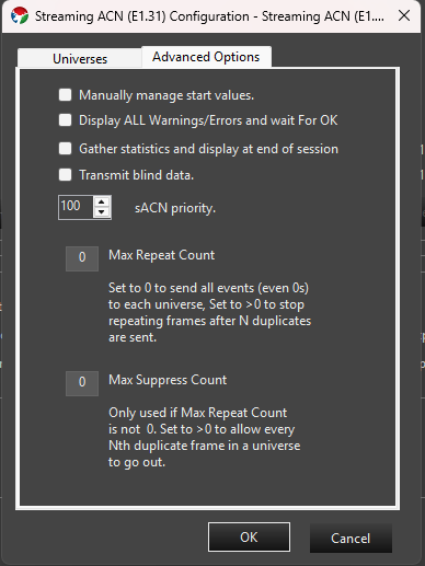
Advanced Options tab
Manually manage start values - see the Universes tab description above.
Display ALL Warnings/Errors and wait for OK - if checked, any warnings encountered when the controller starts (for example, a configured network adapter that no longer has an address) are shown in a dialog that must be dismissed before playback continues. When unchecked, these are silently ignored.
Gather statistics and display at end of session - if checked, Vixen tracks the number of packets and slots sent per universe and shows a summary when the show stops.
Transmit blind data - sets the Preview_Data flag defined by the E1.31 specification on outgoing packets, marking them as not intended for permanent effect.
sACN priority - the E1.31 source priority (0-200, default 100) sent with every packet. This is only relevant if more than one E1.31 source is transmitting to the same universe; receivers that support priority arbitration use it to decide whose data wins.
Max Repeat Count - by default (0) Vixen sends a packet for every frame of your sequence to every universe, even when the data hasn’t changed since the last frame. Set this above 0 to have Vixen stop re-sending a universe’s data once it has repeated unchanged for that many frames, which can reduce network traffic on large shows.
Max Suppress Count - only used when Max Repeat Count is above 0. Set above 0 to let every Nth suppressed duplicate frame through anyway, which is useful if a receiver needs a periodic keep-alive packet even while your data isn’t changing.
Patching
Elements / Props are patched to this controller just like any other controller. Select the controller and when you patch, the selected elements will be patched to the next available channels. You can also select a range of channels and patch elements to those directly. See Patching Controllers for more information.
3 - Patching Setup
Information about patching elements to controllers.
3.1 - Patch Elements to Controllers
Introduction
In order for your controllers to output data, the elements need to be connected to them. This is a process we call Patching. Think of the old telephone switchboards where an incoming call needs to be connected by an operator to a destination. The operator plugged in a cable from one jack to another to connect the calls. They called this patching the call. The same concept applies here. This allows your elements to be connected to your controllers in any order providing great flexibility.
The graphical view in the center pane of the Display setup screen shows what’s going on.
In this screenshot you can see that one element is patched to a color breakdown filter which in turn has 3 outputs that route to the controller output channels.
So what’s going on in that color breakdown filter? If we were to double click on it, you’d see the setup screen.
What this is doing is taking the element information, and breaking down the colors to 3 separate paths, one for the red, one for the green, and a 3rd for the blue. Most RGB lights in common use need to get the data for each color on separate control channels. This breaks it up so the controllers can understand it.
From this filter, the data is patched to the appropriate controller channels. Note that should your RGB lights be in a different RGB order, you can change the order of the colors in the color breakdown filter, or you could repatch the outputs of the filter with patching lines that cross. Either way is equally valid.
Filters vs Properties
This can be confusing. Properties are information about the element that are used by various parts of the software. Currently an element can support Color, Grid, or Location properties. The element color properties are used in the sequence editor so that you are only presented the color options for colors that this element supports. Editing the color property does not alter the color breakdown filter. Editing the color breakdown filter (in graphical view) does not alter the color property. The easiest way to change them both, is to unpatch the element, and start over.
Filters affect how the data flows from elements to controllers. They do not “belong to” an element, but rather are independent objects that are connected to elements, other filters, and controller channels.
When you use the configure button to add color handling. This invokes a wizard which sets up both the element’s color property, as well as a color breakdown filter.
Conversely, when you add a dimming curve, the wizard only adds the dimming curve filter, and no properties.
It’s important to note that the list box below the configure button is a list of the properties assigned to an element. Only some configure wizards will produce a property in this list. And even if it has a similar name, the property is not at all linked to a filter.
Patching Process
First you need to make sure your filter chain is the way you want it. Select the element(s) you want to patch from the element setup pane on the right.
Decide if you want to include dimming curves, and if so, how much control you wish to have over it. If you want to add a dimming curve and have the same curve apply all of the colors add it at this point. (this gives it a dimming curve, but no ability to color balance)
One Dimming curve will be added for each element. Hint: Use a library curve. See Dimming Curves below.
Then go to the configure box below and select color handling.
Choose the appropriate color handling scenario for these elements.
One color breakdown filter will be added for each element.
If you want to add dimming curves to this element that you can adjust with different curves for each color, add the dimming curve at this point. (You would do this if you want to color balance your elements to each other)
One dimming curve will be added for each output of the color breakdown filters (for RGB, number of elements x 3). Hint: Use a library curve. See Dimming Curves below.
Double check the graphical view to make sure this is the signal flow you are trying to achieve. If you’re satisfied, go back to the simple patching view.
Now take note of the number of patch points in the selected elements section of the simple patching view. This is the number of controller channels you’ll need.
Select the controller channels you want to connect these elements to. Note: You can select more channels than needed, and only the necessary channels will be used. It’s faster to select more outputs than necessary than it is to actually count out how many you need.
In the bottom area of the center pane, it will tell you how many element patch points will be connected to how many channels. If the number doesn’t match, that may be ok (see note above) but ideally these numbers should match. If they don’t match, there will be a message below that explains what will happen.
Once you’re satisfied that it’s good, go ahead and hit the Patch Elements to Controllers button.
There may be cases where your physical lights are backwards from how you have your elements set up. You can account for this in the patching process by using the Reverse Element Order option in the Selected Elements column.
There is a similarly worded option in the Selected Controllers column as well. The difference here is that the output channels will be reversed. If this is an element with a multi-output color breakdown filter (such as RGB) not only will the elements be patched in reverse, but the color order will also be reversed. You probably don’t want to use this option to reverse multicolor elements.
Unpatching
If you want to preserve the filter chain, you’ll want to unpatch from the controllers. Select the controller channels to be unpatched, and press the Unpatch Controllers button
If you want to discard the filter chain and recreate it, you can unpatch from the elements. Select the elements to be unpatched, and click the Unpatch Elements button. It will then ask you if you want to remove the filters as well. The answer is almost always yes. (there’s some legacy reasons why you wouldn’t want to remove filters, but you can no longer get to them from the display setup screen, so you might as well delete them)
Dimming Curves
It was mentioned above, but to additionally call it out. The best practice when adding dimming curves to your elements is to use a library curve for the curve when setting it up. This allows you to go into the curve library and edit the library curve to change any instance of the dimming on the elements it was used to patch. We recommend giving it some thought and setting up a library curve for each prop that you may want to adjust or even all items that use the same type of lights so you can easily balance them. Adjusting the library curve values once patched in makes an immediate change to the output. Alternatively, you can choose to just replace the existing curve with a new one in the display setup. You do not have to unpatch to replace an existing curve with a new value, however you will need to restart Vixen to see the results. Thus the library curve has an advantage of being able to change without a restart.
The best place to position the curve in the filter chain is between the element and the color break down in most cases. This allows you to adjust the overall brightness of the light evenly across whichever colors are on the breakdown filter. If you need to adjust color balance, then the place for the curve is after the breakdown on each individual output of the breakdown. In the case of RGB pixels, you most likely want to have a red curve, a blue curve and a green curve in your library for that prop or type of lights. You can then adjust each color in the library to adjust for color balance.
3.2 - Dimming Curves
Dimming Curves
Dimming curves are generally used to reduce the overall brightness of a one or more lights. Generally this is used with RGB pixels. Dimming curves themselves are the very same curves you may be familiar with in the Sequencer for controlling brightness or other aspects of effects. They are utilized in the patching chain to affect the output to the lights. They will not affect the brightness shown in the preview. Here is a typical view of the patching chain for a single RGB pixel in the graphical view of the display setup.
Typical patching with dimming curve.
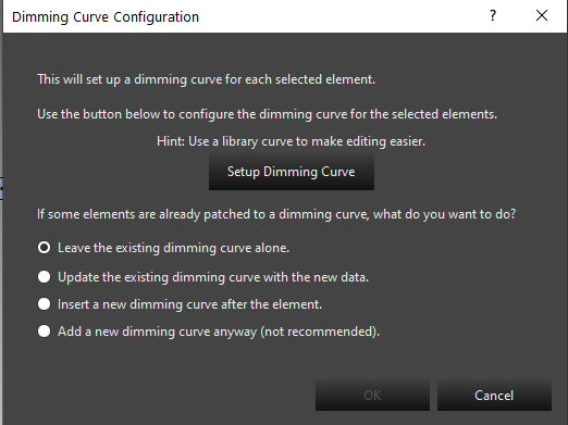
The dimming curve typically precedes the Color Breakdown filter. This evenly affects all color values flowing through the path. The Dimming Curve wizard helps you add a dimming curve to your patching.
Invoking the Dimming Setup.
Setup screen.
The main setup screen helps you add the dimming curve. The typical choices here will be to update an existing dimming curve, or insert a new dimming curve after the element. If you are starting your patching, you will use the insert a new dimming curve. This is also true in the newer workflows in the preview when adding a prop or using the wizards and they prompt you to add a dimming curve. These new prop wizards will default to using the insert option. When updating an existing dimming curve, you may need to restart Vixen for it to take effect.
Dimming Curve Setup
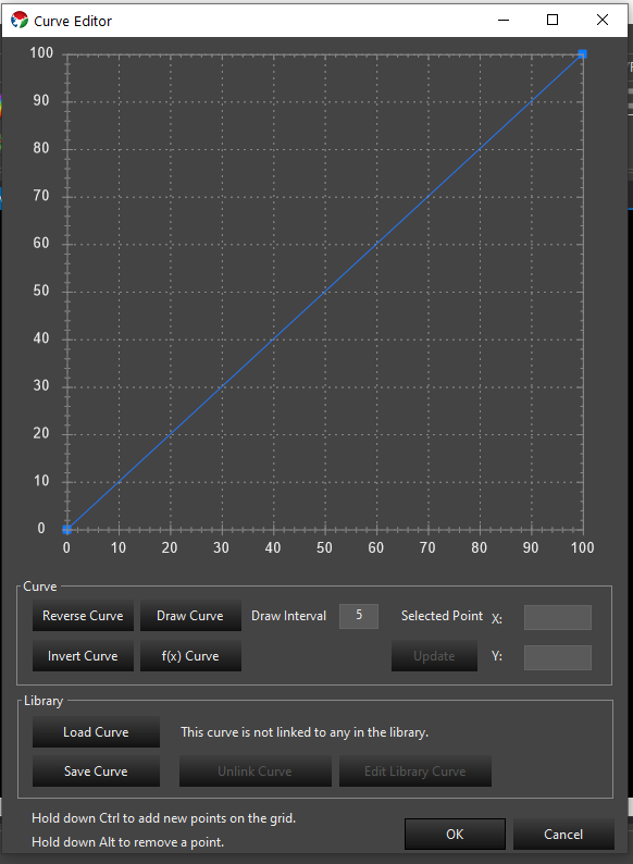
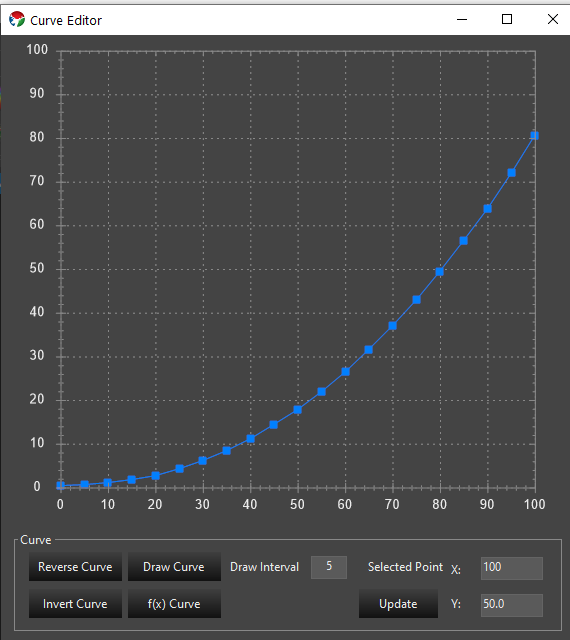
Clicking the Setup Dimming Curve from the Dimming Curve wizard will bring up the curve editor. This editor is used in other places to edit curves so it will become familiar to you. Below is the default curve that will be the starting point.
Default Dimming Curve.
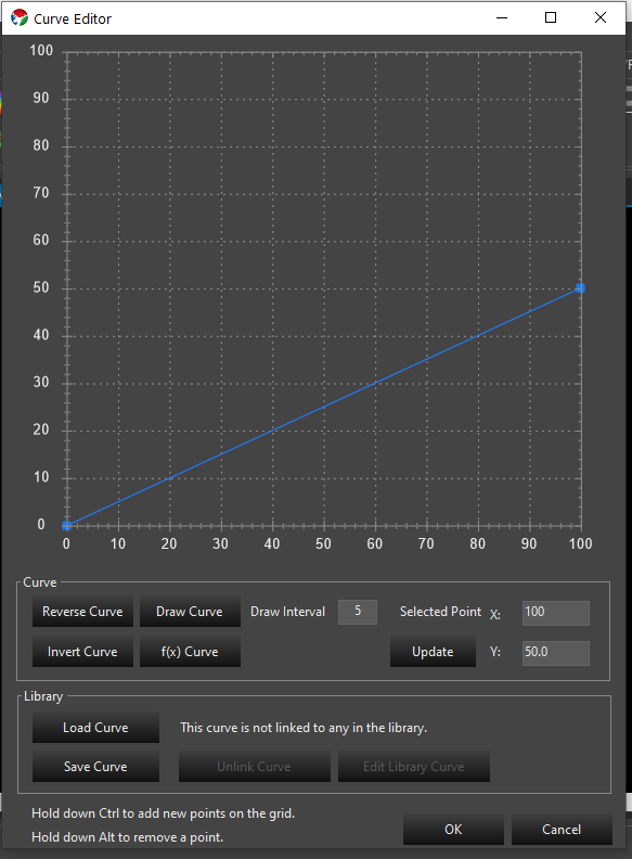
This is a standard linear ramp. It is a mapping transform, so the value across the bottom is mapped to the value on the left by moving up the graph to the curve line to find the outgoing value. The above curve will produce the same values out that come in and will not do any dimming. If we want our lights to run at 50% brightness, we will configure the curve as follows.
A common misconception is that the curve should be a flat line. A flat line will result in all values being mapped to the same brightness. This is generally not what you want.
Gamma Curves
Pixel based lighting has a linear brightness response. The human eye does not perceive these linear steps as being equal. There are many articles about using a gamma curve to compensate the linear response to something the human eye visualizes better. We can implement gamma curves in our dimming flow to do this compensation. There is a curve generator option in the curve editor to generate a gamma curve for you.
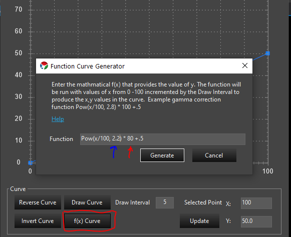
Function Curve Generator.
Using the f(x) Curve button you can invoke a screen to allow you to generate a gamma curve. The formula for a Gamma curve is in the screen. You can copy the example and edit it to your needs. The value indicated by the red pointer is the max brightness. In the example that is 100 and above it has been changed to 80 indicating that the max value for brightness is 80%. The value indicated by the blue arrow is the gamma value. A range of 2.0 - 2.4 is fairly typical. This value can be experimented with to find the value most appealing to the eye. If you happen to have gamma specs for your lights, you can use that value here. Above it has been set to 2.2.
Gamma Curve with 80% max and gamma of 2.2.
The above image is the result of generating the curve with a 80% max brightness and a gamma of 2.2.
Library Curves
The best practice for adding dimming curves is to create the curve as a library curve. This allows you to edit the curve in the library to change the value instead of having to use the Dimming wizard to replace the curve anytime you wish to change the value. On the curve editor you can save your new curve. This will save it to the library. Once you save the curve you will use the load curve button to load that saved library curve so library version can be used as the dimming curve. If you already have a curve saved you can load it directly and reuse one from other props. Library curves can be edited in the sequence editor in the curve library. Additional information on curves can be found here: Curves
4 - Custom Prop Editor
This section covers the Custom Prop Editor.
Overview
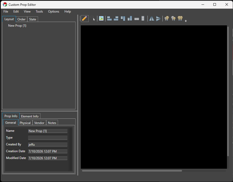
The Custom Prop Editor is a replacement for the deprecated prop template mechanism, used to model props that don’t fit the Preview’s Smart Objects. You can design almost any prop you want, share models with others, and import existing models from other sequencers.
Launching
The Custom Prop Editor can be launched from multiple places, and offers the same features no matter which one you use:
The main Admin screen, under Tools -> Custom Prop Editor.
The Preview, under View -> Prop Editor, or the Custom Prop Editor toolbar button next to Add Custom Prop / Custom Prop Library.
Window Layout
The editor window is split into four panes, plus a menu bar:
Menu barFile (New, Open, Save, Save As, Import xModel, Exit), Edit (Cut, Copy, Paste), View (Assign Background, Background Opacity), Tools (Vendor Browser, Export Wire Diagram), Options (Preferences), and Help (View Help).
Element Tree (top-left) Builds the Elements and Groups for the Prop, across three tabs: Layout, Order, and State. See Element Tree below.
Prop Info / Element Info (bottom-left) Metadata about the whole Prop, or about whichever element is currently selected in the tree. See Prop Info and Element Info below.
Drawing Canvas (right) Where you place and arrange the lights that make up the Prop. This pane, and its toolbar, stay visible no matter which Element Tree tab is active. See Drawing Canvas below.
A status bar at the bottom of the window shows the current mouse position over the canvas.
Element Tree
Layout
The Layout tab shows the Prop’s element hierarchy as a tree, similar to the tree used in Display Setup or Preview Setup. Double-click (or F2) a row to rename it inline.
Right-click a row for the context menu:
Create Empty Group / Copy to New Group / Move to New Group
Cut / Copy / Paste / Paste as New
Delete
Rename
Find/Replace Rename
You can drag and drop rows to reorder them within a group or move them between groups (drop on a group to add to it). Groups of lights and groups of groups can’t be mixed together in one drag, and lights can’t be dropped directly on the root element. Holding Ctrl while dropping reverses the order of the items you’re moving.
Order
The Order tab shows a flat list of every light in the Prop, sorted by its current render order, with that order number shown next to each name. This is the pixel/render order used elsewhere, such as wire diagram export. Drag and drop rows to reorder them — the whole list renumbers sequentially after a drop. Right-click for Reverse (reverses the order of the selected rows), Rename, and Find/Replace Rename.
State
Since Build 1449.
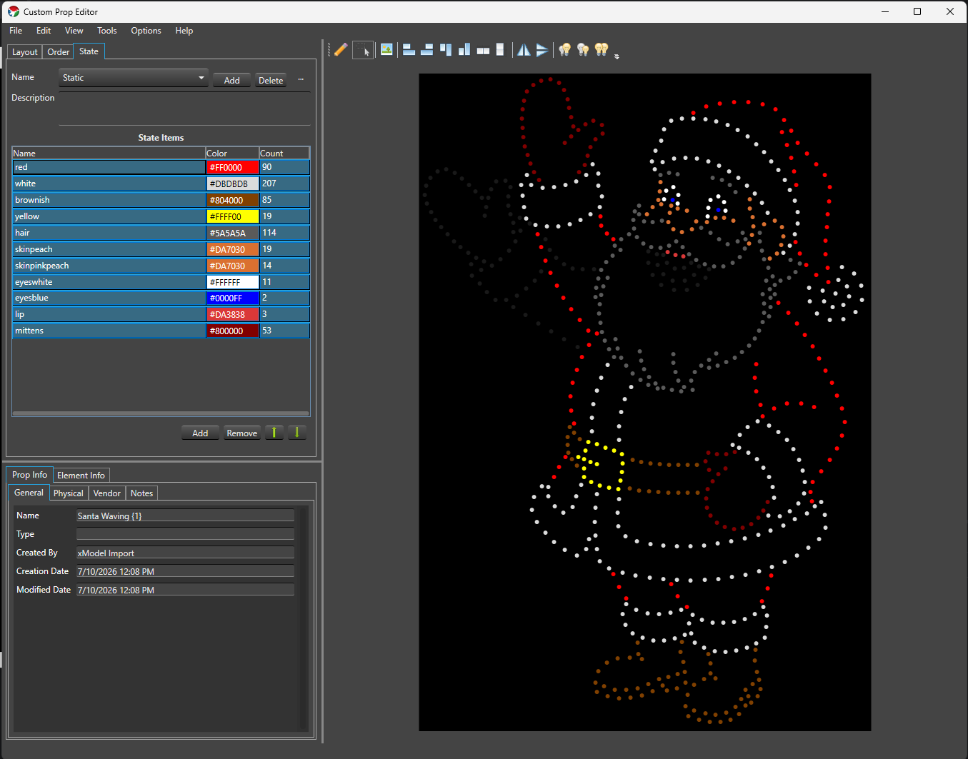
The State tab authors State definitions directly on the Prop, so they’re already in place the moment you import the Prop into a Preview — no need to separately configure the State property in Display Setup afterward. It follows the same State Definition/State Item model as the State property, and mirrors its Setup dialog as closely as the Custom Prop Editor’s layout allows.
Name A drop-down of the Prop’s State definitions, with Add, Delete, and a … menu for Rename and Copy — the same behavior as the State property’s State Definitions.
Description A free-text field for the selected State definition.
State Items A grid of the selected State definition’s items — Name (inline editable), Color (double-click to open the color picker, or type a hex value directly), and Count (read-only, the number of assigned lights) — with Add, Remove, and Move Up/Move Down buttons below it, matching the State property’s State Items grid.
Validation problems, if any, are listed in red below the grid.
Assigning lights is different here than in the State property. There’s no checkbox tree — instead, you assign lights by selecting exactly one State Item row and then working directly on the Drawing Canvas:
Click an unassigned light to add it to the selected State Item; click an already-assigned light to remove it.
Drag a selection box to add every light inside it to the selected State Item.
Hold Ctrl while drag-selecting to remove every light inside the box from the selected State Item instead.
Canvas assignment only works when exactly one State Item row is selected. With zero or multiple rows selected, clicking or drag-selecting on the canvas does nothing to your assignments.
While the State tab is active, the Drawing Canvas itself switches into a live local preview: every light not covered by an active State Item dims to a near-black RGB (25, 25, 25) so the assigned lights stand out, and each assigned light shows its State Item’s color.
Selecting one State Item row previews only that row.
Selecting multiple rows previews all of them at once — but canvas assignment editing is disabled while multiple rows are selected, since it wouldn’t be clear which row you meant to edit.
If a light is assigned to more than one active State Item with different colors, the preview shows the RGB average of those colors.
This preview is local to the editor — it never sends anything to Vixen Live Preview or other output. There’s no separate preview on/off toggle; it’s simply active whenever the State tab is.
Leaving the State tab (switching to Layout or Order) restores the canvas to its normal appearance and behavior.
Drawing Canvas
The canvas toolbar has two mutually exclusive modes:
Draw mode Click anywhere on the canvas to add a new light at that point, under whichever element is currently selected in the tree (or creates a new one).
Selection mode Click a light to select it (Ctrl-click to add/remove from the selection), or drag a selection box over empty canvas to select every light fully inside it.
There’s no dedicated tool for drawing a string, arc, or grid of lights in one action — you place lights individually in Draw mode, then use the arranging tools to line them up:
Align Left, Align Right, Align Top, Align Bottom
Distribute Horizontal, Distribute Vertical
Flip Horizontal, Flip Vertical
Increase Light Size, Decrease Light Size, Match Light Size
With two or more lights selected, resize handles appear on the selection’s bounding box (corners and edges), along with a rotate handle above it. Dragging a resize handle scales the selected lights’ positions and sizes relative to the opposite corner or edge — hold Shift to keep the scaling uniform. Dragging the rotate handle rotates the selection around its center — hold Ctrl to snap to 45° increments.
There’s no zoom or snap-to-grid in the Custom Prop Editor canvas; pan using the scroll bars, and the canvas size matches the Prop’s configured Height/Width.
Assign Background (View menu, or the toolbar button) sets a JPG/GIF/PNG image as a reference background for the canvas, useful for tracing a photo of the actual prop. Background Opacity (View menu) dims it. Selected lights can be removed with the Delete key, after a confirmation prompt (deleting a light removes it from every group it belongs to).
Prop Info
Metadata about the whole Prop, across four sub-tabs:
GeneralName, Type (a category like “Christmas”, “Halloween”, “General”), Created By, Creation Date, Modified Date.
PhysicalMaterial, Height, Width, Depth, Node Count, Bulb Type, and Color Mode (Full Color, Multiple Color, Single Color, or Other — declares color handling for the whole Prop; if it mixes color modes, choose Other). This maps to color handling in Display Setup.
VendorName, Contact, Website, Email, Phone — filled in automatically when you import a model through the Vendor Browser.
Notes A free-text field for anything else worth recording about the Prop.
Element Info
Metadata about whichever element is currently selected in the Layout tab:
Name
Face Component and Face Color Associates this element with a face part (for example Eyes Open, Eyes Closed, or one of the LipSync phoneme codes) used by the LipSync effect.
Model Type Since Build 1449. Classifies the element’s role for State authoring and Preview import: None (no special role — the default), Model (the primary element State definitions are authored against and where the State property is attached on import), SubModel (a submodel grouping), FaceInfo (imported or user-designated face information), or StateInfo (imported or user-designated legacy state grouping, from older xModel imports). At most one element in the Prop can be Model; setting a new one clears the previous choice. If no element is explicitly set to Model, the Prop’s root element is treated as the model element for State authoring and Preview import.
Children and Lights Read-only counts of this element’s child elements and the lights beneath it.
Light Size Read-only; shows multiple sizes if the lights beneath a group don’t all share one size.
Vendor Browser
Tools -> Vendor Browser opens the Vendor Inventory window, a way to browse and import props that vendors (or other users) have already built and published.
Choose a vendor from the Vendor drop-down.
Browse the category tree below it to find a Prop. The vendor controls how their categories are organized.
Clicking a Prop shows its details on the right: a preview image, a Product Info tab (type, material, dimensions, pixel count/description/spacing, notes), and — if a downloadable model is available — a Model Options tab listing each available model with a Select button.
Pressing Select downloads and opens that model in the Custom Prop Editor, and fills in any blank Physical and Vendor fields on the Prop Info tab from the vendor’s listing.
From there you can edit the element tree, layout, or any other attribute to tailor the Prop to your needs, then save it as your own.
Importing
File -> Import xModel imports an xLights .xmodel file — whether it stores its layout as CustomModel or the more compact CustomModelCompressed, the importer handles both automatically. Along with the light layout, an xModel import also brings in:
subModel definitions, as elements with Model TypeSubModel.
faceInfo definitions, as elements with Model TypeFaceInfo, for use with LipSync.
stateInfo definitions, mapped directly into the State tab as State definitions and State items.
Importing switches the canvas out of Draw mode into Selection mode automatically.
Preferences
Options -> Preferences sets editor-wide defaults: Light Color and Selected Color (how lights look on the canvas normally and when selected), State Preview Base Color (the dimmed color used for non-active lights while the State tab’s local preview is active), and Default Light Size for newly placed lights. A Defaults button resets all of them.
Tutorial
General Overview
Analog Strings
Duplicate Parts
We use Google Analytics to understand how the site is used. See our
privacy policy.
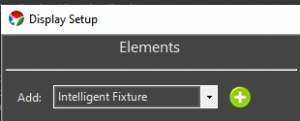
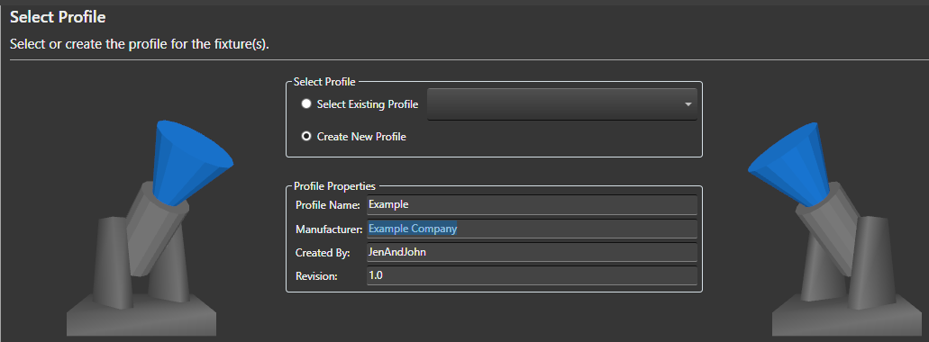
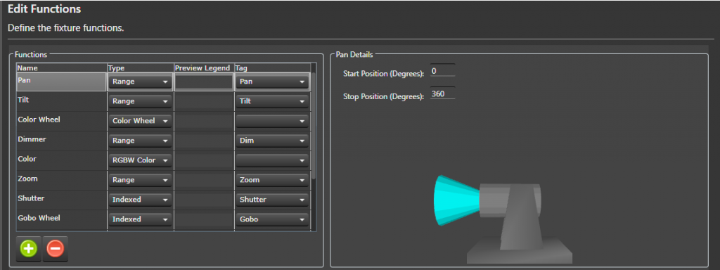
 button to add additional fixture functions.
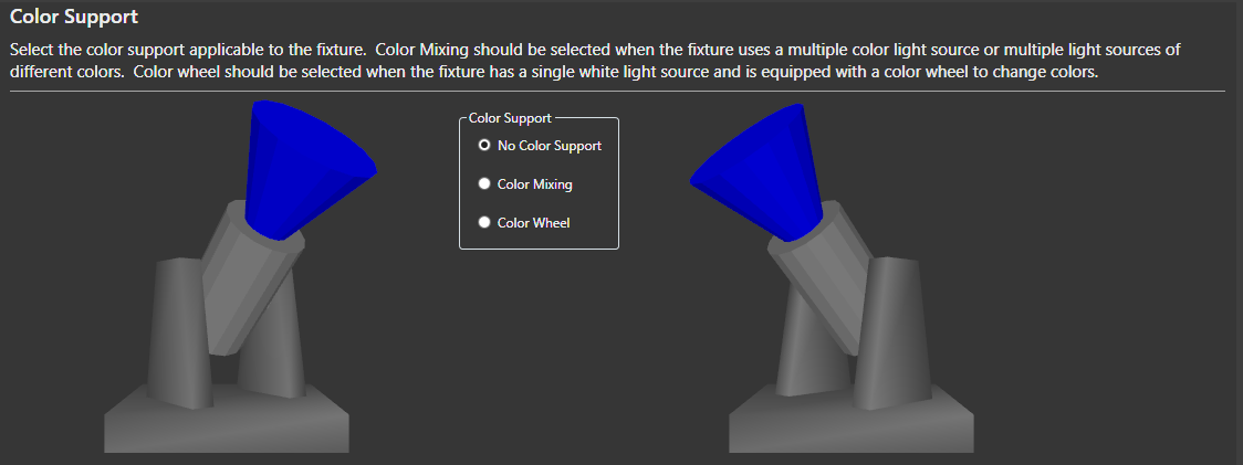
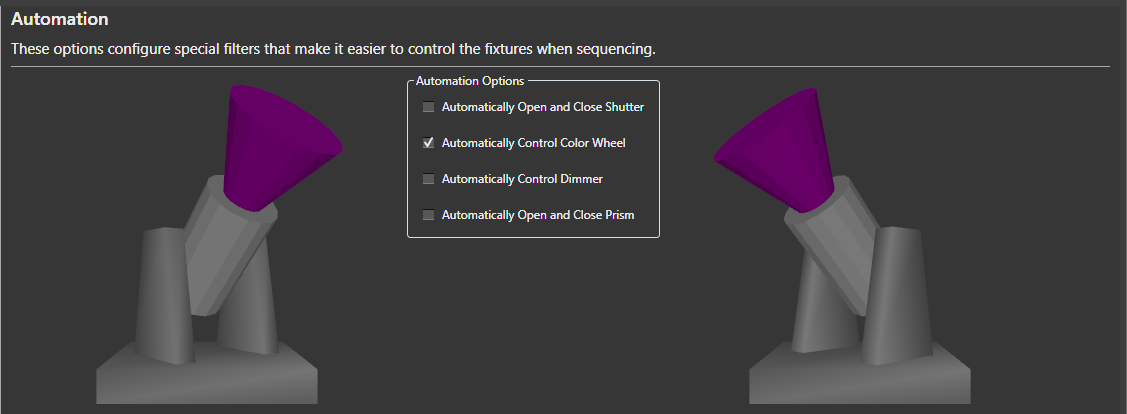
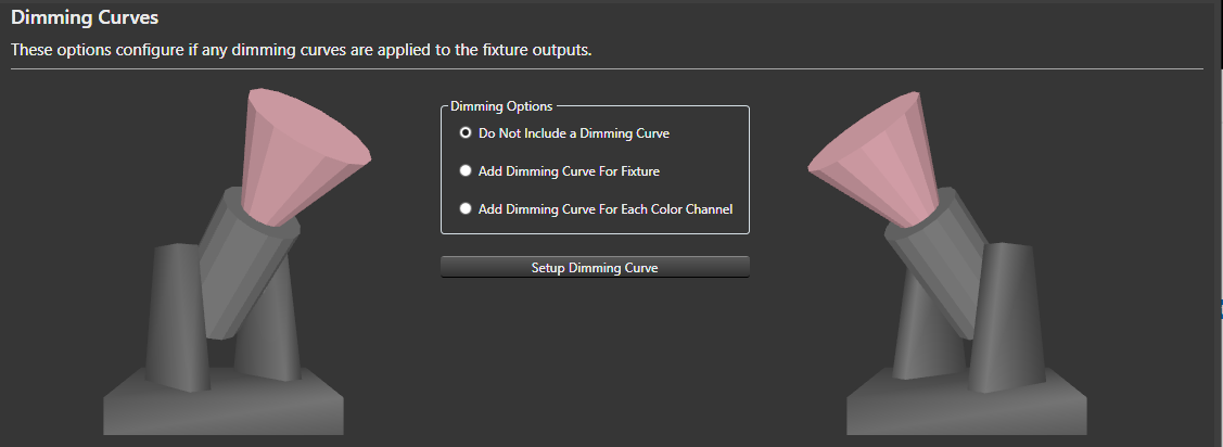
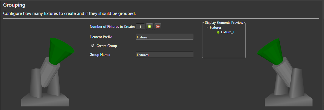
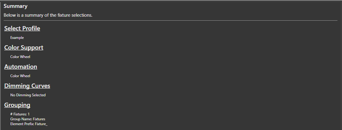
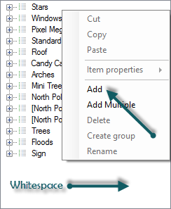
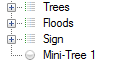
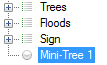

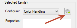
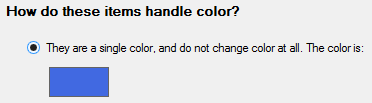
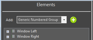
 to the right of Generic Numbered Group drop down box.