This is the multi-page printable view of this section. Click here to print.
Documentation
- 1: Getting Started
- 1.1: Introduction
- 1.2: Installing
- 1.3: Creating a Profile
- 1.4: Display Setup
- 1.5: Sequencing
- 1.6: Controller Setup
- 1.7: Support
- 2: Concepts
- 2.1: Display Elements and Groups
- 2.2: Color and Brightness
- 2.3: Element Color Types
- 2.4: Color Gradients
- 2.5: Controllers
- 2.6: Curves
- 2.7: Filters and Patching
- 2.8: Streaming ACN
- 2.9: Glossary
- 3: Usage
- 3.1: Setup and Configuration
- 3.1.1: Element Setup
- 3.1.1.1: Intelligent Fixture Wizard
- 3.1.1.1.1: Select Profile
- 3.1.1.1.2: Edit Functions
- 3.1.1.1.3: Edit Channels
- 3.1.1.1.4: Color Support
- 3.1.1.1.5: Automation
- 3.1.1.1.6: Dimming Curves
- 3.1.1.1.7: Grouping
- 3.1.1.1.8: Summary
- 3.1.1.2: Setup Display Elements
- 3.1.1.3: Renaming Elements
- 3.1.1.4: Renaming Elements by Find/Replace
- 3.1.1.5: Duplicating Elements
- 3.1.1.6: Color Handling
- 3.1.2: Controller setup
- 3.1.2.1: Launcher
- 3.1.2.2: SanDevices 682
- 3.1.3: Patching Setup
- 3.1.3.1: Patch Elements to Controllers
- 3.1.3.2: Dimming Curves
- 3.2: Sequencer
- 3.2.1: Basics
- 3.2.1.1: Basic Edit Functions
- 3.2.1.2: Editor Shortcut keys
- 3.2.1.3: Playing Sequences
- 3.2.1.4: Timeline
- 3.2.1.5: Effect Editor
- 3.2.1.5.1: Inline Curve Editor
- 3.2.1.5.2: Inline Gradient Editor
- 3.2.1.6: Draw Mode
- 3.2.1.7: Drag and Drop
- 3.2.1.8: Alignment Helpers
- 3.2.1.9: Resize / Draw Indicator
- 3.2.1.10: Snap Points
- 3.2.1.11: Audio
- 3.2.1.12: Preset Libraries
- 3.2.1.13: Marks
- 3.2.2: Layers
- 3.2.2.1: Layer Types
- 3.2.2.2: Layer Editor
- 3.2.2.3: Layer Mixing
- 3.2.3: Effects
- 3.2.3.1: Basic Lighting
- 3.2.3.1.1: Alternating
- 3.2.3.1.2: Candle Flicker
- 3.2.3.1.3: Chase
- 3.2.3.1.4: Dissolve
- 3.2.3.1.5: LipSync
- 3.2.3.1.6: Pulse
- 3.2.3.1.7: Set Level
- 3.2.3.1.8: Spin
- 3.2.3.1.9: Twinkle
- 3.2.3.1.10: Wipe
- 3.2.3.2: Pixel Lighting
- 3.2.3.2.1: Balls
- 3.2.3.2.2: Bars
- 3.2.3.2.3: Border
- 3.2.3.2.3.1: Advanced Mode
- 3.2.3.2.3.2: Marquee Mode
- 3.2.3.2.3.3: Simple Mode
- 3.2.3.2.4: Butterfly
- 3.2.3.2.5: Circles
- 3.2.3.2.6: Colorwash
- 3.2.3.2.7: Count Down
- 3.2.3.2.8: Curtain
- 3.2.3.2.9: Fire
- 3.2.3.2.10: Fireworks
- 3.2.3.2.11: Garlands
- 3.2.3.2.12: Glediator
- 3.2.3.2.13: Life
- 3.2.3.2.14: Liquid
- 3.2.3.2.15: Meteors
- 3.2.3.2.16: Morph
- 3.2.3.2.16.1: Basics
- 3.2.3.2.16.2: Free Form Mode
- 3.2.3.2.16.3: Pattern Mode
- 3.2.3.2.16.4: Time Based Mode
- 3.2.3.2.17: Pattern
- 3.2.3.2.18: Picture
- 3.2.3.2.19: Pinwheel
- 3.2.3.2.20: Plasma
- 3.2.3.2.21: Shapes
- 3.2.3.2.22: Shockwave
- 3.2.3.2.23: Snowflakes
- 3.2.3.2.24: Snowstorm
- 3.2.3.2.25: Spiral
- 3.2.3.2.26: Spirograph
- 3.2.3.2.27: Text
- 3.2.3.2.28: Tree
- 3.2.3.2.29: Vertical Meter
- 3.2.3.2.30: Video
- 3.2.3.2.31: VU Meter
- 3.2.3.2.32: Wave
- 3.2.3.2.33: Waveform
- 3.2.3.2.34: Whirlpool
- 3.2.3.3: Device Action
- 3.2.3.3.1: Custom Value
- 3.2.3.3.2: Launcher
- 3.2.3.3.3: RDS
- 3.2.3.4: Intelligent Fixture
- 3.2.3.4.1: Fixture
- 3.2.3.4.2: Fixture Strobe
- 3.2.3.4.3: Frost
- 3.2.3.4.4: Gobo
- 3.2.3.4.5: Line Dance
- 3.2.3.4.5.1: Fan
- 3.2.3.4.6: Prism
- 3.2.3.4.7: Set Position
- 3.2.3.4.8: Set Zoom
- 3.2.3.4.9: Spin Color Wheel
- 3.3: General
- 3.3.1: Profiles
- 3.3.2: Import / Export
- 3.3.2.1: Sequence Export
- 3.3.2.2: Sequence Import
- 3.3.2.3: Falcon Pi Player
- 3.3.3: Zip Wizard
- 3.4: Scheduler
- 3.4.1: Scheduling a Show
- 3.4.2: Show Editor
- 3.4.3: Show Scheduler
- 3.5: Preview
- 3.5.1: Preview Setup
- 3.5.2: Main Preview Screen
- 3.5.3: Adding Items
- 3.5.4: Common Settings
- 3.5.5: Basic Drawing
- 3.5.6: Smart Shapes
- 3.5.6.1: Arch
- 3.5.6.2: Candy Cane
- 3.5.6.3: Icicles
- 3.5.6.4: Intelligent Fixture
- 3.5.6.5: Mega Tree
- 3.5.6.6: Net
- 3.5.6.7: Star
- 3.5.7: Linking Elements
- 3.5.8: Custom Prop Editor
- 3.6: Web Interface
- 3.7: Programming API
- 3.7.1: Command Lines
- 3.7.2: Web API
- 4: Tutorials
- 4.1: Effects
- 4.2: Preset Libraries
- 4.3: Preview
- 4.4: Layering
- 4.5: Sequence Import / Export
- 4.6: Scheduler
- 5: Donating
1 - Getting Started
1.1 - Introduction
Overview
The Vixen project is dedicated to creating a better creative experience in putting on your own animated lighting display. Whether that is a holiday display, theatrical, or some other project, Vixen can provide the tools to make that experience sucessful. It has a modern UI with an intuitive sequencing workflow that can facilitate the rapid creation of content. It supports all the mainstream hardware and protocols.
Getting started with Vixen
In order to get started with Vixen, you will need a Windows PC with the Vixen software installed along with some form of lighting control hardware. There are many options for hardware including Sandevices, Falcon, Kulp, ESPixelStick, Renard, DMX, and other Arduino or Beaglebone based devices. Vixen supports the mainstream protocols like Renard, Sacn / e1.31, DDP, DMX, and generic serial.
The documentation contained here will provide a good start to understanding how to use the software. There are written and video tutorials. In addition, there are help links throughout the software that link to these pages for help on the fly in the area you are working with. There are great forums, Facebook pages, and a You Tube channel to obtain further help. See the links in the footer of these pages to guide you to those locations.
Concepts
The Concepts section provides you with an overview of the key topics you should know in order to become proficient with the software.
Usage
The Usage section takes you on a deep dive into how to do things in Vixen. This covers all the key features in depth and should be your go to guide for help. Many of the help links in the software link directly to these pages.
Tutorials
The Tutorials section provides additional insight into how to use certain features of the software. Many of these are video tutorials that can provide a more hands on visual into how to accomplish things.
1.2 - Installing
Overview
All Windows 7/8 support ceased in 2020. Windows 8.1 will have limited support.
Windows 10 or 11 is the recommended OS for the best results.
Mobile type processors often found in laptops have often been found to perform poorly with Vixen 3 when they are in power saving mode. You should make sure you have the power saving in performance mode or disabled for optimal results.
Setting your computer’s power and performance settings to Maximum Performance is highly recommended. If using a laptop, plugging it into a power source can improve performance as well. (as opposed to running on batteries.) Additionally, if you intend to use the built in scheduler in V3, you may need to have a lot of RAM installed. The exact amount varies based on the total number of effects and their complexity for the entire scheduled show. 16 GB or more may be necessary for mid sized shows. The internal scheduler is not suitable for high channel count shows
Which Version Do I Install?
Vixen is available as either a 32 bit or a 64 bit application.
- If you’re running a 64 bit version of windows 8.1 or greater you should download and install the x64 package.
- If you’re running a 32 bit version of windows, download and install the x32 package. The 32 bit version will likely be phased out in 2023.
The benefit of the 64 bit version is that it is able to make use of more system memory. 32 bit applications are limited to less than 3GB of memory. If you are using a PC with more than 3GB of RAM, the 64 bit version will allow you use more of your available system memory to make the lights go blinky flashy. This results in a faster, smother sequencing experience with less lag time. The 32 bit version will in fact work on an x64 version of windows, but if you’ve got 64 bit windows, why not use it.
System Requirements
Display with less than 2000 hardware controller channels
- Windows 10 or greater.
- 64 bit version of Vixen 3 or 32 bit if your system does not support 64 bit.
- Dual Core processor. 2.0Ghz per core. Intel Core 2 Duo or newer.
- 4 GB RAM or more
- 1024 x 768 (XGA) or greater video monitor
Display with more than 2000 hardware controller channels
- Current Windows 10 or greater. 64 bit version.
- 64 bit version of Vixen 3.
- Multi Core processor. 2.8Ghz per core Intel Core i5 or greater.
- 8+ GB RAM.
- Ample hard drive space. Multiple profiles can take up several hundred megabytes.
Installation
- Uninstall any previous version you may already have installed. (or install the new version into a new folder.
- Download the installation program from the Release Builds page.
- Run the file you just downloaded and follow the prompts. You may need to whitelist the installer and application in your virus scanner to ensure a clean installation.
- Use the shortcut or menu item created to run the program.
1.3 - Creating a Profile
Overview
In Vixen we try to think of things in terms of a show or display. This tends to organize around something like a Christmas display or a Hallowen display, but can really be any logical project you want to define. The artifacts are stored in what we call a Profile. In the simplest terms, when you first launch Vixen, it will create a default profile for you. The files for the layout of your display, the sequences, the audio and media you use are all stored in this profile. By default the folder for the profile is under the users My Documents folder called Vixen 3. C:\Users{user}\Documents\Vixen 3.
Profiles
Beyond the basic getting started, you may create displays for mutiple events or even multiple different sites. In many cases you will want to keep these in seperate Profiles aligned to those specific events or sites. For example your Halloween display is in a seperate profile as your Christmas display since they have different display elements. Vixen has support for this and you can read more about that in the section on Profiles.
Profile Structure
A Profile has specific file structure that artifacts are kept in. For the most part you generally do not need to worry about the specific structure. Vixen will store things were they belong when you create content. If you ahve multiple profiles, then each profile will have it’s own folder and the structure will be similar. See the section on Profiles for more details of the file structure.
1.4 - Display Setup
Overview
The first step in creating a new display is tell Vixen about the elements in your display. There are two main areas that drive the setup of your display. The Preview Setup and the Display setup. In older versions of Vixen this would start in the Display Setup, but in the current versions, you should begin in the Preview Setup.
Preview Setup
From the main screen launch into the Preview Setup using the Setup Previews button. If this is your first time you will be presented with the preview setup screen.

Create a new preview by clicking the Add New Preview button. Choose Vixen Display Preview from the list and click Ok. A new preview will be added. You will notice a window for the preview has now been created. In the list there is checkbox next to the preview. This controls if the preovew is visible or not. In the section for Selected Preview, you can give your preview a better name. Once you have chosen a name click the Update button. Vixen supports multiple previewss, but in most cases you will only use one.
Click the Configure Preview button to open the preview setup screen. This is where you will begin to build your display.

To build your display you will likley want to have a picture of your house or scene where the display will be presented. This will help you organize you props in the locations you intend to place them. A visual reference if you will. Take the image of your location and use your favorite editor to size it to something resonable for the resolution of your monitor. 1600 x 1200 is a a general ballpark unless you have a very large area or dense display. To add the picture, click the picture icon in the upper left in the Background section. Navigate and choose the image file and click ok. Your image should be presented in the Preview tab of the screen. If it is larger than the screen window, there will be scroll bars to navigate around. The slider next to the picture icon can be used to adjsut how bright it is. You will likley want to dim the image down to simulate darkness so you can see the props. Now you are ready to add your first Prop. See Background for more information.
Add a Prop
For the getting started example, we are going to add an Arch. It is a simple prop and easy to configure to get going. In the Smart Objects section of the toolbar there is a rainbow icon representing an Arch. There are other icons representing other common types of props used in displays. You can read more about them in Basic Drawing or Smart Objects. If you have Props other than the predefiend types, you can add custom designs. See the section on Custom Props for more details.
Click the rainbow icon to select the Arch. Then in the large preview area that has you background image you can draw the shape. The best approach is to visualize a rectangular box where you want the Arch to be. Then start in the upper left of that area and click and drag to the lower right. You will see an Arch appear that you can drag to an approximate size. Don’t worry if the placement is not perfect or the size is off. Just get the basic shape created and it can be adjusted later. After releasing the mouse button, you will be presented with the setup screen for the Arch.

In this case we will define a pixel Arch. The default is typical and will have a name for the Prop called Arch. Each pixel node in the Arch will start with a name of Arch Px and they will be numbered using that pattern Arch Px-1, Arch Px-2, etc. Click Ok to select the defaults. The next screen will ask you if you want a dimming curve. For this example we are going to select No. You can read more about Dimming Curves later. The next screen will allow you to choose the color handling. The choices here will depend on if your lights are analog strings, dumb RGB, or full color RGB. In our case since we are setting up a pixel light arch, the default choice of any color and they are full mixing RGB is correct. The color order of RGB is generally correct for pixel lights. If the color order is different, that can be handled later in other ways.

After clicking ok on the color handling entry, you will be complete with the Arch setup. You will want to hit the Esc key or click the large arrow icon in the Select box in the toolbar to leave drawing mode if you do not want to keep adding more Arches. In drawing mode you can create multiple props of te same type one after the other without needing to click the smaart object icon again. See the Preview section for more details on adding props. After hitting Esc to leave draw mode, you can click the Arch on or near one of the lights and it will be selected. The Arch properties pane will be enabled also once it is selected to view the configuration. If you expand the Arch in left column, you can see the individual lights represented. These are called elements. Your screen should look similar to the following.

You can edit the location or size of your prop using basic drawing concepts. Click to drag it around. Use the handles when selected to resize it. There are also many other tools align props to each other. See the section on Align for more information.
For the purposes of this example you have an Arch that you can use for creating a sequence.
Further Reading
See the section on Element Setup for more information about how to create and manage your Props. The parts of a Prop are called an Element and many of these sections refer to editing elements specifically.
1.5 - Sequencing
Overview
This section will walk you through creating your first sequence. If you have not done the basic display setup, see the getting started section on Display Setup. Getting started with creating a simple sequence is very straight forward.
Sequencer
The sequencer is were you will spend the majority of your time. This is where your creative ideas can be applied to building a sequence. From the main screen, click the New Sequence button to open the sequencer window. The is window consists of a toolbar at the top to access many of the functions. Most commonly will be the play/stop/pause icons to control playing your sequence. This toolbar is customizable in many ways to suit your needs. The rest of the window is composed of dockable windows for the various functions. The main section is the Timeline were your props are listed in a tree structure that is identical to what is created in the setup. You should keep this docked in the main window. If you have created the Arch prop in the previous section, you will see the Arch in a column on the left part of the Timeline. The plus icon to the left of the prop allows you to expand and see the structure of it.
In addition to the Timeline, there are two other windows we will focus on while getting started. The Effect window and the Effect Editor window. The Effect window contains all the effects Vixen has to use on your props. It should be visible on the left side by default. If it is not, you can use the View -> Effects Window and ensure that is it checked. This window lists all the Effects and groups them by type. The most common types are Basic Lighting and Pixel Lighting. You can learn more about each type in the linked sections. There are two other types for controlling specialized Devices and Intelligent Fixtures. You will also want to ensure that the Effect Editor window is also visible. This defaults to being on the right side of the window.

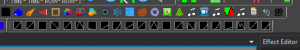
The effects can also be accessed via an optional toolbar. Under View -> Toolbars, select Effects and ensure it is checked. It will look something like the following and can be customized to have labels or not.

Now that you have some familiarity with how to access the effects, lets add a basic effect to our Arch. From either the Toolbar, or the Effect window, click and drage the Set Level effect onto the row for the Arch in the Timeline. You can place it anywhere in the visible space under the Time Ruler. It will create a 2 second long effect that sets the Arch to a white color. The effect should be selected by default as indicated by a dotted line around it. If it is not selected, there will be a solid black line around it. If it is not selected, just click on the effect and it will be selected.

After dropping the effect, your window should look something like the following.

The Effect Editor allows you to change the settings of how the effect behaves. It allows you to edit the selected effects behavior. The Set Level is the most basic of effects, so it only has two settings. The color and the intesity. Use the slider to change the intensity. It varies from 0 - 100 percent. If you set it to 50 percent, you will see the white bar for the effect change in brightness to reflect the lower intensity. As you drag the slider, a tooltip will indicate the value it is set to. To change the color, double click on the the white square in the Effect Editor. A color picker window will appear and allow you to select the color you want. Since this is a pixel prop, any color is available. There are presets for the common RGBW colors, or you can enter RGB or HSV values. You can also use the color box to select with your mouse. Once you select Ok, you new color will be reflected in the color square and the effect will render and show the new color as well. If you want more information on the effect, you can click the question mark icon or the More Info link in the Effect Editor. It will navigate you to the proper section in the online documentation.
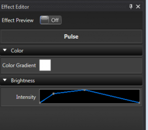
Add a Pulse
Lets add another effect. This time drag the Pulse effect onto the timeline somewhere after the Set Level. It looks similar to the Set Level, but this effect allows you to change the intensity and/or the color over the span of the effect. You will notice that the Effect Editor has some different controls for this effect. The editor adapts the controls based on the type of effect selected.

For this effect, the Intensity control is now a rectangle with a diagonal line on it. This indicates the effect will ramp up from 0 to 100 in intensity. You can see this reflected in the effect with the white color getting brigher along the time span of the effect. How the intensity behaves is controlled by what is called a Curve. There are two ways to edit the Curve. The most convienient is the Inline Curve Editor that you see in the Effect Editor. For this example, hover your mouse over the top right side of the diagonal line where it meets the edge. There is a dot there indicating the 100 percent point. When you hover over it, it will change to a cross cursor, and you can click and drag it down. Drag it down along the right edge to about half way. Again you will see a tooltip indicating the coordinates of the point. For this example you are looking for something near 100, 50. The 100 is the position in time, and the 50 is the intensity value. The diagonal line will follow your drag motions. Once you release the mouse the effect will render and you will see the the ending intensity of the effect is now lower. There can be many points across the curve to give it infinite shapes. Curves are very powerful for shaping the behaviors of effects. They are common across most of the effects. See the section on Curves for more information.
The color on this effect is more complex than the simple color of the Set Level. It can change color over time much like the Intensity can be varied with the Curve. Set the section on Color Gradients and the Inline Gradient Editor for more information on how it works.
Play Preview
Now that you have added an effect, you want to see what it looks like in the Preview window. If you created the Preview in the earlier part of getting started, you will have another window open that has your scene displayed. Click the Play icon in the sequencer toolbar and the sequence should begin playing. You will see a green caret and a vertical line moving across the Timeline showing the progress as it plays. Once the play position gets to the first effect, you should begin to see your Arch light up in the Preview window. You can visualize the differences in the behaviors of the two effects. Once you get past the two effects, you can click the Stop icon in the toolbar to stop the playback. You can also use the space bar to start and stop playback.
Adding Audio
You will likley want to set your sequence to some music. It is easy to add an Audio track to the sequence to align your effects to. Vixen can play most of the common audio formats. To add an audio track, click Tools -> Audio -> Associate Audio. A dialog will appear to navigate to the location of the audio track. Select the audio track you want to use and click Ok. The sequencer will copy the audio file into the Profile and load it in the sequence. You will see the Waveform of the audio track rendered above the Timeline Ruler. Now when you play your sequence you will hear the audio track play and the play indicator will follow the location in the music track. By default Vixen uses the default audio output device. If you need to switch it to another device you can by clicking the speaker icon in the toolbar. A drop down will present a list of devices to choose from.
Congratulations. You have created your first basic sequence and watched it play. See the section on the Sequencer for more info on how to use it. There are many powerful tools to enable your creative side to build great sequences.
1.6 - Controller Setup
Overview
Hopefully by now you have made your first sequence and seen the visulaization of it play on a basic prop. You can create entire sequences and a whole show to visualize without ever needing to setup any controllers. But at some point you will want to see your hard work on some real props. At that point you will need to setup some controllers and connect your Props to the controlers. This is done by a process called patching.
Display Setup
The Display Setup screen is where the details of the controllers are managed. A bit of back history is relavent here. In past versions of Vixen, the Display setup is where you would have started. You would create your Props here first instead of in the Preview like the getting started guide demonstrated. You would create all the Props, and then have to go to the Preview and link them together. As time went along we realized that it was more efficient to combine that creation and linking process into a more seemless step. You can still do things the old way and you may see many references or videos showing that older method.
From the main screen, click the Setup Display button to open the window. On the left you will see the the familiar list of your Props in the tree layout. In the middle is information on the patching. The section on the right is where the controllers are configured. For this example we will assume you are using one of the common SACN e1.31 controllers commonly used for pixels. See Streaming ACN for more information on this protocol.
Add Controller
In the right hand column under controllers there is a drop down box to select the type of controller. Choose Streaming ACN (e.131) and click the green plus icon next to it. You will be prompted for a name. Choose something that will help you identify what this controller is used for, Click Ok. The next dialog will ask you for the number of outputs on this controller. This is the channel count you will be using. Each pixel typically uses 3 channels. One for each of the RGB colors. In our case of the ARch, we know we have 25 pixels, so 25 * 3 equals 75 channels needed. You may be using many Props on the same controller, so your channel count will need to reflect your needs. Try not to over allocate beyond what you need to use even if the controller suppports more. You can always come back and adjust the number of channels later.
You now have a controller in the list on the right hand column. You can click the plus in front of it to expand and see the number of channels/outputs. The next step is to configure the universes. Select the controller and click the gear icon at the bottom of the column. You will be presented with the universe confguration screen.
This will need to match your controller setup. In this case we will assume you are using universe 1, our prop starts on channel 1 and we are going to have just 75 channels to match our Arch. Change the 510 in the last column to 75. Click the green plus at the bottom and set the IP Address of the controller. You should see something similar to this.

If it looks right, then click Ok. If you now expand the plus in front of the controller you will see the universes mapped to the outputs. The dots will be grey indicated nothing is patched to them.

Now I want to patch my Arch to this controller. I select the Arch in the left column and the controller in the right column. In the middle section I now see I have 75 total patch points on the selected elements (Arch Prop) and 75 outputs on the selected controller, so everything matches. The big Patch button is enabled in the bottom of the middle section and it indicates it is going to patch 75 element patch points to 75 controller outputs.

Click the Patch button. It will prompt a dialog indicating the patch details. Now if I expand my Arch, and the controller I see all green dots indicating they are connected.

Click Ok on display setup and then you can play your sequence. If all is properly confgured on the controller, you should see lights working when the effects are played.
Another Example
The above was a very basic example. In reality you will have many more Props and a more complex controller setup. See the e682 example for a more complex setup with controller screen shots. Some of the Vixen screns are from older versions without the dark styling, but the concepts are all the same.
Further Reading
See the section on Patching Setup for more in depth details about the patching process and the tools available to help.
1.7 - Support
See the Community page for information on how to get additional support beyond these pages. There is a robust community of avid Vixen users that are willing to help.
2 - Concepts
Overview
Vixen is quite a paradigm shift from the legacy sequencers in the way the lighting concepts come together. In other software(including Vixen 2.x), it’s normally a case of setting up your controllers, and then you have a list of numbered outputs that you can use to sequence on; that is, you’re sequencing directly against the outputs/channels for the controller. However, in Vixen, these ideas have been broken down into two distinct areas: the physical components of your display (ie. the controllers and their outputs), and the logical or abstract components of your display (eg. the items or props or fixtures that you have). Additionally, because the design has been broken into these two parts, there’s another important component to it: how they actually connect up (eg. how the items/fixtures relate to the controllers and outputs). These three components are called Controllers and Outputs (for the physical components); Elements and Groups (for the logical or abstract components); and Patching (to define how elements are connected to Controllers/Outputs).
2.1 - Display Elements and Groups
Overview
Elements are the building blocks to modeling a Prop in Vixen 3. The purpose is to be able to model how a display is set up, and not be concerned with the physical realities of the hardware, controllers, channel numbers, etc. To assist in this, elements can be nested into groups to associate common elements to model a physical Prop. These groups are critical for some of the advanced sequencing tools, later on.
The general intent for the development and creation of elements is that it should represent or model something in your display. (e.g. an item, or fixture, or prop) If you have elements that you’re naming things like Renard-37, Channel-21, Tree-1-Red lights, then you’re going about it the wrong way.
Elements are the entry point for data into the Vixen system. For example, when sequencing a song, the user would sequence data against the elements and groups in their configuration. When playing back the sequence, the effect is applied to one or a group of elements and then it is processed through to the to the appropriate controller in a way that abstracts the details from the user.
Example
For example, a Megatree item in a display might be defined as a group called Megatree, with 16 elements inside it: Megatree-1 through to Megatree-16 that represent the 16 strings of lights around the tree. If those strings are pixels, then there might be 50 other elements nested within each string that represent each pixel. Or, a display might have multiple shrubs/bushes around a garden: 4 on the left, 8 in the middle, and 4 on the right. A user might decide to group each set of shrubs into one group (eg. Shrubs-Left, Shrubs-Middle, Shrubs-Right), and then group those 3 into another group called Shrubs. This allows effects to be used on all shrubs or just one area very easily. The idea is to apply effects at the highest level items that represent things we know, not the elements of the physical lights.
Properties
Elements and groups also have the ability for extra Properties to be defined and configured for each element or group. The intent of a Property is to give the user some way to provide extra information about that element in the display. This information will be used by the effects in the sequences. A color handling property can be used to restrict effects on that element to a certain range of colors. Or, a Position property, can represent the position of elements in their display. Some of these are configured by the user on setup, and others get created as part of another setup process. The Position properties are generally set automatically by the preview when it is configured and based on the location of elements in relation to each other.
2.2 - Color and Brightness
Overview
Color and brightness are handled a bit differently in Vixen 3. To understand the color system in Vixen 3, you need to know a little bit about color models.
RGB (Red Green Blue)
The RGB (Red, Green, Blue) color model is the most well known and is what is used most commonly in other sequencers. It defines a color space in terms of three components:
- Red, which ranges from 0-255
- Green, which ranges from 0-255
- Blue, which ranges from 0-255
The RGB color model is an additive one. In other words, Red, Green and Blue values (known as the three primary colors) are combined to reproduce other colors. For example, the color “Red” can be represented as [R=255, G=0, B=0], “Violet” as [R=238, G=130, B=238], etc.
Its common graphic representation is the following image:

HSB (HSV) color space
The HSB (Hue, Saturation, Brightness) color model defines a color space in terms of three constituent components:
- Hue : the color type (such as red, blue, or yellow).
- Ranges from 0 to 360° in most applications. (each value corresponds to one color : 0 is red, 45 is a shade of orange and 55 is a shade of yellow).
- Saturation : the intensity of the color.
- Ranges from 0 to 100% (0 means no color, that is a shade of grey between black and white; 100 means intense color). Also sometimes called the ‘purity’ by analogy to the colorimetric quantities excitation purity.
- Brightness (or Value) : the brightness of the color.
- Ranges from 0 to 100% (0 is always black; depending on the saturation, 100 is the brightest version of the color in the given hue and saturation.).
Its common graphic representation is the following image:

The HSB model is also known as HSV (Hue, Saturation, Value) model. The HSV model was created in 1978 by Alvy Ray Smith. It is a nonlinear transformation of the RGB color space. In other words, color is not defined as a simple combination (addition/substraction) of primary colors but as a mathematical transformation.
Note: HSV and HSB are the same, but HSL is different. HSL and other color models are beyond the scope of this document and will not be explained here.
Color Models and Light Sequencers
As mentioned earlier, most sequencers other than Vixen 3 use the RGB color model. While this corresponds conveniently with most basic RGB lighting devices, it’s not particularly convenient for actually working with color and brightness transitions in lighting design. For lighting applications, the HSV color model is a more suitable system for conceptually working with color and brightness. It is actually more useful to think about color and to interact with it using the parameters of the HSV system. For example, in the RGB color model, if you wanted to make the lights brighter, you would have to take all three values and increase them proportionally. In the HSV model, you would just increase the V value. Similarly, if you want to make a color more or less vibrant, you would increase or decrease the saturation.
Of the 3 parts of a HSV color, only two parts describe the color: the Hue and Saturation. The Value describes how bright the color is. In vixen 3, the Hue and Saturation are controlled by the color controls (color picker or gradient editor). This describes the color itself. The Value is always tied to the brightness controls (intensity or curve). This is how bright the light is.
You’ll notice in the color picker, that the V is always 100. You can only choose the full brightness version of any given color. This is often a point of confusion with users who are used to other sequencers. If you want to adjust the intensity, you don’t use the color picker. That is done using the intensity controls. For example, if you wanted to create a dark green color, you might be familiar with using like RGB values 17, 130, 41. This translates to a Hue of 133, Saturation of 87 and a Value of 51. The value will always be 100 on the Vixen 3 color picker. Vixen will automatically correct this to 100, and you will see your RGB values change to 33, 255, 80. This looks like a bright green. There’s nothing wrong here, this is how it is designed to work. To get that dark green, you then need to set the intensity (or curve, depending on the effect) to 51.
Colors and Gradients
The word Color is used to refer to a color that doesn’t change over time. Colors that change over time are referred to as Gradients. Gradients contain one or more colors, and the timing relationship of when the colors change. The time relationship is not absolute. It is a percentage relative to the length of the effect.
Intensity and Curves
Similar to the concept of colors and gradients above; an intensity is a fixed brightness value. A Curve is a change in brightness over time. The time relationship is not absolute. It is a percentage relative to the length of the effect.
*Color model explanations and imagery from colorizer.org.
2.3 - Element Color Types
Overview
It’s a common misconception that Vixen 3 is for RGB (Pixel) lights. It is true that it’s very easy to sequence RGB lights in Vixen 3, but it’s also a great sequencer for standard Christmas lights as well. When creating your elements, you’ll need to define what kind of lights that element consists of. If you don’t configure the Color Handling, which creates the color properties, that element is assumed to be full RGB. The different types of lights are as follows:
Single Color (Discrete Color)
A single color string is usually a traditional strand of single color Christmas lights. It could also be a floodlight, or other special light that can only be one color. When configuring the Color handling for an element, you’ll need to choose what color that light actually is.
When creating effects for a single color element, you will only be able to choose the one specific color that you’ve defined for this element. They will be shown in the timeline in this color. They will also appear in this color in the preview. Generally the Basic Effects category will be the effects used on these types of elements.
Multiple Independent Colors (Discrete colors)
This is a way to use multiple single color channels as one element. This is commonly used for mini-trees or super strings made from multiple strands of single color lights where each colored string is plugged into a different controller channel. If you have an element that consists of a string of red lights, a string of green lights, and a string of white lights, this is the appropriate option to choose. This differs from RGB in that the colors don’t actually mix. If you turn on red and green, you wouldn’t see yellow, you would see red and green. When choosing this option, you’ll need to define what colors the individual lights are for this element.
Whenever you are selecting colors for basic effects on an element defined as multiple independent colors, you will only be able to choose the colors that this device supports. You may chose more than one color at a time. You will see the effect in the timeline with the separate colors you chose, they will not appear as mixed colors. In the preview, these elements will appear as separate side by side strings for each color. Generally the Basic Effects category will be the effects used on these types of elements.
RGB (Full Color)
This is used for a light that has multiple color components which mix to form secondary colors. This can be pixels, dumb RGB strings, RGB floodlights or similar devices. An RGB device is a full color-mixing device. Unlike the discrete color option, if you turn on the red and green channel, you will see yellow.
When selecting colors for effects on RGB type elements, you will be able to choose any color and it will be shown in the timeline as that color. These elements will render in full color in the preview. This opens the door to the Pixel Categories of effects.
2.4 - Color Gradients
Overview
Color gradients are a way of representing color over time in Vixen. Instead of having a single color, you can create colors with transitions in them that shift from one color to another. Multiple colors can be included in a gradient and you can shape via the editor the points which the colors transition from one to another. Many of the effects are then able to take advantage of this and provide features that change the color over time.
Color Points
Each Color Gradient will have one or more color points. Each color point defines what the color is at a point within the gradient. Color Gradients with more than one color point will have a transistion zone between the color points where the gradient moves from one color to the other. In between the colors there is a weighting point. When the weight point is in the middle of the two colors they will transition evenly. But if it is moved toward one color or the other, the weight of the transition will shift to favor the color the point is closest to.
Editor
The Color Gradient editor allows you to edit the color and color points in a gradient. Within the editor you can add color points and set where they lie. You can adjust the weight between them with the location dot. A simple interface into the library is available to save and load gradients. Library gradients can be edited by loading them from the library.
Library
Color Gradients may be named and saved to a library so they can be reused without havign to recreate them each time.
2.5 - Controllers
Overview
Controllers are the actual objects that send data out of the computer, in a specific format and transport method to real hardware in your yard. After you’ve defined your elements on a high level, you’ll need to set up at least one controller to output data to the real world. You’ll need one controller for each output of your computer. There are different kinds of controller modules that correspond with real world hardware. For example, the “Open DMX Output” controller will output one universe of DMX data using the protocol designed for the Enttec Open DMX based hardware dongle.
Configuration
When you configure a controller, you need to first specify the type. There are several supported output types that correspond with various real world hardware. After defining the controller, you need to tell it how many channels it will have. This needs to be the sum of all of the individual output channels of all actual devices connected to that port. Most controllers also have some other information specific to that device that also needs to be defined. For a Renard, it would be the Com Port, and Baud Rate; for sACN, it’s the universes and addressing. Some controller types have no configurable parameters, the Open DMX Output is one example. It doesn’t use a com port, and it has a fixed output size of 512 channels.
One common mistake is for users to define multiple controllers when you should only be using one. Many hardware systems use a common data bus where data leaves the computer from one port and then travels down a data wire in and out of several controllers in a daisy chain configuration. The Renard protocol is a good example of this. If you have a chain of Renards (regardless of type) that all connect to a computer at a single port, you need to define only one controller for that whole chain. DMX, sACN, ArtNet are also common examples of controllers that share a data bus.
On the other hand, if you have two Renard (or DMX, etc) wires connected to different ports on your computer, you need to define one controller for each data connection. Each may have it’s own number of channels, and own configuration parameters (baud rate, etc).
While it’s beyond the scope of this article, it’s important to note that some hardware supports multiple protocols. For example, a Renard controller may be configured to run DMX firmware. In that case it’s a DMX device and needs to be configured using a DMX controller, not a Renard controller.
Similarly, there are protocol converters out there that convert from one protocol to another. For example, the sACN to DMX/Renard bridge will take data in on the sACN protocol via ethernet, and convert and output that data in Renard or DMX formats. In this case, you would need to define the controller as a sACN controller in Vixen. Vixen doesn’t care what happens to the data downstream once it leaves the computer.
Another common mistake is to configure all the channels your controller can technically handle. This occurs with e1.31 controllers that can support thousands of channels. If you are only using 500 channels of the 2000 your controller supports, you only need to configure the 500 channels in Vixen. You can always change the count later on as your display expands.
2.6 - Curves
Overview
Curves are a way to represent change over time. There are many uses for Curves in Vixen from controlling the dimming of the outputs to how parameters change over time in the effects.
Editor
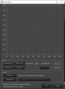
The curve editor allows you to define how a parameter changes over time. The most common place you see curves is for intensity. The Pulse effect is a key example where this is used. To create a ramp effect, the curve will be a diagonal line from the lower left to the upper right. To create a ramp down, the curve is reversed. Additional points can be added to the curve to change how it acts. The points can be dragged to the proper place, or the actual values can be edited.
Curves can also be used for non-intensity parameters as well. One example of this is the movement curve in the Chase Effect. In this case, the curve defines the motion of the chase where the Y axis represents the chase position over the Z axis which is relative time.
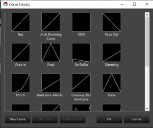
Once you are happy with a custom curve, you can save it to a the library and link it to other effects so they can look the same. The curve library can be edited from within the effect editor or from the Tools menu in the main sequencer window.
Since the 3.4 releases the curves can now be edited directly in the effect editor without needing to launch the full dialog curve editor. Basic adjustments can be made here to quickly shape a curve. If needed final adjustments can then be made in the full dialog editor. See Effect Editor
The full curve editor supports many features. There are buttons to reverse a curve, invert a curve, free hand draw and use a mathematical function to generate one. There are also key mouse combinations that allow a curve to be adjusted. Holding the Shift Key and click dragging a point on the line will convert it to a flat line curve. It can be freely moved up and down to any point on the graph. This mimics functionality in the inline curve editor.
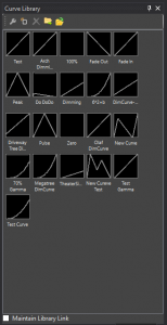
Curve Library
The Curve library can be accessed in several ways from the Sequence Editor.
- Tools -> Curve Editor This bring up a dialog window with the Curve library and allows new curves to be added and existing ones to be edited or deleted.
- View -> Curve Library Window This opens a docking window that can be placed in docked locations in the editor. This allows the same features as above, but you can also drag them out and drop them on effects. You can also import/export the library to share between profiles or others.
- Toolbar By right clicking in the toolbar you can add other toolbars such as the curve library. The toolbar has the same features as the docker window. The features can be accessed by right clicking on the toolbar to bring up the menu.
2.7 - Filters and Patching
Overview
Patching is the idea used to tell Vixen how a element relates to an output. In a simple setup, a user might have 12 mini-trees, and a single Renard to control them. They might patch each mini-tree channel directly 1:1 to a corresponding output on the Renard. This is a simple use case, and is the equivalent to the way Vixen 2.x works: a direct 1:1 correlation between elements that the user sequences with and the outputs from the controller.
However, in a more complicated setup, there may not be 1:1 mappings. For example, say the user has a large tree that has been wrapped in 8 strings of lights, and they have each string on a different output on a controller. If they wanted to treat the tree as one single object (eg. not control each string individually), they can map the one “Tree” element to the 8 controller outputs that correspond to the strings.
Filters
In this patching system we have also introduced the concept of ‘filters’ which can be inserted in the path from elements to controller outputs. Filters are intended to take data in, manipulate it in some way, and then output the data. For example, a simple filter might be a dimming curve. The Dimming Curve filter has a single input and a single output. It transforms the intensity value of any lighting data it gets according to a user-configured curve. It wouldn’t affect the data in any other way, or doesn’t distinguish between multiple pieces of data coming in: for example, if there are two lighting values that come in at the same time, it transforms them independently, then outputs the two lighting values.
A more complex filter might be the Color Breakdown filter. This can be configured to take any given lighting value, and split up the data based on the color component of the lighting value. It will then output the broken-down values on independent filter outputs. For example, a common example would be an RGB breakdown filter. The filter would be configured with 3 components: pure red, green and blue and when it gets a lighting value, it would split it up into the red part, green part, and blue part, and output those (component) lighting values on the 3 filter outputs.
Filters can also be stacked, so you could have a dimming curve (to adjust the intensity of all data), which then goes through a color breakdown filter to split it out suitable for a particular controller scheme.
Finally, there are other possibilities for filters that haven’t yet been implemented: for example, some DMX systems might control a movable lighting fixture with a 16-bit value for a movement axis. However, since DMX is 8-bits per channel, it combines two for the full 16 bits. A filter might be created which takes in a generic “movement” data item, and splits it into a 16-bit value, but on two separate outputs (for the high 8 bits and the low 8 bits). These might then be patched to the appropriate DMX channel.
One current limitation of the patching/filtering system is that any component, filter or outputs, can only have a single source item. That is, you can’t patch two different channels to a single output. This is scheduled to be changed, but is probably not that common a use case, so it may be a while until we get to it.
2.8 - Streaming ACN
Overview
Streaming ACN, also known by it’s abbreviation sACN or by its technical specification document number e1.31 is a lighting protocol that encapsulates DMX type data and sends it over a TCP/IP Ethernet network. It is an intermediate step between DMX based lighting controls, and full ACN based implementations. ACN (Architecture for Control Networks) is an extensible suite of protocols that can be used to control all varieties of devices used in live production networks. Since a full transition to ACN is a major paradigm shift, sACN was created that operates within an ACN network and uses familiar concepts from the DMX standard that has been in common use for decades. DMX defined the electrical signaling as well as the data format. Only the concepts of channels and universe and a loose guideline for timing is carried forward from DMX to sACN.
Universes and Channels
In DMX, only 512 channels of data could be carried on a DMX cable. This was a limit based on the balance of data rate, distance requirements, multidrop topology and refresh rate. With all of those factors considered, 512 channels was defined as the standard number of channels in a universe. As shows grew, and designers needed more than 512 channels to control a show, it became necessary to implement multiple independent DMX networks. While not part of the standard, the term universe became the standard term to refer to each separate DMX network. In the DMX world, every group of 512 channels was its own physical network and this network was called a universe.
Ethernet networking has far greater capacity for bandwidth and routing. In fact, the bandwidth of the network has no defined limit in Ethernet networking. Faster and faster links continue to be invented and come into common use. Ten years ago, 100BaseT was common. Now 1000BaseT and even 10GBaseT are becoming more and more common. So there is no need to limit the number of channels transmitted on an Ethernet network. However, to maintain backwards compatibility, and to make it easy for hardware developers to implement new transitional devices, the 512 channel per universe limit was kept. But you can now send many universes on the same wire. sACN currently allows 63,999 universes on a network. This doesn’t mean this will work on a 10Mbps network. But you can get pretty close on a 1000Mbps network.
Addressing
Many people get tripped up over Universe/Channel addressing. It’s actually quite simple. Channels are grouped into universes and universes are numbered. You can think of it similar to postal addresses. The channel is like the house number, and the universe is like the street name. You can have a 101 First street, and a 101 Second street and the proper mail will get to the right houses.
A universe can have any number of channels in it from 1 to 512. But each universe always starts at channel 1. If you only have 50 channels to send, you can have a universe send only channels 1-50. But you cannot send only 51-100. (why would you want to?)
Why do I see the number 510 or 170?
Pixels or RGB elements take 3 channels to communicate the data for the Red, Green and Blue parts of the color. If you have 10 pixels, you need 30 channels.
512 does not evenly divide by 3. 512 = 170 1/3. So you can only fit 170 full pixels into a universe with 2 channels left over. 510 channels is 170 pixels worth of data. Earlier models of pixel controllers did not bridge this gap across universes and required you to contain full pixels within a universe. This is becoming less common on newer hardware designs. It’s important to know which universe size your hardware supports when configuring the sACN universe outputs.
Multicast Vs Unicast
ACN is designed to be a minimal configuration control protocol. It is intended that the show controller (the computer) just puts the data out onto the network, and the receivers see everything and get configured to use only what they need. For this reason, multicast networking makes the most sense. Multicast is a mechanism where the sender transmits the data, and the receivers see the available data and use it.
Multicast is a network assisted technology that relies on the network to manage which devices want the information and which don’t care. It is backwards compatible with networks that have no specific multicast support. But in these environments, since there is no assistance at the network level, every device gets all of the data. This can easily result in a network that gets very congested. It also tends to overwhelm many simple hardware receivers because they must inspect each packet of data to determine if it should use it or not.
This network guided delivery of data relies on a standard networking protocol called IGMP (Internet Group Management Protocol). This is a system where listeners who are interested in a stream will subscribe to the group. The switches then forward the traffic to only the switch ports where there are subscribers. In the context of sACN, the groups correspond with a particular universe. For this to work, you need network switches and routers that support multicast routing and/or IGMP snooping. In general this is not a feature found on home networking equipment. It’s found on managed or smart switches.
Because many people use low end networking equipment, especially in the early days of sACN adoption, The sACN standard also allows for unicast transmission of the data. Basically, the standard says that while multicast is preferred, receivers must process any data that gets to it. This helps to reduce network flooding on networks without proper multicast support.
It’s a myth that you can send more universes using unicast than you can by multicast. When the network is doing its job, and all devices are following the rules, the traffic is the same in both cases. It can even be less with multicast, because if more than one controller is getting the same universe data, only one packet is sent to the whole network, not one per device. The unicast is better myth started in the DIY Christmas Lighting hobby. The early model pixel controllers didn’t properly implement IGMP subscriptions, so it looked like it didn’t work anyhow. And these same devices had to employ other means to cope with the overload of data coming in the ports. So there were artificial restrictions placed on it that were safe amounts of data the controller could handle without overload.
sACN over WiFi
When using WiFi as a link for your sACN data, multicast is always better because of the physical nature of wifi being a broadcast medium. There’s no magical network switching happening in mid air. Multicast also bypasses certain physical layer data integrity checks in 802.11 WiFi. WiFi makes assumptions in the fundamental design that it’s more important for data to arrive without errors than it is for it to arrive on time. While that’s true for most general purpose internet traffic, that’s not the case for live show realtime data. For our applications, its more important that the data arrive on time, than arrive correct. If it had to retry because there were data errors, it would be too late anyhow. So it’s better that data gets dropped than for it to arrive late. That’s what happens in multicast over WiFi. Unicast on the other hand will retry a few times until it knows the receiving device got the data and got it correctly. This will usually be seen as irregularly lagging transitions on your lights.
Optimizing the stream
While the specification doesn’t give a hard and fast timing for how often a universe should be refreshed, it will never be more than 44 times per second, which is the maximum speed allowed in the old DMX standard. It is typically much lower though - often corresponding on the frame rate of your sequencing or lighting software. Vixen 3 defaults at a 50ms interval which corresponds to 20 frames per second. Like DMX, sACN is designed to be a streaming format where all the data keeps getting resent over and over regardless of whether it’s changed. If a light didn’t get the message right the first time, it’ll have another chance 50 milliseconds later.
In contrast, if you’re familiar with Light O Rama, you may have experienced stuck effects. LOR is not a streaming format. It’s a state change protocol. It sends instructional commands that tell the lights what to do over what period of time. If one message is missed, the light doesn’t change. DMX (and sACN) do not have this problem because they keep repeating what all lights should be doing at every given moment.
But you can probably imagine, that sending the same data over and over ad infinitum is a whole lot of unnecessary data. Especially when you consider that many lights aren’t changing for reasonable periods of time even in an active show. As mentioned earlier, there’s no minimum refresh timing in sACN. The specification further gives the receiving device the discretion to determine what duration means that there’s no more data coming and the source is inactive. Though it’s generally accepted that you should get at least one frame of data per minute for the source to be considered alive. Furthermore, the specification allows the receiving device to decide what to do when it determines that there’s no active data. It could shut everything off, or turn it on to a predetermined level, or execute some internal program. Or it could leave everything at the level it was last set.
You probably get the comments that you must have a high electric bill with all those lights. But you probably also know that by blinking the lights, they’re off more than they’re on and the electric bill isn’t that bad. The same line of thought follows with the network traffic. If you’re going a few seconds at a time without changing a value, why resend it constantly.
Vixen has two parameters on the advanced tab for Streaming ACN controllers. The first value is the number of times it will keep sending a frame of data that hasn’t changed. This makes sure that the lights are at the values they should be before taking a break in the data stream. For example, if you set this value to 10 and the sequence turns everything on for 5 seconds, it will send the frame for all on 10 times (at 50ms intervals) and then stop sending frames and sleep until something changes. this makes sure that all the lights had a chance to get the data and catch up before stopping the stream. If this value is set to zero (default), the output will not sleep and keep sending data at the normal refresh interval.
The second setting is a keep-alive. This is the number of frames it’s allowed to skip during sleeping periods. If the first setting is 10, and the second is 40, it will keep sending that unchanged data for 10 frames, then wait for 40 frames, then send it once and wait another 40 or resume whenever something changes. This setting keeps a refresh packet going out at regular intervals regardless of change. It will keep controllers awake and in sync. When the repeat value above is 0, this keep-alive value has no effect. When the keep alive is 0, it will not send the periodic frame and will continue sleeping
When used together, these two settings can drastically reduce network traffic while still keeping all of the relevant data going to the controllers. You may want to have the repeat value set higher for WiFi controllers than you would for wired ones. Most if not all of the pixel controllers currently in the DIY Christmas hobby hold their last received values indefinitely. This means the keep-alive value can be safely set rather high. A value of 99 represents about 5 seconds at the default interval rate. If the chance of stray data is low, it’s safe to let long periods of time go by without sending a refresh frame. Again, with WiFi, you may want to send this more frequently just in case some stray data leaves a channel in the wrong state. The periodic refresh will bring it back where it should be.
2.9 - Glossary
Channel
The individually controllable outputs of a Controller.
Controller
A module that defines an specific hardware device or set of devices. The controler setup contains channel configuration, communications protocol, and how it’s connected to the show computer.
Curve
Intensity that changes over time. This is usually used to refer to a brightness value for an effect. The curve control shows brightness on the vertical Y axis and time on the horizontal X axis. Time is a percentage of the duration of the effect. It is not possible to define a curve in terms of absolute time, it is always relative to the effect duration.
Effect
An action on an element or group. Effects range from simple set level to more advanced like twinkle and chase. Effects can overlap in the sequencer. Some elements may only work with certain element types, and some effects may require a group of elements to be effective.
Element
The controllable display elements. These are the strings of lights or the individual pixels that make up your display. Examples of an element are: A candy cane controlled as one unit, or a minitree(RGB) or a string of lights. Elements can be grouped together for convienent manipulation (see Group) The horizontal tracks in the Sequencer where you assign effects to a display element. In the Preview, it is the element you see that responds to effects in the timeline.
Filter
An object inserted into the path between an element, and a controller channel that modifies, splits, or combines the information in some way.
Gradient
A gradient is a color that changes over time. It consists of one or more colors that are positioned horizontally along a timeline. Similar to a curve, the horizontal axis represents time, relative to the length of a given effect.
Group
A logical grouping of elements. This helps to organize elements into groups that are likely to be worked with together. Within the sequencer, effects can be applied to either elements, or groups. A level effect applied to a group, will affect all elements in that group. Groups may contain other groups. There is no limit to how deep groups can be nested.
Mark
A line in the sequencer that helps visualize certain notable timing points. Marks might be used to show the beat of the music, or to show other transition points in the song.
Module
A portion of the application that performs a specific task. Vixen 3 is built with a modular architecture to allow easy adding of new functionality by 3rd parties.
Output
Deprecated – we don’t talk about those anymore because it can mean too many things and just gets confusing!
Patch
A logical connection between Elements, Filters, and Controller Channels. A patch controls how information from an Element is routed through various filters and ultimately reaches the actual device being controlled.
Preview
The screen used as a virtual lighinting display. The preview allows you to play your sequence on virtualized hardware so you can see how it will look.
Program
A list of sequences. Used in the scheduler.
Property
Elements may be assigned properties to define additional information about the specific element. Certain effects may make use of these properties to perform special actions. Properties might be used to specify coordinates for image mapping or other future uses.
Scheduler
The tool used for setting up what to play, and when to play it. This tool allows you to define programs (aka playlists) and a schedule defining when the programs will play.
Sequence
A set of ordered actions and effects that will be performed on your Elements
Timed Sequence
A sequence that follows a timeline. These are most often used with music. Effects are assigned to groups and elements that happen at a certain point in time.
Sequencer
This is the tool that you use to create your timed sequence.
Timeline
The section of the sequencer located above the element effect workspace. It shows the position in time where you are working.
Treeview
Several configuration windows use a heirarchical view to show the oranizational relationship of groups and their members.
Waveform
The graphical representation of an audio file in the sequencer. By visually looking at the waveform, you can see the loud and soft points of the song, as well as identify the beat.
3 - Usage
3.1 - Setup and Configuration
Display Configuration Concepts
When setting up a light display with Vixen, there are certain configuration steps that must be taken to tell the software what elements and output controllers you will be using. Vixen separates the elements you have in your physical display from the outputs and controllers you use to run your display. You can work all year designing and sequencing a display and setup your outputs as you setup your physical display.
Elements
You can think of an element as an individually controlled item in your display. Examples of a single element is an incandescent or LED string of lights, multiple strings of lights you want to ALWAYS control as a single unit, a single node in an RGB pixel, or even a servo driven prop.
You’ll notice that we call a single pixel an element. In Vixen, all three colors are GROUPED into a single element based on filters (next section) so you can think of this RGB node as a single item. When you sequence this pixel later, you tell it you want it to be blue and it just is.
For a more in-depth discussion of Elements, see Display Elements & Groups.
Color Handling
Standard light strings (single color incandescent or LED strings, multi-color strings, etc.) are what Vixen calls “single color”. There are two ways to configure the color handling of these strings.
- Single Color: This is generically what Vixen calls a “standard” string of lights. A single string with all red lights or a single string with multi-colored lights are a both defined as a “single color” item.
- Multiple Colors: This selection is used when you have multiple light strings on a single prop in your display that are controlled separately. For example, a popular way to light mini-trees is to wrap them with red, green, blue and white strands of standard light strings but control each of the strings separately. This allows you to set the trees to any one of these colors (or some or all of the colors) at any time in your sequencing. In vixen, you define ONE ELEMENT and tell the software, by selecting this option, that this element is a set of multiple strings of lights. When sequencing, you select an effect and color (red fade for example) and just the red trees light automatically.
RGB strings are defined by choosing this filter. If you have a string of 50 RGB nodes, for example, you would select the string in the element tree and define the color handing as “Full RGB”. This tells each of the 50 nodes that there are 3 colors in EACH of the nodes (150 outputs total).
Controllers
Controllers define single outputs to your physical display. So, for example, if you have an element that is a single color string of lights, this string would be linked to an individual controller. As another example, if you had defined a string with 50 RGB pixel nodes and defined their color handling as RGB, you would link each of these elements to 3 output channels. Your 50 pixel RGB string would be linked to 150 output channels.
For more information, see Controllers.
3.1.1 - Element Setup
3.1.1.1 - Intelligent Fixture Wizard
Required Materials
Vixen’s support for intelligent fixtures (DMX moving heads) is based on giving Vixen detailed knowledge about your hardware. To perform this data entry you are going to need the User manual for your fixture that lists the functions your fixture supports and what channel(s) are associated with those functions.
Time Commitment
Expect to spend ~20 minutes defining your fixture profile.
Background
The Intelligent Fixture Wizard has two purposes:
- It creates fixture profiles. The fixture profile contains what functions the fixture supports and what channels are used for those functions.
- It creates Intelligent Fixture display elements and adds them to the display.
How to Start
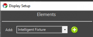
The Intelligent Fixture Wizard can be activated from the Display Setup. Select Intelligent Fixture from the Elements drop down and then select the Plus button.
Video Tutorials
3.1.1.1.1 - Select Profile
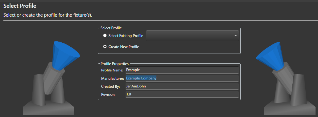
Select Profile Options
-
Select Existing Profile - If you have already created a Profile for your fixture you could select it here. The drop down shows all fixtures installed into the active Vixen profile. The fixture profiles are stored within the Vixen profile. Note in the future users may be able to download fixture profiles from the Vixen website that other users have submitted.
-
Create New Profile - The default is to create a new fixture profile. The fixture profiles are stored within your overall Vixen profile.
Profile Properties
-
Profile Name - Name of the intelligent fixture profile. For new fixture enter a unique name. This name is used as the fixture profile filename.
-
Manufacturer - Optional name of the manufacturer of the fixture hardware.
-
Created By - This read-only field is determined by the Windows login name.
-
Revision - Field for keeping track of updates to the profile definition. Refer to Persistance Note below for implications of updating a profile. If the profile is being updated consider incrementing the Revision number.
Persistance Note
If the Profile Name is changed it is effectively as ‘Save As’’ like operation as the existing profile is not modified. If anything is changed in a profile, only newly created fixtures will receive the changes. Existing fixtures are NOT impacted by the changes and if desired will need to be updated via their Intelligent Fixture property.
Select the Next button to continue to configure your intelligent fixture.
Video Tutorials
3.1.1.1.2 - Edit Functions
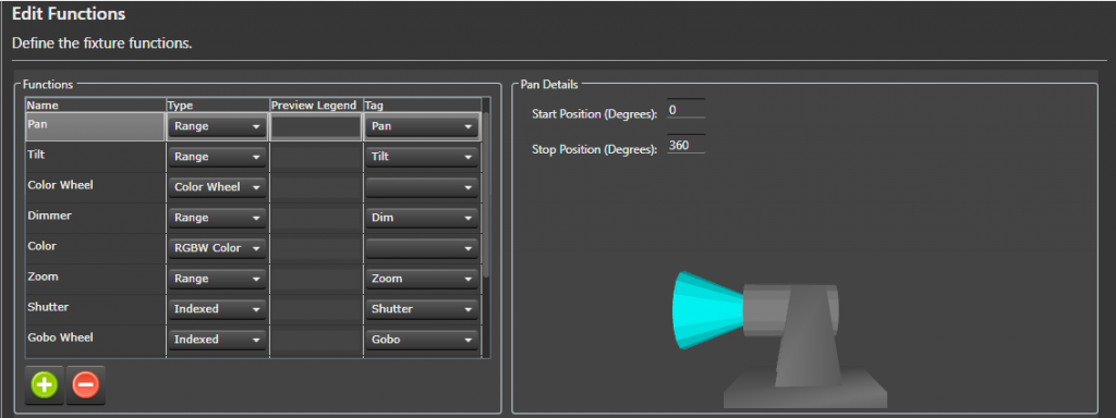
Background
This wizard page (Edit Functions) and the Edit Channels wizard page define the majority of the fixture. Vixen comes with a number of built in functions to make this data entry task easier. This page defines the functions that will be assigned to channels on the next wizard page (Edit Channels). The name of each function needs to be unique. Note the names of the predefined functions can be changed to better match your fixture’s user manual.
What is a Tag?
The Vixen Intelligent Fixture support was designed to allow users to input their fixture channel map information in verbatim. There are areas of the Vixen Intelligent Fixture support where Vixen needs to know what certain fixture function do. These areas include the Preview, Effects and automating the handling of certain functions like shutter. The Fixture Profile uses a tag to give the software the necessary knowledge about the functions. There is tagging at the function level but there is also tagging for index values. Many of the built in functions are already assigned a tag.
What Do I Do On This Wizard Page?
Look over your fixture user manual and make sure all your fixture functions are defined on this page.
Note is possible to navigate back and forth between the Edit Functions and Edit Channels wizard pages if you find you need to add an additional function.
Select the Plus  button to add additional fixture functions.
Some of the functions require additional details which appear in the details pane to the right.
Create New Function
- Select the Plus button to add a new function.
- Give the function a unique name.
- Assign the function a type (Range, Indexed, Color Wheel, RGB Color, RGBW Color, None).
- (Optionally) assign a Preview Legend. The preview legend is displayed below the fixture with corresponding DMX value assigned to the channel. This feature can be useful for debugging problems.
- Optionally assign a Tag to the function. See ‘What is a Tag’’ section above for more information.
Assigning Function Details
There are twelve built in functions. The following sections describe each built in function and what configuration is still required. The functions in the fixture profile are NOT ordered. If your fixture does not support one of these built in functions there is no harm in leaving them in the profile. If there is any doubt if a function might be applicable to your fixture leave it in the list to save data entry. These built-in functions are properly tagged to maximize support with the Vixen Intelligent Fixture sequencing effects.
- Pan Function - Input the range of motion the fixture supports when panning. This value helps ensure the Preview matches the movement of the actual hardware. The Start position defines the resting position of the fixture. The stop position defines the maximum range of movement.
- Tilt Function - Input the range of motion the fixture supports when tilting. This value helps ensure the Preview matches the movement of the actual hardware. The Start position defines the resting position of the fixture. The stop position defines the maximum range of movement.
-
Color Wheel - Defines the colors that the fixture supports. This function may not be applicable to color mixing fixtures.
- Select the Plus button to add a new color wheel entry.
- Enter a unique name for the color wheel entry.
- Enter the DMX start value for the color.
- Enter the DMX stop value for the color.
- (Optionally) select if the entry should be controlled via a curve. Example: select Use Curve when the manual shows a range of DMX values that spin the color wheel.
- (Optionally) select the Half Stop option if the entry is half way between two colors on the color wheel. Note the colors will automatically populated for this entry.
- Select the … button to assign the color.
- Select the Exclude Color Property option to exclude the color entry from the color property associated with the element. This option should be selected for colors like CTB and UV.
- Select the Plus
- Zoom Function - Indicate whether the fixture zooms from a narrow beam to a wide beam or vice-versa.
-
Shutter Function - Defines a function for controlling the fixture’s shutter position.
- Select the Plus button to add a new index entry.
- Enter a unique name for the index entry.
- Optionally select Use Curve for entries that define a strobing rate.
- Enter the DMX start value for the index entry.
- Enter the DMX stop value for the index entry.
- Tag the entry if the entry open or closes the shutter. This tagging allows Vixen to automatically control the shutter when color is applied to the fixture.
- Select the Plus
-
Gobo Function - Defines a function for selecting gobos.
- Select the Plus button to add a new gobo entry.
- Enter a unique name for the gobo entry.
- Optionally select the Use Curve for entries that spin the gobo wheel or define a range where the user should select a specific value.
- Enter the DMX start value for the gobo entry.
- Enter the DMX stop value for the gobo entry.
- Optionally select an Image for the gobo entry. The image is displayed on the timeline for Gobo effect. Gobo images are stored in the Vixen profile at \Fixtures\Images. Select the Import Gobo Images button to copy images to this folder.
- Select the Plus
-
Open Close Prism Function - This fixture function may not be mainstream but is similar to a shutter function in that it applies a prism or removes the prism. For fixtures that support this function it is typical to have one index entry that applies the prism and another entry to remove the prism. If the entries are tagged Vixen will automatically apply the prism if a prism is selected via another function.
- The entry that applies the prism should be tagged Prism Open.
- The entry that remove the prism should be tagged Prism Close.
Associated Prism Function - This drop down allows the user to select the associated Prism function that is being opened and closed. This field is critical when the fixture contains more than one prism function that can be opened and closed.
-
Prism Function - Defines a function for placing a prism into the beam of light.
- Select the Plus button to add a new prism entry.
- Optionally select the Use Curve for entries define a range where the user should select a specific value within that range. This entry will be edited using a curve in effects.
- Enter the DMX start value for the prism entry.
- Enter the DMX stop value for the prism entry.
- Set the Tag to Prism for prism entries that should be available in the Prism effect. Entries like a Stop can be omitted.
- Select the Plus
- Frost Function - Defines a function that places a frost lens in the beam of light. This function is a range function and does require any further configuration.
Select the Next button to continue to configure your intelligent fixture.
Video Tutorials
3.1.1.1.3 - Edit Channels
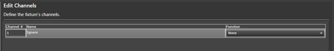
Background
The Edit Channels wizard page defines the channels on the fixture.
The channels in this grid are order dependent.
When complete the channels in this grid should match your fixture’s user manual.
The number of channels in this grid should match your fixture’s user manual.
Often intelligent fixtures define channels for the convenience of controlling the fixture from a lighting controller with sliders.
If there are channels that are not needed when controlling the fixture from Vixen they can be skipped by placing an Ignore row and a function of None.
A channel with a function of None will be ignored by Vixen. Including these ignore rows are important to keep patching to a controller easy and straightforward.
What Do I Do On This Wizard Page?
This wizard page defines the channels that make up the fixture. This table should match your user manual precisely. Channels should not skipped or omitted. Order is important and should match your fixture’s manual.
- Select the Plus button to add a new channel.
- Give the channel a unique name.
- Select the fixture Function for the channel.
You can use the Wizard Back button to add or edit the functions.
Select the Next button to continue to configure your intelligent fixture.
Video Tutorials
3.1.1.1.4 - Color Support
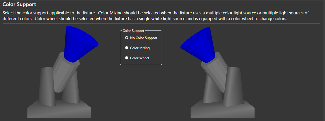
Background
Vixen will examine fixture channels and functions and default the color support. This selection is hardware dependent. The Color Wheel option requires that the fixture has a Color Wheel function. Vixen will extract all the colors from the color wheel and create a color property for the fixture element with a discrete color for each color on the color wheel.
-
No Color Support - This option can be selected if you want to manually control the color through separate display elements. This option is not recommended.
-
Color Mixing - This option should be selected when the fixture uses multiple color sources or multiple light sources of different colors. Examples are RGB and RGBW.
-
Color Wheel - This option should be selected when the fixture has a single white light source and is equipped with a color wheel to change colors.
Select the Next button to continue to configure your intelligent fixture.
Video Tutorials
3.1.1.1.5 - Automation
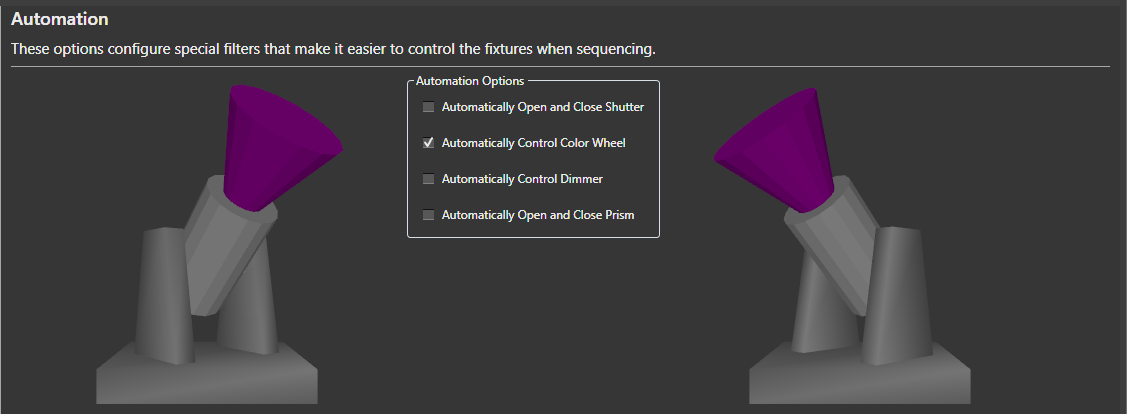
Background
This wizard page configures Vixen Intelligent Fixture automation. The goal of the automation is to make it as easy as possible to sequence the intelligent fixture. Vixen will examine the fixture’s channels and functions and default these options accordingly.
-
Automatically Open and Close Shutter - This option will automatically control the shutter channel based on the color channels. Whenever an effect is generating color, the shutter will open. Whenever there is no effect, or the effect is dark, the shutter will be closed.
-
Automatically Control Color Wheel -This option will automatically control the color wheel by matching colors generated in the effects to colors supported on the color wheel.
-
Automatically Control Dimmer - This option is usually selected for fixtures with a color wheel and fixed white light source. It will automatically control the fixture’s dimmer channel based on the intensity of the colors in the effects.
-
Automatically Open and Close Prism - This option is usually selected for fixtures that have both a channel for enabling the prism and another channel for selecting the position or movement of the prism.
Select the Next button to continue to configure your intelligent fixture.
Video Tutorials
3.1.1.1.6 - Dimming Curves
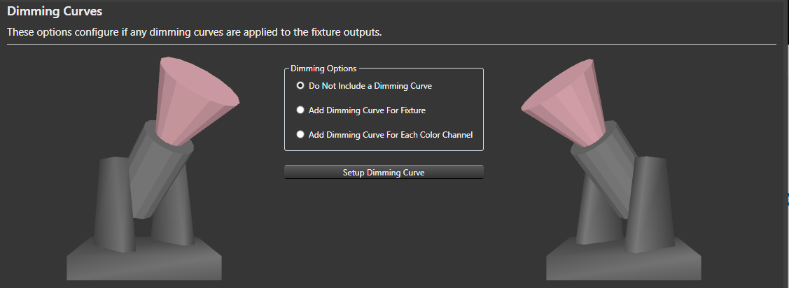
Background
This wizard page configures optional dimming curves for the fixture outputs. From this wizard one dimming curve can be configured via the Setup Dimming Curve button. A dimming curve can be useful if you want to ensure you drive the fixture at less than maximum intensity. Typically used on fixtures with a LED light source.
-
Do Not Include a Dimming Curve - The default option is not not include any dimming curves.
-
Add Dimming Curve For Fixture - This option adds a single dimming curve for all color channels.
-
Add Dimming Curve for Each Color Channel - This option configures a separate dimming curve for each color channel. With this option all the dimming curves are initially identical. The curves can be further adjusted via the Patching Graphical View.
Select the Next button to continue to configure your intelligent fixture.
Video Tutorials
3.1.1.1.7 - Grouping
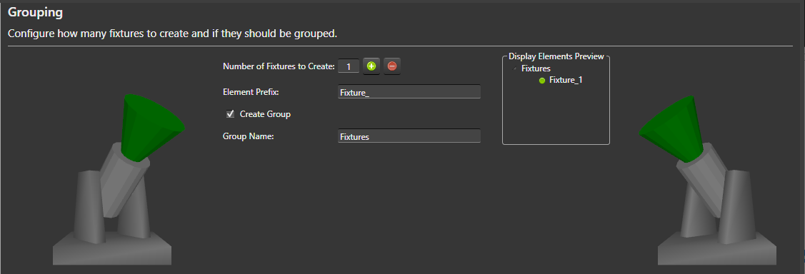
Background
This wizard page determines how many fixture display elements to create and if to group them. This wizard page also determines the naming convention for the fixtures. The Display Elements Preview to the right gives an indication of how the fixtures will be displayed in the Elements tree. Note Vixen will modify the element names as necessary to avoid duplicates as all display elements must have unique names.
-
Number of Fixtures to Create - Number of fixture display elements to create. Select the Plus
button to have the wizard create additional fixtures. -
Element Prefix - Name prefix for the fixture display elements.
-
Create Group - Determines if the fixtures are nested under a group in the display element tree.
-
Group Name - Name of the fixture group.
Select the Next button to continue to configure your intelligent fixture.
Video Tutorials
3.1.1.1.8 - Summary
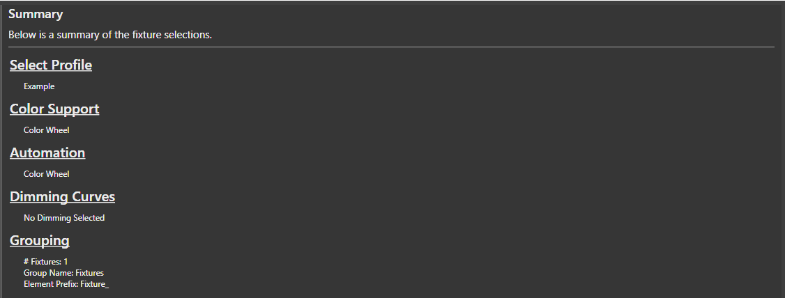
Background
The Summary wizard page summarizes the selections made on the previous pages for review. Select the Finish button for the wizard to actually create the fixture display elements and save the fixture profile to the file system.
3.1.1.2 - Setup Display Elements
Concepts
Elements are the main building blocks of your display. Every display item you want to use in your show will need either an element, or an element group defined for it.
Adding Single-Element Items
An item such as a single string of lights is defined as a single item in the Element Tree. So, if you have a string of lights that is a single color, or even a single multi-colored standard string, it is defined as a single element. Think of if this way. If you plug it in and can only control the entire string at once, it is a single display item. Conversely, if you can set each light to any number of colors or there are is more than one controllable item in the string, it is not defined this way.
Right-click somewhere in the white-space of the Element Tree and select Add.

Give your element a name. We’ll call ours Mini-Tree 1. The new element will be added to the list as a single node.

Click on the newly created element to select it.
Make sure Color Handling is selected in the Selected Item(s)/Configure section and press the Configure button

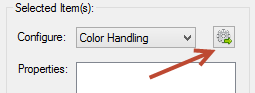
When the Color Configuration dialog box appears, click on the first radio button (They are a single color…).
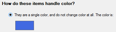
Click the color box (blue in the above graphic) to define the color of this element.
Click OK when you’re done and you’ll get a dialog box telling you what you just did – hit OK on this dialog to close it.
That’s it. You’ve successfully defined a single element for your display.
There is no need yet to link anything in the Element Tree to output controllers. With these elements defined, you can sequence your display and setup a preview. Only when you are ready to physically connect your output controllers do you need to come back and mess with the controllers.
Single-Element Shortcuts
Let’s say you have 16 mini-trees that are a single color (mine are white). These are standard 120V light strings and each is separately controlled by a channel on a Renard controller (so, 16 strings, 16 outputs on a controller)
Select Generic Numbered Group from the Add combo-box under Element Setup.
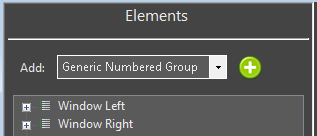
Click on the  to the right of Generic Numbered Group drop down box.
A dialog box will appear that lets you name your new element group and each item within the group. We’re going to fill ours out with a group name of Mini-Trees, an item prefix of Mini-Tree and an item count of 16.
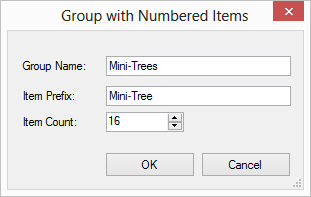
When you press OK a new group will be created at the bottom of the Element Tree named Mini-Trees with 16 individual trees named Mini-Tree-X where X is the number of the item.
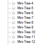
Now, we need to define the color-handling for these items. For versions 3.6 and above the following steps will be invoked automatically for you when you create an item with the prop shortcuts. In addition, you will be prompted to ask if you need a dimming curve to control the brightness of your prop. Click on the Mini-Trees group so it is selected.
Make sure Color Handling is selected in the Selected Item(s)/Configure section and press the .
When the Color Configuration dialog box appears, click on the first radio button (They are a single color).
Click the color box (blue in the above graphic) to define the color of this element.
Click OK when you’re done and you’ll get a dialog box telling you what you just did — hit OK on this dialog to close it.
That’s it. You’ve successfully defined a group of single 16 elements for your display.
Multiple-Element Shortcuts
3.1.1.3 - Renaming Elements
Introduction
There are multiple ways to rename elements. The simplest form is a single item rename. There are also features that enable multiple items to be renamed at the same time. One of them will be discussed here. The other one has it’s own section under Find/Replace.
Simple Renaming
To rename a single element, you can select the element and then right click and select rename. You will be prompted with a dialog to enter the new name. Clicking the ok button will apply the change. If the new name for the element matches an existing name, it may append a unique qualifier because all element names must be unique.
Multiple Element Rename
When you select multiple items to rename, a dialog box will appear to allow you to shape the renaming by forming templates. These templates are the same as the one used in the Add Multiple helpers that generate elements based on sequential naming patterns.
3.1.1.4 - Renaming Elements by Find/Replace
Introduction
You may have element structures that were created with names that did not have the exact structure you wanted or have evolved over time and need some restructuring. The standard rename function has abilities to rename multiple items via a sequential template format. At times, this may be too rigid for your needs and a simple find replace mechanism can better serve the purpose. An example is shown below where the paste as new function was used to duplicate a element group structure. The groupings themselves have elements that have been restructured out of a sequential naming structure. The intent here is to remove the - 2 on the end and change it from Snowflake 1 to Snowflake 5. This way the newly cloned element group will match the pattern of the original ones it was cloned from. See element duplication for additional details. Starting in 3.6 and above this can be done from the Display Setup or the Preview Setup forms.
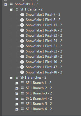
Steps
-
Select a group of elements to Find/Replace naming patterns. They can be all together, or slected from multiple different levels. Select only the items you wish to act on.
-
Right click on the selected items and choose Find/Replace.
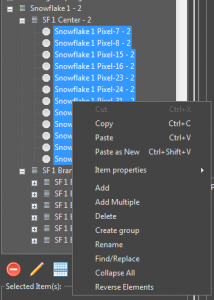
-
On the dialog box that appears you can create patterns of find and replace. Patterns can be chained to allow for multiple find replace operations in one pass without having to do the Find/Replace operation multiple times.
-
First we will create the pattern to rename Snowflake 1 to Snowflake 5. In the Find what text field we put Snowflake 1. In the Replace with text field we put Snowflake 5. You will notice the list at the left showing on the fly what will happen as you type the values in.
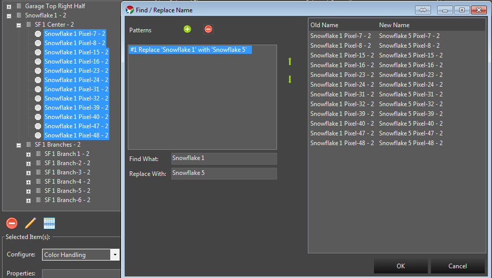
- Next we also want to remove the - 2 on the end. So we click the green + button to add a new pattern. This new Find/Replace will occur on the result of the previous pattern. We enter a the - 2 in the find what. Notice we enter a blank space in front because we also want to remove the blank that is there. - 2. Because we want to replace that with nothing, we leave the replace with text field empty. The list on the right updates to reflect the result of all our changes.
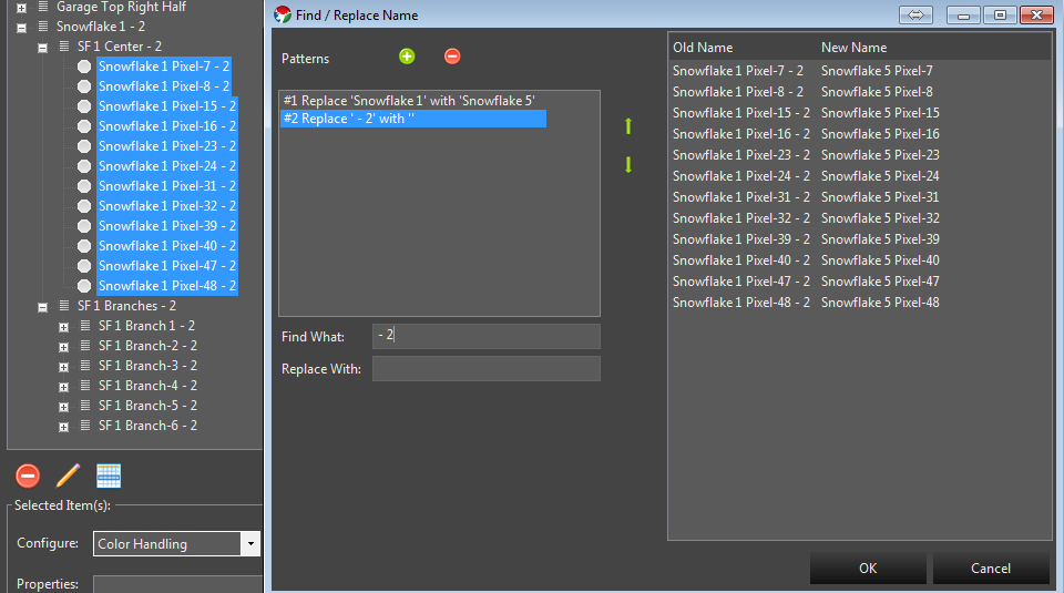
- Now that the list on the right reflects what we want the elements to look like, we can click the ok button and the changes will be applied.
3.1.1.5 - Duplicating Elements
Introduction
In some cases you may have created an element structure that does not conform to one of the built in template generators and you need to create more of them. Instead of manually recreating each one, Vixen has a feature to allow you to copy and paste a new version of it. Normally copy and paste just makes additional copies that are linked to the original. But in this case you truly want a new version of it.
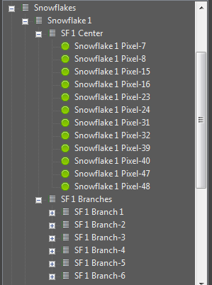
Steps
-
Select the top level of the item group you want to make a new version of. In the example above I would select the Snowflake 1 Element group.
-
Right click out in the white space area of the element list and the context menu will appear.
- Choose Paste as New. After this a cloned copy will be created as shown below.
Because Vixen does not allow different elements to have the same name, the feature will append some numeric qualifier on the end of the new elements to make them different. You can leave these as is, or use some of the renaming features described elsewhere to rename them.
3.1.1.6 - Color Handling
Color Handling
Color handling provides information on how the elements use color. There are 3 common types of lights.
- Traditional analog incandesent, or LED string lights. These have been around for a long time and are typically a string of single color lights.
- Dumb Pixels. These are LED pixels, but the whole string color can be controlled and will all be the same color at the same time. They lights are not individually addressable.
- Pixels. These are modern addressable string of lights that can be made any color and each light can be any color.
The color configuration can occur from multiple places. If you add elements in display setup using the templates, the color setup will typically be presented as part of the setup workflow for each type of prop. If you create individual elements outside of one of the wizards, then it will be presented when you use the Add Properties -> Color Handling.
Color Configuration
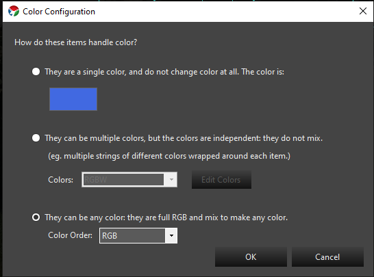
The Color Configuration dialog will be presented from multiple places. It is key to getting the color setup correct on your elements so the sequencer can properly manage them. There are 3 options on this dialog and they relate to the information above on what type of lights you are using.
- Single color. This is for traditional lights where the element is a single color only.
- Multiple colors that do not mix. This is for waht is known as super strings of traditional lights. A single prop may have multiple strings of different color lights covering the same area. You would configure this to have the set of colors that match what your strings are.
- Mixing color types. This is typical of a pixel that can be any color. Typically they are RGB.
3.1.2 - Controller setup
3.1.2.1 - Launcher
Description
The Launcher Controller is used for triggering an external command from within Vixen. It is used in combination with the Launcher Effect that passes the command line executable and any arguments through to this controller at a specified time.
Setup
There is minimal setup for this controller. Just add it to your controller list and ensure it is enabled. You typically only need one ouput which is the default.
Patching
A single Element is normally directly patched to this controller. There should be no color breakdown or dimming handlers in the path. It should resemble the following.
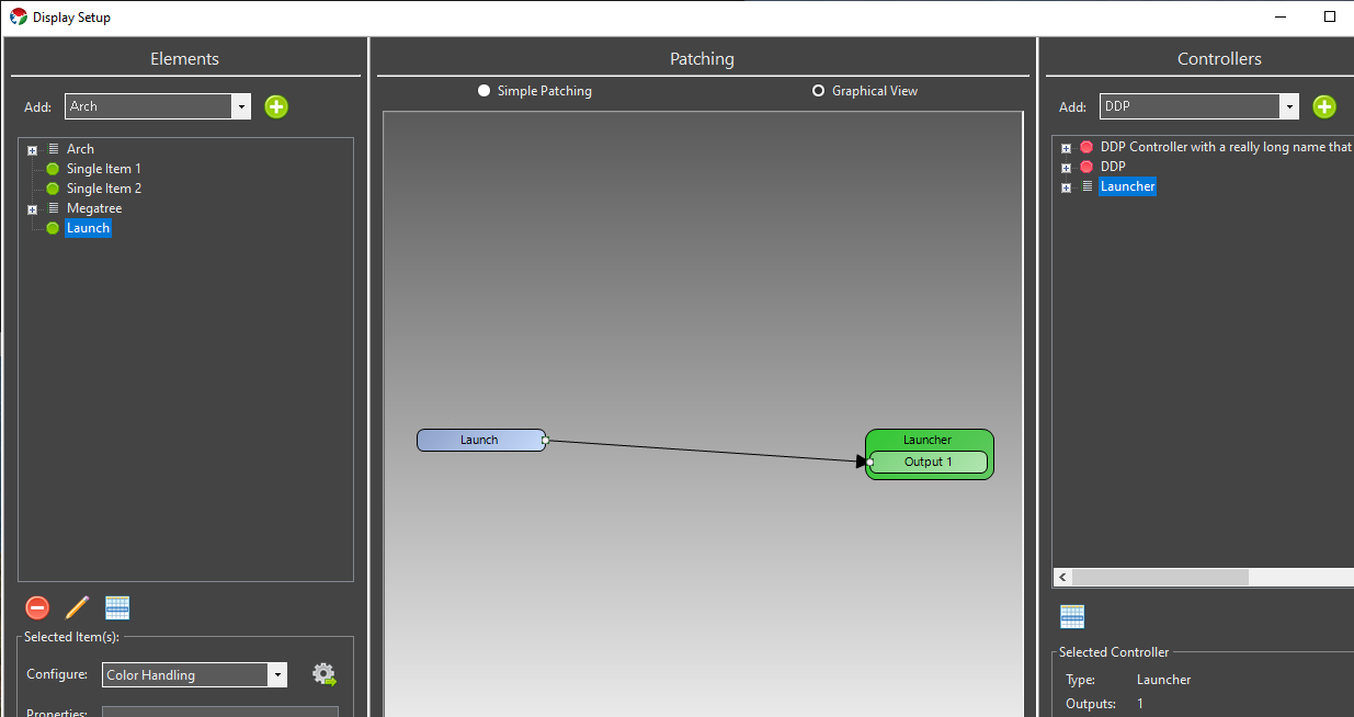
3.1.2.2 - SanDevices 682
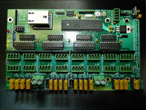
**NOTE some of the screenshots in this tutorial are slightly outdated. The underlying concepts however are sound and this article will remain available until we are able to update it.
If you only have a few strands that you would like to set up in Vixen, or want to get started quickly, setting up one strand per Universe will be the simplest way to achieve this.
In this example I will set up 3 strands of 54 RGB pixels each, running over WS2811.
Since we need 3 channels to drive each of the Red, Green and Blue channels, this means we need:
54 pixels x 3 colors = 162 channels per strand.
162 channels x 3 strands = 486 channels overall.
This example sets it up so that strand 1 is on Universe 1, strand 2 is on Universe 2 and strand 3 on Universe 3.
NOTE: One Universe-per-strand is not a good layout to deal with large displays like Megatrees, and in fact it’s not possible to set up a E682 with 1 Universe per strand and still use all 16 outputs. However, it’s a good way to learn initially, and fine for small displays.
Caveat: This assumes you have nothing else set up. If you do - you will have to change your numbering accordingly.
Configuration Steps
a) Start by opening your web browser and connect to the SanDevices IP address. It will display the SanDevices configuration page (in this case for a E682):
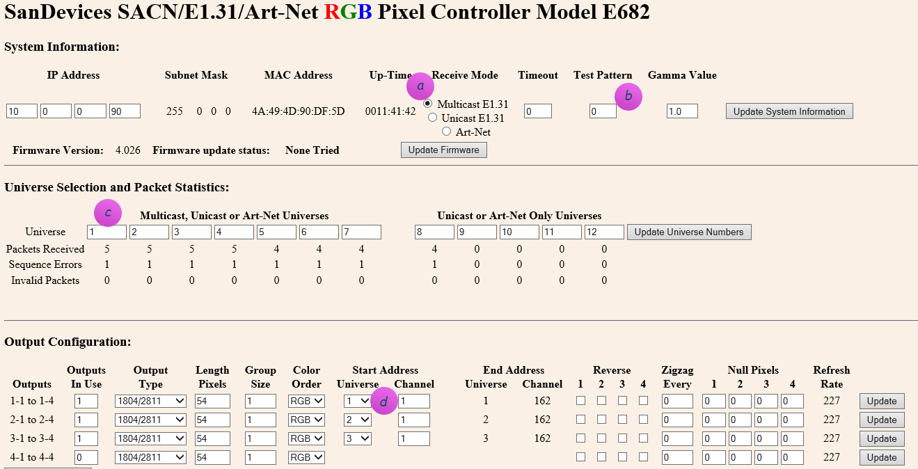
Set the page up as above.
a) Make sure you’ve specified Multicast, and no test pattern (b). If you change either of those, click Update System Information before proceeding.
c) Make sure your Universe selection contains universe 1 to 12. These are the universes that will appear in the dropdown at (d)
TIP: After you change any one line on the page, you have to first click the button on the right of the line to apply. Don’t fill it all out and then click one of the buttons, you’ll lose all of your other changes!
Connecting to Vixen 3
b) To connect the SanDevices controller, in Vixen 3, click on Setup Display and add a new Streaming ACN (E1.31) controller. Specify 486 outputs in order to match the 486 channels (53 pixels x 3 colors x 3 strands).
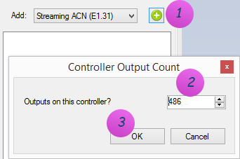
c) Right-click on the newly added controller, and click on Configure. Add 3 Universes and use Multicast Ethernet, since your Sandevices controller (above) is set up as Multicast E1.31:
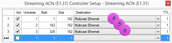
NOTE 1: The name Multicast Ethernet may be called something else. This is the default name on Windows 8. On earlier operating systems it may be called: Multicast Local Area Connection.
To instead enter a Unicast address, right-click the destination field to bring up the IP address form and enter the ip address, or the host name if you have DNS:
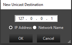
NOTE 3: The Start column above is the Vixen 3 start address of the channel inside its logical E1.31 controller view, and only comes into play if you need to individually map pixels to specific channels. It has nothing to do with the SanDevices controller, and likely will not map to any number you will see on the SanDevices configuration page.
Typically you would just set this up as a contiguous sequence throughout by setting line 1 to start at 1, and for all other lines use the formula of:
Start = Previous line Start + Previous line Size
d) Now create 3 elements to map to the 3 strings. These are the items that appear in the Sequence editor that you will use later to choreograph against.
On the left hand side, add a Generic Numbered Group for String 1. See Setup Display Elements for more information.
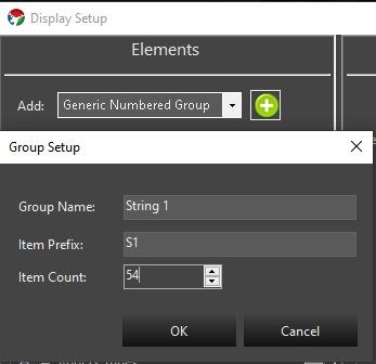
Repeat the same steps for String 2 (item prefix: S2), and String 3 (item prefix: S3).
e) After this you should see 3 strings. Select them all.
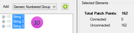
f) Notice above how it says: 162 patch points. At this point Vixen thinks you want 1 channel per item on the string. This is not quite right yet - you instead want 3 channels per item (RGB). So we need to tell that to Vixen. At the bottom on Configure, select Color Handling, and add the RGB filter.
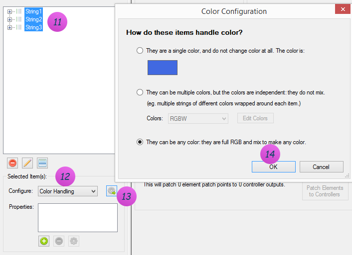
g) If all went well, you should now see 486 patch points on the left, and 486 outputs on the right to path it to:
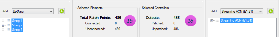
h) Click Patch Elements in the bottom center section, and you’re off to the races! See Patching Controllers for more information on patching.
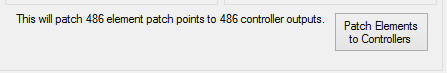
3.1.3 - Patching Setup
3.1.3.1 - Patch Elements to Controllers
Introduction
In order for your controllers to output data, the elements need to be connected to them. This is a process we call Patching Think of the old telephone switchboards where an incoming call needs to be connected by an operator to a destination. The operator plugged in a cable from one jack to another to connect the calls. They called this patching the call. The same concept applies here. This allows your elements to be connected to your controllers in any order providing great flexibility.
The graphical view in the center pane of the Display setup screen shows what’s going on.
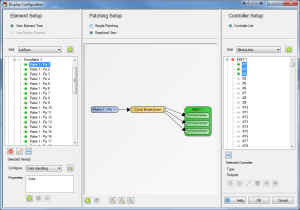
In this screenshot you can see that one element is patched to a color breakdown filter which in turn has 3 outputs that route to the controller output channels.
So what’s going on in that color breakdown filter? If we were to double click on it, you’d see the setup screen.
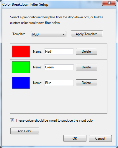
What this is doing is taking the element information, and breaking down the colors to 3 separate paths, one for the red, one for the green, and a 3rd for the blue. Most RGB lights in common use need to get the data for each color on separate control channels. This breaks it up so the controllers can understand it.
From this filter, the data is patched to the appropriate controller channels. Note that should your RGB lights be in a different RGB order, you can change the order of the colors in the color breakdown filter, or you could repatch the outputs of the filter with patching lines that cross. Either way is equally valid.
Filters vs Properties
This can be confusing. Properties are information about the element that are used by various parts of the software. Currently an element can support Color, Grid, or Location properties. The element color properties are used in the sequence editor so that you are only presented the color options for colors that this element supports. Editing the color property does not alter the color breakdown filter. Editing the color breakdown filter (in graphical view) does not alter the color property. The easiest way to change them both, is to unpatch the element, and start over.
Filters affect how the data flows from elements to controllers. They do not “belong to” an element, but rather are independent objects that are connected to elements, other filters, and controller channels.
When you use the configure button to add color handling. This invokes a wizard which sets up both the element’s color property, as well as a color breakdown filter.
Conversely, when you add a dimming curve, the wizard only adds the dimming curve filter, and no properties.
It’s important to note that the list box below the configure button is a list of the properties assigned to an element. Only some configure wizards will produce a property in this list. And even if it has a similar name, the property is not at all linked to a filter.
Patching Process
- First you need to make sure your filter chain is the way you want it. Select the element(s) you want to patch from the element setup pane on the right.
- Decide if you want to include dimming curves, and if so, how much control you wish to have over it. If you want to add a dimming curve and have the same curve apply all of the colors add it at this point. (this gives it a dimming curve, but no ability to color balance)
- One Dimming curve will be added for each element. Hint: Use a library curve. See Dimming Curves below.
- Then go to the configure box below and select color handling.
- Choose the appropriate color handling scenario for these elements.
- One color breakdown filter will be added for each element.
- If you want to add dimming curves to this element that you can adjust with different curves for each color, add the dimming curve at this point. (You would do this if you want to color balance your elements to each other)
- One dimming curve will be added for each output of the color breakdown filters (for RGB, number of elements x 3). Hint: Use a library curve. See Dimming Curves below.
- Double check the graphical view to make sure this is the signal flow you are trying to achieve. If you’re satisfied, go back to the simple patching view.
- Now take note of the number of patch points in the selected elements section of the simple patching view. This is the number of controller channels you’ll need.
- Select the controller channels you want to connect these elements to. Note: You can select more channels than needed, and only the necessary channels will be used. It’s faster to select more outputs than necessary than it is to actually count out how many you need.
- In the bottom area of the center pane, it will tell you how many element patch points will be connected to how many channels. If the number doesn’t match, that may be ok (see note above) but ideally these numbers should match. If they don’t match, there will be a message below that explains what will happen.
- Once you’re satisfied that it’s good, go ahead and hit the Patch Elements to Controllers button.
There may be cases where your physical lights are backwards from how you have your elements set up. You can account for this in the patching process by using the Reverse Element Order option in the Selected Elements column.
There is a similarly worded option in the Selected Controllers column as well. The difference here is that the output channels will be reversed. If this is an element with a multi-output color breakdown filter (such as RGB) not only will the elements be patched in reverse, but the color order will also be reversed. You probably don’t want to use this option to reverse multicolor elements.
Unpatching
If you want to preserve the filter chain, you’ll want to unpatch from the controllers. Select the controller channels to be unpatched, and press the Unpatch Controllers button
If you want to discard the filter chain and recreate it, you can unpatch from the elements. Select the elements to be unpatched, and click the Unpatch Elements button. It will then ask you if you want to remove the filters as well. The answer is almost always yes. (there’s some legacy reasons why you wouldn’t want to remove filters, but you can no longer get to them from the display setup screen, so you might as well delete them)
Dimming Curves
It was mentioned above, but to additionally call it out. The best practice when adding dimming curves to your elements is to use a library curve for the curve when setting it up. This allows you to go into the curve library and edit the library curve to change any instance of the dimming on the elements it was used to patch. We recommend giving it some thought and setting up a library curve for each prop that you may want to adjust or even all items that use the same type of lights so you can easily balance them. Adjusting the library curve values once patched in makes an immediate change to the output. Alternatively, you can choose to just replace the existing curve with a new one in the display setup. You do not have to unpatch to replace an existing curve with a new value, however you will need to restart Vixen to see the results. Thus the library curve has an advantage of being able to change without a restart.
The best place to position the curve in the filter chain is between the element and the color break down in most cases. This allows you to adjust the overall brightness of the light evenly across whichever colors are on the breakdown filter. If you need to adjust color balance, then the place for the curve is after the breakdown on each individual output of the breakdown. In the case of RGB pixels, you most likely want to have a red curve, a blue curve and a green curve in your library for that prop or type of lights. You can then adjust each color in the library to adjust for color balance.
3.1.3.2 - Dimming Curves
Dimming Curves
Dimming curves are generally used to reduce the overall brightness of a one or more lights. Generally this is used with RGB pixels. Dimming curves themselves are the very same curves you may be familiar with in the Sequencer for controlling brightness or other aspects of effects. They are utilized in the patching chain to affect the output to the lights. They will not affect the brightness shown in the preview. Here is a typical view of the patching chain for a single RGB pixel in the graphical view of the display setup.
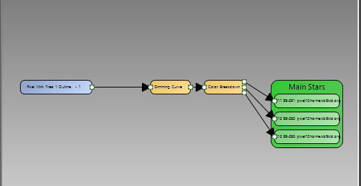
Typical patching with dimming curve.
The dimming curve typically precedes the Color Breakdown filter. This evenly affects all color values flowing through the path. The Dimming Curve wizard helps you add a dimming curve to your patching.
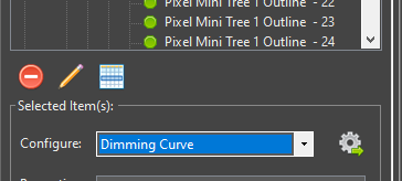
Invoking the Dimming Setup.
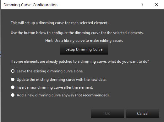
Setup screen.
The main setup screen helps you add the dimming curve. The typical choices here will be to update an existing dimming curve, or insert a new dimming curve after the element. If you are starting your patching, you will use the insert a new dimming curve. This is also true in the newer workflows in the preview when adding a prop or using the wizards and they prompt you to add a dimming curve. These new prop wizards will default to using the insert option. When updating an existing dimming curve, you may need to restart Vixen for it to take effect.
Dimming Curve Setup
Clicking the Setup Dimming Curve from the Dimming Curve wizard will bring up the curve editor. This editor is used in other places to edit curves so it will become familiar to you. Below is the default curve that will be the starting point.
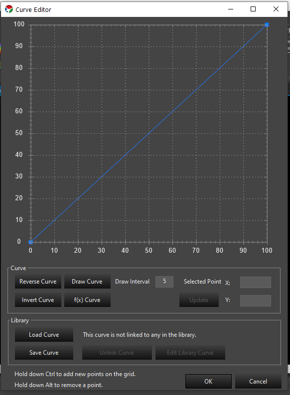
Default Dimming Curve.
This is a standard linear ramp. It is a mapping transform, so the value across the bottom is mapped to the the value on the left by moving up the graph to the curve line to find the outgoing value. The above curve will produce the same values out that come in and will not do any dimming. If we want our lights to run at 50% brightness, we will configure the curve as follows.
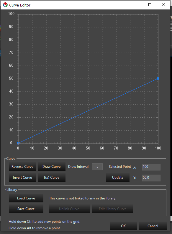
A common misconception is that the curve should be a flat line. A flat line will result in all values being mapped to the same brightness. This is generally not what you want.
Gamma Curves
Pixel based lighting has a linear brightness response. The human eye does not perceive these linear steps as being equal. There are many articles about using a gamma curve to compensate the linear response to something the human eye visualizes better. We can implement gamma curves in our dimming flow to do this compensation. There is a curve generator option in the curve editor to generate a gamma curve for you.
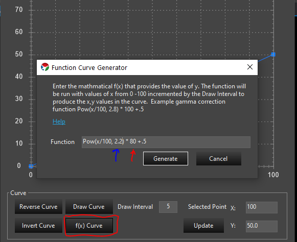
Function Curve Generator.
Using the f(x) Curve button you can invoke a screen to allow you to generate a gamma curve. The formula for a Gamma curve is in the screen. You can copy the example and edit it to your needs. The value indicated by the red pointer is the max brightness. In the example that is 100 and above it has been changed to 80 indicating that the max value for brightness is 80%. The value indicated by the blue arrow is the gamma value. A range of 2.0 – 2.4 is fairly typical. This value can be experimented with to find the value most appealing to the eye. If you happen to have gamma specs for your lights, you can use that value here. Above it has been set to 2.2.
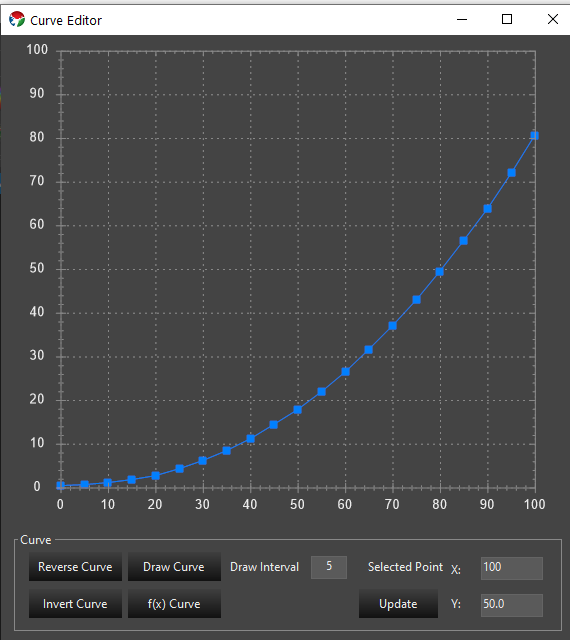
Gamma Curve with 80% max and gamma of 2.2.
The above image is the result of generating the curve with a 80% max brightness and a gamma of 2.2.
Library Curves
The best practice for adding dimming curves is to create the curve as a library curve. This allows you to edit the curve in the library to change the value instead of having to use the Dimming wizard to replace the curve anytime you wish to change the value. On the curve editor you can can save your new curve. This will save it to the library. Once you save the curve you will use the load curve button to load that saved library curve so library version can be used as the dimming curve. If you already have a curve saved you can load it directly and reuse one from other props. Library curves can be edited in the sequence editor in the curve library. Additional information on curves can be found here: Curves
3.2 - Sequencer
3.2.1 - Basics
3.2.1.1 - Basic Edit Functions
Overview
Editing a sequence is one of the most important aspects of creating your light show. The sequencer is intended to facilitate rapid creation of content and also to feel at home with standard conventions you have used in other applications.
Cut, Copy, and Paste
The Cut, Copy and Paste features of the sequencer follow the well established patterns in the OS world. You can select any effect with the mouse and cut/copy it using the normal Ctrl C, Ctrl V and Ctrl X keyboard shortcuts or the right click mouse conventions. Selected effects will have a white dotted line around them whereas non selected ones will have a solid black outline.
Pasting works like it does in most all other applications. Standard keyboard and context menus are provided. To paste effects that are on the clipboard, select the row and time position in the timeline you want to paste and invoke the paste function. Effects will paste in the time and row spacing they were copied in. For example, if you copy effects from two side by side rows, they will be pasted at the new location in the side by side rows starting with the one you selected to paste to. If there are skip rows when it is copied, those same skips will occur during pasting. You can paste an entire row or rows of data copied from the row selection. They will paste at the entire row level. To copy an entire row, select the element name label and the enture row will be come selected. Use the keyboard shortcuts to copy or cut it. Then select the new row in the same manner and use the Ctrl V shortcut to to paste it. Effects can be copied between two open editors or even two open instances of Vixen.
Copy / Paste with Layers
Layer information will be copied along with the effects if they are located in a layer. The same is true when copying between two sequences if the same layer exists in the target sequence. You must have the layer created in the target location for this to work.
Effect Multi-Selection
Multi select of effects can be done by holding down the CTRL key while selecting the effects you want. You can select multiples in a range on the same row by clicking the first one to elect it and then SHIFT click one further before or after it in the row. All effects in between will be selected. You can click on the element name in the row and this will select the entire row. It will be outlined in blue and all effects will show selected.
Clicking the timeline and dragging the mouse with the left mouse button held will create a rectangular selection lasso that will select all effects inside or touching the lasso. You can also utilize the drag box filter by clicking the drag box icon in the toolbar to choose which effects the drag box will select. This will filter the selections to only those effects matching your criteria.
Additional capabilities for selection are provide by the Draw Mode. See the section on Draw Modes for further details.
Editing Effects
Effects can be edited in many ways. Clicking on any effect will bring up it’s settings in the Effect Editor. You settings can be changed and the effect will render the changes on the fly. If you have multiple effects of the same type selected, all their settings can be edited at the same time. There are also some basic settings that may be the same for multiple types of effects. These can be edited at the same time as well. The Effects section details the settings for each Effect.
Effects can be resized by clicking on the start or the end and dragging them to the new length you desire. Multiple effects can be selected at the same time and resizing them works in unison. See Snap Points for more info on getting effects to align to specific things in the Timeline.
Effects can also be dragged from one element to another by clicking on them and dragging while holding the mouse down. Multiple effects can be selected and dragged at the same time. By holding the Ctrl key down while dragging the effect(s) you can create a copy of them and drag the copy to the new location. Holding the Shift key down locks the dragged effects in the same vertical time so you can move them up or down to another element. See the Timeline section for more details.
Clicking on the left edge of an effect while holding down the Alt key and moving the mouse will cause the effect just left to adjoin with this effect. Continuing to move the mouse while the Alt key is depressed will jointly size both effects. Similarly, clicking on the right side of an effect while holding down the Alt key and moving the mouse right will adjoin the immediate right effect. Continuing to move the mouse while the Alt key is depressed will jointly size both effects. Holding the Alt and Shift keys down together will work similarly, but only Effects at at the same Layer will be affected.
Effect Replacement
There are times when you want to replace one or more effects with an effect of a different type. This can be tedious when you have to delete them and create new. On top of that you likely want them to occupy the same time slot and duration of the original effect. Fortunately there is an easy way to accomplish this.
Existing effects can be replaced with another effect type directly in the editor. Select the effects you want to replace with a different effect. Hold down the Control key and drag the new effect you want anywhere on the timeline. You will be prompted to confirm you want to replace the selected effects with the new effect. Once you agree, all the selected effects will now be replaced with the new effect set to it’s default. All of the effects will still be selected and you can edit them all at once.
3.2.1.2 - Editor Shortcut keys
| Editing | |
| Select All | Ctrl + A |
| Delete Selected Element | Del |
| Cut | Ctrl + X |
| Copy | Ctrl + C |
| Paste | Ctrl + V |
| Duplicate Effect | Ctrl + Left Mouse and drag |
| Add Multiple Effects form | Ctrl + Right Mouse |
| Move selected effect left | Ctrl + 🡸 |
| Move selected effect right | Ctrl + 🡺 |
Align Start Times
|
S Shift + S |
Align End Times
|
E Shift + E |
Align Both Times
|
B |
| Align Centerpoints | C |
Match Duration
|
U Shift + U |
Align Start to End
|
R Shift + R |
Align End to Start
|
N Shift + N |
| Distribute Equally | D |
| Distribute Effects | I |
| Align the beginning of the selected effects to the closest Mark | Ctrl + Shift + S |
| Align the end of the selected effects to the closest Mark | Ctrl + Shift +E |
| Align the beginning and end of the selected effects to the closest Mark | Ctrl + Shift + B |
| Zoom and Scroll | |
| Zoom Time in | Ctrl + ➕ |
| Zoom Time out | Ctrl + ➖ |
| Zoom Time | Ctrl + Mouse Wheel |
| Scroll Timeline | Shift + Mouse Wheel |
| Scroll up / down in Timeline |
Page Up Page Down |
| Jump to top of Timeline | Home |
| Jump to bottom of Timeline | End |
| Jump to start of Timeline | Ctrl + Home |
| Jump to end of Timeline | Ctrl + End |
| Zoom Row Height In | Ctrl + Shift + ➕ |
| Zoom Row Height Out | Ctrl + Shift + ➖ |
| Change Default Row Height (all rows) | Ctrl + Shift + Mouse Wheel |
| Expand/Collapse Selected Row | T |
| Expand/Collapse Selected and Child Rows | Ctrl + T |
| Effects (While in Effect Editor) | |
| Hover over Gradient and use keys to reverse Gradient | Alt + Shift + Left Mouse |
| Hover over Curve and use keys to flip Curve | Ctrl + Shift + Left Mouse |
| Hover over Curve and use keys to reverse Curve | Alt + Shift + Left Mouse |
| Transport Controls | |
| Play / Stop Sequence |
Space Bar F5 F8 |
| Pause Sequence |
Ctrl + Space F6 |
| File | |
| Save Sequence | Ctrl + S |
| Save As | Ctrl + Alt + S |
| Quit | Ctrl + Q |
| Adds effect with Horizontal Orientation | Alt + Drag multiple files to Timeline |
| Adds multiple effects one after another | Ctrl + Drag multiple files to Timeline |
| Marks | |
| Create Mark during playback or while playback is paused | Shift + Space |
| Add a Mark and prompt for label name | Shift + Right Mouse on Ruler |
| Add a Mark and fill with label duration | Ctrl + Right Mouse on Ruler |
| Add Mark with fill label duration and prompt for label name | Ctrl + Shift + Right Mouse on Ruler |
| Adjust previous and current Mark duration | Alt + Resize Mark |
Click here for a demo on the use of Shortcuts.
Click on the Keyboard Shortcuts card below to open in a separate window, to view or print.
3.2.1.3 - Playing Sequences
Overview
Playing seqeunces is one of the most common activities that will be used. The Sequencer provides many features in order to provide a rich experience.
Play Pause Stop
The toolbar has icons for Play, Pause and Stop. These can be used to control the playback of the sequence in the editor. These options work like most any other editor you may experience them in. The Play button toggles between Play and Pause. The Stop button is always available. In addition to the toolbar buttons, the Spacebar will toggle between Play and Pause and is the shortcut to those buttons.
Playback Start Point
In addition to these basic functions, you can have custom playback points or ranges. Clicking once in the Timeline ruler area will display a single arrow head and give you a play from point.
Clicking a new start point or selecting a new range will cancel the old one. Any playback will now start from this newly selected point or range.
Ctrl and click once in the Timeline ruler will auto play from that point. Original range or single play point will be restored after play finishes.
Playback Ranges
In addition to playing from a selected point, playing a specified range is possible. This allows you to work on a specific section of the sequence without having to think about stopping the playback at the same place.
Clicking and dragging in the Timeline will create a range to play. Playing will then only play this range of the sequence.
Click on |< icon left of play button returns play start marker to beginning. If range is selected range will extend to beginning.
Click on >| icon right of stop button pushes play range to end.
Holding Control while selecting the play range will auto play on mouse release. Original range or single play point will be restored after play finishes when the range is selected using the control key.
Marks in the Mark Bar also support a double click to play the range of the Mark Bar. This can be very useful in sequencing Lip Sync tracks.
Looping
Looping is also possible. By selecting the green loop button on the play bar the sequencer will play in a loop the entire sequence or the selected play range. This also works if you use double click on Mark to choose the range to play when loop is selected.
Delayed Start
Delayed start is possible under Sequence -> Playback -> Play Options.
3.2.1.4 - Timeline
Overview
The Timeline is the heart of the sequence editor. It is divided up from left to right in minutes and seconds. Top to bottom in rows are the Elements you have defined in the Display Setup. These should correspond to the props in your display and may have Groups of props that you have organized. Any groups can be expanded to reveal the sub elements or other groups. The Timeline can be zoomed in or out to show as much or little of the time the sequence covers. There are keyboard and mouse shortcuts to control the zoom and allow panning from left to right and up and down. See the Editor Shortcuts section for more details on these commands.
Time Ruler
The ruler along the top contains the hash marks for the time intervals. These will vary from minutes to seconds to milliseconds as you zoom in and out. You can also click here to place a caret as the starting place or drag and select a range for the sequence when playing. See Playing Sequences for more information on this feature. Marks can be added here to mark beats or other important parts of the sequence and can be used as alignment references. Hovering the mouse near the bottom of the ruler will transition the cursor to a horizontal bar that you can click and drag to resize the height of the ruler. The time numbers will scale in size relative to the height. Marks can be added via the ruler. See Adding Marks.
Mark Bar
Below the ruler is the Mark Bar. This area will only show up if you have Marks that have the Mark Bar enabled. Marks can be edited in this area to change their start time, duration, text and location. This works similar to how effects are managed. See Editing Marks for more details.
Rows
As mentioned above the Timeline consists of rows of the elements organized in an expandable tree. This mirrors the tree created in the Display Setup. Clicking the plus icons in front of a group element will expand that row to reveal its children. Rows can be selected by clicking in the area where the element name is. You can use this to Cut, Copy and Paste entire rows of Effects.
The rows can have a highlight indicator showing if they have any effects on them, or any of their children have effects. Enabling the menu option View -> Highlight Rows With Effects will turn this feature on. The element names will be highlighted in yellow if that row has any effects on it. The plus expander icon will be outlined in yellow if any of the children have effects on them. With the combination of the two, you can quickly see where effects may be hiding.
You can resize the height of any row in the Timeline. In the element name section hover over the bottom border for any element. Then the horizontal cross cursor appears, you can click and drag the row to the height you want. There are also keyboard short cuts increase or decrease all the rows sizes together. They can be found under the menu options in View to zoom the rows in or out. To reset the row heights to the default click the option under View -> Reset Row Height to Default. The height settings are saved when you close the sequence editor and will be restored when returning.
Rows can also be collapsed quickly by clicking the View -> Collapse All Element Groups option. This will return all the rows to the collapsed state. The expanded states of the rows are also saved from session to session.
Effects
Effects can be added to the elements in multiple ways. You can drag the effect from the Effect list docker onto any place in the timeline. They can also be added from the context menu by right clicking in the place you wish to add it and then navigating to the effect and selecting the desired one. Effects are added with a default length of 2 seconds and default settings that are helpful to get you going. More control over how effects are added can be obtained by using the Draw Mode feature. Once an effect is on the timeline it can be edited in the Effect Editor docking widow by selecting it. See the Effect Editor section for details on editing effects.
Effects can be moved around on the timeline by simply clicking on them and dragging it to the desired location. The length can also be changed by dragging on the beginning or end of the effect. A tool tip will appear when resizing to show the start and duration of the effect. The same tool tip will appear when hovering over the effect. Multiple effects can be moved or resized at the same time by multi selecting them. This uses standard select means of Ctrl/Shift click as you would see in any modern windows app. Once you have multiples selected, they can be moved or resized as a group. See the section on Alignment Helpers and the Draw Indicator sections for further ways to manipulate effects in relation to each other.
Effects can also be Cut, Copied and Pasted from one place to another. Normal paradigms apply for this mechanism. Another way to make a quick copy of an effect is to Ctrl click and then drag on the effect. This will clone the selected effect(s) and allow you to quickly drag a copy of it else where. Holding the Shift key while dragging the effect will hold it at the time so you can drag it to another element and not change its position in time.
Clicking on the left edge of an effect while holding down the Alt key and moving the mouse will cause the effect just left to adjoin with this effect. Continuing to move the mouse while the Alt key is depressed will jointly size both effects. Similarly, clicking on the right side of an effect while holding down the Alt key and moving the mouse right will adjoin the immediate right effect. Continuing to move the mouse while the Alt key is depressed will jointly size both effects. Holding the Alt and Shift keys down together will work similarly, but only Effects at at the same Layer will be affected.
Each effect can have an info popup when the mouse is hovered over them. This provides information such as the name of the effect, the start and end time, the duration, and the layer the effect is in. This can be enabled or disabled under View -> Show Effect Info or with Ctrl+I.
Marks
Marks will be shown on the timeline as vertical lines in the color and style of the collection they are part of. These can be very helpful in aligning effects to beats or other important features in a sequence.
Timeline Shuttling
Movement up and down and right and left in the Timeline can be done with a mouse and scroll wheel. The mouse wheel will scroll up and down when hovered over the Timeline. Holding Shift while scrolling the mouse wheel will move left and right.
Holding Ctrl while scrolling will zoom in and out the visible time span. Where the point of zoom occurs can be controlled by the option in the menu View -> Zoom Under Mouse Position. When selected the point of zoom will be where the mouse is. Otherwise it will be the center of the visible Timeline. Ctrl + and Ctrl - will also allow you to zoom with the keyboard.
Persisted Settings
Many of the Timeline settings are saved with each sequence you edit. Thus when you return, the place on the Timeline will be restored along with expanded groups and row sizing to get you back sequencing as quickly as possible.
3.2.1.5 - Effect Editor
The effect editor is a docking pane used to edit the features of the effects. There are various controls that are highly intuitive to control the values of the effects. The docking pane can be docked in any of the normal docking places or can float as a undocked window.
Properties of the effect are divided up into collapsable categories. Most of these categories are consistent across all the effects. This will help you find similar features across the multitude of effects as you become familiar with them.
The label for each property has some hover text that gives a better description of what the property changes or how it may act.
The editing is done in a live mode. All changes take effect once the adjustment settles for a short period of time. The effect will be rendered and the new representation will show in the timeline.
More than one effect can be edited at the same time. Each property will be applied to each effect edited. The effect do not even have to be the same kind. Some properties may not support multiple editing depending on their function, or if all effects do not have that property and will not be shown.
The sliders control items that have ranges.
Check boxes for on off type options.
Combo boxes for items that have specific selections.
Text boxes for other values that need text or have specific values that are beyond the resolution of a slider. The text boxes themselves have a bit of a slider function built in for numeric values. When you hover you mouse just below one the cursor will turn to a cross. At that point you can click and drag left and right below the text box to quickly alter the value up or down.
There are image representations for Colors, Curves and Gradients. When double clicked, these will open the appropriate editor for each type. These also serve as Drag Drop zones to drag that item out to somewhere else in the editor or another one dragged into to be used as the setting. They can be dragged onto other effects in the timeline or into their respective library to add them to the library. These same items can be dragged from the libraries onto the type in the editor to change them. See the drag/drop section for more details. They can even be dragged across two open sequences in two different editors.
In addition to double clicking the Color Gradients or Curve editor images to bring up the large full editors, both can be edited inline directly inline in a similar fashion as they can be edited in the larger editors. Most of the same actions work the same.
Many of these options will change based on selections you make. Options that are not relevant to a specific configuration will be hidden.
Lastly there is an option to turn on the live preview at the top. This will enable previewing of just the selected effects in the preview window if you have it running. This way you can preview the changes to specific effects without having to play the sequence.
3.2.1.5.1 - Inline Curve Editor
Overview
The Inline Curve Editor is a powerful tool that allows many features of the larger Curve editor dialog to be done inline in the effect editor. This improves efficency for the user since they do not have to keep opening and closing a bulky dialog box.
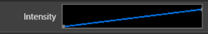
Editing Curves
- To add a node, hold the Control Key and Click the line where you want to add the node.
- To delete a node, hold the Alt Key and Click the node you wish to delete.
- To move a node, simply Click and Drag any node to the position you want. (The full editor provides more precision if needed)
Shortcuts
- To flatten the curve into a horizontal line, hold the shift key and click anywhere in the curve control. Holding shift while dragging will allow you to position that horizontal flat line up and down. This function is intended to replace the functionality of the old simple sliders that have now been replaced with curves.
- To reverse the curve direction, (flip left to right) use Control+Shift while clicking the curve.
- To invert the curve (flip top to bottom), use Alt+Shift while clicking the curve.
Drag and Drop
- Using the curve library, you can drag curves and drop them onto the curve in the effect editor. This works from the full library panel, or the toolbar. The opposite also works. You can drag the curve from the effect editor pane to the preset library or toolbar to add them to the library.
- You can drag a curve from the effect editor onto any other effect or selected effects on the timeline. If the effect has more than one curve, you will be prompted to choose which curve to replace.
- To invoke the full curve editor, simply double click on the black area of the curve control.
- When a curve is linked to a library curve, the line will be gray and a link icon will appear over the control.
Full Gradient Editor
- To invoke the full curve editor, simply double click on the curve in the effect editor.
A linked Curve denoted by the chain link in the upper left corner.
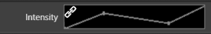
You will not be able to edit the linked curve in the effect editor pane. Double clicking the curve control will allow you to link or unlink library curve. Once it is unlinked, you can edit it in the inline editor or the larger Curve dialog.
3.2.1.5.2 - Inline Gradient Editor
Overview
The Inline Curve Editor is a powerful tool that allows many features of the full Color Gradient editor dialog to be done inline in the effect editor. This improves efficency for the user since they do not have to keep opening and closing a bulky dialog box.
Editing Colors
- To add a color node, simply click in the empty space just below the gradient image.
- To delete a node, hold the Alt Key and Click on the node you want to delete.
- To change the color of a node, Double Click on the node.
- Nodes can be dragged to change the positon of the blend.
- Fine editing of the blend or the points between colors is still done with the full editor.
Drag Drop
Using the gradient library, you can drag colors or gradients from the preset library or toolbar and drop them onto the gradient in the effect editor. The opposite also works to add a gradient to the library. You can also drag the gradient from the effect editor to another effect on the timeline. If the effect on the timeline has multiple gradients, you will be prompted for which gradient to replace.
Shortcuts
Sometimes you may want the reverse of an existing gradient that is being used. You can use Alt+Shift and Click on the gradient in the effect editor and it will reverse the color order.
Full Gradient Editor
- To invoke the full gradient editor, simply double click on the gradient in the effect editor.
Library Gradients
- When a gradient is linked to a library gradient, a link icon will appear over the gradient control and no nodes will be shown.
A linked Color Gradient denoted by the chain link in the upper left corner.
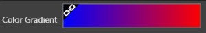
You will not be able to edit the linked gradient in the effect editor pane. Double clicking the gradient control will allow you to link or unlink the library gradient. Once it is unlinked, you can edit it in the inline editor or the Full Gradient Editor.
3.2.1.6 - Draw Mode
Overview
Draw modes in Vixen stem from concepts in the CAD world. Learning these techniques can significantly improve your ability to sequence in a rapid fashion.
Traditionally, effects are added to the sequence by dragging them to the sequence, or adding them from the context menu. In either case, the effect created is 2 seconds in duration, and added one at a time.
The new conceptual Draw Mode changes that. Effects can be drawn to the desired length, which cuts down on or eliminates the need to resize or adjust the effect after it has been created.Multiple effects of the same type can also be created in one step, across elements(channels).
Selection Mode
With the addition of Draw Mode, the primary mouse function of clicking, dragging, and selecting effects has now become known as “Selection Mode.” Two icons on the tool bar indicate which mode is active for use by the left mouse button. When using Draw Mode, the cursor in the sequence will change from the default arrow to a cross as a visual indicator that you are in Draw Mode, this only happens when you are ready to being drawing. (Draw Mode is enabled and an effect has been selected)
The function of the left mouse button is indicated by a blue box around the associated icon. The pencil icon indicates Draw Mode, and the arrow indicates Selection Mode.
Selection mode functions in the exact same way you have been used to sequencing in Vixen 3. With that said, we will focus on Draw Mode for the remainder of this document.
Special Notes
The middle mouse button can be used as an override of Selection Mode.
The Alt key can be used to override Draw Mode while held down.
Draw Mode
Effect Selection
The effect you wish to draw with can be selected at any time, by a single click in the effects pane. Click the effect again to stop using it, or select a new effect to use. While in Draw Mode, if no effect is selected, the left mouse button reverts to Selection Mode, to begin drawing again, simply select an effect, there is no need to change back to Draw Mode, unless you used the Escape key, or clicked the Arrow icon to exit Draw Mode. When an effect is selected, it will have a blue background. For quickly changing the selected effect, you can use the UP/DOWN arrow keys.
Special Notes
While in Draw Mode, you can still drag & drop other effects into the sequence, and continue on drawing with your selected effect.
After Draw Mode is enabled, and and effect has been selected, move to the point you wish to draw the effect at, click and hold the left mouse button and draw the effect to the desired length. You can start drawing from the start or end of the desired effect. A draw box will appear to indicate where the effect(s) will be placed.
The draw box is not a visual representation of the effect being drawn, and is only intended as a visual guide for effect placement. To draw move than one effect at once, draw the box across other elements you wish to place effects on. When the draw box represents the desired location of the effects, release the left mouse button, and the effects are created. The created effects are also immediately selected as a group for quick manipulation.
While in Draw Mode, you can still adjust the length of effects by grabbing the border of the effect at the start or end. However, you cannot click and drag the effect to move it. This is because Vixen allows you to stack effects on top of each other. You can click and drag the effect to move it by using the Alt key to override Draw Mode.
Key Points
Up/Down arrow keys change selected drawing effect.
Escape key explicitly exits Draw Mode, and changes to Selection Mode.
You do NOT have to be in Draw Mode to create your sequence, you may still use Vixen 3 just as you have in the past.
Middle mouse button overrides selection mode, when an effect is selected to draw with.
Pressing and holding the Alt key over rides Draw Mode.
3.2.1.7 - Drag and Drop
Overview
Drag and drop is a integral part of any modern application. The sequencer supports many drag and drop operations to make it easier for the user to sequence.
Colors, Gradients, Curves
Color, Color Gradients, and Curves can be dragged from the library dockers directly onto effects, or onto the appropriate Color/Color Gadient/Curve box in the effect editor. They can also be dragged from the Effect Editor out onto other effects. If you have your libraries in a toolbar view, they can be dragged from there as well. If you are dropping them on the Timeline, they can be dropped on to a group of selected effects. For example, if you have 5 Pulse effects selected, and drop a Color Gradient on one of them, it will be applied to all of the selected ones. If an effect has more than one possible target for the Color, Color Gradient, or Curve you are dropping, you will be given a pop up option to select which attribute to replace. Just click the correct one and it will be applied.
Files
You can Drag files from Windows Explorer and drop them onto a row / location on the timeline. Multiple files and file types can be dragged at the same time. The Sequencer will determine the type of the files and attempt to create the proper effect that can utilize the file in the location the files were dropped. The most common types are video and image files, but a complete list is as follows.
Supported Effects are:
- Picture All standard image types.
- Video All standard video types.
- Glediator .gled file types.
- Shapes .svg file types (Scalable Vector Graphics files).
Tutorial
3.2.1.8 - Alignment Helpers
Overview
Alignment Helpers allow you to quickly align effects in a number of ways.
Unless specifically noted, the reference effect is the effect that you right click on
to access the context menu or selection based if you use the keyboard shortcuts.
To access the Alignment Helpers, you will need to have a minimum of two effects selected,
then right click the effect you wish to use as a reference, then Navigate to the Alignment menu item,
this will give you a sub menu of the alignment helpers available.
Align Start Times
This helper allows you to align the start time of multiple effects in one quick action.
By default, when you align start times, the end time of the effects are not changed, thus increasing, or decreasing the duration of the effect. The shortcut for this is to press the S key while the mouse pointer is over the selected effect to use as the reference.
To prevent the duration from changing, hold the shift key while clicking this helper.
This will move the start time of the selected effects to match the start time of the reference
effect, and will not change the duration of the selected effects.
In the event that one of the selected effects end time is before the start time of the reference
effect, that effect will be moved to match the start time, and the duration will be held.
Align End Times
This helper allows you to align the end time of multiple effects in one quick action.
By default, when you align end times, the start time of the effects are not changed, thus increasing, or decreasing the duration of the effect. The E key is the shortcut while hovering over the reference effect.
To prevent the duration from changing, hold the shift key while clicking this helper.
This will move the start end time of the selected effects to math the end time of the reference
effect, and will not change the duration of the selected effects.
In the event that one of the selected effects start time is after the end time of the reference
effect, that effect will be moved to math the end time, and the duration will be held.
Align Both Times
This helper allows you to quickly align effects, with matching start and end times. Use the B key as a shortcut while hovering over the reference effect.
Align Center Points
This helper aligns the center of all selected effects to the reference effect.
Match Duration
This helper allows you to match the duration of selected effects, to that of the reference effect.
By default, the end time of the effect is changed to match duration.
Hold the shift key while clicking this helper to change the start time to match duration.
Align Start to End
This helper allows you to align the start time of selected effects to the end time of the reference effect.
At this time the duration of the effect is held, there is no modifier key to maintain the effects end time.
Align End to Start
This helper allows you to align the end time of selected effects to the start time of the reference effect.
At this time the duration of the effect is held, there is no modifier key to maintain the effects start time.
Distribute Equally
This helper distributes a number of selected effects over a period of time, determined by the starting time of the top most
selected effect, and the end time of the bottom most selected effect.
This total amout of time is determined by subtracting the starting time from the end time. The result of that calculation
is divided by the number of selected effects which results in the duration to be used for the selected effects.
The effects are then aligned Start to End, in a stair stepped pattern.
Distribute Effects (Dialog)
This helper is an advanced version of the Distribute Equally helper, you will be presented with a dialog window, which allows you full control over the distribution of the selected effects.
The options for this helper are:
- Time Control
- Start Time
- End Time
- Duration Control
- Equal Duration
- Do Not Change Duration
- Specified Duration
- Placement Control
- Stair Stepped
- Overlapped
- Spaced
- Starting Point
- First
- Last
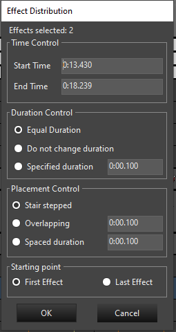
Mark Alignment
Effects can be aligned to marks using the mark alignment functions.
Align Start to Nearest Mark
To align the start of the effect to a mark, select the effect(s) and then right click and click Alignment-> Align End to Nearest Mark or use the CTRL + SHIFT + S shortcut while hovering over the selected effect.
Align End to Nearest Mark
To align the end of the effect to a mark, select the effect(s) and then right click and click Alignment-> Align End to Nearest Mark or use the CTRL + SHIFT + E shortcut while hovering over the selected effect.
Align Both to Nearest Mark
To align the both ends of the effect to a mark, select the effect(s) and then right click and click Alignment-> Align Both to Nearest Mark or use the CTRL + SHIFT + B shortcut while hovering over the selected effect.
3.2.1.9 - Resize / Draw Indicator
Overview
Moving and aligning effects to a part of a waveform, marks, or other effects is key to creating a sequence. This can be tedius if you are struggling visualize the alignment. In order to better visualize where the effect starts or ends, an indicator is optionaly available to make that easier.
Resize Indicator
The Resize / Draw Indicator option allows you to toggle on or off lines which appear from the top to bottom of the grid at the start or end of a selected effect as an indicator to assist in the movement or resizing of effects.
To enable or disable the indicator lines, enable the option under Edit -> Resize / Draw Indicator in the toolbar menu. You can set the color of the lines in the sub menu of that item. The color options are Blue, Yellow, Green, White, and Red.
When enabled, the indicator line will appear on the resizing end of an effect when you resize that effect. If you are moving an effect, the indicator lines will appear at both ends of the effect.
The indicator lines also appear for the Draw Box when using the Draw Mode feature.
3.2.1.10 - Snap Points
Overview
Snap Points are a common feature in many drawing or editing applications. Vixen provides a very powerful version of this feature to enable snapping effects to things like marks or other effects. There are two items in the editor that support snapping. Those are Marks and Effects.
Configuration
Snap points can be enabled with the Magnet icon in the tool bar. When the Magnet icon is selected, the feature will be enabled. To the right of the Magnet icon is a drop down that will allow you to select the strength multiplier of the snap. This governs how close something needs to be to the other object for it to snap into place. 1 is the weakest and 4 is the strongest.
Snapping to Effects
Effects support snapping to each other. When dragging or resizing an Effect, when it geets close to to another Effect it will jump to or attract to the other Effect. This enables you to easily get two effects back to back without trying to align them precisly. Effects favor being glued to another Effects.
Snapping to Marks
In addition to snapping an Effect to another Effect, they will also attract to Marks. This makes it easy to align an effect to a Mark when you are editing them. There are other Alignment tools for aligning effect to Marks as well. Effects will favor another Effect over a Mark when they are in the same area. You can increase the strength of the Marks in the Mark Docker by increasing their Weight setting.
3.2.1.11 - Audio
Overview
Most sequences will have an audio track that the lights are syncronized to. Vixen supports most formats of audio files and provides many features for incorporating audio into a sequence.
Adding / Removing Audio
Audio can be added or removed from the options under the Tools -> Audio menu in the Sequencer. To add audio, click the Associate Audio menu or the musical note in the icon toolbar. A dialog will appear for you to select your audio file from the file system. Once you add an audio file, it will be copied into the Media folder in the Vixen profile. If the sequence is not the same length as the audio file, you will be prompted to ask if you would like to resize the sequence. If you choose yes, the sequence will be resized to match the audio file. This is generally the desirable state. You can replace the current audio file with another one by using the same Associate Audio menu. You will be prompted to ask if you want to replace the audio.
To remove an audio file, you can select the Remove Audio menu option. The audio that is currently associated will be removed. The length of the sequence will remain the same.
Waveform
Once an audio file is associated, the Timeline will be updated with a waveform showing the general audio shape of the audio. This is similar to what you will see in other audio players or editors. It is based on sampling the audio and mapping that into the time available. Zoomming in and out of the timeline will increase or decrease the detail of the sampling. The waveform can take two shape. Either a full stereo waveform with each channel eminating from the the center, or a single mono form with the merged channels eminating upward. You can change toggle this under the View -> Full Waveform option in the toolbar menu. The vertical space the waveform occupies can be changed by hovering at the bottom of the waveform area until a cross bar cursor appears. Clicking and dragging will allow you to resize the area to the desired height.
Beat / Bar Detection
Marks for audio beats and bars can be automatically detected on an audio track that has been added to the the sequence in the editor, under the menu in the toolbar Tools -> Audio -> Beat/Bar detection. This will bring up a dialog to select the type of marks you want to generate. See Beat / Bar Detection under the section on Marks.
Audio Playback Speed
The speed of the audio will change to follow along with the sequence playback speed. This can be changed by using the - + buttons on either side of the speed guage in the icon toolbar. 100 is normal speed. Numbers lower than 100 are slower, and numbers higher are faster.
Speed / Tempo
Since Version 3.9.
The way in which the audi sounds when played at speed other than 100 can be changed by selecting the Speed / Tempo option in the toolbar under Tools -> Audio. The default is unchecked and will use speed as the playback option. If you select the option, it will use an algorythm to vary the tempo of the audio as the speed changes. Tempo may be useful in Lip Sync operations to better hear the words in an audio track.
3.2.1.12 - Preset Libraries
Overview
Preset libraries offer a helpful way to save off frequently used items like Colors, Color Gradients, and Curves in order to use them over quickly. These items are frequently used in Effects and other areas.
Docker Windows
The editor has docking windows to manage presets for Curves, Colors and Color Gradients. These can be enabled or disabled from the View* menu in the toolbar. The docker windows can be docked into any of the normal places. Here you can create collections of your most used values. They can be dragged from these docker windows directly onto effects, or to the appropriate place in the Effect Editor.
The docker windows have a menu bar that is similar amongst all three.
- Edit The wrench icon can be used to edit a selected item in the library, or you can double click it. The appropriate edit dialog will appear for the item you are editing.
- New The wew icon will launch a dialog asking for a name. It will then launch the appropriate editor with the new item to create.
- Delete The red X icon will delete the selected item.
- Export The folder with the green arrow icon will export the library to a file.
- Import The open folder icon will import a library from a saved file.
Toolbars
The same libraries can be enabled as a toolbar in addition or in place of the docker windows. All the same features are available from the toolbar as in the docker.
3.2.1.13 - Marks
Overview
Marks are a very useful way to label interesting things in a sequence. They are primarily used for timing tracks and marking the beats of a song. They can be added manually, generated by tools in the sequencer, or imported from various 3rd party sources. Marks primarily show up in the Ruler section of the timeline below the audio track if the sequence includes one. But they can also show up in the Marks Bar.
Mark Collections
Mark collections are now entirely managed in the Mark Collection docker. You can add/remove them, adjust their color, set their appearance and their type from the Mark Collection docker. You can import them from various different formats including Audacity, Papagayo, xTiming and other Vixen users amongst many. They also can be exported in Vixen format.
Marks Bar
The Marks Bar can be enabled per Mark Collection in the Mark Collections docker. All marks have a duration, but it may not be relevant for all usages of marks. The Marks Bar provides additional functionality in the form being able to visualize that duration of the Mark. The primary use for this is for Lip Syncing faces. These marks can have text and that can be used to mark the locations of phrases, words, and phonemes.
Adding Marks
Marks are added via the right click functionality in the ruler. Right click on the spot in the ruler you want the mark to start. A default mark will be added to the active collection. The active collection can be set in the Mark Collections docker by checking the box in the Pencil column next to the collection that should be active. Holding the Control Key while right clicking to add a mark will have it fill the time between the two marks you add it between. You can add text at the same time the mark is added by holding the Shift key while right click to add. Adding the Control Key to that additionally will have it fill the gap between two marks.
Editing Marks
Simple Marks can be moved by dragging the Mark indicator in the time ruler to the position your want it. The Mark bar itself allows for editing the marks when the bar for the collection is enabled. You can drag their start and end times or the entire mark in the same way you manage effects in the timeline. Dragging in the middle area of the mark will move the entire mark left or right along the timeline. Dragging the beginning or end of the mark will allow you to move those respective times. You can select multiple marks and then drag them right or left along the timeline as a group by dragging in the middle of one of the marks. Similarly, you can drag the start or end times of all selected ones uniformly by dragging the start or end of one of the marks left or right. While editing marks alignment marks will be projected up through the audio waveform to assist in alignment.
Holding the Alt key and double clicking on a mark will cause it to expand and fill the time between the mark prior to and after it. Right clicking on the mark will invoke a context menu that allows various functions such as Cut/Copy/Paste, Delete, and Edit of the text. Marks can be Cut / Copied along the timeline and can be pasted across collections. The shortcut keys do not work here at the current moment due to conflicts with the same actions on Effects.
Controlling Play
An additional feature allows the the user to play a section of the sequence by double clicking on a Mark in the Mark Bar. When double clicking a mark, the editor will play the sequence over the range of the mark duration in a single pass and stop at the end. If the Loop function of the sequence is enabled, then that duration will loop until the stop button is clicked. This can be very useful in aligning marks to audio especially when doing lip sync. The marks can be moved while it is looping, but the section of the sequence that is playing will not reset until the loop is restarted.
Mark Collection Appearance
Each Mark collection can have some attributes set to distinguish it from the others. This can be customized by the user in the Mark Collection docker by right clicking on the Mark Collection name. Here the color, and line type, and bolding can be set. The Solid Line, Bold, and Color all influence how the lines through the timeline look as well as the color of the mark in the Mark Bar.
Mark Collection Types
There are four types of mark collections.
- Generic This the basic all purpose type and is used for basic timing marks.
- Phrase This collection is used to denote marks used as the Phrases for Lip Sync purposes. Each mark should contain the text of a vocal phrase.
- Word This collection should be used for the broken down words of a Phrase type collection. When using the breakdown function in the Mark Bar on a Phrase type mark, it will break out the words and place them in a Word collection.
- Phoneme This collection is used as the broken down Phonemes for a word.
Mark Collection Linking
The three collection types that pertain to Lip Sync can be linked to each other to make the association. A word collection should be linked to a parent Phrase collection. A Phoneme collection should be linked to a parent Word collection. This guides the breakdown feature in the Marks Bar on where to put the associated breakdown. Under normal workflows this linking would be done automatically. If you create a Phrase collection first and then break that down into words, it will create an appropriate word collection and link it automatically. The user can edit the linking if necessary on each collection. A collection can only be linked to one parent.
Mark Weight
Each Mark collection can be assigned a weight which is used for how strong effects snap to them in the Timeline. This can be set from the Mark Collection Docker by right clicking on the Mark Collection. There is a Weight option on the menu and a sub menu with numerical choices to pick the weight. The higher the number, the stronger the weight. The Mark line in the Timeline will vary depending on the weight so they can be distigushed. See Snap Points for more info.
Mark Offset Time
A collection of Marks can be shifted in time to adjust the whole group if needed. Right click the collection in the Mark Docker and choose the option to Offset Time. A dialog will appear to enter the time in milliseconds to shift the time. Entering a positive number will shift the Marks ahead in time. A negative number will shift the Marks back in time. This only applies to the collection that you right click on. If you want to do more collections, you would need to apply the same to each one.
Mark Tapping
Tapping can be accomplished by having a Mark Collection defined in the Mark Collection docker. Then with the collection you want to use marked as active, you can hold the Shift key and then hit Space where you want marks to be placed while the sequence is playing. Once the marks are added, you can later adjust their positioning within the timeline.
Beat / Bar Detection
Marks for audio beats and bars can be automatically detected on an audio track that has been added to the the sequence in the editor. Under Tools -> Audio -> Beat/Bar detection. This will bring up a dialog to select the type of marks you want to generate. This uses the Queen Mary VAMP plugins that are commonly used in Audacity to detect beats and bars. The defaults on this dialog are generally adequate. You can choose the name of the mark collection prefix you would like to use. It defaults to Beats. You can choose the colors of the marks by double clicking on the color boxes for each option. You can change them later if you need to. In the Clef you can choose the timing of the music. A lot of music is 4/4 so the default may work for most songs. Otherwise you can change it to what the music is. It does not generally do well with tracks that change signatures. Once you click Generate, it will create Mark Collections for all the options that were selected in the editor. See above for editing the generated collections.
Mark Import
Mark collections can be imported from various other sources. The Import menu on the Mark Collections Docker allows you to choose the source for that import. It can be tracks from Audacity, xTiming from XLights, or from the Singing Faces Project.
XLights Singing Faces Project Import
There is a browser under the import menu on the Marks collection docker to browse the available Singing Face tracks available in the project. In many cases that includes information about the audio track that was used to make them. When importing, these will create the Phrases, Words, and Phonemes.
Audacity
Audacity can create a label track that includes the beats (and other things) in a song. Vixen has the capability to import these labels.
Audacity can use various plugins to analyze music and has basic beat detection built in. If you want more advanced beat detection, you can download other plugins for use with Audacity. I have used the Vamp plugins with some success. You can download them here for use in Audacity: http://www.vamp-plugins.org/.
3.2.2 - Layers
The 3.3 release brings support for layers. Layers are defined at the sequence level and effects belong to a layer. By default a new sequence has one layer called Default and this serves to act the same as things have been in previous releases. Older sequences opening in the 3.3 release will have the default layer and all effects will belong to that layer.
Layers are combined from the highest to the lowest by definable mixers. Each layer you create can have it’s own mixer chosen from the available mixers. Each mixer defines how colors will combine between layers.
To assign an effect to a layer, right click on it in the timeline and navigate to the Layer menu. From there a list of the layer names will appear and you can select the layer to associate the effect to. The menu also will have a check next tot he layer the effect is currently associated with. Hovering over the effect will show a tooltip with effect information. In this tooltip will show the layer the effect is currently associated with.
New effects added to the timeline will be in the Default layer automatically. Copy and pasting effects will retain the layer of the original effect.
3.2.2.1 - Layer Types
Overview
Layers are a method of controlling how seperate Effects on the same element interact with each other. It can be very powerful to create variations on the existing effects. There are several types of Layer Mixers that can be used.
Intensity Overlay
The Intensity Overlay Layer is used to apply the brightness of one effect onto the other Effects in the layer.
Mask
The Mask Layer is used to use one Effect to Mask out parts of other effects.
Mask and Fill
Mask and Fill is very similar to the Mask, except instead of leaving unlit areas where the masking effect is, it will replace those areas with the effect in the Mask and Fill layer.
Color Change
Color Change mixer will replace the colors in other Effects with its own Effect colors.
Proportional Mix
Multiply Color
Luma Key
The Luma Key Mixer matches on brightness and then replaces colors with those in the Layer Effect.
Chroma Key
The Chroma Key Mixer matches on a tolerance of a specific color and replaces that color with the color in the Layer Effect. There are several settings in the configuration to control the behavior of this mixer.
3.2.2.2 - Layer Editor
Overview
Layers are a method of controlling how seperate Effects on the same element interact with each other. It can be very powerful to create variations on the existing effects. The Layer Editor is the docking window in the Sequencer that controls how the layers are confgured. The layer editor is a docking window like most of the other editor type windows. It can be positioned in any fashion typical of a docking style window. If it is not visible it can be enabled under the View menu in the sequence editor. The menu name is Layer Editor Window.
Layers are stacked in the editor by their order of precedence. Layers on top will be processed first, working down to the default layer at the bottom. The Default layer is fixed and will always be at the bottom. No mixing occurs in this layer.
Editor
Buttons at the top of the editor allow new layers to be added, or selected layers to be deleted. If any effects are associated with a layer when it is deleted, all those effects will be automatically moved to the default layer.
Layers can be reordered by dragging them in the list to the position you want them to be in. In order to drag the layer, you need click in the blue area surrounding the Layer expander. It will highlight in blue as you hover over it.
Expanding the layer provides a way to name the layer as desired as well as change its configration if it has options. The drop down box allows you to choose the type of mixer used to combine color between this layer and the layer below it. If the type of mixer has confguration options, there will be a Configuration button once it is expanded. Clicking on that will bring up the configration dialog for that type.
As you work on your sequence, you may find that you need multiple sets of layers in different orders to accomplish what you need. Keep in mind that layers and their order are applied across the entire sequence.
3.2.2.3 - Layer Mixing
Intensity Overlay
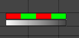
Layers can be used to dim effects that do not currently have a level curve over the entire effect by using the Intensity Overlay mixer in a defined layer. As shown below the white pulse is in the Intensity Overlay layer and the Alternating is in the Default layer. The alternating effect will fade out in relation to the ramp on the pulse effect. The color of the pulse is not important on full color elements.
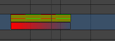
On discrete items that have color defined, the same principle applies with a bit of a spin. Here I am placing this on some led string lights with defined color. There are multiple strings of Red, Green, and Blue. Here I am alternating from red to green. I have added a red pulse to the intensity overlay layer. Here the red lights will dim as they match the red of the pulse. The green will stay at full intensity.
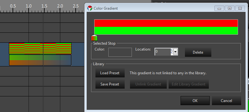
To dim both colors I add green to the pulse.
Mask
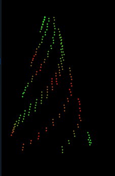
The Mask mixing method allows you to mask out areas of an effect with another effect. You can accomplish this in a similar manner as depicted above. Areas that are lit in the layer that has a the Mask mixer will turn off areas in the effect in the layer beneath it. One example of this is a spiraling butterfly effect. By placing a Spiral effect in the Mask layer and a Butterfly effect in the default layer, the lit spirals in the Spiral effect will create spiral cut outs in the Butterfly. This gives the effect of Spirals where the spokes have the Butterfly pattern on them. The colors of the spirals themselves are irrelevant for using it as a mask. You really only need one color and you configure the spirals to the look you want. The example below was created by just dropping the two effects with defaults, mining them up and setting the spiral to the layer that has a Mask mixer setup.
Mask and Fill
Mask and fill is very similar to the Mask mixing, except instead of leaving unlit areas where the masking effect is, it will replace those areas with the effect in the Mask and Fill layer. In the spiral example above, the colored spirals in the Spiral effect will be visible and replace those areas of the Butterfly. Thus you end up with a spiral overlaid on the Butterfly. Without layering, these would mix and give mixed results. Here you get the exact colors of the Spiral on top of the Butterfly effect so in this case the colors are relevant and you can configure them as needed to obtain the effect you want. Here is how this looks in the preview. I used one color of blue and I reduced the thickness of the spiral by about half to get this look.
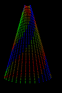
Conclusion
These are just simple examples of the power of layers. There are other mixers that allow for combining in many different ways. Layers are also cumulative, so you can mix multiple effects in higher layers to affect lower layers. We will be adding more in the future as need arise.
Tutorials
3.2.3 - Effects
String Based Effects
All effects support being applied to the elements in a string like format. Depending on the setup of the elements, groups of elements can form a representation of a string. Most effects apply their logic based on those groups acting like a string. This mode is designated by the Target being set to Strings
Location Based Effects
Location based effects create their effects by using the relative location of the elements as defined by their location in the preview. When creating you elements, they should be positioned in relative space to each other the same as they would be when in the display. This allows the effect to apply its logic based on where they lie in 2D space. This is sometime referred to a whole house model, but int he case of Vixen it relates to whatever elements are in the group you place the effect. This can be your entire house or just several props. You have complete flexibility here based on your group definitions.
As of 3.5 release the following effects support rendering based on location or as strings: Balls, Bars, Border, Butterfly, Circles, Colorwash, Coutdown, Curtain, Picture, Pinwheel, Plasma, Text and Video. In the editor set the Target drop down to Locations.
Intelligent Fixture Effects
Intelligent Fixture Effects are different than the other lighting effects in that most of the work is done by the fixture (DMX) hardware. In other words Intelligent Fixture Effects are just exposing the capabilities of the fixture hardware in easy to use effects. Most fixture will only support a subset of these effects. The effect help pages identify the requirements of the hardware for the effect to be applicable.
Device Action Effects
Device Action effects are intended to control items external to Vixen at precise times during a sequence. External items might include special hardware devices or other software applications.
3.2.3.1 - Basic Lighting
3.2.3.1.1 - Alternating
Overview
The Alternating effect does what it’s name implies. It automates the process of alternating elements between colors. A simple example is a row of mini trees alternating back and forth from red to green.
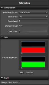
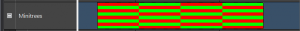
Configuration
- Timing Source This sets the source of how the alternating timing occurs.
- Time Interval This sets the timing of the alternates to be based on time.
- Change Interval This controls the interval that the alternates change on. The value is in milliseconds.
- Static Effect This option allows you to specify if the effect actually changes back and forth between colors over the duration of the effect or just sets up an alternating color pattern that is the same over the duration of the effect. This can be easily used to set alternating color patterns without having to use a pulse on all the individual elements. An example of this is the American flag that has red and white bars alternating, but are the same color for the length of the flag.
- Mark Collection Since Version 3.5. This sets the reference for the alteranates to be based on the Marks in a Mark Collection.
-
Mark Collection This allows you to choose the Mark Collection for the Marks to be used in aligning the alternates. The following is an example of being aligned to the Marks.
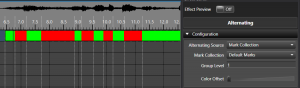
-
- Time Interval This sets the timing of the alternates to be based on time.
- Group Level Specifies how many elements are of the same color before switching to the next color in the list. In the case of pixels with color of red and white set, if you set it to 5, there will be 5 lights that are red and then 5 that are green and then 5 more red and back to green and so on. This works for non pixel elements as well. The default is 1.
- Change Interval Defines on a non static effect, how often the colors switch back and forth. It is specified in ms. So if you want the colors to switch back and forth every 500 ms, set it to 500.
- Color offset Specifies how many colors to jump when the alternating pattern starts over. This can create interesting marquee style effect.
Color
- Gradients This allows you to choose the color sets to be used. The alternating supports what we can a Color Gradient Level Pair. In this case the color and the brightness level work together. With this you can specify fading colors or any other combination. This works just like a pulse, only within that color portion of the alternating. Each Color Gradient has a Curve to control it. You can add or remove these pairs of colors. Both the Color Gradient and the Curve support drag and drop. See Inline Curve Editor and Inline Gradient Editor.
Depth
- Levels Deep When enabled it controls at what level the Alternating is applied inside a group of elements. So you can have 8 items and then have 4 of them grouped to the left and 4 grouped to the right. All of these are grouped under on group. By placing the Alternating at the top level group, you can Alternating all 8 of the items or the left and the right group as a pair.
Tutorials
3.2.3.1.2 - Candle Flicker
Overview
The Candle Flicker effect was designed to simulate the effect of a candle flickering. It has many settings to adjust how the flicker behaves.
Configuration
- Group Level Controls how many elements in the group have the same flicker applied to them. Defaults to 1 meaning each element gets it’s own unique flicker.
Color
- Color Sets the color of flicker.
Brightness
- Max Controls the maximum brightness that a flicker can be. This is a 0 - 100 percent range of the overall color brightness.
- Min Controls the minimum brightness that a flicker can be. This is a 0 - 100 percent range of the overall color brightness.
Flicker
- Change Percent Controls how much change the flicker will have. 0 - 100 percent range of intensity.
- Deviation Controls how much the flicker deviates over the span of the effect.
- Flicker
- Frequency Controls the frequency of the flicker.
3.2.3.1.3 - Chase
Overview
The Chase Effect allows you to have a series of Pulse effects spaced out across the duration of the effect. Instead of having to place and distribute individual pulses over time, this effect will do the math to distribute them evenly for you.
Behavior
Since Version 3.6u1
-
Across Elements/Groups is the default behavior and is equivalent to how the effect acted prior. When the effect is applied on an element that has multiple levels deep, then the Behavior section will appear.
-
Each Element/Group This is a new behavior that changes how the effect looks at the elements and targets them. Previously you could use the levels and chase across a group of Arches or similar props, but if you wanted to apply the same chase to each Arch in the group, you would need to put a Chase on each Arch specifically. Now you can choose the Each Element/Group behavior and the proper level to get an identical Chase on each arch. This also allows the possibility to Chase up/down a Pixel tree instead of just around it. Many combinations are possible using variations of the Behavior and Level options.
Color
- Color Handling This controls how the colors are applied on the effect. The simplest is a single color which will create a simple chase with only that color on it. The other three options allow for a Color Gradient to be applied in different ways on the effect. See Inline Gradient Editor
-
Single Color This sets the color to be a simple color.
-
Gradient Thru Effect This will transition the colors on the chase over time to match the colors in the gradient. This allows you to have a chase that goes from say red to blue over the duration.
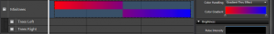
-
Gradient Per Pulse Each individual pulse within the chase will have the gradient applied to it. Each pulse will have the same color. So the pulse can go from red to blue.
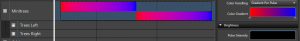
-
Gradient Across Items The gradient will be applied proportionately over group of items that the chase covers with each item receiving the color within the gradient that corresponds to it’s percentage of the entire group.
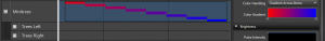
-
- Color Gradient / Color Depending on the Color Handling setting this will allow the simple color, or the Color Gradient to be set. See Inline Gradient Editor.
Brightness
-
Pulse Intensity This setting controls the shape of the pulse Curve. Much like the same setting in the pulse effect, you can control is each pulse ramps up or down or any shape you can design with the Curve. See Inline Curve Editor.
The default setting represents a ramping on motion where each portion of the chase ramps up to full brightness

The shows a pulse ramping up and then down just by altering the shape of the Curve into a ^ shape.

Direction
-
Direction This Curve controls the direction the chase moves across items. In it’s simple form it is right to left, or left or right. But you can design custom movements to have it move right and then back left in the same effect. See Inline Curve Editor
Normal Direction

Reversing Direction

Pulse
-
Extend Pulse To End Extends the pulses to the end of the effect to enable a chase to on type effect. Each pule will foloow the curve and then maintain the last intensity to the end of the effect. Pulse Intensity must be above zero on the curve at the end.

-
Extend Pulse To Start. This is the opposite of etendign to end. This allows the effect to be all on at the start, and then chase the elements off. Pulse Intensity must be > 0 at the beginning of the curve.

-
Pulse Overlap Controls how much the pulses of the chase overlap with each other. This can be used to create a more smooth flowing effect by adding more overlap.
Zero overlap
200 ms overlap
Depth
- Levels Deep Controls at what level the Chase is applied inside a group of elements. So you can have 8 items and then have 4 of them grouped to the left and 4 grouped to the right. All of these are grouped under on group. By placing the Chase at the top level group, you can Chase all 8 of the items or the left and the right group as a pair.
3.2.3.1.4 - Dissolve
Overview
TThe Dissolve effect simulates colors disolving from, or filling into a space. The effect name of Dissolve may seem to suggest that it can only dissolve, but it also supports the opposite with filling color into an element. It has many settings to adjust how the effect behaves.
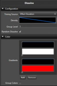
Configuration
- Timing Source Controls if the effect is driven by the time duration, or by Marks in a Mark Collection.
- Density A Curve that governs how dense the coverage of the elements and how the dissolve itself acts. See the Inline Curve Editor.
- Group Level Controls how many elements in the group have the same Dissolve applied to them. Defaults to 1 meaning each element gets it’s own unique Dissolve.
- Random Disolve Controls if the Disolve pattern is random (Checked) as to the order elements Disolve, or if the user can take more control.
- Starting Element Starting location where the Dissolve or Fill will commence from.
- Dissolve Flip Flips the direction of the sequential Dissolve.
- Both Directions Dissolves or Fills in both directions, one after the other.
Color
- Gradients Sets the Color Gradient and intensity Curve for the effect. You can have more than one Gradient and each Gradient will have its own intensity Curve. See the Inline Gradient Editor and Inline Curve Editor.
- Color Per Step When enabled, color will change for each step variation. When disabled, each step variation will have all colors.
- Random Color Order When enabled the colors will be chosen at random instead of in order.
- Group Color When enabled, each element will have all colors generated in parallel.
Depth
- Effect Depth Controls the depth level in groups that the effect should be applied to. If there are multiple levels of props in a group, the same Dissolve can be applied to each group instead of using multiple effects by using this setting.
3.2.3.1.5 - LipSync
Overview
The Lip-sync effect helps to facilitate sequencing singing faces. It is a multi purpose effect that has evolved over the years into a powerful tool for syncronizing lyrics to your face mapped props. This effect relies on the mapping of the face properies in your elements in order to work properly.
Configuration
- Phoneme/Marks This setting determine how the LipSync effect behaves.
- Mark Collections Since Version 3.5. This set the effect to get its phomeme information from the Marks in a Mark Collection. This is the default and the most common way to use the effect.
- Mark Collection This sets the Mark Collectin that contains the Marks with the Phonemes in it. There are typically 3 types of collections. Phrases, Words, and Phonemes. You select the Phonemes one here.
- Allow Mark Gaps When enabled, the effect does not fill gaps between the Marks with a REST.
- Phoneme This allows the effect to be used in manual mode where you configure the phoneme you want to use specifically.
- Mark Collections Since Version 3.5. This set the effect to get its phomeme information from the Marks in a Mark Collection. This is the default and the most common way to use the effect.
- Mapping Type This allows you to choose the mapping type. This controls how phonemes are mapped to the individual elements in your Prop.
- Face Mapping This option is used when you have a Prop that is usually a defiend shape and you have mapped specific elements to the mouth phonemes.
- Image Mapping This option is used for matrix type props that use an image for a mouth shape rather than mapping individual lights or elements.
- Eye Mode This sets how the eyes should be handled when the effect is active.
- Open This sets the eyes to open using the open eyes mapping.
- Closed This sets the eyes to be closed using the eyes closed mapping.
- Off This sets the effect to ignore turning on the eyes.
- Show Outline This sets the effect to turn on the outline using the outline mapping.
Lip-Sync Enhancements
Since Vixen 3.5
Lyric Tracks
A good way to get lyric tracks that are very close to begin with is to use a track generator. One that works pretty well is the Autolyrics site. One of our users made a video that gives an overview of the process. When selecting the mark track to use in the effect, be sure to use the Phoneme one. If you need to make adjustments, you can adjust the phoneme marks to better align with the lipmovements you want. If the track is slightly off, you can select and move the blocks of phrases, words, phonemes to meet your needs. In most cases this gets you very close.
3.2.3.1.6 - Pulse
Overview
The Pulse effect is one step above a Set Level. In fact this effect can do everything the Set Level can plus more. The main differences here are the ability to use a color gradient over a single color and the ability to shape the brightness as a curve value to vary over the length of the effect. See the sections on Curves and Color Gradients for more details on how they work.
With the ability to control the brightness over the duration of the effect, the Pulse enables things like a fade on or fade off by adjusting the curve from a ramp up or ramp down. But the curve can take any shape and thus you can form your pulse to do about anything.
The pulse is also highly useful as a modifying effect when using layers. It can be used to fade other effects on or off, or control their brightness. See the sections on Layers for more details.
Color
- Gradients Sets the Color Gradient for the effect. See the Inline Gradient Editor.
Brightness
- Intensity Sets the intensity Curve for the effect. See the Inline Curve Editor.
3.2.3.1.7 - Set Level
Overview
The Set Level is the most basic off all effects. It allows you to turn on a element at a level for the specific duration. The level slider determines the brightness of the effect. It supports a single RGB color.
Color
- Color This allows you to set the color of the element. Double click the color box to bring up a color picker, or drag and drop colors from the library onto it.
Brightness
- Intensity This slider allows you to choose the intensity of the color. It is a 0 - 100 percent slider.
3.2.3.1.8 - Spin
The Spin is similar to the Chase effect. It can be thought of as repeating chases back to back which creates a spinning effect.
Behavior
Since Version 3.6u1
-
Across Elements/Groups is the default behavior and is equivalent to how the effect acted prior. When the effect is applied on an element that has multiple levels deep, then the Behavior section will appear.
-
Each Element/Group This is a new behavior that changes how the effect looks at the elements and targets them. Previously you could use the levels and spin across a group of Arches or similar props, but if you wanted to apply the same Spin to each Arch in the group, you would need to put a Spin on each Arch specifically. Now you can choose the Each Element/Group behavior and the proper level to get an identical Spin on each arch. This also allows the possibility to Spin up/down a Pixel tree instead of just around it. Many combinations are possible using variations of the Behavior and Level options.
Color
- Color Handling This controls how the colors are applied on the effect. The simplest is a single color which will create a simple Spin with only that color on it. The other three options allow for a Color Gradient to be applied in different ways on the effect. See Inline Gradient Editor
-
Single Color This sets the color to be a simple color.
-
Gradient Thru Effect This will transition the colors on the Spin over time to match the colors in the gradient. This allows you to have a Spin that goes from say red to blue over the duration.
-
Gradient Per Pulse Each individual pulse within the Spin will have the gradient applied to it. Each pulse will have the same color. So the pulse can go from red to blue.
-
Gradient Across Items The gradient will be applied proportionately over group of items that the Spin covers with each item receiving the color within the gradient that corresponds to it’s percentage of the entire group.
-
- Color Gradient / Color Depending on the Color Handling setting this will allow the simple color, or the Color Gradient to be set. See Inline Gradient Editor.
Brightness
-
Pulse Intensity This setting controls the shape of the pulse Curve. Much like the same setting in the pulse effect, you can control is each pulse ramps up or down or any shape you can design with the Curve. See Inline Curve Editor.
The default setting represents a ramping on motion where each portion of the chase ramps up to full brightness
The shows a pulse ramping up and then down just by altering the shape of the Curve into a ^ shape.
-
Minimum Brightness This allows you to set a minimum level of the color across areas that are not spinning. So you could have a green spin over a dim green background. The background will have the same color attibutes chosen above.
- Minimum Level Enabled when you choose minimum brightness and allows you to set the 0 - 100 percent intensity via a slider.
Direction
- Direction the direction the spin rotates can be choosen from this drop down. The possible values are Forward and Reverse.
Speed
- Speed Format This controls the way the speed of the spin is controlled.
- Revolution Count This sets the speed to be a number of revolutions over the span of the effect.
- Count The number of revolutions.
- Revolution Frequency This controls the speed as a factor of frequency over the span of the effect.
- Revolution The frequency of the revolutions.
- Fixed Time This controls the speed of the spin as a function of time.
- Revolution Time Time in milliseconds for a revolution to take.
- Revolution Count This sets the speed to be a number of revolutions over the span of the effect.
Pulse
- Pulse Type This controls the type of the pulse behavior.
- Distribute Evenly This distributes the pulses evenly over the timespan of the revolution. This is the default.
- Fixed Time This sets the duration of each pulse in milliseconds.
- Duration Duration of the pulse in milliseconds.
- Percent Revolution This sets the duration of the pulse to be a percent of the revolution time.
- Pulse Length A 0 - 100 percent value determining the percent of the revolution.
Depth
- Levels Deep Controls at what level the Spin is applied inside a group of elements. So you can have 8 items and then have 4 of them grouped to the left and 4 grouped to the right. All of these are grouped under on group. By placing the Spin at the top level group, you can Spin all 8 of the items or the left and the right group as a pair.
3.2.3.1.9 - Twinkle
Overview
The Twinkle effect was designed to simulate the effect of twinkling lights on a Prop.
Color
- Color Handling This controls how the colors are applied on the effect. The simplest is a single color which will create a simple Twinkle with only that color on it. The other three options allow for a Color Gradient to be applied in different ways on the effect. See Inline Gradient Editor.
- Single Color This sets the color to be a simple color.
- Gradient Thru Effect This will transition the colors on the Twinkle over time to match the colors in the gradient. This allows you to have a Twinkle that goes from say red to blue over the duration.
- Gradient Per Pulse Each individual pulse within the Twinkle will have the gradient applied to it. Each pulse will have the same color. So the pulse can go from red to blue.
- Gradient Across Items The gradient will be applied proportionately over group of items that the Twinkle covers with each item receiving the color within the gradient that corresponds to it’s percentage of the entire group.
- Color Gradient / Color Depending on the Color Handling setting this will allow the simple color, or the Color Gradient to be set. See Inline Gradient Editor.
Brightness
- Max Controls the maximum brightness of the twinkles.
- Min Controls the minimum brightness of the twinkles.
- Variation Controls the percent variation in the brightness of each twinkle.
Configuration
- Avg Pulse Time Controls how long the average pulse time of each twinkle is in milliseconds.
- Coverage Controls what percentage of the Prop is covered by twinkles.
- Variation Controls the percent variation in the time of each twinkle.
Depth
- Levels Deep When enabled it controls at what level the Twinkle is applied inside a group of elements. So you can have 8 items and then have 4 of them grouped to the left and 4 grouped to the right. All of these are grouped under on group. By placing the Twinkle at the top level group, you can Twinkle all 8 of the items or the left and the right group as a pair.
3.2.3.1.10 - Wipe
Overview
The Wipe was one of the first location aware effects in Vixen. The goal of this effect is somewhat similar to the Chase, however it is aware of the position of the elements as defined in the Preview. It uses this location awareness to simulate a chase across all of its elements in a Wiping fashion.
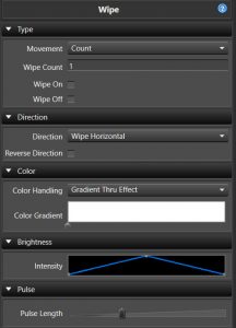
Type
- Movement
- Count This sets the number of wipe passes in the timespan of the effect.
- Wipe Count The number of wipes.
- Wipe On When enabled, the wipe will maintiain the elements in the on state as the wipe moves across.
- Wipe Off When enabled, the wipe will start out on and wipe off across the prop.
- Pulse Length This controls the wipe by a measure of the pulse length.
- Movement This controls the wipe by the movement curve.
- Count This sets the number of wipe passes in the timespan of the effect.
The Wipe on/off options are similar to the Chase extend to start/end options. These are most useful for wiping the stage on or off. The pulses have the same rules as the Chase and need to have a > zero end value for wiping on and a > zero start value for wiping off. The default pulse curve has a zero start and end value, so to use this you would need to adjust to a ramp on for the wipe on case or ramp off for wipe off as an example.
Direction
- Direction It can move in a number of directions, horizontal, vertical, diagonal up, diagonal down, burst, circle burst and diamond burst.
- Reverse Direction When enabled, the direction will be reversed.
Color
- Color Handling This controls how the colors are applied on the effect. The simplest is a single color which will create a simple Twinkle with only that color on it. The other three options allow for a Color Gradient to be applied in different ways on the effect. See Inline Gradient Editor.
- Gradient Thru Effect This will transition the colors on the Wipe over time to match the colors in the gradient. This allows you to have a Wipe that goes from say red to blue over the duration.
- Gradient Across Items The gradient will be applied proportionately over group of items that the Wipe covers with each item receiving the color within the gradient that corresponds to it’s percentage of the entire group.
- Color Gradient Sets the Color Gradient to be used. See Inline Gradient Editor.
Brightness
- Intensity This sets the Curve that controls the intensity of the color over the effect. See Inline Curve Editor.
Pulse
- Pulse Length The pulse length is also similar to the pulse overlap feature of the Chase and allows for the pulses to be adjusted to smooth out the Wipe or lengthen the amount of visible time any part of the lights are lit.
3.2.3.2 - Pixel Lighting
3.2.3.2.1 - Balls
Overview
Creates an effect that animates Ball looking shapes.
String Setup
-
Positioning - Determines how the target elements are treated. Either as individual strings or by their actual location in the display preview. Locations is often referred to as whole house, but it can be any form of multiple props. Generally you want Strings when applying to one prop and locations if the target is multiple props.
-
Orientation - Controls the orientation of the display area (matrix).
Configuration
-
Type - Configures how balls behave when reaching the edge of the display element between Bounce or Wrap.
-
Fill - Selects the type of fill for the balls between Fade, Empty, Solid, Gradient, and Inverse.
-
Speed - Configures the speed of the moving balls.
-
Speed Variation - Randomly adjusts the speed of the moving balls around the Speed level by the amount of variation.
-
Size - Size of the balls.
-
Ball Count - Controls the number of balls displayed.
-
Random Time - Configures the maximum time used to detrmine when the ball direction changes. This setting only applies when Random Movement is selected.
-
Random Movement - Randomly changes the ball direction at random times.
-
Random Radius - Creates random size balls up to the Size value.
-
Collide - Change the ball direction when balls collide.
-
Collide Color - Change the ball color when balls collide.
Color
- Gradients - Controls the colors of the balls.
Brightness
- Intensity - This is an overall brightness intensity curve over the duration of the effect. This is a legacy parameter, consider using intensity overlay layers instead.
Video
3.2.3.2.2 - Bars
Overview
Creates an effect that animates bars on a display element. This effect works the best on a matrix with a large pixel count.
String Setup
-
Positioning - Determines how the target elements are treated. Either as individual strings or by their actual location in the display preview. Locations is often referred to as whole house, but it can be any form of multiple props. Generally you want Strings when applying to one prop and locations if the target is multiple props.
-
Orientation - Controls the orientation of the display area (matrix).
Configuration
-
Bar Type - Selects either a Flat or an angled Zig Zag styled bar.
-
Direction - Sets the direction of bar movement.
- Moves Up - The bars move in a upward direction.
- Moves Down - The bars move in a downward direction.
- Compress - The bars move in a motion that looks like they are compressing in the middle.
- Expands - The bars move outward from the center.
- Moves Left - The bars move from right to left.
- Moves Right - The bars move from left to right.
- Horizontal Compress - The bars move in a motion that looks like they are compressing in the middle.
- Horizontal Expand - The bars move outward from the display element center.
- Alternate Up - The bars move up in an alternating fashion.
- Alternate Down - The bars move down in an alternating fashion.
- Alternate Left - The bars move left in an alternating fashion.
- Alternate Right - The bars move right in an alternating fashion.
-
Rotation: The rotation of the bars. The bars can rotate in either direction using the following mapping to the curve:
- 100 - 180 Degrees (Counter Clockwise)
- 75 - 90 Degrees (Counter Clockwise)
- 50 - No Rotation
- 25 - 90 Degrees (Clockwise)
- 0 - 180 Degrees (Clockwise)
-
Motion - Determines the how the motion of the bars is controlled by selecting either Iterations or Speed.
-
Iterations The number of times the pattern repeats over the duration of the effect.
-
Speed - Determines how fast the bars moves.
-
Repeat - Determines how times the color bars are repeated on the display element. This indirectly determines the thickness of the bars.
-
Highlight: Creates a white highlighted leading edge on each bar. This may not be highly visible in some cases using locations.
-
Highlight %: Controls the percentage of the bar that is highlighted white. Setting only available in Location mode.
-
3D: Makes each color appear as a gradient fading to black. This is a legacy function, consider using gradients instead.
Color
- Gradients: This is where you set the colors of the bars.The number and order of the colors here will be how they are applied in the effect. The list supports gradients of solid, or varying colors.
Brightness
- Intensity - This is an overall brightness intensity curve over the duration of the effect.
Zig Zag Configuration
-
Amplitude: Controls the height of the zig zag’s crest.
-
Period: Controls the width or wave length of the zig zag.
-
Thickness: Controls the thickness of the zig zag.
-
Spacing: Controls the blank area between each zig zag color.
Video Tutorial
3.2.3.2.3 - Border
Overview
Creates an effect that outlines a display element with a border.
String Setup
-
Positioning - Determines how the target elements are treated. Either as individual strings or by their actual location in the display preview. Locations is often referred to as whole house, but it can be any form of multiple props. Generally you want Strings when applying to one prop and locations if the target is multiple props.
-
Orientation - Controls the orientation of the display area (matrix).
Configuration
-
Border Mode - Selects the type of border.
- Simple - This border mode provides a uniform border around the display element.
- Advanced - This border mode provides advanced control over the size and width of the border.
- Marquee - This border mode provides moving bands of color moving around the display element.
This border mode also has special render levels that make visually interesting patterns on mega-trees.
Video Tutorial
3.2.3.2.3.1 - Advanced Mode
Overview
Creates an effect that outlines a display element with a border with advanced configuration controls.
String Setup
-
Positioning - Determines how the target elements are treated. Either as individual strings or by their actual location in the display preview. Locations is often referred to as whole house, but it can be any form of multiple props. Generally you want Strings when applying to one prop and locations if the target is multiple props.
-
Orientation - Controls the orientation of the display area (matrix).
Configuration
-
Border Mode - Selects between Simple, Advanced, or Marquee borders.
-
Border Type - Selects between Single or Independent border width control.
Single border type makes all the sides of the display element a uniform thickness.
Border
-
Thickness - Adjusts the thickness of the border. Applies when Single Border Type is selected.
-
Top Width - Adjusts the top border thickness. Applies when Border Type is set to Independent.
-
Bottom Width - Adjusts the bottom border thickness. Applies when Border Type is set to Independent.
-
Left Width - Adjusts the left border thickness. Applies when Border Type is set to Independent.
-
Right Width - Adjusts the right border thickness. Applies when Border Type is set to Independent.
-
Width - Configures the width of the border.
-
Height - Configures the height of the border.
Movement
-
X Offset - Adjusts the position of the effect along the X axis.
-
Y Offset - Adjusts the position of the effect along the Y axis.
Color
-
Gradient Mode - Configures how the Color Gradient is applied to the border (Over Time, Across Element, Vertically Across Element, Diagonal Bottom-Top Element, Diagonal Top-Bottom Element).
-
Color Gradient - Controls the colors of the border.
Brightness
- Intensity - This is an overall brightness intensity curve over the duration of the effect. This is a legacy parameter, consider using intensity overlay layers instead.
3.2.3.2.3.2 - Marquee Mode
Overview
Creates an effect that outlines a display element with a marquee border.
String Setup
-
Positioning - Determines how the target elements are treated. Either as individual strings or by their actual location in the display preview. Locations is often referred to as whole house, but it can be any form of multiple props. Generally you want Strings when applying to one prop and locations if the target is multiple props.
-
Orientation - Controls the orientation of the display area (matrix).
Configuration
-
Border Mode - Selects between Simple, Advanced, or Marquee borders. Refer to the links below for more information on each of the Border Modes.
-
Render Level - Controls how the marquee is rendered (Level 0, Level 1, or Level 2).
- Level 0 - (default) renders the effect as a normal matrix outlining it with a border.
- Level 1 - Converts the matrix into a single strand of pixels. The single strand is created by looping back and forth.
- Level 2 - Converts the maxrix into a single stand of pixels. The single strand is created by always starting on the left side of the matrix.
Render Levels 1 and 2 provide visually interesting patterns when this effect is placed on a mega-tree and other props.
-
Thickness - Controls the width of the marquee border as a percentage of the display element.
-
Stagger - Controls the offset between each band of pixels in the marquee border as a percentage of the display element. The Thickness needs to greater than 1 pixel for this control to be visible.
-
Band Length - Controls the size of the marquee color bands as a percentage of the display element.
-
Skip Length - Controls the size of the blank area between marquee color bands as a percentage of the display element.
-
Reverse - Toggles the direction of the marquee movement.
-
X-Size - Determines the size of the marquee along the x-axis.
-
Y-Size - Determines the size of the marquee along the y-axis.
Movement
-
X Offset - Adjusts the position of the effect along the X axis.
-
Y Offset - Adjusts the position of the effect along the Y axis.
-
** Wrap X Axis ** - Allows the marquee to wrap around the display element on the x-axis.
-
** Wrap Y Axis ** - Allows the marquee to wrap around the display element on the y-axis.
Color
- Color Gradient - Controls the color of the bands that make up the marquee.
Brightness
- Intensity - This is an overall brightness intensity curve over the duration of the effect. This is a legacy parameter, consider using intensity overlay layers instead.
3.2.3.2.3.3 - Simple Mode
Overview
Creates an effect that outlines a display element with a simple border.
String Setup
-
Positioning - Determines how the target elements are treated. Either as individual strings or by their actual location in the display preview. Locations is often referred to as whole house, but it can be any form of multiple props. Generally you want Strings when applying to one prop and locations if the target is multiple props.
-
Orientation - Controls the orientation of the display area (matrix).
Configuration
- Border Mode - Selects between Simple, Advanced, or Marquee borders.
Border
- Width - Controls the thickness of the border.
Color
-
Gradient Mode - Configures how the Color Gradient is applied to the border (Over Time, Across Element, Vertically Across Element, Diagonal Bottom-Top Element, Diagonal Top-Bottom Element).
-
Color Gradient - Controls the colors of the border.
Brightness
- Intensity - This is an overall brightness intensity curve over the duration of the effect. This is a legacy parameter, consider using intensity overlay layers instead.
3.2.3.2.4 - Butterfly
Overview
Creates a pulsing effect reminiscent of the flapping wings of a butterfly.
String Setup
-
Positioning - Determines how the target elements are treated. Either as individual strings or by their actual location in the display preview. Locations is often referred to as whole house, but it can be any form of multiple props. Generally you want Strings when applying to one prop and Locations if the target is multiple props.
-
Orientation - Controls the orientation of the display area (matrix).
Configuration
-
Butterfly Type - Allows you to choose between different movement patterns. Different patterns may be suitable for different element group types.
- Pulsing Circle
- Pulsing Grid of Circles
- Alternating Inverted Boxes
- Flapping Wings
-
Direction - Changes the direction in which the pattern moves. This is more evident on the linear Butterfly types than it is on the pulsing or oscillating types.
- Forward
- Backword
-
Motion - Controls how the effect progresses across time.
- Iterations - Displays the Iterations slider to specify the number of times the pattern repeats over the duration of the effect.
- Speed - Displays a Speed Curve for configuring the speed of the pattern over the duration of the effect.
-
Iterations - The number of times the pattern repeats over the duration of the effect.
-
Speed - Controls the speed of the repeating pattern over the duration of the effect.
-
Repeat - The number of times the pattern repeats in each iteration.
-
Background Skips - The number of time the background is skipped per pattern
-
Background Chunks - Divides the background into a number of chunks for a “broken up” pattern.
Color
Color Scheme - Controls the color scheme used for the effect.
- Gradient - Uses the gradient defined below to set the colors for the effect.
- Rainbow - Uses a fixed rainbow color palette for the effect.
Brightness
- Intensity - This is an overall brightness intensity curve over the duration of the effect. This is a legacy parameter, consider using intensity overlay layers instead.
3.2.3.2.5 - Circles
Overview
Creates an effect that animates concentric circles.
String Setup
-
Positioning - Determines how the target elements are treated. Either as individual strings or by their actual location in the display preview. Locations is often referred to as whole house, but it can be any form of multiple props. Generally you want Strings when applying to one prop and locations if the target is multiple props.
-
Orientation - Controls the orientation of the display area (matrix).
Configuration
-
Fill - Selects the type of fill for the circles between Fade, Empty, Gradient Over Time, and Gradient Over Element.
-
Direction - Configures the movement of the circles between either In or Out.
-
Speed - Configures the speed of the radially pattern of the circles.
-
Size - Controls the size of the concentric circles.
-
Circles - Controls the number of circles displayed.
Movement
-
Horizontal Offset - Controls the center positioning of the effect in the horizontal plane.
-
Vertical Offset - Controls the center positioning of the effect in the vertical plane.
Color
- Gradients - Controls the color of the effect.
Brightness
- Intensity - This is an overall brightness intensity curve over the duration of the effect. This is a legacy parameter, consider using intensity overlay layers instead.
Video
3.2.3.2.6 - Colorwash
Overview
Creates an effect that washes colors over the display element.
String Setup
-
Positioning - Determines how the target elements are treated. Either as individual strings or by their actual location in the display preview. Locations is often referred to as whole house, but it can be any form of multiple props. Generally you want Strings when applying to one prop and Locations if the target is multiple props.
-
Orientation - Controls the orientation of the display area (matrix).
Configuration
-
Type - Selects between pattern variations.
- Center
- Outer
- Invert
-
Motion - Controls how the effect progresses across time between Speed and Iterations.
- Iterations - Displays the Iterations slider to specify the number of times the pattern repeats over the duration of the effect.
- Speed - Displays a Speed Curve for configuring the speed of the pattern over the duration of the effect.
-
Iterations - The number of times the pattern repeats over the timespan of the effect.
-
Speed - Controls the speed of the colors washing over the prop.
-
Horizontal Fade - Adds a horizontal fade to the color wash pattern.
-
Vertical Fade - Adds a vertical fade across the color wash pattern.
-
Shimmer - Adds a flashing/strobing effect as the color fades.
Color
- Color Gradient - Controls the color of the wash for the duration of the effect.
Brightness
- Intensity - This is an overall brightness intensity curve over the duration of the effect. This is a legacy parameter, consider using intensity overlay layers instead.
Video
3.2.3.2.7 - Count Down
Overview
Creates an effect that displays a count down on a display element.
String Setup
-
Positioning - Determines how the target elements are treated. Either as individual strings or by their actual location in the display preview. Locations is often referred to as whole house, but it can be any form of multiple props. Generally you want Strings when applying to one prop and Locations if the target is multiple props.
-
Orientation - Controls the orientation of the display area (matrix).
Configuration
-
Count Type - Controls how the effect counts (To end of effect, Down from time, Up from time).
-
Time Format - Controls the units of the count down (Minutes or Seconds).
-
Fade - Controls how the count down numbers appear (None, In, Out, In/Out)
-
Size Mode - Controls whether the text shrinks or grows as the numbers are displayed (None, Shrink, Grow).
-
Start Time - Field is only available when the Count Type is set to Down from time or Up from time. This initializes where the effect will count from.
-
Font - Specifies the font, style and size to be used. You may use any font installed on the PC. Note that the fonts used must be installed on any PC where you will transfer this sequence.
-
Film Spinner - Adds a film spinner around the number. This feature works best on a medium to high resolution matrix.
Movement
-
Direction - Controls the direction of the effect (Left, Right, Up, Down, Rotate, None, Random).
-
Angle - When enabled, controls the angle of the count down over the duration of the effect. This field is only available when the Direction is set to Rotate.
-
Horizontal Offset - This is used to offset the center of the count down horizontally on the grid. Since this is a curve it can be used to move the center over the duration of the effect.
-
Vertical Offset - The vertical offset. This is used to offset the center of the count down vertically on the grid. Since this is a curve it can be used to move the center over the duration of the effect.
-
Center Stop - When enabled, causes the count down number to stop at the center of the grid. This field is only available when the Direction is set to Left, Right, Up, or Down.
-
Movement per number - When enabled, the count down number moves as specified by the Direction over the grid for each number. This field is only available when the Direction is set to Left, Right, Up, or Down.
-
Iterations - When enabled, controls how fast the count down moves.
This field is only available when the Direction is set to Left, Right, Up, or Down. This field is not applicable when Movement per number is selected.
Color
-
Text Color Gradients - One or more gradients used to color the count down number and when enabled the film spinner.
-
Gradient Mode - Specifies how gradients will be applied to the text. There are 8 combinations of direction and how it’s applied. The gradient can be applied across the letters of the text, or across the whole element group. If it’s across the letters, the gradient will stay with the text. If it is across the element, it will appear that the text travels through the colors of the gradient.
-
Film Spinner Gradients - One or more gradients used to color the film spinner background swipe.
-
Film Spinner Gradient Mode - Specifies how gradients will be applied to the film spinner background swipe (Across Text, Vertical Across Text, Vertical Across Element, Diagonal Across Text, Diagonal Across Element, Reverse Diagonal Across Element, Reverse Diagonal Across Text)
Brightness
- Intensity - This is an overall brightness intensity curve for the count down over the duration of the effect. This is a legacy parameter, consider using intensity overlay layers instead.
Video Tutorial
3.2.3.2.8 - Curtain
Overview
Creates an effect that imitates a curtain opening or closing across your display element.
String Setup
-
Positioning - Determines how the target elements are treated. Either as individual strings or by their actual location in the display preview. Locations is often referred to as whole house, but it can be any form of multiple props. Generally you want Strings when applying to one prop and Locations if the target is multiple props.
-
Orientation - Controls the orientation of the display area (matrix).
Configuration
-
Direction - Selects the direction of the movement (Open, Close, Open-Close, Close-Open).
-
Motion - Controls how the effect progresses across time between Position or _Iterations.
-
Iterations - The number of times the pattern repeats over the duration of the effect.
-
Edge - Selects the position where the curtain opens from (Left, Center, Right, Bottom, Middle, Top).
-
Swag - Controls the amount of swag on the moving curtain edge. (simulating the inertial curving movement of drapery in motion).
Color
- Color Gradient - The color of the curtain.
Brightness
-
Intensity - This is an overall brightness intensity curve for over the duration of the effect. This is a legacy parameter, consider using intensity overlay layers instead.
-
Intensity Per Iteration - Adjust the intensity over each iteration.
Video
3.2.3.2.9 - Fire
Overview
Creates an effect that simulates burning fire.
String Setup
- Orientation - Controls the orientation of the display area (matrix).
Configuration
-
Location - Selects the side of the grid for the base of the fire (Bottom, Top, Left, Right).
-
Height - Adjusts the flame height. This parameter is a curve that allows you to vary the height over the duration of the effect.
Color
- Hue Shift - Adjusts the color of the flame as a hue shift from normal fire colors.
Brightness
- Intensity - This is an overall brightness intensity curve for over the duration of the effect.� This is a legacy parameter, consider using intensity overlay layers instead.
Video
3.2.3.2.10 - Fireworks
Overview
Creates an effect that simulates fireworks bursting in the sky. You can select to use random Fireworks, Fireworks to the Audio track or Fireworks to Marks in a Mark collection.
Configuration
-
Fireworks Source - Selects what source is used to determine explosions (Standard Random Explosions, Mark Collections, Audio)
-
Explosions - The number of bursts over the duration of the effect.
-
Random Velocity - Allows you to specify either a fixed velocity (speed) of the bursts when not checked, or when checked, a random velocity for each burst within a range from min to max.
-
Min Velocity - Lower bound on the random burst velocity.
-
Max Velocity - Upper bound on the random burst velocity.
-
Velocity - Controls the velocity of the particls when Random Velocity is not selected.
-
Random Particles - Controls the number of particles in each burst. If checked, allows you specify a maximum and minimum to define a range for particle count for each burst. If not checked, allows you to specify a fixed number of particles for all bursts.
-
Min Particles - Lower bound on the number of random particles.
-
Max Particles - Upper bound on the number of random particles.
-
Particles - Controls how many particles will be created for each explosion when not using Random Particles.
Color
-
Color Type - Selects the type of color explosions between (Standard Bursts, RainBow Particles, Range Particles, Palette Particles, Random Bursts).
-
Colors - Allows you to define one or more colors or gradients for the bursts. By defining multiple colors, you can allow for independent bursts of different colors. If you use gradients rather than solid colors, you can have individual bursts that change from one color to another.
Brightness
- Intensity - This is an overall brightness intensity curve over the duration of the effect. This is a legacy parameter, consider using intensity overlay layers instead.
Video Tutorial
3.2.3.2.11 - Garlands
Overview
Creates an effect that simulates filling the grid by wrapping it with garland. This effect is best suited on megatree type props.
String Setup
-
Positioning - Determines how the target elements are treated. Either as individual strings or by their actual location in the display preview. Locations is often referred to as whole house, but it can be any form of multiple props. Generally you want Strings when applying to one prop and Locations if the target is multiple props.
-
Orientation - Controls the orientation of the display area (matrix).
Configuration
-
Motion - Controls how the effect progresses across time between Iterations or Speed.
-
Movement Type - Selects whether the movement is based on iterations or speed.
-
Direction - Sets the direction of the movement (Up, Down, Left, Right).
-
Iterations - The number of times the pattern repeats over the duration of the effect.� This is only available when movement type is set to Iterations.
-
Speed - The amount of time for one iteration of the effect.� If the speed is set to a point where one iteration is less than the duration of the effect, it will repeat with one or more additional iterations.� This parameter is only available when movement type is set to Speed.
-
Garland Type - Selects between different styles of garland.
-
Spacing - Adjusts the distance between the strings of garland.
Color
- Gradients - Specify one or more colors/gradients to be applied across the prop.� The colors are applied starting with the last color in the list filling the side where the direction is set and follows through to the first color in the list on the other side of the prop
Brightness
- Intensity - This is an overall brightness intensity curve over the duration of the effect.� This is a legacy parameter, consider using intensity overlay layers instead.
Video
3.2.3.2.12 - Glediator
Overview
Creates an effect that is used to import effects created with the Glediator application. More information on glediator can be found at: Glediator Website and Download
Notes: You will need to change the Glediator Matrix size to match the Vixen matrix size you are using the effect on.
Jinx
Jinx! can be used to create files to import to this effect also. In Jinx!, you will need to specify to output to Glediator file, which writes an .out file after starting output in Jinx! It is the .out file that you rename to .gled and then Vixen can read it using the Glediator effect.
String Setup
- Orientation - Controls the orientation of the display area (matrix).
Movement
-
Movement Type - Select between Iterations or Speed. When set to iterations, the Iterations slider will adjust the number of times the pattern will repeat over the duration of the effect. When Movement Type is set to Speed, the Speed slider will control the speed of each iteration.
-
Iterations - Controls how many times the pattern repeats over the timespan.
-
Speed - Controls the speed of the pattern.
Configuration
- File Name - Selects the Glediator file you wish to use.
Brightness
- Intensity - This is an overall brightness intensity curve over the duration of the effect. This is a legacy parameter, consider using intensity overlay layers instead.
3.2.3.2.13 - Life
Overview
The Life effect is a random particle growth type effect. It is designed to imitate colonies of microbes as they replicate and grow. When set to a high cell start count, it resembles old fashioned TV snow. When set to a low Cell Start count, it can be made to somewhat resemble confetti.
String Setup
- Orientation - Controls the orientation of the display area (matrix).
Configuration
-
Speed - The speed at which the particles progress.
-
Cells to Start - The number of pixels or “colonies” at the beginning of the effect.
-
Type - This applies different variations to the growth pattern.
Color
- Gradients - One or more colors/gradients used randomly for each particle.
Brightness
- Intensity - This is an overall brightness intensity curve over the duration of the effect. This is a legacy parameter, consider using intensity overlay layers instead.
Video
3.2.3.2.14 - Liquid
Overview
Creates an effect that leverages the Google Liquid Fun library to simulate fluid movement. This effect can produce unique liquid patterns if the settings are finely tuned. This effect works the best on a matrix with a large pixel count.
String Setup
-
Positioning - Determines how the target elements are treated. Either as individual strings or by their actual location in the display preview. Locations is often referred to as whole house, but it can be any form of multiple props. Generally you want Strings when applying to one prop and locations if the target is multiple props.
-
Orientation - Controls the orientation of the display area (matrix).
Configuration
-
Render Scale Factor - Determines the factor used to scale the Liquid matrix to the sparse matrix formed by the selected elements. The scale factor can improve how the effect renders in a sparse location based matrix since the liquid particles are larger.
-
Top Barrier - Creates a barrier at the top of the display area. This barrier prevents the liquid particles from leaving the top of the display area.
-
Bottom Barrier - Creates a barrier at the bottom of the display area. This barrier prevents the liquid particles from falling out of the element.
-
Left Barrier - Creates a barrier at the left side of the display area. This barrier prevents the liquid particles from leaving the left side of the display area.
-
Right Barrier - Creates a barrier on the right side of the display area. This barrier prevents the liquid particles from leaving the right side of the element.
-
Mix Colors - When selected liquid particles of different colors will combine colors when the particles collide or come into contact with each other.
-
Particle Size - Defines the radius of all particles in the effect.
-
Warm Up Frames - Runs the Liquid engine for the specified number of frames before rendering the effect. This setting is useful if you want a large number of particles in the display area at the beginning of the effect.
-
Despeckle Threshold - This setting helps fill in empty (speck) pixels in the effect by filling them in with the average color of the surrounding pixels if the number of surrounding empty (black) pixels is less than the threshold.
Emitters
-
Emitters - This list defines the emitters in the effect. Emitters can be added or removed via buttons at the bottom of the list.
-
Particle Type - Determines the type of particle created by the emitter. The differences between the types is very subtle. Powder is the one type that produces a different behavior that is visually discernible.
-
Use Color List - When selected this option controls the color of the particles created by the emitter. The particles will cycle through the colors in the list for configurable number of frames.
-
Frames Per Color - Determines how many frames of particles are created for each color in the list.
-
Particle Color - Determines the color of the emitter’s liquid particles
-
Particle Intensity - Determines the brightness of the emitter’s liquid particles.
-
Particle Lifetime - Determines how long the emitter’s particles exist.
-
Particle Velocity - Determines the speed of the particles emitting from the emitter.
-
Animate - This option animates the position of the emitter within the element.
-
Random Start - Controls whether the animated emitter’s start position is random. When selected the initial start position of the emitter is randomized to a position on the display element.
-
X Start Position - Controls the X starting position of the emitter. Zero is the far left of the display element. 100 is the far right of the display element.
-
Y Start Position - Controls the Y starting position of the emitter. Zero is the bottom of the display element. 100 is the top of the display element.
-
Edge Handling - This option controls how the emitters behave when they reach the edge of the display area.
- Bounce setting causes the emitter to bounce off the edge of the display area.
- Wrap setting causes the emitter to wrap around from the other side of the display area.
-
Velocity X - Controls the speed of the emitter in the X axis when animated.
-
Velocity Y - Controls the speed of the emitter in the Y axis when animated.
-
X Position - Controls the position of the emitter on the display area in the X axis.
-
Y Position - Controls the position of the emitter on the display area in the Y axis.
-
Nozzle Size - Controls the size of the area the particles are released from the emitter. The smaller the nozzle the more the particles go in different directions. The larger the nozzle the more the particles go in a straight line.
-
Nozzle Movement - Controls how the position of the emitter’s nozzle is determined.
- Fixed Angle - Angle determine by a curve
- Oscillate - Oscillates back and forth between two angular stops.
- Spin Clockwise - Spins clockwise for the duration of the effect
- Spin Counter Clockwise - Spins clockwise for the duration of the effect
-
Nozzle Angle - Controls the angle of the emitter’s nozzle.
- 0 - Points Right (0 Degrees)
- 25 - Points Up (90 Degrees)
- 50 - Points Left (180 Degrees)
- 75 - Points Down (270 Degrees)
- 100 - Points Right (360 Degrees)
-
Oscillate Start Angle - Defines the starting angle of the oscillation.
-
Oscillate End Angle - Defines the end angle of the oscillation. This is the point where the nozzle will reverse the direction of rotation.
-
Nozzle Speed - Determines the emitter’s nozzle rotation speed.
-
Flow Control - This drop down determines the continuity of the liquid flow.
- Continuous - Solid flow of liquid.
- Pulsating - Solid flow for a number of seconds followed by a period where the emitter if off for a number of seconds.
- Use Marks - Uses a mark collection to determine when the emitter is On. The emitter will be Off when not covered by a mark.
- Musical - Uses the volume of the music associated with the sequence to determine the flow rate. As the volume in the music gets louder the flow of the emitter increases.
-
Flow - Controls the rate of particles emitted by the emitter.
-
Mark Collection - Selects the Mark Collection to use to determine when the emitter is emitting (On).
-
On Time (ms) - Controls the number of milliseconds the emitter is emitting in 50 ms increments.
-
Off Time (ms) - Controls the number of milliseconds the emitter is off in 50ms increments.
3.2.3.2.15 - Meteors
Overview
Creates an effect that simulates falling meteors. Can also be used to create an explosion, or a swarm of flies.
String Setup
- Orientation - Controls the orientation of the display area (matrix).
Configuration
-
Motion - Controls the type of meteor between (Falling, Random, and Explode).
-
Direction - The direction of movement of the meteors.
-
Speed - The speed at which all meteors move (available when Random motion is not selected)
-
Speed Variation - Allows you to add a bit of dynamic variation to the meteors. This value combines with the Speed setting to allow each meteor to use a random speed. The random speed will only deviate from the base speed by the amount of variation set here.
-
Count - The number of meteors.
-
Tail Length - The length of the meteor tail.
-
Tail Taper - Controls the brightness taper of the meteor tails.
-
Start Position - Determines where the meteors will start from (Random, Random the Zero Position, Zero Position)
-
Meteor Effects - Applies special motion effects to the movement of the Meteors
-
Movement - Adjusts the type of movement (None, Bounce, Wrap, Speed, Wobble, Wobble Both Directions).
-
Ground Level - Adds a ground level for the meteors to hit.
-
GroundLevel - A curve that establishes the ground level over the duration of the effect.
-
Flip Direction - Flips the directions the meteors will move.
-
Count Per String - Generates meteors for each string.
Color
-
Color Type - Selects how colors are applied to the effect.
- Rainbow - Uses random colors on all meteors and their tails
- Range - Uses one solid color for each meteor. The colors are chosen from a range between the colors/gradients in the gradient list.
- Palette - Uses one solid color for each meteor. The colors are chosen from the specific colors/gradients in the gradient list. If the colors in the list are gradients, only the starting color is used.
- Gradient - Uses one gradient for each meteor. The gradients are chosen from the specific colors/gradients in the gradient list.
-
Gradients: The colors/gradient list used by the effect. See the color type above for how the colors/gradients are applied.
-
Ground Color - Determines the color of the ground. Only visible if the Ground Level curve is non-zero.
Brightness
- Intensity - his is an overall brightness intensity curve over the duration of the effect. This is a legacy parameter, consider using intensity overlay layers instead.
Video
3.2.3.2.16 - Morph
3.2.3.2.16.1 - Basics
Overview
Create an effect morphs shapes (polygons/ellipses/lines) on the display element(s). This effect works the best on a matrix or mega-tree with a large pixel count. This effect can be used as a standalone effect but also can be used as a layering mask along with other effects.
String Setup
-
Positioning - Determines how the target elements are treated. Either as individual strings or by their actual location in the display preview. Locations is often referred to as whole house, but it can be any form of multiple props. Generally you want Strings when applying to one prop and locations if the target is multiple props.
-
Orientation - Controls the orientation of the display area (matrix).
Polygon Configuration
-
Polygon Type - Determines the mode of the morph effect.
- Pattern - This mode was inspired by other sequencers. This mode is restricted to using four point polygons, ellipses or lines. This mode includes settings that allow the user to repeat a shape (polygon/ellipse/line) several times across the display element. Repeating the shape establishes a repeating pattern. _
- Free Form - This mode allows the user to draw an unlimited number of shapes (polygons/ellipses/lines) on the display element. There is no limit to the number of polygon points used. _
- Time Based - This mode allows the user to draw a shape (polyon/ellipse/line) and then morph it over the duration of the effect. The only restriction on the number of polygon points is that all polygon frames must have the same number of points. In this mode the user creates frames and positions them within the time scale of the effect. The user is in control of how the shape moves or changes shape by creating the frame snapshots.
Both the Free Form and Time Based modes are candidates to be used with layering and other effects to create unique composite effects.
Each mode of the morph effect has a dedicated help page:
-
Fill Type - Determines how the shape (polygon/ellipse/line) is filled (Wipe, Solid, Outline).
-
Margin - By default the polygon editor associated with the Morph effect only allows the user to draw on the display element. The Margin defaults to zero (percent). By increasing the Margin a larger virtual display element is created for the purposes of drawing shapes. When a margin is in use the actual display element is outlined in red. When the effect is rendered only the portion of shapes that overlap the red outline will be displayed. The margin setting is especially useful for Time Based Mode. It can be used to animate a shape that enter and exits the display element smoothly. The margin is a percentage of the display element width and height (0 - 100%).
Video Tutorial
3.2.3.2.16.2 - Free Form Mode
Overview
The free form mode of the morph effect allows the user to draw an unlimited number of shapes (polygons/ellipses/lines) in the polygon editor. Each shape can be configured separately from the Morph effect settings. Polygons in this mode can have an unlimited number of points, however the wipe fill type is limited to four points. Solid polygons are useful in layering operations when combined with other effects.
-
Fill Type - Determines how the shape (polygon/ellipse/line) is filled (Wipe, Solid, or Outline).
- Wipe - This fill type performs a wipe effect across the shape for the duration of the effect. The wipe is colored with head and tail color gradient.
- Solid - This fill type fills the shape using the Polygon Color gradient. This fill type is useful for when using the shape as a layering mask.
- Outline - This fill type outlines the shape using the Polygon Color gradient.
Solid or Outlined Shapes
-
Polygon Color - Determines the color of the shape (polygon/ellipse/line) for the duration of the effect.
-
Polygon Intensity - Controls the brightness of the shape for the duration of the effect.
-
Label – This is a user editable text field that helps to identify which shape are which in the Morph effect collection of polygons. These labels are visible in both the Morph effect settings and in the Polygon Editor.
Wipe Shapes
-
Head Length – Determines the length of the head wipe in pixels.
-
Head Duration – Determines the percentage of the effect duration it takes the wipe head to travel across the shape (polygon/ellipse.line).
-
Acceleration – Determines the acceleration of the shape’s (polygon/ellipse/line) wipe. The acceleration can be either increasing or decreasing (deceleration).
-
Head Color – Determines the wipe head color over the duration of the effect.
-
Head Intensity – Controls the brightness of the head wipe over the duration of the effect.
-
Tail Color – Determines the wipe tail color over the duration of the effect.
-
Tail Intensity – Controls the brightness of the tail wipe over the duration of the effect.
-
Start Offset – Determines when the wipe starts. This offset is the percentage of the effect’s total duration to wait before starting the wipe.
-
Label – This is a user editable text field that helps to identify which shape are which in the Morph effect collection of polygons. These labels are visible in both the Morph effect settings and in the Polygon Editor.
3.2.3.2.16.3 - Pattern Mode
Overview
The pattern mode of the morph effect assists the user in drawing repeated shapes on a display element. In this mode the user draws one shape using the Polygon Editor. Then in the Morph Effect settings configures how the shape should be repeated. The user is able to determine in what direction to repeat the shape and how many times to repeat it.
This mode can also be used to seed the Free Form mode. The user can create a repeating pattern of shapes and switch the effect to Free Form mode and the shapes will be retained. Once in Free Form mode the user can configure settings on each of the shapes individually.
Polygon Configuration
-
Fill Type - Determines how the shape (polygon/ellipse/line) is filled (Wipe, Solid, or Outline).
- Wipe - This fill type performs a wipe effect across the shape for the duration of the effect. The wipe is colored with head and tail color gradient.
- Solid - This fill type fills the shape using the Polygon Color gradient. This fill type is useful for when using the shape as a layering mask.
- Outline - This fill type outlines the shape using the Polygon Color gradient.
-
Edit Polygons - Select this button to display the polygon editor to draw polygons, ellipses and lines on the display element.
Pattern Configuration
-
Repeat Count – Determines how many times to repeat the shape (polygon/ellipse/line).
-
Repeat Direction – Determines the direction of the repeating pattern of shapes (polygons/ellipses/lines).
-
Repeat Skip – Determines the spacing in-between the repeating shapes (polygons/ellipses/lines).
-
Stagger – Determines if the start time of the wipe is staggered for the repeating polygons/ellipses/lines.
Wipe Configuration
-
Head Length – Determines the length of the head wipe in pixels.
-
Head Duration – Determines the percentage of the effect duration it takes the wipe head to travel across the shape (polygon/ellipse.line).
-
Head Color – Determines the wipe head color over the duration of the effect.
-
Head Intensity – Controls the brightness of the head wipe over the duration of the effect.
-
Tail Color – Determines the wipe tail color over the duration of the effect.
-
Tail Intensity – Controls the brightness of the tail wipe over the duration of the effect.
-
Acceleration – Determines the acceleration of the shape’s (polygon/ellipse/line) wipe. The acceleration can be either increasing or decreasing (deceleration).
3.2.3.2.16.4 - Time Based Mode
Overview
The time based mode of the morph effect allows the user to draw a shape and then morph that shape during the effect. The user is required to draw at least two snapshots of the shape. These two shapes become the start shape and the end shape. The effect will linearly move the points on the shape between the snap shots. This mode of the effect can be used to animate a shape across the display element. This mode can also be used to change the shape’s appearance. Make the shape bigger, smaller or changes it appearance. This mode of the effect can also be useful for layering operations.
Mode Restrictions:
- The same shape type (polygon, ellipse, line) must be used for the entire effect.
- When morphing polygons the number of points that make up the polygon must be the same across all snap shots.
Polygon Configuration
-
Polygon Color – Determines the color of the shape (polygon/ellipse/line) for the duration of the effect.
-
Polygon Intensity – Controls the brightness of the shape for the duration of the effect.
-
Fill Polygon – Determines if the Fill Type of the polygon (Solid or Outline).
3.2.3.2.17 - Pattern
Overview
Creates an effect that draws a pattern and animates it. The pattern is either a basket weave or bricks. This effect works the best on a matrix with a large pixel count.
String Setup
- Positioning - Determines how the target elements are treated. Either as individual strings or by their actual location in the display preview.
- Orientation - Controls the orientation of the display area (matrix).
Configuration
-
Pattern Type - Selects the pattern (Weave or Brick) to animate.
-
Direction - Configures the direction of pattern movement.
- Moves Up - The pattern moves in a upward direction.
- Moves Down - The pattern moves in a downward direction.
- Vertical Expand - The pattern moves outward from the vertical center.
- Vertical Compress - The pattern moves in a motion that looks like they are compressing in the vertical middle.
- Moves Left - The pattern moves from right to left.
- Moves Right - The pattern moves from left to right.
- Horizontal Expand - The pattern moves outward from the horizontal center.
- Horizontal Compress - The pattern moves in a motion that looks like they are compressing in the horizontal middle.
- Center Compress - The pattern moves in a motion that looks like they are compressing in the middle.
- Center Expand - The pattern moves outward from the center.
-
Rotation - The rotation of the pattern. The pattern can rotate in either direction using the following mapping to the curve:
- 100 - 180 Degrees (Counter Clockwise)
- 75 - 90 Degrees (Counter Clockwise)
- 50 - No Rotation
- 25 - 90 Degrees (Clockwise)
- 0 - 180 Degrees (Clockwise)
-
Speed - Determines how fast the pattern moves.
-
Highlight - Creates a white highlighted leading edge on each weave bar or brick. This may not be highly visible in some cases when using location positioning.
-
Highlight % - Controls the percentage of the bar / brick that is highlighted. This control is only applicable when the effect is in Locations mode.
-
3D - Makes each color appear as a gradient fading to black.
Weave Configuration
-
Thickness - Controls the thickness of the weave bar. This value is a percentage of the display element.
-
Spacing - Controls the blank area between each weave bar. This value is percentage of the display element.
-
Advanced Sizing - Enables curves for controling the weave bar thickness and spacing. The horizontal and vertical weave bar thickness and spacing can be configured independently when in advanced sizing mode.
-
Horizontal Thickness - Controls the thickness of the horizontal weave bars. This value is a percentage of the display element.
-
Horizontal Spacing - Controls the blank area between each horizontal weave bar. This value is percentage of the display element.
-
Vertical Thickness - Controls the thickness of the vertical weave bars. This value is a percentage of the display element.
-
Vertical Spacing - Controls the blank area between each vertical weave bar. This value is percentage of the display element.
Brick Configuration
-
Brick Height - Controls the height of the bricks.
-
Brick Width - Controls the width of the bricks.
-
Mortar Height - Controls the height and width or mortar between bricks.
-
Rotate Brick - Rotates the bricks by 90 degrees.
Color (Weave)
-
Horizontal Gradients - The color gradients for the horizontal bars that make up the weave. The list supports gradients of solid, or varying colors. Gradients are applied over the width of the bar.
-
Vertical Gradients - The color gradients for the vertical bars that make up the weave. The list supports gradients of solid, or varying colors. Gradients are applied over the width of the bar.
Color (Brick)
-
Brick Colors - Controls the color of the bricks. The list supports gradients of solid, or varying colors. Gradients are applied across the bricks.
-
Mortar Color - Controls the color of the brick mortar. Gradients is sampled and applied over the duration of the effect.
Brightness
- Intensity - This is an overall brightness intensity curve over the duration of the effect. This is a legacy parameter, consider using intensity overlay layers instead.
Video Tutorial
3.2.3.2.18 - Picture
Overview
Creates an effect that imports a picture file to be displayed on a grid type prop. May also be used to apply a texture to an element of any configuration.
A great place to download seamless tiles is: http://www.patterncooler.com/. They have a great system setup that allows you to customize the background to get almost anything you could want.
String Setup
-
Positioning - Determines how the target elements are treated. Either as individual strings or by their actual location in the display preview. Locations is often referred to as whole house, but it can be any form of multiple props. Generally you want Strings when applying to one prop and Locations if the target is multiple props.
-
Orientation - Controls the orientation of the display area (matrix).
Movement
-
Type - Controls tye type of movement (None, Tiles, Left, Right, Up, Down, Up & Left, Down & Left, Up & Right, Down & Right, Peekaboo 0, Peekaboo 90, Peekaboo 180, Peekaboo 270, _Wiggle).
-
Center Stop - When selected, causes the image to stop at the center of the grid and then disappear. This setting is only applicable to Movement types Up, Down, Left and Right.
-
Iterations - The number of times the pattern repeats over the duration of the effect.
-
X Offset - Shifts the image horizontally. This setting and the Y Offset can be used to animate the image with a user defined motion path.
-
Y Offset - Shifts the image vertically. This setting and the X Offset can be used to animate the image with a user defined motion path.
Configuration
-
Picture Source - Selects between an embedded built-in image or selecting a file.
-
Embedded Pictures - Select from a collection of included pattern images.
*note, you may choose a eithe rcustom file, or embedded image, but not both. -
Stretch to Grid - Adjusts image diminesions to fit the grid size.
-
Scale to Grid - Enable to scale the image to fit your grid.
Effect Color
-
Color Effect - Selects the type of color/gradient applied to the picture (None, Custom Color, Gray Scale).
-
Color Gradient - Selects the color of the effect. Applicable when the Color Effect selection is Custom Color.
Brightness
-
Intensity - This is an overall brightness intensity curve over the duration of the effect. This is a legacy parameter, consider using intensity overlay layers instead.
-
Increase Brightness - Increases the brightness of the image.
Video
3.2.3.2.19 - Pinwheel
Overview
Creates an effect that makes a spiral that resembles a Pinwheel. You can control the number of arms that it has and the colors they will be. There are numerous options that control how the arms behave. This effect can be layered with other effects to produce complex effect combinations.
String Setup
-
Positioning - Determines how the target elements are treated. Either as individual strings or by their actual location in the display preview. Locations is often referred to as whole house, but it can be any form of multiple props. Generally you want Strings when applying to one prop and Locations if the target is multiple props.
-
Orientation - Controls the orientation of the display area (matrix).
Configuration
-
Motion - Controls how the effect progresses across time between Speed and Iterations.
-
Movement - Controls variance of the motion over time.
-
Arms - Controls how many arms the wheel has.
-
Thickness - Determines how thick the arms are.
-
Size - Determines how big around the wheel is.
-
Twist - Determines how much the arms curve.
-
X Offset - Shifts the center of the wheel along the X-axis.
-
Y Offset - Shifts the center of the wheel along the Y-axis.
-
Center Hub - Determines how big the hub or hole in the center of the wheel is.
-
Rotation - Determines which direction the wheel spins (Forward, Backward).
-
Blade Type - Determines how the blade looks (Flat, 3D, Inverted 3D, Fan). There are 4 choices from a flat look to 3D looks and a fan blade look.
Color
-
Color Type - Determines how the colors are applied to a blade. The gradient can traverse over time, over the length of the blade. There are options for random colors or a rainbow of colors.
-
Colors - Can be simple colors or gradients. Each color or gradient has a level to adjust it’s brightness over the duration of the effect. You can have one to many colors. The blades will rotate across the selected colors.
Brightness
- Intensity - This is an overall brightness intensity curve over the duration of the effect. This is a legacy parameter, consider using intensity overlay layers instead.
Video
3.2.3.2.20 - Plasma
Overview
Creates an effect that resembles plasma. The style and motion of the plasma can be configured by the effect settings.
String Setup
-
Positioning - Determines how the target elements are treated. Either as individual strings or by their actual location in the display preview. Locations is often referred to as whole house, but it can be any form of multiple props. Generally you want Strings when applying to one prop and Locations if the target is multiple props.
-
Orientation - Controls the orientation of the display area (matrix).
Configuration
-
Speed - Controls the speed of the motion.
-
Line Density - Controls the density of the pattern. The higher the setting, the smaller and tighter the plasma patterns appear.
-
Plasma Style - Selects between different variations of the plasma pattern.
Color
- Color Type - Selects between different methods to apply colors to the effect.
- Custom - Uses one or more gradients to set the colors.
- Red & Green
- Green & Blue
- Rainbow
- Black & White
Brightness
-
Intensity - This is an overall brightness intensity curve over the duration of the effect. This is a legacy parameter, consider using intensity overlay layers instead.
-
Gradients - Configure one or more colors or gradients to use when the color type is set to Custom.
Video
3.2.3.2.21 - Shapes
Overview
Creates an effect that animates shapes on the display element.
String Setup
-
Positioning - Determines how the target elements are treated. Either as individual strings or by their actual location in the display preview. Locations is often referred to as whole house, but it can be any form of multiple props. Generally you want Strings when applying to one prop and locations if the target is multiple props.
-
Orientation - Controls the orientation of the display area (matrix).
Configuration
-
Shape Source - Selects option for determining how shapes are added or removed. Options include None, Create Shapes from Mark Collection, Remove shapes from Mark Collection.
-
Mark Collection - Selects the mark collection for determining when to add or remove shapes as determined by the Shape Source setting.
-
Type - Selects the type of shape to display. There are built-in shapes organized by the following categories Geometric, Christmas, Halloween. There is also a File option to import a shape from an svg file.
-
File - Display a file selection dialog to select an svg file to use for the shape. This setting is only available when File Type is selected.
-
Geometric Shapes - Selects one of the built-in geometric shapes to animate.
-
Christmas Shapes - Selects one of the built-in Christmas themed shapes to animate.
-
Halloween Shapes - Selects one of the built-in Halloween themed shapes to animate.
-
Movement - Configures how shapes behave when reaching the edge of the display element between None, Bounce or Wrap.
-
Fade Type - Selects the type of shape fade type from None, In, Out or Random.
-
Size Mode - Selects how the shape changes size between Shrink, Grow, and Random.
-
Size - Determines the size of the shapes.
-
Size Variation - Randomly adjusts the shape size around the Size level by the amount of variation.
-
Count - Controls the number of shapes to be displayed.
-
Size Change - Enable increase/decrease of shape size based on size variation.
-
Scale To Grid - Sizes the shape to fill the display element. Shape motion is disabled with this option.
-
Random Angle - Randomly configures the rotation of the shape.
-
Random Size - Randomly adjusts the shape size.
-
Fill Color - Fills the shape with the Fill Color.
Shape Settings
-
Outline Dash Length - Controls the outline dash length of the shape, used with the Outline Space Length to draw the shape.
-
Outline Space Length - Controls the outline space length of the shape, used with the Outline Dash Length setting to draw the shape.
-
Outline Thickness - Controls the thickness of the shape outline.
-
Rounded Corners - Add rounded corners to the Geometric shapes.
Speed Settings
-
Speed - Controls the speed of the shape moving on the display element.
-
Speed Variation - Randomly adjusts the speed around the Speed level by the amount of the variation.
-
Size Speed - Controls how fast the shape grows or shrinks.
-
Size Speed Variation - Randomly adjusts the size speed around the Size Speed level by the amount of the variation.
-
Angle Speed - Controls the rotation speed of the shape.
-
Angle Speed Variation - Randomly adjusts the rotation speed around the Angle Speed level by the amount of the variation.
Color
-
Fill Colors 1 - Controls the fill color of the shapes.
-
Outline Colors - Controls the outline color of the shapes.
Brightness
- Intensity - This is an overall brightness intensity curve over the duration of the effect. This is a legacy parameter, consider using intensity overlay layers instead.
Video Tutorial
3.2.3.2.22 - Shockwave
Overview
Creates an effect that simulates the shockwave from an explosion, or the ripples of an object thrown into water.
String Setup
-
Positioning - Determines how the target elements are treated. Either as individual strings or by their actual location in the display preview. Locations is often referred to as whole house, but it can be any form of multiple props. Generally you want Strings when applying to one prop and Locations if the target is multiple props.
-
Orientation - Controls the orientation of the display area (matrix).
Configuration
-
Shape - Selects between a Circle or Diamond shaped shockwave.
-
Center X - Sets the horizontal position where the pattern is centered from. This control has a range of 0-100 where 50 is the horizontal center.
-
Center Y - Sets the vertical position where the pattern is centered from. This control has a range of 0-100 where 50 is the vertical center.
-
Radius - Controls the radius of the shockwave over the duration of the effect.
-
Scaled Radius - Scales the shockwave to the size of the element.
-
Width - Controls the width of the shockwave over the duration of the effect.
-
Acceleration - The increase in movement speed over the duration of the effect.
Color
-
Color Gradient - The color or gradient used to color the effect. If a gradient is used, it is applied to the whole effect over the duration of the effect.
-
Blend Edges - When checked, adds smoothing to the leading and trailing edge of the ripple. When unchecked the ripple will have a hard edge.
Video
3.2.3.2.23 - Snowflakes
Overview
Creates an effect that simulates falling snowflakes.
String Setup
- Orientation - Controls the orientation of the display area (matrix).
Configuration
-
Snowflake Type - The number of tips on the snowflakes, or a random, mixed collection.
-
Include 45pt - When Random is selected, this option determines whether the large and complex 45pt flakes are included.
-
Motion - Controls the motion of the snowflakes between Falling, Random, Explode, Grid, and Grid Offset.
-
Fade - Controls the type of fade applied to each snowflake (None, In, Out, In/Out).
-
Snow Build-up - Allows the snowflakes to build up at the bottom of the display element.
-
Build-up Speed - Adjusts how fast the build up of snow is over the duration of the effect.
-
Initial Build-up - Sets the height level of the initial snow build-up at the bottom of the display element.
-
Min Angle - Minimum angle the snowflake moves. Applicable when the Motion is set to Random.
-
Max Angle - Maximum angle the snowflake moves. Applicable when the Motion is set to Random.
-
Speed - Controls the base speed of the snowflake motion.
-
Speed Variation - The amount of variation from the base speed for the snowflakes over the duration of the effect. This allows you to add some dynamic variation to the falling speed of the snowflakes. The speed will only deviate from the base speed by the rate set here.
-
Horizontal Flake Count - Controls the number of horizontal snowflakes.
-
Verical Flake Count - Controls the number of vertical snowflakes.
-
Flake Count - The number of snowflakes in the pattern over the duration of the effect.
-
Movement - Adjusts the type of movement.
-
Random Intensity - Uses a random Brightness/Intensity for each snowflake.
Movement
This category is visible when the Movement is set to Speed, Wobble, or Wobble Both Directions.
-
Horizontal Center Speed - Horizontal center speed.
-
Horizontal Speed Variation - Randomly adjust the speed around the Horizontal Center Speed by the amount of variation.
-
Vertical Center Speed - Vertical center speed.
-
Vertical Speed Variation - Randomly adjust the speed around the Vertical Center Speed by the amount of variation.
-
Wobble - Controls the wobble of the snowflakes. This setting is only applicable when the Movement is set to Wobble or Wobble Both Directions.
-
Wobble Variation - Randomly adjust the wobble around the Wobble level by the variance over the duration of the effect.
Color
-
Color Type - Controls the Type of color.
- Range - Requires multiple colors/gradients. Flakes will appear in a range of colors bounded by the colors defined in the color/gradient lists.
- Palett - Snowflakes will appear in the specific color(s) defined in the color/gradient lists.
- Rainbow - Applies a cycling rainbow of color to each snowflake
- Alternate
-
Center Color - The color of the center point of each snowflake. When a gradient is used, each snowflake uses a fixed color centerpoint, but the centerpoint of each snowflake will be the color of the point in the gradient in time when that snowflake appears.
-
Outer Color - The color for the arms and tips of the snowflake. When a gradient is used, each snowflake uses a fixed color for the arms and tips, but the color of each snowflake will be the color of the point in the gradient in time when that snowflake appears.
Brightness
- Intensity - This is an overall brightness intensity curve over the duration of the effect. This is a legacy parameter, consider using intensity overlay layers instead.
Video
3.2.3.2.24 - Snowstorm
Overview
Creates an effect that mimics an intense snowstorm with snow falling sideways.
String Setup
- Orientation - Controls the orientation of the display area (matrix).
Configuration
-
Speed - How fast the snowflakes move.
-
Count - How many snowflakes are in the effect at any given time.
-
Length - The length of the tail on each snowflake.
-
Reverse Direction - When checked, snowflakes move from left to right. When unchecked, snowflakes move from right to left.
Color
-
Color Type - Controls the type of color for the snowstorm.
- Rainbow - Cycles through a rainbow of colors.
- Range - Each snowflake will be a single color selected from a range between the defined colors.
- Palette - Each snowflake will be one of the specific colors/gradients defined in the color list.
- Gradient - Uses gradients in the color list for each individual snowflake.
-
Color - Selects the color gradients used by Color Types Range, Pallette, and Gradient.
Brightness
- Intensity - This is an overall brightness intensity curve over the duration of the effect. This is a legacy parameter, consider using intensity overlay layers instead.
Video
3.2.3.2.25 - Spiral
Overview
This effect is best used on a megatree. When used on a megatree, it appears as a spiraled effect around the tree. When used on a flat matrix, it appears similar to the bars effect but with diagonal bars and space between the bars.
String Setup
- Orientation - Controls the orientation of the display area (matrix).
Configuration
-
Direction - The direction of movement of the bands in the spiral pattern. Forward, Reverse or None.
-
Motion - Controls how the effect progresses across time between Speed and Iterations.
-
Iterations - The number of times the pattern repeats over the duration of the effect.
-
Speed - Determines how fast the swirls move.
-
Repeat - The number of times the color pattern repeats per iteration.
-
Thickness - The thickness of each band. This value is a percentage range of 0-100%
-
Rotation - The angle of rotation of the bands. 0 is in the center and is vertical. The outer limits are -50 and 50 and represent a tilt of 50 degrees to the left or right.
-
3D - Applies a horizontal fade to each band.
-
Grow - Causes each band to start at the thickness specified above and grow to the maximum width.
-
Shrink causes each band to start at the maximum thickness and shrink to the thickness defined above.
Grow and shrink can be combined and used together. When used this way, it will first start at the specified thickness and grow to the maximum followed by shrinking from the maximum to the specified thickness.
Color
-
Gradients - One or more gradients used to color the spiral bands.
-
Vertical Blend - When selected, gradients are applied vertically to the bands. When not selected, gradients are applied horizontally.
Brightness
- Intensity - This is an overall brightness intensity curve over the duration of the effect. This is a legacy parameter, consider using intensity overlay layers instead.
Video
3.2.3.2.26 - Spirograph
Overview
Creates an effect simulating the geometric patterns created by a children’’s spirograph geometric drawing toy. This effect creates moving flower type effects. When setting the controls for this effect, it is helpful to understand the actual toy it is based upon: https://en.wikipedia.org/wiki/Spirograph
String Setup
- Orientation - Controls the orientation of the display area (matrix).
Configuration
-
Speed - The speed at which the pattern is drawn.
-
Outer Circle Radius - The radius of the inner circle.
-
InnerCircle Radius - The radius of the outer circle.
-
Spirographs - The number of circles (roulette curves) that make up the spirograph.
-
Distance - A fixed distance between the circles
-
Color Range - When color type is set to Standard, this defines what part of the range of colors is used.
-
Animate Distance - Uses a variable distance instead of a fixed distance. Creates a sense of growth in the pattern.
Color
-
Color Type - Controls how color is applied to the effect.
- Standard - Uses the defined colors/gradients in order from center outward.
- Rainbow - Draws in completely random colors.
- Random - Uses only the defined colors randomly.
-
Gradients - One or more colors used to shade the effect.
Brightness
- Intensity - This is an overall brightness intensity curve over the duration of the effect. This is a legacy parameter, consider using intensity overlay layers instead.
Video
3.2.3.2.27 - Text
Overview
Creates an effect that displays text on the display element. The text can appear in any font. It can be static or moving.
String Setup
-
Positioning - Determines how the target elements are treated. Either as individual strings or by their actual location in the display preview. Locations is often referred to as whole house, but it can be any form of multiple props. Generally you want Strings when applying to one prop and locations if the target is multiple props.
-
Orientation - Controls the orientation of the display area (matrix).
Configuration
-
Text Trigger - Controls how the text is triggered to be displayed.
- None - Uses standard text with no trigger.
- Mark Collection - Uses marks to trigger when words are shown.
- Mark Collection - Labels - Uses marks to trigger when words are shown but addtionally uses the label on the mark as the text.
-
Direction - The direction of the movement.
-
Iterations - The number of times the pattern repeats over the duration of the effect.
-
Mark Collection - Selects the Mark Collection to use to determine when words are displayed. Switching the Text Text Trigger to Mark Collections or Mark Collection - Labels allows each word in the text string be displayed on each Mark.
-
Text Duration - Adjust the way the duration is used between Auto Fit, Mark duration, and User defined.
-
Text Fade - Fades the text choosing between _None, _In, _Out, In/Out.
-
Time Visible Length (ms) - Shows each word for the selected period of time up until the next word. Applies to Text Duration set to User defined.
-
Repeat Text - When enabled will repeat the individual words if there are move Marks in the collection than the number of total words.
-
Direction Per Word - When enabled will move the text based on Direction over the duration of each displayed word.
Movement
-
Vertical Offset - The vertical offset to help center text vertically on the grid.
-
Center Stop - When enabled, causes the text to stop at the center of the grid and then disappear.
Color
-
Text Color Gradients - One or more colors or gradients to be applied to the text. One color will be applied to each line of text.
-
Cycle Color per Character - Cycles through the color gradients for each character of the text.
-
Gradient Mode - Specifies how gradients will be applied to the text. There are 8 combinations of direction and how it’’s applied. The gradient can be applied across the letters of the text, or across the whole element group. If it is across the letters, the gradient will stay with the text. If it is across the element, it will appear that the text travels through the colors of the gradient.
-
Use Base Color - If selected, allows you to select a background color to appear behind the text.
-
Base Color - The color to use for the background.
Text
-
Text Line(s) - One or more lines of text to display.
-
Font - Specifies the font, style and size to be used. You may use any font installed on the PC. Note that the fonts used must be installed on any PC where you will transfer this sequence.
-
Center Text - Centers the text.
-
Text Layout - The orientation of the letters. When Normal, the text appears normally. When set to Stacked, the letters are stacked vertically.
Brightness
-
Intensity - The overall brightness envelope for the text itself over the duration of the effect.
-
Base Color Intensity - The overall brightness envelope for the background color over the duration of the effect.
Video Tutorial
3.2.3.2.28 - Tree
Overview
Creates an effect that simulates wrapping garland around a tree. This effect is best used on megatrees.
String Setup
- Orientation - Controls the orientation of the display area (matrix).
Configuration
-
Speed: - How fast the garlands are drawn around the tree.
-
Overall Intensity - The overall intensity envelope of the entire effect over the duration of the effect.
Tree
-
Color - One or more colors or gradients to be applied to the text. One color will be applied to each line of text.
-
Intensity - The intensity of the tree background over the duration of the effect.
Branches
-
Branch Direction - The direction in which the branches are drawn (Up, Down, Left, Right, Up/Right, Up/Left, Down/Right, Down/Left, Alternate, None).
-
Branches - The number of branches to divide the tree into. Determines the number of garland rings to apply to the tree.
-
Color Type - How colors are applied to the garlands.
- Static - One color/gradient per garland level.
- Twinkle - Each pixel in the garland twinkles thru the defined colors.
- Alternate Segment - Each swagged segment of garland is colored alternately through the list of defined colors.
- Alternate Pixel - Each pixel is colored by rotating through the list of defined colors.
-
Color - One or more colors/gradients used to color the garlands around the tree.
Blending
-
Blend - Adjusts the amount of blending or tapering of each branch level.
-
Blend Direction - Determines the direction of the blend.
Video
3.2.3.2.29 - Vertical Meter
Overview
Creates an effect that simulates Simulates a vertical audio meter. This is designed as a single string effect, but if it is applied to a grid, all strings will behave the same.
The origin of the meter is the starting point where it is drawn on the preview. So the preview should be drawn from the bottom up for it to appear as a normal vertical meter.
Hint: To get the meter to properly fit the element group, you should Start with the Zoom at max and then adjust the Gain starting at the low end working upward so that the loudest parts of the music have minimial visible effect. Then adjust the Zoom downward so that the softer parts of the music make the element light up most of the time.
Audio Sensitivity Range
-
Gain - This adjusts the sensitivity of the effect to the audio volume.
-
High Pass Filter - Applies a high pass filter to the audio before processing. A high pass filter allows frequencies above the defined threshold to pass while blocking everything below it. This represents the low end cutoff of the audio.
-
High Pass Frequency - The frequency (in Hz) to use for the High Pass Filter. This value should be lower than that of the Low Pass Filter if it is being used.
-
Low Pass Filter - Applies a low pass filter to the audio before processing. A Low Pass filter allows frequencies below the defined threshold to pass while blocking everything above it. This represents the high end cutoff of the audio.
-
Low Pass Frequency - The frequency (in Hz) to use for the Low Pass Filter. This value should be greater than that of the High Pass Filter if it is being used.
-
Normalize - Applies an audio normalizing filter to the audio before it is analyzed for use in the effect. This should be enabled for most uses.
-
Zoom - Scales the visual response to the audio.
Response Speed
-
Attack Time - How fast the effect responds to the audio. This adjusts the slope of the leading edge of the wave.
-
Decay Time - How long the effect lingers on the audio before dropping back down. This is the slope of the trailing edge of the wave.
Color
-
Color Handling - Controls how the color is handled.
- Linear - Applies a standard Green-Yellow-Red gradient to the string. When this option is selected, The Green and Red position sliders will be available to adjust the threshold where the color transitions.
- Discrete - Applies a standard Green-Yellow-Red gradient to the string using discrete colors. When this option is selected, the Green and Red position sliders will be available to adjust the threshold where the color transitions.
- Custom - Uses a custom gradient to define the color range. Set up the custom gradient in the Color box below.
-
Custom Gradient - Controls the color of the effect.
-
Green Gradient Position - Controls the stop point for the green color in the gradient.
-
Red Gradient Position - Controls the stop point for the red color in the gradient.
-
Flip - Reverses the direction of the meter.
Brightness
- Intensity - This is an overall brightness intensity curve over the duration of the effect. This is a legacy parameter, consider using intensity overlay layers instead.
Depth
- Levels Deep - Determines at which element grouping level to apply the effect.
3.2.3.2.30 - Video
Overview
Creates an effect that allows you to embed a video file to be played on your grid.
String Setup
-
Positioning - Determines how the target elements are treated. Either as individual strings or by their actual location in the display preview. Locations is often referred to as whole house, but it can be any form of multiple props. Generally you want Strings when applying to one prop and locations if the target is multiple props.
-
Orientation - Controls the orientation of the display area (matrix).
Movement
-
Movement Type - Choose between several options to move the video around the grid while it is playing.
-
Iterations - Controls the number of times the pattern repeats over the timespan.
-
Playback Speed - Allows you to speed up or slow down the playback of the video file.
-
X Offset - Moves the video horizontally.
-
Y Offset - Moves the video vertically.
Video Configuration
-
File Name - Select the file to use.
-
Color Type - Selects between Color or Grayscale.
-
Stretch to Grid - Adjuts the image dimensions to fit the grid size.
-
Scale to Grid - When enabled, resizes the video to fit the grid.
-
Intensity - The overall brightness envelope over the duration of the effect.
Advanced Configuration
-
Start Time - The number of seconds into the video file to start from. This helps to save time editing and trimming video files specifically for use with this effect.
-
Maintain aspect - Keeps the aspect ratio of the video when scaling it to fit. This will keep the proper shape of the video, but may result in blank bars.
-
Rotate Video - The angle of rotation to apply to the video.
-
Increase Brightness - Helps to brighten up dark video files.
3.2.3.2.31 - VU Meter
Overview
Create an effect that simulates a VU meter indicator light. This is designed as a single element effect. The whole element group will be the same color at any point in time. This effect, along with Vertical Meter and Waveform are all audio based effects. They use the actual audio associated with the sequence as the input for the effect. Because these effects must preprocess the audio before creating the effect, it may take a few extra moments to render the effect on the timeline whenever it moves or changes.
Hint: To get the meter to properly fit the element group, you should Start with the Zoom at max and then adjust the Gain starting at the low end working upward so that the loudest parts of the music have minimial visible effect. Then adjust the Zoom downward so that the softer parts of the music make the element light up most of the time.
Audio Sensitivity Range
-
Gain - This adjusts the sensitivity of the effect to the audio volume.
-
High Pass Filter - Applies a high pass filter to the audio before processing. A high pass filter allows frequencies above the defined threshold to pass while blocking everything below it. This represents the low end cutoff of the audio.
-
High Pass Frequency - The frequency (in Hz) to use for the High Pass Filter. This value should be lower than that of the Low Pass Filter if it is being used.
-
Low Pass Filter - Applies a low pass filter to the audio before processing. A Low Pass filter allows frequencies below the defined threshold to pass while blocking everything above it. This represents the high end cutoff of the audio.
-
Low Pass Frequency - The frequency (in Hz) to use for the Low Pass Filter. This value should be greater than that of the High Pass Filter if it is being used.
-
Normalize - Applies an audio normalizing filter to the audio before it is analyzed for use in the effect. This should be enabled for most uses.
-
Zoom - Scales the visual response to the audio
Response Speed
-
Attack Time - How fast the effect responds to the audio. This adjusts the slope of the leading edge of the wave.
-
Decay Time - How long the effect lingers on the audio before dropping back down. This is the slope of the trailing edge of the wave.
Color
-
Color Handling - Controls how the color is handled.
- Linear - Applies a standard Green-Yellow-Red gradient to the string. When this option is selected, The Green and Red position sliders will be available to adjust the threshold where the color transitions.
- Discrete - Applies a standard Green-Yellow-Red gradient to the string using discrete colors. When this option is selected, the Green and Red position sliders will be available to adjust the threshold where the color transitions.
- Custom - Uses a custom gradient to define the color range. Set up the custom gradient in the Color box below.
-
Custom Gradient - Controls the color of the effect.
-
Green Gradient Position - Controls the stop point for the green color in the gradient.
-
Red Gradient Position - Controls the stop point for the red color in the gradient.
Brightness
- Intensity - This is an overall brightness intensity curve over the duration of the effect. This is a legacy parameter, consider using intensity overlay layers instead.
3.2.3.2.32 - Wave
Overview
Creates an effect that produces waves on the display element. This effect works the best on a matrix with a large pixel count.
String Setup
-
Positioning - Determines how the target elements are treated. Either as individual strings or by their actual location in the display preview. Locations is often referred to as whole house, but it can be any form of multiple props. Generally you want Strings when applying to one prop and locations if the target is multiple props.
-
Orientation - Controls the orientation of the display area (matrix).
Configuration
-
Waves - This list defines the waves in the effect. Waves can be added or removed via the Add and Remove buttons at the bottom of the list. The waves are ordered by number and layered on top of each other. The last wave will draw on top of all the other waves.
-
Wave Type - Determines the type of of waveform.
- Sine - Sinusoidal waveform.
- Triangle - Non-sinusoidal waveform named for its triangular shape.
- Square - Non-sinusoidal periodic waveform in which the amplitude alternates at a steady frequency between fixed minimum and maximum values, with the same duration at minimum and maximum.
- Decaying Sine - Sinusoidal waveform where the amplitude is decreasing over time.
- Fractal Ivey - Random growing ivey vine like growing pattern.
- Sawtooth - Non-sinusoidal waveform. It is named based on its resemblance to the teeth of a plain-toothed saw with a zero rake angle.
-
Use Marks - Enables the Mark Collection Name drop down to select a mark collection to determine when the Decaying Sine will bounce back to the normal amplitude.
-
Mark Collection Name - This optional setting determines when the Decaying Sine wave type rebounds back to the normal amplitude. If this setting is left empty the Decaying Sine will bounce back to the normal amplitude once the amplitude reaches zero.
-
Movement Type - Determines the movement of the waveform.
- Continuous - Continuous waveform that grows.
- Snake - Only portion of the waveform is shown which for sine wave type appears snake like. Once the waveform reaches the edge of the display element it wraps around to the other side.
- Grow and Shrink - The waveform grows to the edge of the display and then shrinks back to the opposite edge of the display.
-
Snake Length - Determines the length of the snake. This setting is only applicable when the Movement Type is Snake.
-
Prime Wave - By default the wave grows across the display element. This setting primes the waveform such that it fills the entire display element at the start of the effect.
-
Direction - Determines the direction of the waveform. This setting allows for multiple waveforms to move in opposing directions.
- Left To Right
- Right To Left
- Top To Bottom
- Bottom To Top
-
Mirror - Mirrors the waveform across an imaginary y-axis.
-
Frequency - Determines how many times the waveform repeats on the display element.
-
Phase Shift - Determines how far the waveform is shifted horizontally from the usual position. The phase shift is adjustable from zero to 180 degrees. This setting is useful to control the relative position of waveforms relative to each other.
-
Thickness - Determines the vertical thickness of the waveform.
-
Amplitude - Determines the height of the waveform.
-
Y Offset - Moves the waveform up or down in the display element.
-
Speed - Determines how fast the waveform moves. The speed determines how many columns of the waveform are rendered each frame. This setting is in columns (or pixels) where each 10 units in the curve editor equals 1 column.
-
Color - Determines the color of the wave over the duration of the effect.
-
Color Handling - Controls how the color gradient is applied to the wave. Selecting Along Wave colors each column of the wave by sampling the gradient for the duration of the effect. Selecting Across Wave uses the gradient to color each pixel that makes up the thickness of the wave.
3.2.3.2.33 - Waveform
Overview
Creates an effect that fills a display element with color based on the audio.
Audio Sensitivity Range
-
Gain - This adjusts the sensitivity of the effect to the audio volume.
-
High Pass Filter - Applies a high pass filter to the audio before processing. A high pass filter allows frequencies above the defined threshold to pass while blocking everything below it. This represents the low end cutoff of the audio.
-
High Pass Frequency - The frequency (in Hz) to use for the High Pass Filter. This value should be lower than that of the Low Pass Filter if it is being used.
-
Low Pass Filter - Applies a low pass filter to the audio before processing. A Low Pass filter allows frequencies below the defined threshold to pass while blocking everything above it. This represents the high end cutoff of the audio.
-
Low Pass Frequency - The frequency (in Hz) to use for the Low Pass Filter. This value should be greater than that of the High Pass Filter if it is being used.
-
Normalize - Applies an audio normalizing filter to the audio before it is analyzed for use in the effect. This should be enabled for most uses.
-
Zoom - Scales the visual response to the audio.
Response Speed
-
Scroll Speed - How fast the color scrolls across the display element.
-
Attack Time - How fast the effect responds to the audio. This adjusts the slope of the leading edge of the wave.
-
Decay Time - How long the effect lingers on the audio before dropping back down. This is the slope of the trailing edge of the wave.
Color
-
Color Handling - Controls how the color is handled.
- Linear - Applies a standard Green-Yellow-Red gradient to the string. When this option is selected, The Green and Red position sliders will be available to adjust the threshold where the color transitions.
- Discrete - Applies a standard Green-Yellow-Red gradient to the string using discrete colors. When this option is selected, the Green and Red position sliders will be available to adjust the threshold where the color transitions.
- Custom - Uses a custom gradient to define the color range. Set up the custom gradient in the Color box below.
-
Custom Gradient - Controls the color of the effect.
-
Green Gradient Position - Controls the stop point for the green color in the gradient.
-
Red Gradient Position - Controls the stop point for the red color in the gradient.
-
Reverse - Reverses the direction of the meter.
Brightness
- Intensity - This is an overall brightness intensity curve over the duration of the effect. This is a legacy parameter, consider using intensity overlay layers instead.
Depth
- Levels Deep - Determines at which element grouping level to apply the effect.
3.2.3.2.34 - Whirlpool
Overview
Creates an effect that draws a whirlpool. This effect works the best on a matrix with a large pixel count.
String Setup
- Positioning - Determines how the target elements are treated. Either as individual strings or by their actual location in the display preview.
- Orientation - Controls the orientation of the display area (matrix).
- Render Scale Factor - Determines the factor used to scale the Whirlpool matrix to the sparse matrix formed by the selected elements.
A value of 1 will provide the highest quality whirlpool. A larger scale factor can improve rendering speed with a potential tradeoff in image quality. This setting is only applicable when the Positioning is set to Locations.
Grid Panels
- Columns - Controls the number of columns of whirlpools on the display element.
- Rows - Controls the number of rows of whirlpools on the display element.
- Panel Spacing - Controls the spacing between the whirlpool panels on the display element as a percentage of the display element.
- Individual Configuration - Enables each individual whirlpool to be configured separately by displaying each whirlpool in the Whirls collection. If the top level Whirl Configuration settings are modified, those changes are applied to all whirl panels.
Whirl Configuration
-
Whirl Mode - Determines if the whirls are drawn as continous rings, concentric rings, or as a meteor travelling the whirlpool path.
- Continuous Whirls - Draw a continuous whirl.
- Concentric Whirls - Draws concentrics rings to form the whirlpool.
- Meteor - Draws a meteor following the whirlpool path.
-
Tail Length - Determines the length of the meteor as a percentage of the display element. Only applies when the Whirl Mode is set to Meteor.
-
Rotation - Configure the direction of rotation (Clockwise vs Counter-Clockwise) that the whirls are drawn.
- Clockwise - Whirls are drawn moving clockwise.
- Counter-Clockwise - Whirls are drawn moving clockwise.
-
Start Location - Controls the corner of the matrix where the whirls start from.
- Top Left - Whirls start in the upper left corner.
- Bottom Left - Whirls start in the bottom left corner.
- Top Right - Whirls start in the top right corner.
- Bottom Right - Whirls start in the bottom right corner.
-
Direction - Determines if the whirls are drawn moving In, moving Out, or In and Out.
- In - Draws the whirls moving in.
- Out - Draws the whirls moving out.
- In And Out - Draws the whirls moving in and then erases the whirls moving out.
-
Reverse Draw - Reverses the drawing of the whirl. The whirl is drawn complete and then is erased.
-
Spacing - Controls the amount blank area between each whirl as a percentage of the display element.
-
Thickness - Controls the thickness of the whirl as a percentage of the display element.
-
3D - Adds 3D shading to the whirls.
Whirls
The whirl collection is only visible when Individual Configuration setting is selected. With the exception of Enabled all the settings of the whirls are documented in the section above.
- Enabled - Determines whether a particular whirl is visible. This settings helps determine which whirl is being modified.
Note if any of the top level Whirl Configuration settings are changed those settings will override any previous individual configuration of those specific settings.
Configuration
-
Iterations - Determines how many times the whirls are drawn during the effect duration.
-
Pause At End - Determines the percentage of the effect’s duration that the completed whirls will be displayed.
Movement
-
X-Scale - Determines the size of the effect’s drawing area along the x-axis.
-
Y-Scale - Determines the size of the effect’s drawing area along the y-axis.
-
Vertical Offset - Controls the position of the effect’s drawing area on the display element in the y-axis.
-
Horizontal Offset - Controls the position of the effect’s drawing area on the display element in the x-axis.
Color
-
Color Mode - Controls how color is applied to the whirlpool.
- Single Color - Applies a single color gradient to the whirlpool over the duration of the effect.
- Side Colors - Applies a unique color gradient to each side over the duration of the effect of the whirlpool.
- Color Rings - Iterates over a collection of color gradients and draws each ring with a separate color gradient over the duration of the effect.
- Color Bands - Applies a collection of colors to the whirlpool by drawing a small band of the whirlpool in each color.
-
Color - Color gradient applied to the whirlpool when in Single Color color mode.
-
Bottom Color - Color gradient applied to the bottom sides of each whirlpool when the Color Mode is Side Colors.
-
Left Color - Color gradient applied to the left sides of each whirlpool when the Color Mode is Side Colors.
-
Right Color - Color gradient applied to the right sides of each whirlpool when the Color Mode is Side Colors.
-
Top Color - Color gradient applied to the top sides of each whirlpool when the Color Mode is Side Colors.
-
Band Length - The length of each color band as a percentage of the display element when the Color Mode is Color Bands.
-
Colors - The collection of color gradients when the Color Mode is Color Rings or Color Bands.
Brightness
- Intensity - This is an overall brightness intensity curve over the duration of the effect. This is a legacy parameter, consider using intensity overlay layers instead.
Video Tutorial
3.2.3.3 - Device Action
3.2.3.3.1 - Custom Value
Overview
Custom Value effect allows the sequencer to specify a custom numerical value, string, or color (RGB) value for an element at precise time(s) during a sequence. The Custom Value effect is a special purpose effect intended primarily for testing and debugging of the Vixen application itself. It is used to generate data of specific types to test downstream modules in the application. This effect is not usually used for sequencing purposes.
Note: When using the numerical Data Type values like 8 Bit Value this effect should NOT be used on display elements that are patched to color filters.
Instead the display element should be directly patched to a controller. This can be done in the Setup Display using the Graphical View. When the Data Type is
configured to numerical values this effect does not create color data (intents) so a color filter will prevent the custom values from
making it to the controller. Contact the Vixen team if you need help in this area.
Previously this effect was used to control special features of DMX moving heads and other intelligent fixtures. Vixen now contains specialized Intelligent Fixture Effects to support controlling DMX moving heads and other intelligent fixtures.
Configuration
-
Data Type - Selects the type of data to generate as the custom value.
- 8 Bit Value
- 16 Bit Value
- 32 Bit Value
- 64 Bit Value
- Color Value
- String Value - (Consumable by the Launcher & RDS Controllers)
-
Value - Custom numeric value, string, or color (RGB) as determined by the Data Type property.
3.2.3.3.2 - Launcher
Overview
This effect is for launching executables and scripts with the Launcher Controller.
Configuration
-
Description - Description associated with the Executable. This description is included in the application log when the Executable is launched.
-
Executable - Executable to run at the precise time of the effect on the sequence timeline. Select the ‘…’ button to browse to the executable or script.
-
Arguments - Optional arguments consumed by the Executable.
Example
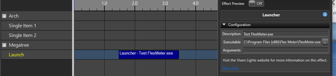
3.2.3.3.3 - RDS
Overview
This effect sends text to the RDS controller at the precise time(s) during a sequence.
Configuration
- RDS Text - Text to send to the RDS controller.
3.2.3.4 - Intelligent Fixture
Video Tutorial
3.2.3.4.1 - Fixture
Overview
Fixture effect is the catch-all effect for intelligent fixtures. This effect provides access to all capabilities of the fixture. The user picks which fixture functions to include in the effect. The graphical representation of this effect on the sequence timeline is horizontal bars of color. Each fixture function is assigned a color.
Configuration
-
Functions - Selects the fixture function to add to the effect.
-
Add - Adds the function selected in the Functions drop down.
-
Remove - Removes the selected function.
3.2.3.4.2 - Fixture Strobe
Overview
Fixture Strobe effect enables the strobe hardware support on the fixture and controls the strobe speed. The display preview will show a blinking beam when this effect is active but does not attempt to reflect the strobe speed which is hardware dependent.
Configuration
-
Function - The function on the intelligent fixture that controls the strobe (shutter).
-
Setting - Index setting that controls how the strobe speed is interpreted.
-
Strobe Speed - Controls the speed of the shutter’s strobe. The setting determines how this curve is interpreted by the hardware.
Requirements
For an intelligent fixture to support the Strobe effect it must have the following:
- Shutter function with the Shutter tag.
- One or more Shutter index items with the Use Curve option and Strobe tag.
3.2.3.4.3 - Frost
Overview
Frost effect controls a lens or filter that softens the edges of the light beam. It can help with blending light/gobos/animation-wheels into a scene by hiding sharp edges. There is no support for the Frost effect in the preview at this time, although the preview legend can be used to verify the function is active.
Configuration
-
Function - The function on the intelligent fixture that controls the frost filter. If the fixture supports more than one frost lens this is where you pick the function.
-
Frost Percentage - Configures the amount of softening of the light beam.
Requirements
- For an intelligent fixture to support the Frost effect it must have a Range Function with the Frost tag.
3.2.3.4.4 - Gobo
Overview
Gobo effect allows for selecting a Gobo to go over the light beam. Depending on the capabilities of the fixture it also allows for controlling the rotation speed of the gobo wheel. There is no support for the Gobo effect in the preview at this time, although the preview legend can be used to verify the function is active.
Configuration
-
Function - The function on the intelligent fixture that controls the gobo wheel. If the fixture supports more than one gobo wheel this is where you pick the desired wheel.
-
Gobo - Selects a specific gobo on the wheel or an option to rotate the gobo wheel.
-
Rotation Speed - Selects the rotation speed of the gobo wheel. Direction of the rotation is usually determined by the selected gobo option.
Requirements
- For an intelligent fixture to support the Gobo effect it must have a Gobo Wheel Function with the Gobo tag.
3.2.3.4.5 - Line Dance
Overview
Line Dance effect coordinates movements of a group intelligent fixtures.
This effect has different dance modes movements that can selected.
These dance movements can be achieved by placing the Set Position effect on each intelligent fixture but this is
time consuming and difficult to adjust. This effect is intended to make sequencing of coordinated movements of multiple
intelligent fixtures quick and easy.
Configuration
- Dance Mode - Selects between the intelligent fixture dance effects (Fan, …more to come).
Requirements
This effect is intended to be placed on a group of 2 or more intelligent fixtures. This effect is intended for intelligent fixtures that are positioned in a line.
3.2.3.4.5.1 - Fan
Overview
The Line Dance Fan effect coordinates the pan of a group intelligent fixtures to make fan shape with the light beams. This effect pans pairs of intelligent fixtures. The amount of pan increases from the center of the collection of fixtures. The intelligent fixtures on both ends have the most pan.
This effect should be used with color effect like Set Level. This effect also works well when the Tilt is modified with the Set Position effect.
Configuration
-
Fan Mode - Selects the type of fan.
- Synchronized - All intelligent fixtures in the collection synchronously start their pan at the beginning of the effect and complete the pan at the end of the effect’s duration.
- Staggered - The fan is performed by panning pairs of intelligent fixtures. Starting with the center two fixtures and moving outward. Generally only two fixtures are moving at any given time.
- Concurrent - All the intelligent fixtures start their pan at the start of the effect and finish based on the degrees of pan.
-
Pan Increment - Controls the Pan angle increment between each fixture. This curve or slider determines how much each pair of intelligent fixtures are panned. The first pair are panned the increment. The second pair are panned 2 times the increment. The third pair are panned 3 times the increment and and so on.
-
Fan Direction - Controls intelligent fixture fan direction (Fan From Center or Fan From Edges).
-
Invert Pan - Inverts the pan movement for the intelligent fixtures that are mounted upside down (inverted).
-
Hold Time - Controls the percentage of the effect duration that holds the fanned out position at the end of the effect.
-
Center Handling - Controls the pan of the center fixture when the effect is targeting an odd number of fixtures.
- Centered - The middle intelligent fixture is not panned.
- Left - The middle intelligent fixture is panned left.
- Right - The middle intelligent fixture is panned right.
-
Advanced Overrides - Display or hides advanced override settings. These settings are generally not expected to be changed.
-
Pan Start - Controls the initial pan of all the fixture participating in the fan. The default is a pan of 360 degrees.
Requirements
This effect requires 2 or more intelligent fixtures that support the Pan function with Pan tag. The effect requires that the intelligent fixtues can pan greater than 360 degrees.
Video Tutorial
3.2.3.4.6 - Prism
Overview
Prism effect selects a prism to be placed in the light beam. Depending on the capabilities of the fixture it also allows for controlling the rotation speed of the prism. There is no support for the Prism effect in the preview at this time, although the preview legend can be used to verify the function is active.
Configuration
-
Function - The function on the intelligent fixture that controls the prism. If the fixture supports more than one prism this is where you pick the desired prism.
-
Setting - Selects the position (angle) of the prism or an option to rotate the prism.
-
Rotation Speed - Selects the rotation speed of the prism.
Requirements
- For an intelligent fixture to support the Prism effect it must have a Prism Index Function with the Prism tag.
3.2.3.4.7 - Set Position
Overview
Set Position effect positions the pan and tilt of the intelligent fixture. This effect configures the pan and tilt of the fixture. This effect is fully supported in the OpenGL preview.
Configuration
-
Pan - Controls the horizontal rotation of the intelligent fixture. The zero position of the curve represents the horizontal starting position of the fixture. The 100 position of the curve indicates the maximum horizontal rotation of the fixture.
-
Tilt - Controls the vertical rotation of the intelligent fixture. The zero position of the curve represents the vertical starting position of the fixture. The 100 position of the curve indicates the maximum vertical rotation of the fixture.
Requirements
-
For an intelligent fixture to support Pan the fixture is required to have a Range Function with the Pan tag.
-
For an intelligent fixture to support Tilt the fixture is required to have a Range Function with the Tilt tag.
3.2.3.4.8 - Set Zoom
Overview
Set Zoom effect configures the zoom angle of the intelligent fixture beam. Fixtures either zoom from wide to narrow or vice versa. The direction of zoom is configurable in the intelligent fixture property Zoom function details. The direction of the zoom is also configurable in the display preview.
Configuration
- Zoom - Curve configures the zoom angle of the intelligent fixture beam.
Requirements
- For an intelligent fixture to support the Set Zoom effect it must have a Range Function with the Zoom tag.
3.2.3.4.9 - Spin Color Wheel
Overview
Spin Color Wheel effect spins the intelligent fixture color wheel. The effect configures the rotation speed and intensity of the light beam. The display preview will show a beam changing colors but does not attempt to reflect the rotation speed as that is hardware dependent.
Configuration
-
Function - The function on the intelligent fixture that controls the color wheel. If the fixture supports more than one color wheel this is where you pick the desired color wheel.
-
Setting - Index setting on the color wheel to pick the direction and rate of speed.
-
Rotation Speed - Curve configures the rotation speed over the duration of the effect. How this curve is interpreted by the fixture is determined by the selected Setting.
-
Intensity - Intensity of the light beam over the duration of the effect.
Requirements
-
For an intelligent fixture to support the Spin Color Wheel effect it must have the following:
- Color Wheel function with ‘Spin Color Wheel’ tag.
- One or more Color Wheel index items with the Use Curve option selected.
3.3 - General
3.3.1 - Profiles
Vixen supports creating multiple profiles so that you can have different setups. One example of this is to allow for a Halloween setup in addition to a Christmas setup, where your elements and display setup are different. I also use it to manage multiple sites so they can be configured independently and keep this size of a profile to a reasonable size.
The Profile setup can be accessed from the main administration page under System -> Profiles.
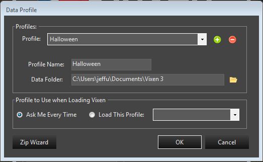
Here you can add or delete profiles. Using the green plus button will add a new profile. The default folder is placed in your My Documents folder and is based on the name you give the profile. If you want to delete a profile you can select it in the drop down and click the red minus button. This will remove the profile from showing up in Vixen, but it will not actually delete the contents on your hard drive. You will need to manually remove it if you want to. This helps prevent accidental removal of a profile.
You can also map to an existing profile that someone has shared with you. Copy or extract their profile under your My Documents folder being careful not to overwrite any of your other profiles. Many people share their default profile which is named Vixen 3. But you will want to extract that to a temp location and rename it before copying to your My Documents so you do not overwrite your main profile. Once you have it copied in, you can create a new profile and navigate the data folder to point to it.
At the bottom of the form are options to manage how profiles are loaded. You can select a default profile to always load when Vixen starts up, or have it prompt you to pick one every time. Keep in mind that if you want to switch profiles often, the ask me overtime is the best choice. To change profiles, you need to exit Vixen and restart it with the option to ask you so you can select the profile you want to load.
Lastly at the bottom is a link to the Profile Zip Wizard where you can create a zip copy of your profile for sharing or backup. See the section on the Zip Wizard for more details.
3.3.2 - Import / Export
3.3.2.1 - Sequence Export
Overview
New in 3.6u1 is the ability to import/export a sequence package. This packages up all the necessary items to share sequence(s) from a profile with someone else, or another profile of your own with different elements. See the section on Importing.
Exporting
From the main admin window, select Tools -> Export Sequence Package menu. A wizard workflow will walk you through making an export package of the sequence(s) you want to share.
Step one is selecting the sequences you want to package. There is a file browser to choose individual sequences, or you can select the middle icon which will add all sequences in the sequence folder. The last icon is used to delete selected sequences from the list. The list supports multiple selection with the normal Shift/Ctrl click or drag select.
Step two allows you to choose the package name and location to save it. The extension for packages is .vpkg. The wizard will suggest a file and path name based on the profile name. The default location to save the package is in the Export folder of the current profile. You can choose the path that makes sense for you. The other option is whether to include the audio files that are used in the sequence. In some cases you may not want to share the audio files and they can be specifically excluded. The default is to include them.
The last step is a Summary confirmation window to validate what will occur. If the summary is correct you can click next and the export will occur. Progress bars will show the status of the export as it proceeds. If there are many sequences, it may take a while to export all of them.
Once finished you have a package file that can be shared. It is fully standalone and has all the information necessary for the import process to use.
Tutorial
3.3.2.2 - Sequence Import
Overview
New in 3.6u1 is the ability to import/export a sequence package. This packages up all the necessary items to share sequence(s) from a profile with someone else, or another profile of your own with different elements. See the section on Exporting.
Importing
From the main admin window, select Tools -> Import Sequence Package from the menu. A wizard workflow will walk you through making an export package of the sequence(s) you want to share.
Step one is selecting the package file to import. This is generated from the Export process described above and has a .vpkg extension. Use the file browser to browse to and select the file to use. The next section is about the mapping file to map the profile elements for the imported sequences to the current profile. If this is the first time importing from the package or profile, you will need to create the map file. If you have previously imported sequences from this package or the same profile the package came from, you can use the file browser to select an existing saved mapping.
Creating a mapping file
You must have a package file selected before you can create a mapping. When you choose to create a mapping file, you will be presented with a screen that has the two element trees. One from the incoming package showing the source tree the sequence(s) are based on. The other tree is the destination tree of the current profile. These are presented in two columns and drag drop is used to drag the element from the destination tree to element on the source tree you want effects to map to. Once you drag it across to map it, the source tree will reflect the mapping. To replace a mapping, drag another item to it. To delete a mapping, select the mapped item and use the delete key. You do not need to map every item if you do not plan to use the effects from that source item. You only need to map what you want or what fits to your display. Once you are happy with all the items you want to map, then you can click Ok. Once clicking ok, you will be prompted to save the map file. Choose an appropriate name and location and save it. Once saved, the wizard will autofill the path you saved the map to in the map file entry box.
Selecting Sequences
Step 2 is selecting the sequences you wish to import. The screen will show you the sequences included in the package file and you can check the ones you wish to import. Multi-select can be used to select the items to change. Pressing space will toggle the state of any selected items.
Summary
Step 3 is a summary of what will be done. If the summary looks correct, then press next.
Final step is the actual import with progress showing the steps. This will take each sequence selected and map the effects in it to the current profile using the mapping file. It will copy in any audio and media files used in the sequences that are imported. When it is complete the newly imported sequences will be in the sequence folder and can be opened in the editor to play or further edit.
Hints and Tips
The import can map most everything including mark collections, layers, and media files like video and pictures that the effects use. One thing it cannot handle is Face mapping. If you map the Face elements from the imported sequences to Face elements in the destination that already have Face mappings created, they should generally just work. If the imported sequences used image mapping for faces, those will not be included. you may need to map those effects to your existing image maps, or create maps that are appropriate.
Tutorial
3.3.2.3 - Falcon Pi Player
Overview
The Falcon Player (FPP) is a lightweight, optimized, feature-rich sequence player designed to run on low-cost Single Board Computers (SBC). It was originally created to run on the $35 Raspberry Pi, hence the middle ‘P’ in the short name but now the FPP supports many more systems. It is still mostly commonly used on a Raspberry Pi (Zero, 2, 3, 4) or a Beagle Bone (Black, Green, Pocket).
The FPP shorthand is still used but it is now just called Falcon Player.
FPP aims to be controller agnostic, it can talk E1.31, DDP, DMX, Pixelnet, and Renard to hardware from multiple hardware vendors. Using various capes, FPP can also be a controller on P5 and P10 Matrixes, or strings of ws2811 pixels.
Useful Links:
Vixen Support
Vixen can export FSEQ files to be played on the FPP player or FPP based controller. There are two ways to export. Sequence at a time from within the Sequencer and via an Export Wizard than can export multiple sequences at a time.
Export Wizard
The Export Wizard is the recommended way to export your sequences. It was added on to help automate the exporting of an entire shows worth of sequences instead of having to do them one at a time in the Sequencer.
Getting Started
The Export Wizard can be started from the main Admin window. Tools -> Export Wizard. This will start the process of configuring an export or using a prevouisly configured one. The first screen will ask if you want to create a new configuration or use an existing one. If this is the first time using, you will choose to Create new export configuration. IF you have used it before and saved a configuration, then you will choose to Use saved export configuration. If you are using an existing, once you choose that option, you will have a drop down to select the saved configuration to use. Choose next to move on.
Selecting Sequences
The next screen will aloow you to select or review the sequences to be exported. If you used a save configuration, this will be pre-populated with the sequences used before. You can edit to add or remove to get the list of sequences you need. The folder open icon will allow you to browse and select the sequences you want to add. The second multifolder icon will automatically add all sequences in the seuence folder for the current profile. The last option is the red X to remove any selected sequences from the list. Once you have the sequences you need in the list, you can choose next.
Configure Outputs
The next screen allows you to choose the controller blocks and the order they should be exported in. The check boxes on each controller determine if it is included in the export. You can drag and drop the controllers into any order desired. The channel ranges will be adjusted to match the new order. This will need to directly match the intended setup in FPP. Vixen can export the controller config for use in FPP, so that can be automated. In that case the controller order is not really important. All that matters is they match. If you are exporting from other sequencers, then you need to ensure they are configured the same. Once you have the proper controllers and order set, you can choose next.
Output Format and Destination
The next screen will be used to setup how to do the export. Here you can choose the output format and the timing to be used. The default of Falcon Player Sequence 2.6+ should be used for modern versions of FPP. There are other options to support legacy versions as well as exporting to older Vixen 2 formats and even CSV.
Once you have chosen a format, the next section will adapt for the format. For Falcon 2.6+, the main options here are as follows.
- Create Universe File This specifies if the universe configuration file should be genrated that reflects the controller and channel mapping. This is generated in the exact format that FPP uses. It can be directly uploaded to replace the existing configuration as part of the export in the wizard.
- Include Audio This specifies if the audio file should be included as part of the export. If enabled, the audio file will be named the same as the sequence file to ensure FPP can locate it automatically.
- Backup Universe File If the export location already has a universe file it will be renamed before it is replaced with the new one created when Create Universe File is enabled.
- Enable Conpression This enables the FSEQ file to be compressed. The default is enabled and recommended.
The last area is the output folder. This can be a file folder on your computer, or the shared location on the FFP device itself if Samba/CIFS file sharing is enabled in FPP. This was enabled by default on FPP versions 5 and older, but on 6+ it has to be enabled in the settings under FPP Settings -> System. You will need to ensure the advanced settings are enabled under FPP Settings -> UI -> User Interface Level in order to view the OS settings. In the section OS Settings, select Enable Samba/CIFS.

This will allow you to direcly export to the FPP folder over a network connection. You can use \ip\fpp by changing ip to either the ip addess of the FPP device, or the hostname if you have DNS. If you directly export to FPP, the export wizard can place all the files where they belong including the universe file, sequences, and audio. If you export to the file system, the output folder structure will mimic the structure on FPP. You can then manually upload the files for FPP. If you let the wizard export to FPP, you will need to restart the FPPD Daemon to pick up any configuration changes.
Summary
The last screen is the summary screen that details what will be done. There is also an option to save this configuration for future use. You can enter the name, or choose an existing configuiration to update. After you hit next, it will commence exporting. There will be progress bars showing the progress through the process.
Sequence Editor Export
Under File -> Export in the sequencer is the legacy export. It is very similar to the wizard, but much simplier in that it can only export the seuence you have open in the editor. You cannot save any setting in it either. This is retained for legacy purposes, but may be removed in the future, so the recomendation is to use the wizard.
3.3.3 - Zip Wizard
Introduction
The zip wizard screen is accessed from the profile System => Profiles menu on the main admin form. It can be used to create backups, copy a profile to another PC, provide a copy to developers to help debug, or share with others and has several options to configure it. Profiles are stored in the My Documents folder by default. This PC\Documents or c:\Users\bob\Documents where bob is the current logged in user. This shows up in various forms depending on the version of windows, but it is the traditional My Documents folder. Profiles generally start with Vixen 3 in the folder name if the defaults are used, but that is not mandatory.
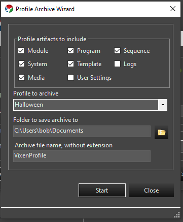
Backups
The primary use of the zip wizard is to make a backup of your profile to restore in case something goes wrong, move it to another machine, or share with others. The settings above are the most common for this use. This will recreate the profile structure into a zip file and save it in the name and location specified. It will cover any changes to the Display Setup / Preview as well as sequences and audio files. This files in the zip archive will be relative to the profile location which is normally in the users My Documents folder.
Restoring Backup
If you need to restore a backup, it can be extracted into the users My Documents folder. This is typically in the form of c:\Users\bob\Documents where bob is the logged in user on the PC. If you are restoring on the same PC where the backup was made, then extracting it is all you should need to do. Your unzip utility should prompt you to overwrite the existing files. If you do not get that prompt, you are likely not extracting it to the same location it was backed up from.
Transfer to another PC
Copying a profile to another PC. In order to transfer the backup to another Vixen instance on another PC, you will extract the files to the users My Documents folder as described above. If you are not using multiple profiles in the source or destination, then that will likely just be the Vixen 3 folder inside My Documents and nothing further will be required. If you have multiple profiles, then the profile may need to be configured in the destination instance of Vixen if it is the first time you are copying it over.
Extracting a Foreign Profile
If you are using a Profile from another user, additional care should be taken to ensure the location of the profile they provided. If they are using a default profile, it may have a folder name of Vixen 3 which is the same as your default profile folder. You do not want to overwrite your default profile which is in My Documents Vixen 3, so when extracting make sure to change the name of the folder it is being extracted to under My Documents.
Profile Management
If this is the first time the profile has been copied to a PC you will need to establishing the the new profile for Vixen to find it. After extracting the profile, start Vixen up. To do this we want to open the Profile Editor. Depending on how you have it setup, you may see the profile selection screen at startup or not. If you see the profile selection screen at startup, the Profile Editor can be opened from there. Otherwise, it can be opened from the System => Profiles menu on the main screen.
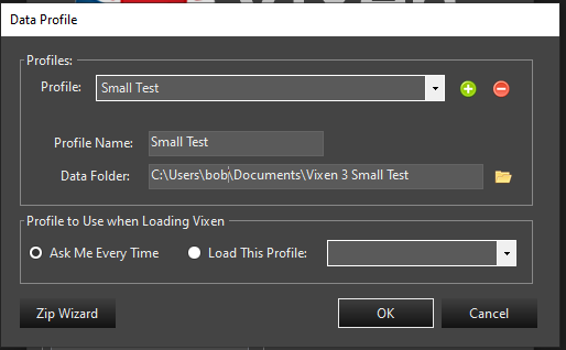
In this screen (shown above) you need to add a new profile and give it a name. Ideally this would be the same name as you used in the source Vixen PC. Then you need to set the Data Folder to the path of where you extracted the profile you copied. This should be in your My Documents folder. In the example above, the path is C:\users\bob\Documents and the profile folder is Small Test. If you used the default path for the profile name on the source machine and named the profile the same on the destination, this may already be correct. Otherwise you can use the file explore to navigate to it. Choose the options to ask you which profile to load, or default to a specific profile and click ok. If you do not choose to ask, then you should select the new profile if you want it to load by default. Vixen will validate that the path entered is correct. If it asks you if you want to create the folder, you have misconfigured the path and should cancel and check the path. You will then need to restart Vixen once the path is correct. Once you restart, then you will either be prompted to choose the profile, or it will load the default profile you chose. You should only need to setup the profile the first time you copy a profile over to establish it. After that, just extracting the backup over the existing profile should work without any changes to the profile setup.
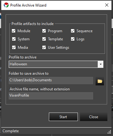
Diagnostics
The use shown above is for capturing the entire profile to provide when creating bug ticket that that has requested the profile to help debug the issue. This provides everything that a developer will need to recreate the profile in it; entirely including the logs which may not be in the affected profile if you are using multiple profiles.
3.4 - Scheduler
3.4.1 - Scheduling a Show
Setting up Your Show
There are two items that need to be setup and configured to run a show (a set of items including sequences). First, you need to setup a show in the Show Editor. This is where you tell the system what sequences, and various actions will be performed during the event.
Running Your Show
After you have setup your show, you need to tell the Vixen system when you would like your show to run. Select Scheduler -> Schedules from the Vixen main menu. For more information look at the Show Scheduler section of the documentation.
Video Tutorial
Check out the video demonstrating how to setup a show and schedule it to run.
3.4.2 - Show Editor
Creating a Show
To create a new show, use the Scheduler -> Shows menu from the main Admin screen. This will present a dialog with options to add, edit, or delete a show. Choose the green plus button to add a new one. It will create a new Show entry and highlight it. Click the item to edit the name to something meaningful for what the show does.
Edit a Show
To edit a show, highlight the show you wish to edit on the Shows dialog and either double click it, or use the pencil icon to open the edit dialog. On this dialog there are 2 sections. On the left is where the items are added to the show. There are 4 tabs and each one has a purpose to help manage the show.
- Startup - This tab controls how which items will occur once at the start of a show.
- Background - This controls items that will run constantly in the background during the enite show. This is useful for things like a tune to sign.
- Sequential - This is for items that run sequentially in the main show.
- Shutdown - This is for items that should run at the conclusion of the show.
You can add new items to any tab with the green plus button at the bottom of the section. Items can be dragged up or down in the lists to set the order they should occur. Items can be removed with the red minus button when they are selected.
The right section of the dialog controls the Actions that occur for the item. The supported Actions are as follows.
- Launch - This is used to launch external programs like you would from the command line.
- Sequence - This is used to run a Vixen sequence.
- Pause - This is used to provide for a delay in seconds. You can use this if you want a pause between sequences.
Delete a Show
To delete a show, use the Scheduler -> Shows menu from the main Admin screen. This will present a dialog with options to add, edit, or delete a show. Select the show you wish to delete. Use the red minus button to delete the show.
3.4.3 - Show Scheduler
After you have setup your Show in the Show Editor, you will want to schedule it to run.
Creating a Schedule
To get to the scheduling in Vixen, Select Scheduler -> Schedules from the main Admin screen.
Add, Edit and Delete a Schedule
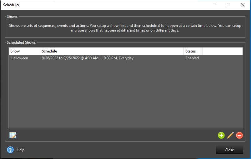
Once you have selected Scheduler -> Schedules from the main Admin screen, you will be presented with the above Scheduler screen. From this you can view your currently scheduled items, add, edit and delete scheduled items. To access the available options, you can either right-click in the list or press one of the buttons below the list.
Select the green plus button to add a new scheduled item.
Select the pencil button to edit the selected schedule item.
Select the red minus button to delete the selected schedule item.
Press the spreadsheet with pencil button on the lower left to edit the show associated with the selected scheduled item.
Adding & Editing a Schedule
When editing a Schedule you will be presented with the following dialog to setup the details of the schedule.
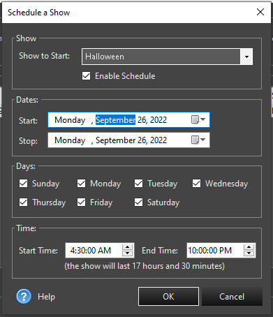
Show Scheduling
The Schedule a Show dialog will allow you to setup your show to run on certain days at certain times between the dates you set. For a show to successfully run, ALL of the following options must be true. For example, it must fall on or between the dates selected, the day of the week must be selected and the time must fall on or between the times selected.
The options are explained below:
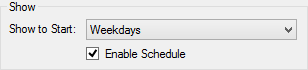
First, you want to selected the show you would like to run when this schedule is executing. The show is setup in the Show Editor before setting up the schedule. Shows can be either enabled or disabled. This allows you to setup a bunch of different schedules as tests or whatever you want and set them to disabled if you don’t want them to execute.
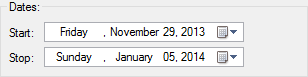
Select the date you want your show to start and the date you want your last show to run.
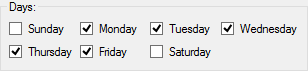
Check the days you want your show to run.
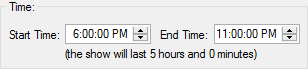
Enter the start time and end time of your show.
Enabling the Scheduler
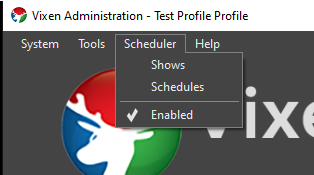
Ensure from the main Admin screen that the scheduler is enabled by selecting the Enabled button. The check mark indicates the scheduler is enabled and you should see the Scheduler Status window showing when the next scheduled item will occur.
Video Tutorial
3.5 - Preview
3.5.1 - Preview Setup
Overview
The Previews Configuration dialog lets you add and edit multiple previews. Why multiple previews? Because you may have one for this year’s Christmas, next year’s Christmas, Halloween, Easter, St. Patrick’s Day and more. Create a preview just to try out new things and have one to hold your current display.
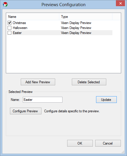
Adding a New Preview
To add a new preview, click the Add New Preview button. You will then be presented with the Select Item dialog box allowing you to select the type of preview you would like to add. Currently, the only choice is Vixen Display Preview… so, guess what? You’re going to click on Vixen Display Preview and press the OK button.
Change the Name of a Preview
You can name each preview whatever you would like. To change the display name of the preview, change it in the Name field of the Selected Preview group box. When you are happy with what you’ve named your preview, make sure you press the Update button or your changes will not be saved.
Editing the Preview
To edit the preview, click on the item you would like to edit and click the Configure Preview button.
Activating a Preview
While you can have multiple preview active at one time, I would suggest only activating one at a time. To activate a preview, click on the checkbox next to the preview name in the listbox. After selected, the preview display will appear on the screen.
3.5.2 - Main Preview Screen
Overview
The main preview screen is where the preview magic happens.
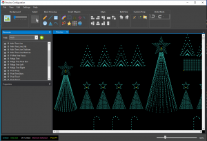
From the top, you can see the main menu bar. You’ll practically never need this unless you prefer words instead of pictures.
On the left, top of this screen is the Elements Tree. This is a duplicate of the elements tree you use to setup the Display Elements & Groups.
Below the Elements Tree are the properties for the currently selected display item.
And, on the right is the stage. This is where you will do all the work to setup your display preview. As you add items, you’ll do it in this area.
Toolbar
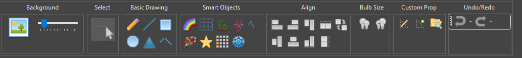
The toolbar is used to tell the preview what you want to do. There are various groups in the toolbar.
Background
To set the preview background, click the picture frame in the Background section of the toolbar.
The background image is usually a picture of your house that you use to define your lighting scene. Try to take the best shot you can looking directly your house. Stand way back and get the entire scene in a single picture - or stitch multiple pictures together. I would not recommend taking a panoramic picture as it tends to distort a lot toward the ends. You can try this, though, if you like.
Setting the Background Image
To set the background image, click on the picture icon in the preview editor toolbar (pictured above). This will bring up a standard Windows file selection dialog box. Most standard image formats are supported (JPG, GIF, PNG).
Background Image Intensity
Most lighting displays happen at night. You can use the slider next to the image toolbar button to set the intensity of the image on the screen. This can be changed at any time.
Resizing the Background Image
-
From the Edit menu, select Background Properties
-
Change the width. By default the height will adjust and keep the aspect ratio of the background image.
-
Selecting the
 button will toggle between keeping the aspect ratio of the width and height fixed vs allowing
both the width and height to be edited independently.
button will toggle between keeping the aspect ratio of the width and height fixed vs allowing
both the width and height to be edited independently. -
All items on the preview will re-size and move to new locations to match the new preview image
-
By unselecting Scale Shapes the preview can be expanded to allow more space for props.
This type of resize is often desired when a background image is not being used.
Select
Clicking this button puts the preview in selection mode. This cancels any other item you may have selected.
Basic Drawing
The basic drawing tools group the simple drawing tools for easy access. See the Basic Shapes for more information on how to use these items.
Smart Objects
The more complicated items are grouped in the Smart Objects area. These are props such as your Mega Tree and Stars. For more information see Smart Objects.
Align
This section contains the tools for aligning and sizing preview objects to each other. The first preview shape you select is used as the reference for the alignment action. You need to select at least two preview shapes to use the alignment tools. Multiples can be selected with Ctrl Click, or the lasso selection. Alignment options include the following:
- Align Top - This will align the topmost edges of all selected shapes to the first shape selected.
- Align Bottom - This will align the bottommost edges of all selected shapes to the first shape selected.
- Align Left - This will align the leftmost edges of all selected shapes to the first shape selected.
- Align Right - This will align the rightmost edges of all selected shapes to the first shape selected.
- Distribute Horizontally - This will distribute the shapes evenly spaced between the leftmost and the rightmost shape.
- Distribute Vertically - This will distribute the shapes evenly spaced between the topmost and the bottommost shape.
- Match Properties - This will match similar properties on shapes like height and width.
Location Offset
When using location based effects, the locations of your props on the preview screen provides the spatial location information used by the effects. This allows for a wipe across several props in a group, or whole house wipes or many other effects. But there are times when your whole display doesn’t fit into one preview. Or it isn’t convenient to work on when it’s all in a single preview. You may want to have multiple preview to show different sections of your display, but you still want to apply a wipe effect across all of them. One example is if you are sequencing for multiple houses. Each house would have its own preview. Another example is if you have a front yard and side yard display. You may want each view on a separate preview. The Location Offset function in the Settings menu allows you to specify the relationship of a preview instance with respect to others. It lets you offset the coordinates of all the props on the preview by a given amount. For the side by side multiple houses, or side yard, front yard examples, You would look at the leftmost preview, and determine it’s dimensions. In the Edit menu, click on Background Properties. Make note of the existing image size dimensions. Then close this preview configuration screen and open the configuration screen for the next preview. In the Settings menu, select “Location Offset Setup”. If you want this second preview to appear to the right of the previous one, enter the width of the previous preview into the horizontal box. For example, if you have two previews that are 1920×1080 in size. You would enter 1920 into the Horizontal offset in the second preview.
Help
Links you to this documentation.
Close
When you’re done editing this screen, click X button in the upper right or File -> Exit. Incremental changes may be saved using the File -> Save menu or Ctrl S. If you dod not save inside the preview you can save or cancel your changes in the Previews Configuration. If you made a huge mistake and want to lose your changes, click Cancel on the Previews Configuration dialog box and it will revert to the last saved change. That could be the save inside the preview, or to the last time you clicked OK in the Preview Configuration Dialog.
Prop Wizards
Starting with Vixen 3.6, above the element tree is a drop down selector to add certain props that have wizards. This is similar to the same wizards in the Display Setup in that you can create the elements and the preview visual all in one step. You select the type of prop you want and then click the green + button to the right. You will be prompted by the wizard for the information needed to create it just like you would in Display Setup. Then once you fill in the info the preview visual will be created and automatically linked. You can then drag it around to position it where you wish. You can also drag the prop shape from the toolbar and it will also invoke the same wizrd as the template in the drop down.
Element Tree
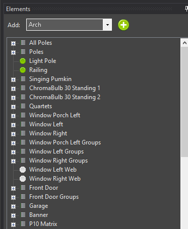
The Element Tree is the same tree used on the Display Elements & Groups screen. If you are using 3.6+, the best way is to create much of the setup in the preview. Most of the abilities to manipulate elements are available in the preview now. When using smart object or the templataes in the preview, it will walk you though setting up the color and dimming if desired. Patching and controllers are still managed in the Display Setup. If you are still using something older than 3.6, then you must start in the Display Setup and then link preview visuals to them. We highly recommend upgrading beyond 3.6 for the best experience. For the purposes of setting up elements, building a preview and then sequencing your display, you can skip the Configure Controllers section.
If you already have the elements created, then you can add a preview visual with the following steps.
- Select a single element or group of elements in the Element Tree
- Click on a shape
- Draw the element on the preview main display
For more information have a look at the section on Linking Elements.
Note: Clicking on an element or group of elements in the element tree will highlight individual pixels, individual strings or entire items depending on what is clicked on in the tree
Item Properties
Display items all have properties associated with them. Along with multiple common properties, some items have custom properties that can be set. See the Basic Shapes and Smart Objects for more information on how to use these properties.
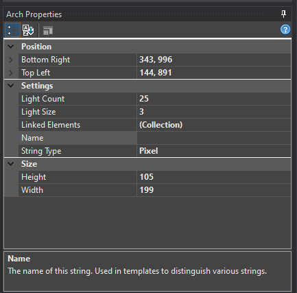
3.5.3 - Adding Items
Overview
Being able to add your Prop shapes to the Preview allows you to visualize what the actual Prop will look like when your sequences are running.
Adding a Shape to the Preview Window
There are two ways to add any item to the preview… automagic linking and manual linking. Automatically linked items can always be edited later in the Element Links Screen.
Automatically Linked Shapes Automatic linking can only happen when a prop is initially added to the screen. If a prop already exists on the screen, you can either delete it and re-draw it or link it manually. To link a shape to an element or elements automatically, first, select the element in the Element Tree, then click on the shape in the toolbar and the left-click and hold the mouse button in the preview window and drag the mouse to the lower left of the shape you are adding.
Manually Linked Shapes Shapes can be drawn without pre-linking them to an element. This is useful if you have not defined elements and want to “play around” with different ideas for your show. I use it all the time to try different placement of props and to try out props I may be considering for next year.
To manually link a shape to an element, click on the […] next to the Linked Elements item in the properties box. Use the Element Links Screen to setup the links to the prop.
Viewing Linked Shapes
To see what prop, string or pixel is linked to an element, find the element on the Element Tree and left-click. If the element or element group is linked to an item in the preview, it will be highlighted. This helps with debugging props, finding string and light rotation, etc.
Notes on Adding and Editing
- Pressing Shift when drawing new objects lets you draw items over and over without selecting them on the toolbar each time.
- Use the arrow keys after selecting an item to move it by single pixels.
- Copy (Ctrl+C) and Paste (Ctrl+V) work and save a lot of time.
- Pasting with Ctrl+V will leave the shape in the “move” status. just move the mouse around and left-click when you get it where you want. This lets you very quickly place mini-trees, for example.
3.5.4 - Common Settings
Overview
There are various common settings that are available in most, if not all of the items you can include in your preview. These options are detailed in this section. When you select a shape in the preview display a properties page will appear on the bottom left side of the preview editor screen.
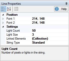
Position
All of the elements have various position properties that can be set. The individual meaning of each of these properties is detailed in the section of help for that item. Everything in the preview is defined by a location based on pixels.
The screen is in (X, Y) coordinates with the top, left pixel being defined as (1, 1). So, if a prop needed to be right 100 pixels and down 10 pixels, it’s location would be (100, 10).
These position properties give you fine control over the exact location and size of the items on your screen. You can usually accomplish what you want with the mouse and by nudging the item with the arrow keys.
String Type
This defines the type of string you want to use for this item. A Standard string type is one where the entire prop is linked to a single element. A Pixel string type is one that has each of it’s lights liked to an individual element. There is nothing wrong with linking multiple lights in a pixel string to the same element.
Standard String
What makes a Standard string Standard is that all of the lights in the string are addressed via a single element.
A Standard string is what most people think of when they think Christmas lights. It is a string of lights that is either a single color or is multi-colored. These lights are static so their color cannot be assigned by the software. The are either on, off, or are in some state in-between.
There is one exception: A string of Pixel lights that are all controlled as a group and are not individually addressable is a Standard string too.
Pixel String
What makes a Pixel string Pixel is that all of the lights in the string are addressed with individual elements.
Light Size
The diameter of the light on the screen. Adjust this until the light size looks the way you want. The defaut size is 3, and bigger numbers provide a larger light diameter.
Light Count
The number of lights in the string or prop. This is very important if you are defining an item with individually addressed pixels. If you are designing with standard strings, this number can be whatever you want to get the look you are going for. Some items, such as the rectangle, have multiple strings each with their own light count.
Increasing the light count in a a string will add lights to the end of the string. If the item is defined as a Standard string type, there is no more configuration necessary. If the item is defined as a Pixel string type, these newly added pixels will be unassigned. You will have to link them to an element.
Decreasing the light count removes pixels from the end of the string. There is a side effect of this. If you have a Pixel string type and remove 10 pixels and then re-add 10 pixels, you will lose any Element linking information you may have had defined.
Linked Elements
When you want to see what your display will look like when you run a sequence, you need to have your preview items linked to elements. See the Linking Elements section for more information.
3.5.5 - Basic Drawing
Overview
The notion of how Props are represented in the Preview is denoted by Shapes. All Props have a Shape and there are 3 distinct types. The first are the Basic Drawing types. These are simple in nature, but can represent a wide variety of items effectively. These are selected from the Basic Drawing area in the toolbar.
Point
Use the button that looks like a pencil. A point is a single light point on the screen. By setting the Light Size property, you can use this light to define spots, floods or other larger light areas on your scene.
Light String
A light string is a single, straight line of lights. This can be Standard or Pixel strings.
Light strings are defined by two points, Point1 and Point2 which are located on either end of the string.
Rectangle
A rectangle is basically four strings of lights that are attached at each corner. Once the rectangle is placed, each corner can be individually moved so that it no longer keeps its rectangular shape.
To maintain a rectangular shape when adjusting it’s size, hold down the Ctrl key while moving the bottom, right corner.
Ellipse
An ellipse is a single string of lights. It can be defined as a standard string of lights or a pixel string.
Ellipses are defined by two points, the top left point and the bottom right point. To adjust the size of the shape, click on one of the corners and drag it to a new size.
The first pixel of an ellipse is the right-most point. Pixels are in order clockwise from this point.
Triangle
A triangle is composed of three strings of lights.
Hold Ctrl while resizing the shape to maintain the triangle as an isosceles triangle.
Multi String
The Multi String is used to draw more complex light strings that are not just in a single straight line. They contan multiple points and line segments that join those points together. They can be Standard or Pixel strings. This can be used for rooflines and other shapes that change directions. You click to start the string and then hover the string out to the location it should change directions. Click again and the segment will hold and you can hover to the next location to click and set that segment. Once you are done, usethe ESC key to end the drawing.
3.5.6 - Smart Shapes
3.5.6.1 - Arch
Overview
An arch can be either Pixel based or Standard string based. A pixel arch has individually addressable pixels across the entire arch and a standard arch has a number of segments that span the arch.
Adding an Arch in Vixen 3.6+
Start in the Preview instead of in Display Setup as you may have done in the past.
You can add an Arch using the wizard buy clicking the Rainbow icon in the Smart Objects toolbar and then with the mouse, click a point in your preview to start the Arch and drag from upper left to lower right. This will create a basic ARch shape and launch the wizard. Next a dialog will appear to setup the basic attributes of the Arch.
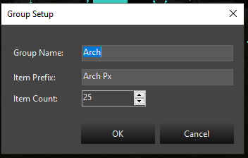
In this dialog, you will provide the group name for your Arch. It defaults to Arch, but if you are adding multiples, you will want to name them Arch-1, Arch-2, etc. The next entry is the name the segments will be called. This defaults to Arch Px. If you are adding multiple Arches, you would name this Arch-1 Px or Arch-2 Px. The Px is just a shortcut for pixel, you can use anything you like for the segments. Each segment will have a number appended to this name. Example Arch-1 Px-1, Arch-1 Px-2.
Last is the number of segments. If this is a Pixel Arch it would be the number of pixels. If it is a Standard* Arch wrapped with segments of light strings, it will be the number of light segments. It defaults to 25.
Once you select Ok, the next step will be whether to add a Dimming Curve or not. See the section on Dimming Curves
After the Dimming Curve, is a dialog to set up the color type of the prop. Depending on the type of lights you are using, the choice here will vary depending on the type of lights used in your Arch. See the section on Color Handling.
After setting the Color Handling, the Arch will be completed and the elements will show up in the tree. All the linking will be done and you are ready to use it. You can resize or move it around using the preview tools.
Linking a Standard Arch to existing Elements
An arch is configured differently than all the other items in the display preview. To define a standard arch, you will be setting the string type to Pixel. Doesn’t make much sense, but stick with me and I’ll explain.
You can assign the same element to multiple lights on a string. That’s what we’re going to do in the case of an arch with multiple segments. We’re going to assign the same element to groups of pixels so that a group of lights turn on when a single element is lit.
Steps:
- Do NOT click on the elements or groups you want to add.
- Click on the Arch smart object.
- Draw the arch on the screen.
- Change the string type to Pixel
- Change the Light Count to a multiple of the number of segments you have. So, if you have 9 segments, I’d suggest 36 (9 X 4) lights.
- Click on the … next to Linked Elements
- Assign your first arch element to the first item multiple (in our example, the first 4 pixels).
- Assign each successive multiple (in our example above, 4 pixels) to the same element.
- That’s it, your done.
Linking a Pixel Arch to existing Elements
This is much easier than adding a standard arch. Just click on your arch group in the element tree, click the arch icon in the toolbar and draw your arch. Your done. Your arch is drawn and is linked to your elements.
Linking Elements
Properties
Position
See Position in Common Settings
Light Count
For an Arch, this is commonly the number of segments in the arch. If your Arch has 25 pixel segments, it will be 25. If you have 9 segments of analog lights, the number will be 9. See Light Count in Common Settings
Light Size
See Light Size in Common Settings
Linked Elements
See Linking Elements
String Type
The string type of an arch will probably be Pixel for nearly everyone. Please see the Adding a Standard Arch above for more information on properly setting the string type.
3.5.6.2 - Candy Cane
Overview
A Candy Cane can be either Pixel based or Standard string based. A pixel Candy Cane has individually addressable pixels across the entire cane and a standard cane has a single strand of lights that span the cane.
Adding a Candy Cane in Vixen 3.6+
Start in the Preview instead of in Display Setup as you may have done in the past.
You can add a Candy Cane using the wizard buy clicking the Candy Cane icon in the Smart Objects toolbar and then with the mouse, click a point in your preview to start the Candy Cane and drag from upper left to lower right. This will create a basic Candy Cane shape and launch the wizard. Next a dialog will appear to setup the basic attributes of the Candy Cane.
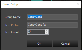
In this dialog, you will provide the group name for your Candy Cane. It defaults to CandyCane, but if you are adding multiples, you will want to name them CandyCane-1, CandyCane-2, etc. The next entry is the name the segments will be called. This defaults to CandyCane Px. If you are adding multiple Candy Canees, you would name this CandyCane-1 Px or CandyCane-2 Px. The Px is just a shortcut for pixel, you can use anything you like for the segments. Each segment will have a number appended to this name. Example CandyCane-1 Px-1, CandyCane-1 Px-2.
Last is the number of segments. If this is a Pixel Candy Cane it would be the number of pixels. If it is a Standard* Candy Cane wrapped with segments of light strings, it will be the number of light segments. It defaults to 25.
Once you select Ok, the next step will be whether to add a Dimming Curve or not. See the section on Dimming Curves
After the Dimming Curve, is a dialog to set up the color type of the prop. Depending on the type of lights you are using, the choice here will vary depending on the type of lights used in your Candy Cane. See the section on Color Handling.
After setting the Color Handling, the Candy Cane will be completed and the elements will show up in the tree. All the linking will be done and you are ready to use it. You can resize or move it around using the preview tools.
Linking Elements
Properties
Position
See Position in Common Settings
Light Count
For an Candy Cane, this is commonly the number of segments in the Candy Cane. If your Candy Cane has 25 pixel segments, it will be 25. If you have 9 segments of analog lights, the number will be 9. See Light Count in Common Settings
Light Size
See Light Size in Common Settings
Linked Elements
See Linking Elements
String Type
The string type of a Candy Cane will probably be Pixel for nearly everyone.
3.5.6.3 - Icicles
Overview
Icicles can be either Pixel based or Standard string based. Pixel Icicles have individually addressable pixels across the entire Icicles and standard Icicles typically have one color strand.
Adding Icicles in Vixen 3.6+
Create Icicles in the Preview instead of in Display Setup as you may have done in the past.
You can add Icicles using the wizard buy clicking the Snowflake icon in the Smart Objects toolbar and then with the mouse, click a point in your preview to Iciclest the Icicles and drag from upper left to lower right. This will create a basic Icicles shape and launch the wizard. Next a dialog will appear to setup the basic attributes of the Icicles.
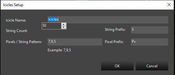
In this dialog, you will provide the name for your Icicles. It defaults to Icicles, but if you are adding multiples, you will want to name them Icicles-1, Icicles-2, etc. Fill in the string count and the pattern for the individual Icicle drops.
Once you select Ok, the next step will be whether to add a Dimming Curve or not. See the section on Dimming Curves
After the Dimming Curve, is a dialog to set up the color type of the prop. Depending on the type of lights you are using, the choice here will vary depending on the type of lights used in your Icicles. See the section on Color Handling.
After setting the Color Handling, the Icicles will be completed and the elements will show up in the tree. All the linking will be done and you are ready to use it. You can resize or move it around using the preview tools.
Settings
See Common Settings
Linking Elements
See Linking Elements
3.5.6.4 - Intelligent Fixture
Overview
Intelligent Fixtures are only supported in the OpenGL Preview due to performance and the need for 3D rendering capability.
There are two ways of adding an intelligent fixture to the preview. If the intelligent fixtures have already been created in the Display Setup then perform the following steps:
- Select the fixture in the Elements tree.
- Select the Intelligent Fixture button on the toolbar.
- Click on the preview and drag to add the intelligent fixture.
If the intelligent fixtures do not exist in the Display Setup perform the following steps:
-
Click on the preview and drag to add the intelligent fixture.
-
Follow the steps on the Intelligent Fixture Wizard to create the intelligent fixture(s).
Once the Intelligent Fixture graphics have been created the following Intelligent Fixture Properties may be adjusted. Select the fixture by clicking on it in the Preview area.
Beam Properties
-
Beam Length - Percentage of the background height. If a background image is not being used then the beam length is the percentage of the height of the preview window. Note percentages greater than 100 are allowed.
-
Beam Transparency - Transparency of the light beam. 0% is completely opaque. 100% is completely transparent. Note at 100% transparency the beam is not visible.
-
Beam Width Multiplier - Determines the beam width at the top of the beam. The multiplier is multiplied times the base width to determine the top width.
Color Wheel Properties
-
Color Wheel Rotation Speed Maximum (s) - The time in seconds it takes the color wheel to make a complete rotation when configured to the fastest setting.
-
Color Wheel Rotation Speed Minimum (s) - The time in seconds it takes the color wheel to make a complete rotation when configured to the slowest setting.
Pan Properties
-
Invert Pan Direction - Changes the start point of the pan by 180 degrees and inverts the direction of movement. This setting is often used with Top (upside down) mounting position.
-
Maximum Pan Travel Time (s) - The time in seconds it takes the fixture to travel from the start position to the stop position.
-
Pan Start Position (Degrees) - Defines the resting position of the fixture. This value helps ensure the Preview matches the movement of the actual hardware.
-
Pan Stop Position (Degrees) - The stop position defines the maximum range of movement. This value helps ensure the Preview matches the movement of the actual hardware.
Position Properties
The following cooordinate properties define a rectangle determing the preview drawing area for the Intelligent Fixture.
-
Bottom Left - Bottom left coordinate of the drawing area.
-
Bottom Right - Bottom right coordinate of the drawing area.
-
Top Left -Top left coordinate of the drawing area.
-
Top Right - Top right coordinate of the drawing area.
Settings
-
Linked Element - Determines the Intelligent Fixture element the graphic is linked to. Selecting the … button allows you to pick an Intelligent Fixture element.
-
Mounting Position - Selects the mounting position of the fixture. This property allows for simulating the fixture being mounted upside down.
-
Name - Name of the intelligent fixture.
-
Show Legend - When true enables a legend that will show a function label and the corresponding channel value. The legend can be used to debug problems and to provide feedback for functions that are not directly supported by the preview. The legend is only applicable to index and range functions that were populated with a Preview Legend character.
-
Zoom Narrow To Wide - Indicates whether the fixture zooms from a narrow beam to a wide beam or vice-versa.
Strobe Properties
-
Maximum Strobe Duration - Determines the maximum amount of time an intelligent fixture’s beam will be active in the preview when it’s shutter is in strobe mode. This time may be reduced depending on the strobe interval time such that the beam is ON (active) for 25% of the interval. This property should be configured to allow the preview to simulate the actual strobe duration of the physical hardware.
-
Strobe Rate Maximum (Hz) - Defines the maximum rate in Hz at which the intelligent fixture should strobe in the preview. This property should be configured to allow the preview to simulate the actual strobe rate of the physical hardware.
-
Strobe Rate Minimum (Hz) - Defines the minimum rate in Hz at which the intelligent fixture should strobe in the preview. This property should be configured to allow the preview to simulate the actual strobe rate of the physical hardware.
Tilt Properties
-
Invert Tilt Direction - Swaps the start position with the stop position and inverts the direction of movement. This setting is often used with Top (upside down) mounting position.
-
Maximum Tilt Travel Time (s) - The time in seconds it takes the fixture to travel from the start position to the stop position.
-
Tilt Start Position (Degrees) - Defines the resting position of the fixture. This value helps ensure the Preview matches the movement of the actual hardware.
-
Tilt Stop Position (Degrees) - Defines the maximum range of tilt movement. This value helps ensure the Preview matches the movement of the actual hardware.
Video Tutorial
3.5.6.5 - Mega Tree
Overview
A Mega Tree can be either Pixel based or Standard string based. A pixel Mega Tree has individually addressable pixels across the entire cane and a standard cane has a single strand of lights that span the cane.
Adding a Mega Tree in Vixen 3.6+
Start in the Preview instead of in Display Setup as you may have done in the past.
You can add a Mega Tree using the wizard buy clicking the Mega Tree icon in the Smart Objects toolbar and then with the mouse, click a point in your preview to start the Mega Tree and drag from upper left to lower right. This will create a basic Mega Tree shape and launch the wizard. Next a dialog will appear to setup the basic attributes of the Mega Tree.
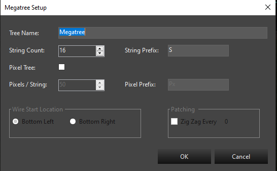
In this dialog, you will provide the name for your Mega Tree. It defaults to Megatree, but if you are adding multiples, you will want to name them Megatree-1, Megatree-2, etc. The next entry is the string count and the prefix name for each string. This defaults to 16 and a prefix of S. Adjust the string count to the number of strings you have.
The next choice is to determine if you have a pixel tree or an analog tree of traditional light strings. If yours is a Pixel tree, then check the Pixel Tree box. You will then choose the number of pixels on each string and the pixel name prefix. The default is 50 nodes. Adjust the count to match your setup. If you have a Standard light tree, then skip over the pixel count.
The next section concerns the startign location for the wiring on your tree. Typical is the bottom left. If yo uare using zig zag strings, then set the option for Zig Zag and enter the number of pixels in each Zig Zag. This is only if you are not setting up the Zig Zag in hardware. This will affect the patching to compensate for hardware that cannot do Zig Zag or if you choose to do it in software istead. It will setup a patching order, so you can just patch it straight through on the Display Setup screen. This does not generally apply to Standard light trees.
Setup for a Pixel Tree
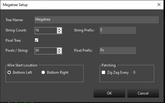
Once you select Ok, the next step will be whether to add a Dimming Curve or not. See the section on Dimming Curves
After the Dimming Curve, is a dialog to set up the color type of the prop. Depending on the type of lights you are using, the choice here will vary depending on the type of lights used in your Mega Tree. See the section on Color Handling.
After setting the Color Handling, the Mega Tree will be completed and the elements will show up in the tree. All the linking will be done and you are ready to use it. You can resize or move it around using the preview tools.
Adding a Mega Tree Manually
There are two different ways to add a mega-tree to the preview display. You can either auto-assign elements to the mega tree when it is drawn, or you can draw the object and define the linked elements later. Both methods have their benefits.
If you have already taken the time to define your element groupings, then you can save a lot of time vs linking the tree manually to elements.
Sometimes, it is nice to just start drawing& on the screen to test your ideas and plan the props you may want to add to your display. In this case, you might just want to play around with placement of objects that you may or may not have created in your element tree. Vixen allows you do place items on the preview without pre-linking them to elements.
Method 1: Auto-Linking Elements
- Click on the main element group for your mega-tree.
- Click on the Mega Tree icon on the toolbar.
- Left-click and hold the mouse button at the top left corner where you want to position the mega tree and, while holding the mouse button, drag to the bottom right to size the tree.
Notes on Auto Linking
- A mega tree without pixels must have 4 or more strings. Each of the child strings in your mega tree must not be a group.
- A pixel mega tree must have a main group with more than 4 sub-groups. Each string in the mega tree (sub-groups) must define more than 4 pixels each and all strings must have the same number of pixels.
Method 2: Manually Linked Elements
- Click on the main element group for your mega-tree.
- Click on the Mega Tree icon on the toolbar.
- Left-click and hold the mouse button at the top left corner where you want to position the mega tree and, while holding the mouse button, drag to the bottom right to size the tree.
Settings
After the tree is drawn, there are many options that can be set to adjust the look of the tree on the preview.
Element Links
Click on the Setup button to link elements to the strings in the Mega Tree. Elements are linked to the mega tree in the Element Links Screen.
String Type
See the common settings section for more information.
Light Size
See the common settings section for more information.
String Count
The string count is the total number of visible strings you have in your mega tree. If you’ve got a 180 degree mega tree and you want 10 strings, set the string count to 10.
Lights per String
Enter the number of lights in each string. This is the same for all strings in the tree.
Top Height
A mega tree is made up of a top ellipse and a bottom ellipse connected by light strings. This is the height of the top ellipse.
Top Width
A mega tree is made up of a top ellipse and a bottom ellipse connected by light strings. This is the width of the top ellipse. It can be as small as 1 or as large as you want. It can even be larger than the base if that’s the way you want it.
Base Height
A mega tree is made up of a top ellipse and a bottom ellipse connected by light strings. This is the height of the bottom ellipse. The width of the ellipse is defined by re-sizing the tree on the preview screen.
3.5.6.6 - Net
Overview
The net can be used to quickly cover an area with lights similar to the Net lights. Areas such as a tree-trunk or a bush can be covered without having to draw every strand of lights. It also makes a fairly accurate representation of icicle light strings.
Settings
Position
See Position in Common Settings
Light Size
See Light Size in Common Settings
Light Spacing
The light spacing is the number of pixels between each light in the net. You can just play with this number to get the look you like.
Linked Elements
See Linked Elements
3.5.6.7 - Star
Overview
A Star can be either Pixel based or Standard string based. A pixel Star has individually addressable pixels across the entire Star and a standard Star has a number of segments that span the Star.
Adding an Star in Vixen 3.6+
Start in the Preview instead of in Display Setup as you may have done in the past.
You can add an Star using the wizard buy clicking the Star icon in the Smart Objects toolbar and then with the mouse, click a point in your preview to start the Star and drag from upper left to lower right. This will create a basic Star shape and launch the wizard. Next a dialog will appear to setup the basic attributes of the Star.
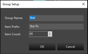
In this dialog, you will provide the group name for your Star. It defaults to Star, but if you are adding multiples, you will want to name them Star-1, Star-2, etc. The next entry is the name the segments will be called. This defaults to Star Px. If you are adding multiple Stars, you would name this Star-1 Px or Star-2 Px. The Px is just a shortcut for pixel, you can use anything you like for the segments. Each segment will have a number appended to this name. Example Star-1 Px-1, Star-1 Px-2.
Last is the number of segments. If this is a Pixel Star it would be the number of pixels. If it is a Standard* Star wrapped with segments of light strings, it will be the number of light segments. It defaults to 25.
Once you select Ok, the next step will be whether to add a Dimming Curve or not. See the section on Dimming Curves
After the Dimming Curve, is a dialog to set up the color type of the prop. Depending on the type of lights you are using, the choice here will vary depending on the type of lights used in your Star. See the section on Color Handling.
After setting the Color Handling, the Star will be completed and the elements will show up in the tree. All the linking will be done and you are ready to use it. You can resize or move it around using the preview tools.
Settings
See Common Settings
Position
A star is defined by two points. If you imagine a rectangle around the star, you have the ability to adjust the top left and bottom right corner of the rectangle to size the star to whatever you need.
Both have an X and Y position. X is horizontal and Y is vertical. You can precisely position the star using the Bottom Right and Top Left configuration options.
Inside Size
A star is defined by two ellipses. The outer ellipse is sizing the star on the screen. The inside size is a percentage of the outer size of the star. For example, if the star is 200 pixels tall and 100 pixels wide and the inside size is set to 40, the inside size will be 80 pixels tall and 40 pixels wide.
This may sound confusing. Just mess around with the setting to get what you want.
Light Count
The number of lights around the perimeter of the star. This will be automatically adjusted DOWN so that each point will have the same number of lights.
Light Size
From one pixel up, the size of the lights in the star.
Linked Elements
See the Linking Elements section for more information.
Star Points
The number of points in the star. It must be three or more… or else it isn’t a star.
String Type
See the String Type section for more information.
Notes
- Holding Ctrl when re-sizing using the bottom right corner will force the star to a fit a perfect square.
- Star pixels start at the right tip of the right-most point (the one pointing to the right) and move clockwise.
- You can nudge any object on the preview screen by selecting it and using the arrow keys. This will move it one pixel at at time.
Video Tutorial
3.5.7 - Linking Elements
Overview
Linking in the Preview is the act of assigning an Element to the light node that it represets. Much of this can be automated when adding Props to the Preview, but sometimes you may need to do it manually. In the Proerties section of a Prop shape is a entry called Linked Elements that can be used to edit the linkage.
Usage Notes
- Some elements have multiple strings. Select the string to edit in the list.
- Selecting a Linked Element and then double-clicking on a single element in the tree will assign that element to the highlighted Linked Element.
- Selecting multiple elements in the Linked Elements list and then double-clicking a single element in the Available Elements tree will assign the double-clicked element to all the highlighted Linked Elements.
- Dragging and dropping a single element from the Available Elements to a linked element will assign that element to the item it was dropped on.
- Selecting multiple elements in the Available Elements tree and dropping them on a linked element will assign, in order, the elements from the tree to the elements in the Linked Elements.
- Dragging an element group from the Available Elements to the Linked Elements will assign them, in order, starting with the element that was the target of the drop in the Linked Elements list.
- Advanced: Right-clicking on an assigned element brings up a popup menu. You can assign this element to ALL elements in ALL strings here.
Video Tutorial
3.5.8 - Custom Prop Editor
Overview
The custom prop editor is a replacement for the deprecated prop template mechanism to model props that don’t fit the Smart Objects. You will be able to design almost any prop you want to model, share models with others, and even import existing models from some other sequencers.
Launching
The Custom Prop editor can be launched from a multiple places. The main Admin screen under Tools -> Custom Prop Editor, and in the Preview under View -> Prop Editor. All of the same features are available no matter which place it is launched from.
Layout
The editor is laid out in 4 basic areas.
- Toolbar The toolbar contains the menus and icon short cuts for the editing features used to build the Prop.
- Element Tree The Element Tree is very similar to the structure used in the Display Setup or the Preview Setup. It is used to construct the Elements and Groups for the Prop.
- Drawing Canvas This is the area used to draw out the layout of the lights for the Prop.
- Prop Info / Element Info This area contains the metadata about the Prop. This like physical atrributes, vendor info, and Face Component.
Vendor Browser
Under Tools -> Vendor Browser is a utility to search for exsting models that vendors, or other users have already built. Use the Vendor drop down box to choose the Vendor of your Prop. Once you select the Vendor, a tree view listing of the categories they have created for organizing their Props is presented. This is designed by the Vendor and we do not control how things are organized. As you expand the tree and find a Prop you are interested in, clicking on the Prop will bring up a section on the right to view the details. This will list any physical information, and image that the Vendor has provided. A Model Info tab containing the model download options will also appear. Choosing Select from the model option, will download and open the model in the Prop Editor for you to use. From here you can save it as a Vixen Prop for using in Vixen. You can also edit the Element Tree or any other attributes of the Prop to taylor it to your needs.
Tutorial
General Overview
Analog Strings
Duplicate Parts
3.6 - Web Interface
Some aspects of Vixen can be controlled from a web browser or mobile device. This is most useful during the setup of your props. You can turn on individual elements for a determined time and color. Sequences can be played as well from the web interface.
To utilize this feature, validate under Tools -> Web Server -> Configure that the server is enabled. There you will find the address and the port the server runs on. Generally the default port is satifatory, but if you have other applications utilizing the default port, you may need to change it. The server can be disabled if not needed.
The interface adapts depending on the device it is viewed on. On desktops and larger tablets it shows a richer two column display. On phones the display will stack into one column so it is easier to use.
At the top is a search bar to filter the results. By default all the top level elements are displayed. Typing in the text box will filter down the results to anything that matches in the whole tree.
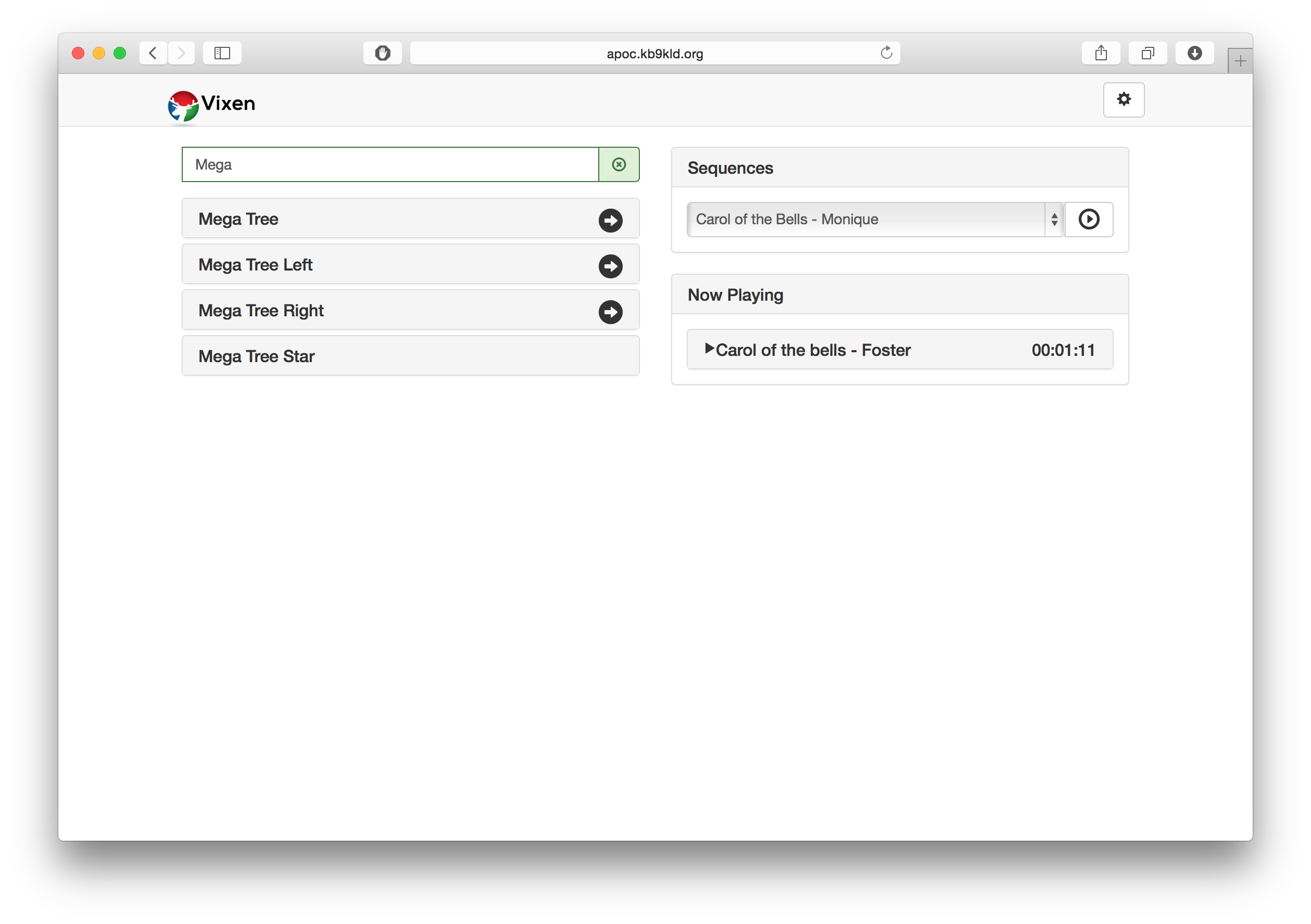
On the left are the controls for the elements defined in the display. They can be controlled, or the right arrow can navigate to their children.
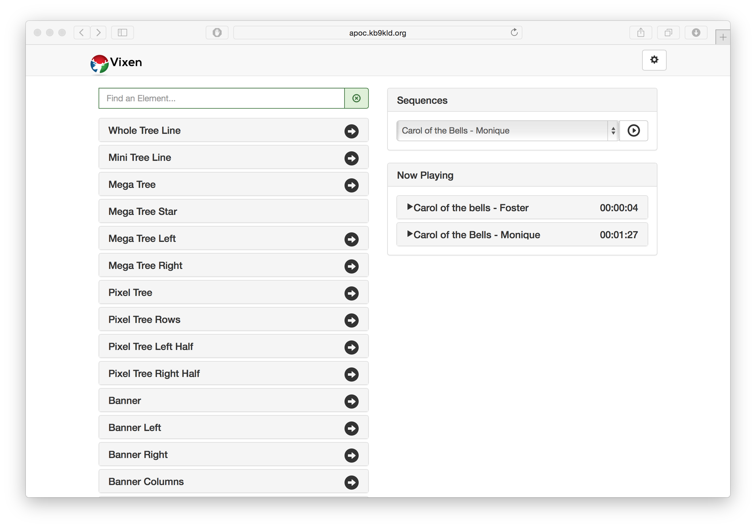
Clicking on the name will expand the controls for the element. Here the element can be turned on for a interval, turned on for a extended period and turned off if previously turned on via the interface.
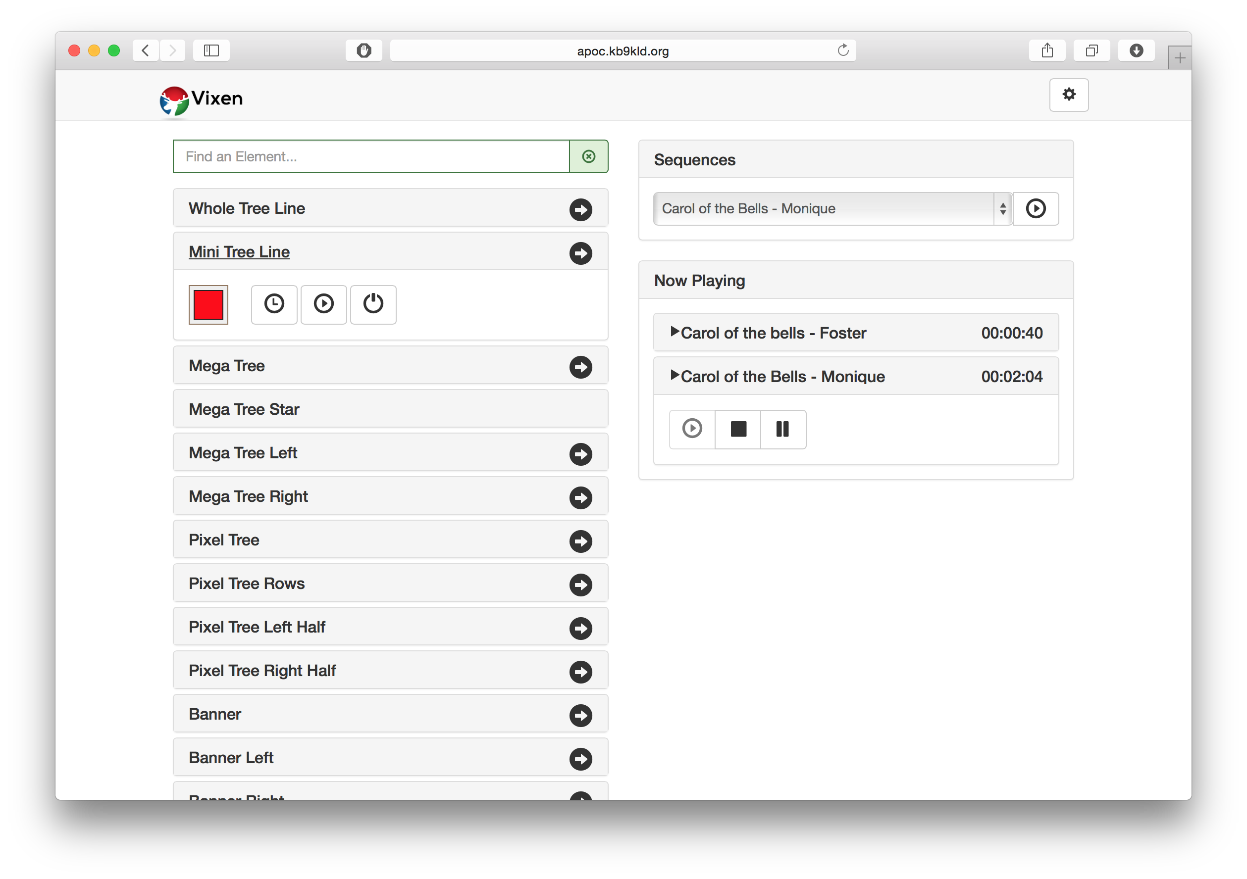
The color can be chosen to turn the element on for. If it is discrete, the configured colors will be configured to select.
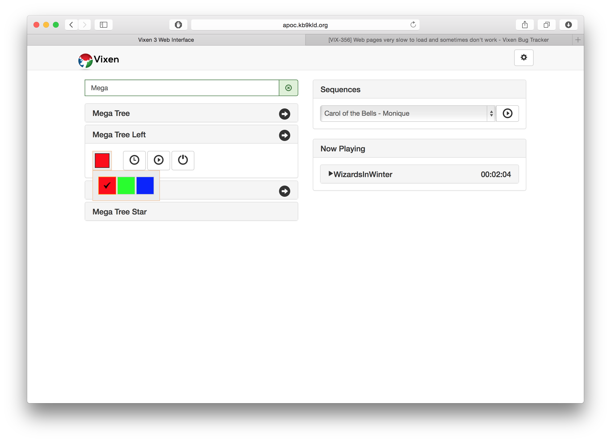
If it is a full color element, the color chooser will provide for the standard colors plus any custom color.
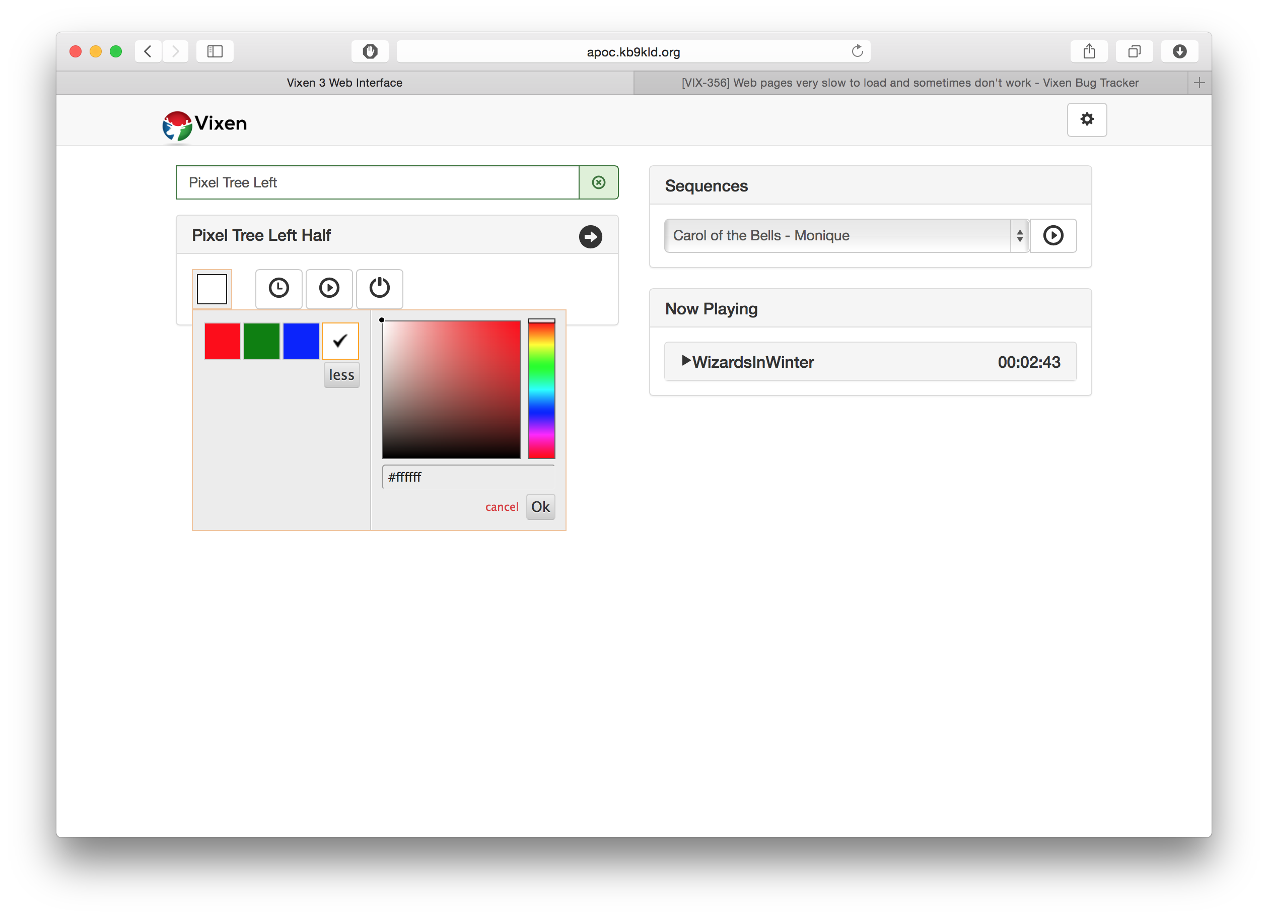
Clicking the gear icon in the upper right will bring up the menu to control the intensity and time on interval. It will scroll up from the bottom. Clicking again will scroll it out of the way.
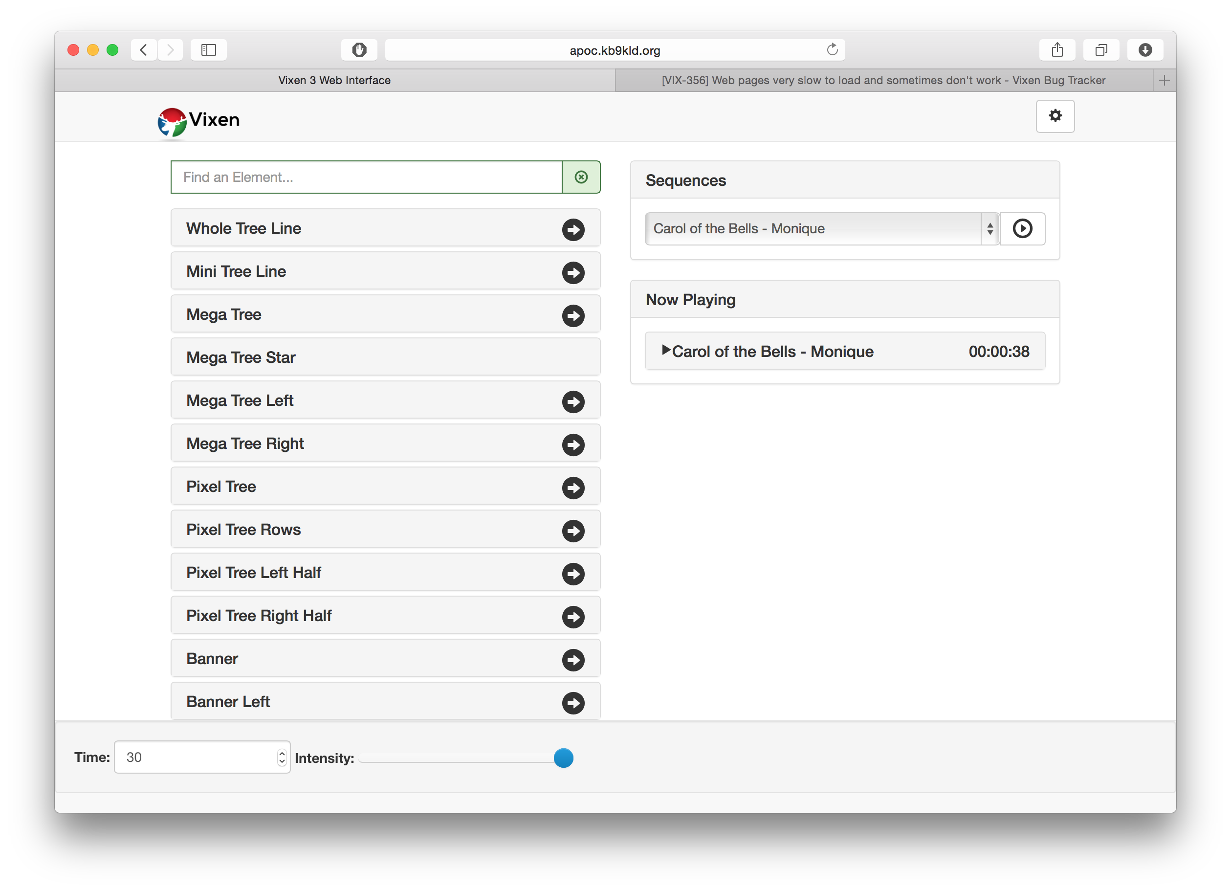
On the right hand side is the sequence control section. Here sequences can be played, paused or started. It will also give a live update view of the current playing sequences. Any sequence can be stopped or paused. Clicking the sequence in the now playing list will reveal the controls.
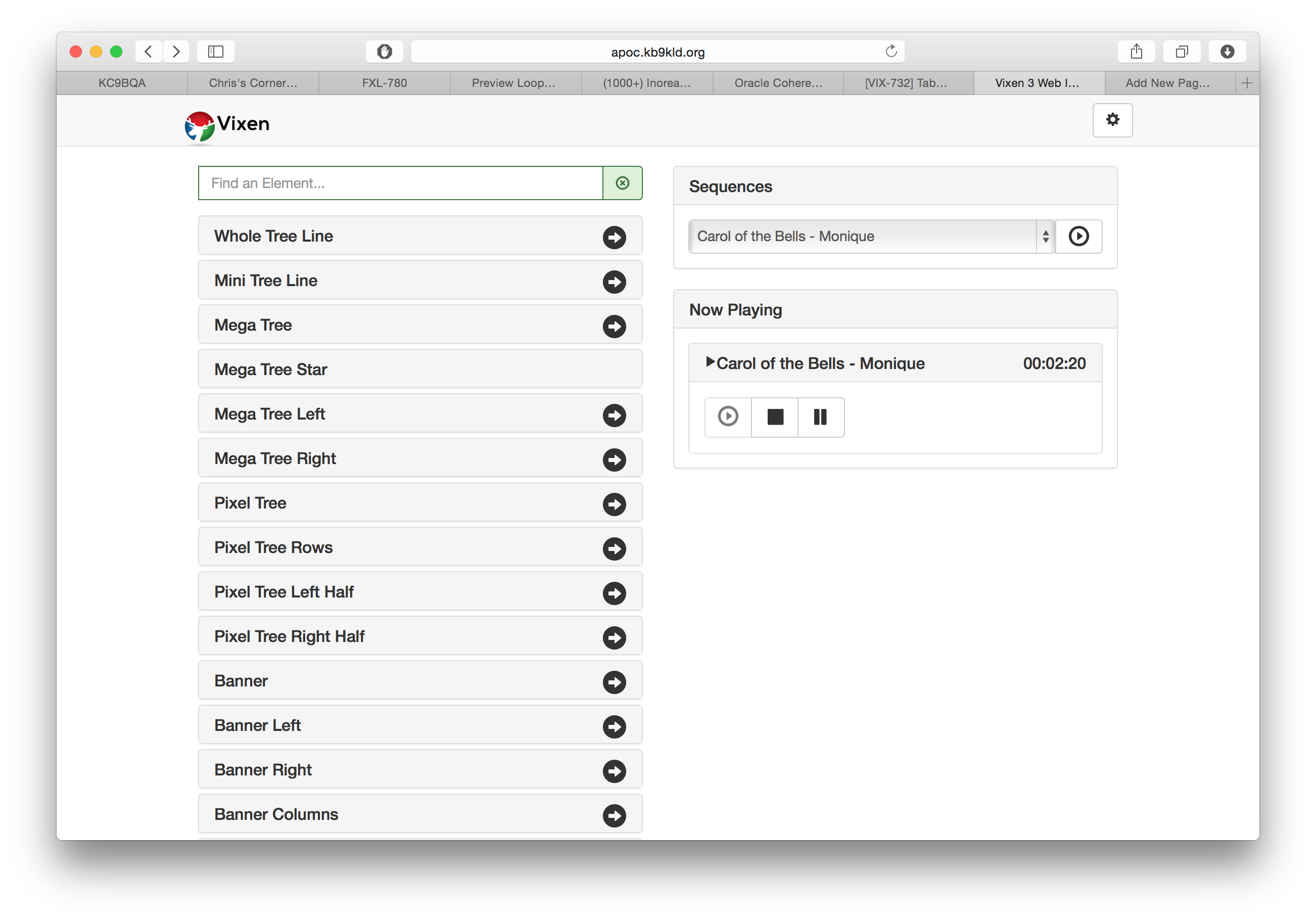
Controllers can also be turned on and off from the interface in order to better manage controlling what is outputting while testing. This can be useful if switching back and forth between Vixen and FPP.
3.7 - Programming API
3.7.1 - Command Lines
Overview
Command line arguments tell Vixen, when it loads, to disable a certain feature or to set a certain option.
Arguments
- no_controllers - Disables all of the controllers in one swell foop.
- no_execution - Disables the execution engine of Vixen.
- data_dir - All of the configuration data for Vixen is held in it’s data directory. The default data directory is My Documents/Vixen 3. Use this option to tell Vixen 3 to use a different data directory for this session.
3.7.2 - Web API
Overview
Vixen implements a Restful Web API. The API allows you to get get element info, search for elements, start/pause/stop a sequence, stop a running sequence and get status updates of running sequences.
You can send commands and receive responses from the Vixen web server using the API below. The key thing to learn with this API is that most of it uses JSON object data. So if a request is POSTing data to the server that data will be in JSON object notation and sent in the body of the request. All responses are in JSON.
The Postman application is a good tool to use to learn how the API works and fully supports sending RESTful requests with JSON notation.
GET /api/element/getElements
Retrieves a list of elements in the display.
Example request:
http://localhost:8080/api/element/getElements
Example Response:
[
  {
    "Id": "6173c7f3-46ee-424a-8e35-54eeadb98439",
    "Name": "Poles",
    "Colors": ["#FFA000"],
    "Children": [{
    "Id": "ff48009b-b051-4584-a654-4b7ed1599080",
    "Name": "Pole 1",
    "Colors": ["#FFA000"],
    "Children": null
  },
  {
    "Id": "9fb69ece-1048-48b3-b55d-067eebcd9ad3",
    "Name": "Pole 2",
    "Colors": ["#FFA000"],
    "Children": null
  },
  {
    "Id": "bf00aaaa-1dc8-4e3b-a21e-2bd57fdaff44",
    "Name": "Pole 3",
    "Colors": ["#FFA000"],
    "Children": null
  }
]
GET /api/element/searchElements
Searches for elements that start with the with prefix.
Example Request: Searches for elements starting with “Po”.
http://localhost:8080/api/element/searchElements?q=Po
Response is the same as getElements.
GET /api/element/on
Allows you to turn on a specified element.
Example Request:
http://localhost:8080/api/element/on
Parms:
id: The guid id of the element
duration: The time in seconds to stay on. 0 is indefinite._
intensity: 0-100 value for brightness
color: The hex code of the color. Blue=#0000FF
_Example Response:
{
  "Message":"Window Left turned on for 30 seconds at 100% intensity."
}
GET /api/element/off
Allows you to turn off a specified element.
Example Request:
http://localhost:8080/api/element/off
Parms:
id: The guid id of the element
Example Response:
{"Message":"Window Left turned off."}
POST /api/element/groupon
Since build #357
Turns on a group of elements. Like the on function, but for a collection of elements.
Example Request:
http://localhost:8080/api/element/groupon
Request JSON object format:
[
 {"id":"e80accf6-a2b0-4b26-95d6-358210ce6580","duration":"30","intensity":"100","color":"#ffff00"},
 {"id":"6d458dbb-12b1-4463-8ae7-a87718d6c412","duration":"0","intensity":"50","color":"#ff0000"}
]
Example Response:
{
  "Message": "2 elements turned on.",
  "Details": [ "Mega Tree Star turned on for 30 seconds at 100% intensity.", "Mega Tree turned on at 50% intensity." ]
}
POST /api/element/clearall
Since build #357
Turns off all active effects in the web server live context. Will not affect playing sequences.
Example Request:
http://localhost:8080/api/element/clearall
GET /api/play/getSequences
Retrieves a list of sequence files in the Vixen 3\Sequence folder. If you are using profiles, the folder returned will be the Sequence folder in the profile folder.
Example Request:
http://localhost:8080/api/play/getSequences
Example Response:
[
  {"Name":"Basic Patterns 1", "FileName":"Basic Patterns 1.tim"},
  {"Name":"Border Pixel Test", "FileName":"Border Pixel Test.tim"}
]
POST /api/play/playSequence
Plays the sequence passed.
Example Request:
http://localhost:8080/api/play/playSequence
Example Response:
{
  "Name":"Announcement",
  "FileName": "C:\\Users\\bob\\Documents\\Vixen 3 – Halloween\\Sequence\\Announcement.tim"
}
Parms: JSON Object
Name: The name of the sequence.
FileName: The filename of the sequence.
Both are obtained from the getSequences call.
Example Response:
{
  "State":1,
  "Sequence":{"Name":"Announcement","FileName":"Announcement.tim"},
  "Position":"00:00:00","Message":"Playing sequence Announcement of length 00:00:12.0680000"
}
POST /api/play/stopSequence
Stops the specified sequence that was started within the web API. Uses the same format as the playSequence for the request data.
Parms: JSON Object
Name: The name of the sequence.
FileName: The filename of the sequence.
Both are obtained from the getSequences call.
Example Response:
{
  "State":0,
  "Sequence":{"Name":"Bedroom Gable Chases","FileName":"Bedroom Gable Chases.tim"},
  "Position":"00:00:00","Message":"Sequence Bedroom Gable Chases stopped."
}
POST /api/play/pauseSequence
Stops the specified sequence that was started within the web API. Uses the same format as the playSequence for the request data.
Parms: JSON object
Name: The name of the sequence.
FileName: The filename of the sequence.
Both are obtained from the getSequences call.
Example Response:
{
  "State":0,
  "Sequence":{"Name":"","FileName":""},
  "Position":"00:00:00",
  "Message":"Sequence Bedroom Gable Chases paused."
}
GET /api/play/status
Provides a status on what is currently playing.
Parms: none
Response:
State: 0 is stopped, 1 is playing, 2 is paused.
Position is the time offset into the current sequence.
{
  "State": 1,
  "Sequence": {"Name": "Christmas Eve Sarajevo", "FileName": "Christmas Eve Sarajevo.tim"},
  "Position": "00:02:14.0460000",
  "Message": null
}
GET /api/system/getControllers
Since Version 3.6
Provides a list of the output controllers defined in the system.
Parms: none
Example Response:
[
  {
    "Id": "971b0b2d-0496-4894-8ecf-744e6f9b671e",
    "Name": "House",
    "IsRunning": true,
    "IsPaused": false
  },
  {
    "Id": "00d0402e-c993-49b1-914a-ab2234f26705",
    "Name": "Renard Bushes",
    "IsRunning": false,
    "IsPaused": false
  }
]
GET /api/system/getController?id=guid
Since Version 3.6
Get the info for specific controller by id.
Parms: controller id as guid
Example Response:
{
  "Id": "971b0b2d-0496-4894-8ecf-744e6f9b671e",
  "Name": "House",
  "IsRunning": true,
  "IsPaused": false
}
POST /api/system/setControllerState
Since Version 3.6
Set the state of a specific controller.
Parms: JSON object
{
  "id":"971b0b2d-0496-4894-8ecf-744e6f9b671e",
  "isRunning":"True"
}
Example Response:
{
  "Message": "House state Not Changed.",
  "Details": [],
  "IsSuccessful": false
}
POST /api/system/setAllControllerState
Since Version 3.6
Set the state of all the controllers.
Parms: JSON object
{
  "id":"",
  "isRunning":"True"
}
Example Response:
{
  "Message": "All controllers state Changed.",
  "Details": [],
  "IsSuccessful": true
}
**POST /api/system/save
Since Version 3.6
Save the System Config.
Parms: None
Example Response:
{
  "Message": "Save Successful",
  "Details": [],
  "IsSuccessful": true
}
Status updates via SignalR messaging
Status updates are published via a SignalR push mechanism. You can include the SignalR client and subscribe to receive these updates.
self.initSysytemStatusHub = function () {

//register for updates
$.connection.ContextStates.client.updatePlayingContextStates = function(states){

//Do stuff with states object

}

// Start the connection
$.connection.hub.start();
}
4 - Tutorials
4.1 - Effects
Alternating
4.2 - Preset Libraries
Preset Libraries
4.3 - Preview
Linking Elements
Creating a Star
Intelligent Fixtures
Custom Prop Editor
4.4 - Layering
Layering Part 1: Intro
Layering Part 2: Masking
Layering Part 3: Advanced
Layering Part 4: Advanced
4.5 - Sequence Import / Export
Sequence Import / Export
4.6 - Scheduler
Scheduler
5 - Donating
People often ask us if they can contribute to the cause of the Vixen project. For years we’ve shied away from accepting donations because we aren’t organized well enough to receive and distribute any funds we might receive. Well we’ve discussed it, and decided that now that our dev team is smaller and our needs are few, it could be manageable.
Any donations will be added to a fund that will be used as directly as possible toward the project. We may purchase lighting equipment to test new features, though most vendors are very gracious already and donate samples for this purpose. We may use it to support training and marketing expenses such as presenting and exhibiting at regional expos. We may use it for web hosting or other internet presence related expenses. We may use it for computing hardware or software to help us test and debug better. If the unlikely event happens that we end up with more in this fund than we can reasonably use on these types of expenses, we will distribute it between the active developers.
We do this for the love of the hobby, and because we’re constantly trying to make a product that does what we need it to do, in the most effective way possible. And by sharing it with the community at large, we benefit by getting feature ideas to make it even better.
If you wish to donate to the Vixen project, you may send funds in any amount via paypal to VixenDonations@gmail.com
Vixen is not a non-profit charity, nor is it a corporation or legal entity of any type. We are a informally organized group of people with no formal or legal association.